Design firm Two-N convened a fantastic data salon last night in Chinatown to talk about the future of data visualization. Heard from speakers Hermann Zschiegner from @2nfo; Matt Macomber from Franklin Templeton and Clara Vydyanath. @MattMacomber@zschiegner
Is @Beyonce secretly a rapper?
https://t.co/eQB5kjSNsA
One of our devs here at 2N, Jasmine noticed something curious about Beyoncé: Her music seemed to move closer to hip-hop and rap as it evolved over time.
full story here: https://t.co/gSjrqntlP1
#Beyoncé#dataviz
🚨 The new #WorldProtests study by @saraburke1, @IsabelOrtizUN, @tendermoustache & @nanchisworld examines almost 3000 protest events across 101 countries over the last 15 years.
Why do people protest? What are the trends? Toplines in the 🧵 below. https://t.co/52QOpv1pMT
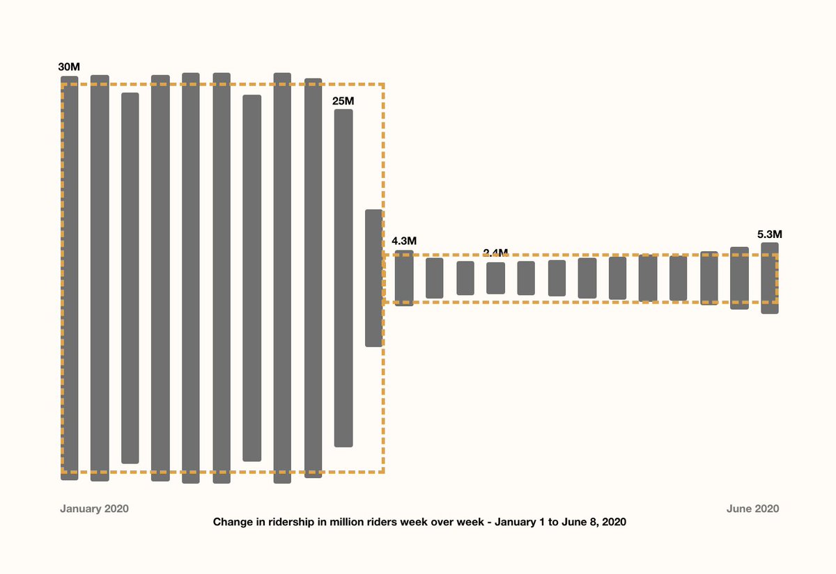
CA Winner: @2nfo’s website examines the impact of COVID-19 on the usage of New York’s MTA, and what the data means for the pandemic’s impacts on populations by socioeconomic status and privilege. https://t.co/Zsm6STGwIr
#CAwinner#interactive#impactsofthepandemic#socioeconomic
Time to get that vaccine!
We are so proud, honored and excited to share that our TWO-N team worked with the amazing digital data journalism team at NBC News to create this piece. We have a long way to go but things are looking hopeful. @elliefry
https://t.co/xPnPuuGeYP
Nearly every county in NBC News' 13 battleground states increased turnout from the 2016 election, according to an analysis of NBC News election results https://t.co/Ulv0Sj3Zu4
🚨 The latest from our publication! 🚨
Our talented intern, Eva Sibinga, examined the @washingtonpost's police shooting database and visualized the racial disparities. Check it out here: https://t.co/BJnz7EFM4D
#DataVisualization#BLM#BlackLivesMatter
If you're in the US, today's the last day to fill out your #2020Census. #GetCounted here: https://t.co/3cbbmU77TH.
Then check out our collaboration w/ @2nfo from earlier this year about what questions were included in each decennial survey since 1790: https://t.co/roIBcRCSkl
If you're curious about more info behind our recent MTA project (https://t.co/EyzGP4zRBb) about the change in #subway ridership due to #COVID19, check out this medium article about @aucher_serr's process: https://t.co/fWhZtohjG0
Some additional insights from the #DataVisualization I worked on at @2nfo. We looked at how @MTA ridership changed during the peak of the #Covid_19 pandemic in #NYC. #Census data helps us see how these changes connect with broader #inequalities.
https://t.co/Uc7oSYDHqB
Are you still riding the #subway? With our new interactive #DataVisualization project, you can learn more about #COVID19's affect on subway ridership, and explore the changes to your neighborhood or favorite subway lines. Explore here: https://t.co/z8ClNV8IUH
Check out our new interactive visualization project looking at how @MTA subway ridership changed during the first few months of COVID-19 and what we can learn from that about our city.
#DataVisualization#Covid_19#nycsubway#SocialDisparities
Who is Still Riding the Subway? Our design technologist @aucher_serr looks at MTA data to answer questions such as ‘who is able to stay at home?’, ‘who has to work the front lines?’, and ‘which communities are at greater risk for exposure?’ Check it out: https://t.co/z8ClNV8IUH