I love when a restaurant brand has a sense of humor. BOND created everything for Roster in Helsinki, from the name to the interiors, with a custom typeface full of sharp angles and quirky serifs, gold foil menus and brass details.
https://t.co/gRnoD1HB8t
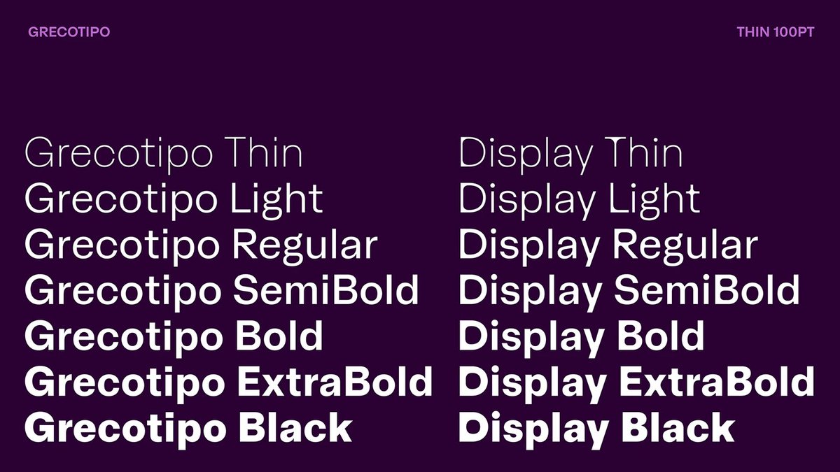
More Plau, because they keep getting it right. Grecotipo is a 32-font family for the Brazilian studio Greco, with a Display cut that has soft rounded counters. Look at that lowercase g.
https://t.co/2P4WAoxvVr
@Stammy@pangram I've been experimenting with AI written but human curated for months. Training AI is super challenging; I don't believe in full automation or no human in the loop. At least for now. But I do get quite impressed sometimes with what AI finds.
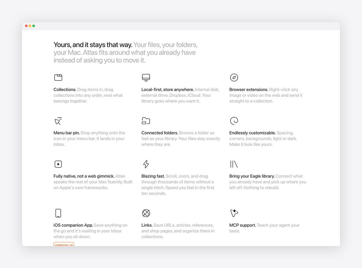
And lastly, speaking of web design and great product design. I am a fan of the work Alexey Sekachov did for Atlas, both the app and the site. Super simple and gorgeous typography.
https://t.co/AANTs2SBBt
There’s something cool about the type treatment here!
Palantis designs a sharp, modular brand identity with earthy palette for FAUVE, a contemporary tea room and specialty coffee shop in Vincennes.
https://t.co/2zDYavIjtx
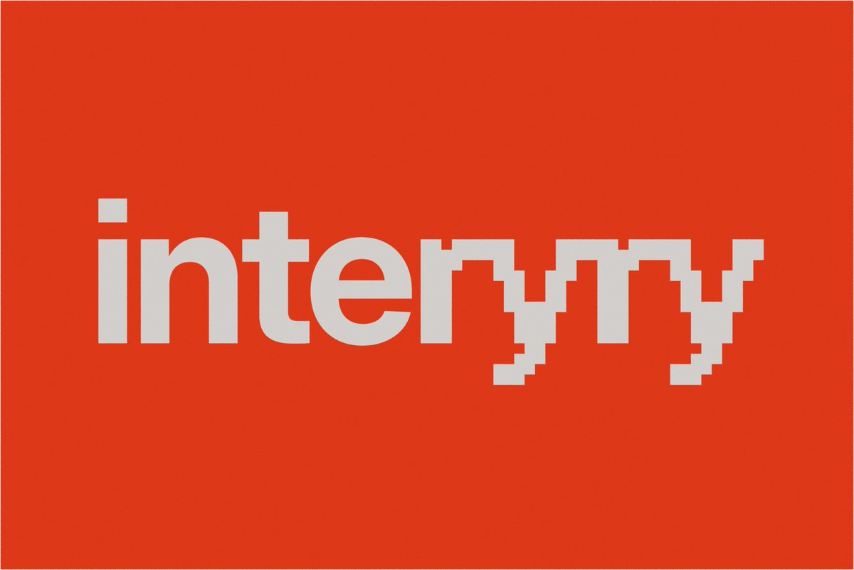
I really like this branding project for Intuit. JKR built the Intuit rebrand around one idea: the letter i. A new lowercase wordmark detaches into an animated symbol for Intuit Intelligence.
https://t.co/SjVV04tAUk
It's almost the weekend! Here's some inspiration for both design and having a good time, haha!
Opera Prima designed a tactile packaging design for Iron Coin Whisky, pairing heavy faceted flint glass with minted metallic coin talismans.
https://t.co/NXSzaMLhrt