A visual system of minimal, black and white overlapping lines references Scouted’s painstakingly curated nest. Featured throughout the brand and in their packaging, it becomes a little piece of their home delivered directly to their customers.#packaging#packagingdesign#branding
Scouted are a hawk-eyed fashion retailer founded by Fraizer Campbell. They champion new and undiscovered brands, bringing them together to create an exclusive virtual wardrobe for people who want to stand apart from typical high street establishments.#logodesign#logo#branding
⚠️FREELANCE DESIGNERS⚠️ I’m still looking for #freelance#brand and #web#designers for @AHOYStudio. January is looking incredibly busy—if anyone has any recommendations, PLEASE can you share here or email [email protected] Thanks, Tom
Visit https://t.co/EGM1KO2BdZ to check out the case study.
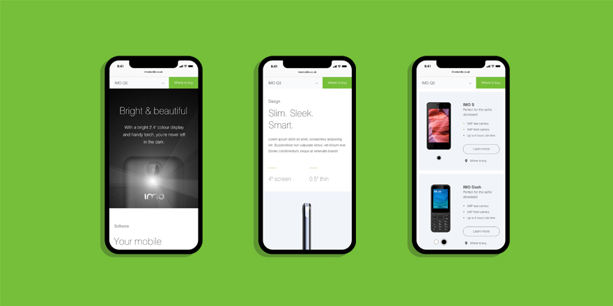
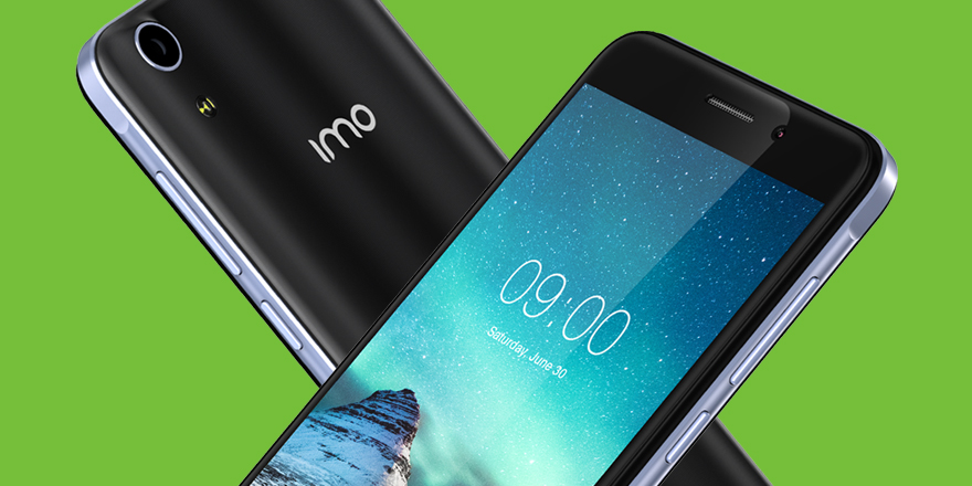
We designed a fresh, contemporary, fully responsive site. The versatile page template design and CMS capability allowed for easy updates and developments as IMO grows and new devices are released and added.
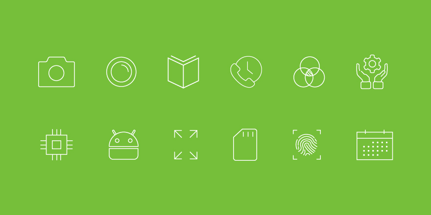
An icon set was developed in a style that complimented the light weight typography. These icons were used throughout the site to highlight key features of products as well as assist in “way-finding” within the site.Visit https://t.co/EGM1KO2BdZ to check out the case study.
Visit https://t.co/EGM1KO2BdZ to check out the case study.
Tone-of-voice was developed to educate audiences around the definition of IMO. Matter-of-fact statements represented the thoughts and feelings of the consumer and encompassed the honesty and attitude of IMO.
Visit https://t.co/EGM1KO2BdZ to check out the case study.
IMO specialise in affordable mobile communications. We were tasked with re-energise their online presence by creating a website that truly reflects the brand’s ethos and aspirations.#webdesign#design#ahoy#portfolio
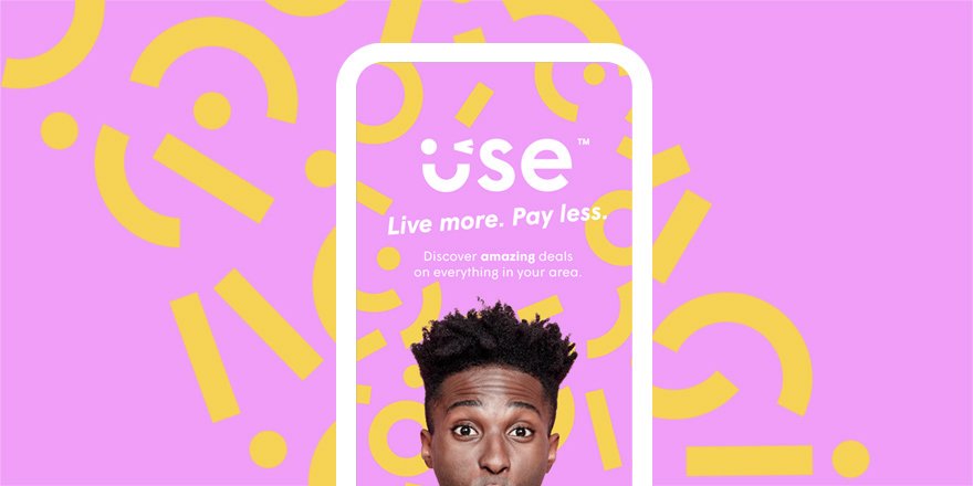
The design of the Use app started by identifying the core features and objectives. Users must be able to find, search for and use offers quickly and intuitively. With these objectives in mind, we created a working prototype.
#graphicdesign#app#appdesign#brandning#identity
Visit https://t.co/MI1uSdvVeC to check out the case study. Playful, fresh and bursting with feel-good energy; the visual language of the brand encapsulates the experience of using an offer. This feeling of surprise and happiness when realising how much you’ve saved.