@TheRuqayyah I hope this advice is only for newbies though because I keep seeing designers pushing apps on Appstore and even designing App screenshot week in week out.
Is product design dead or there are no Jobs, make your point clear 🤔.
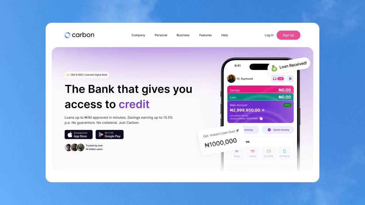
Hey guys, been heads down on something exciting 👀
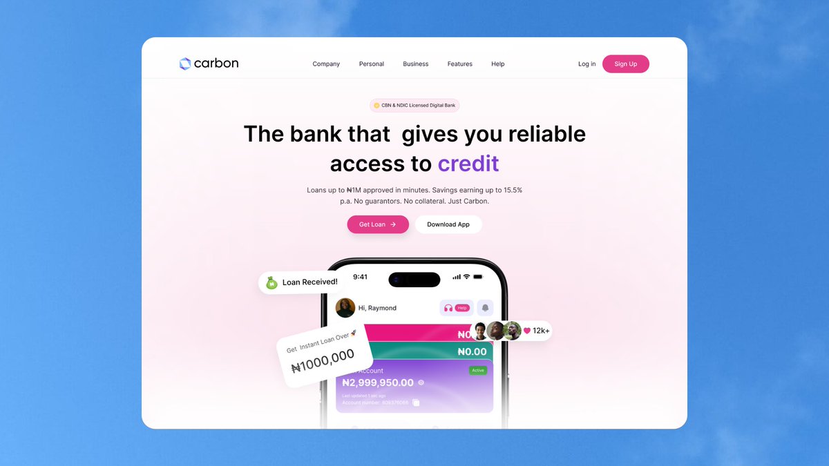
I'm redesigning the Carbon Bank landing page.
Here's the old vs. new Hero Section.
🧵
Here's what changed:
✅ Added a Log In button so existing users have a clear entry point.
✅Cleaned up the nav to reduce decision fatigue and improve focus.
✅Strengthened visual hierarchy so the eye knows exactly where to go.
✅Replaced weak buttons with CTAs that are actually conversion-focused.
Same Carbon brand, but with a sharper, calmer look. 💰
You don't build confidence by thinking about it.
You build it by doing things you weren't sure you could do.
Every time you keep a promise to yourself, trust grows a little stronger.
Well from the look of things I can now confirm My productivity is tied to the kind of music I'm listening to.
My adrenaline is tied to sounds.
Who else feels same way?
https://t.co/NeBiTI1zXq
While redesigning Carbon's hero section, I explored different directions instead of settling for the first idea.
If you were landing on this page for the first time, which hero section would grab your attention more?
A or B?
And more importantly, why? 👇