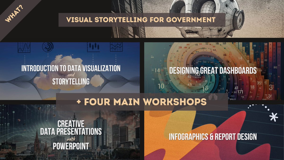
Public servants in Australia now have FIVE more options for creative training. Our data design & storytelling workshops are now available through Austender (Panel: SON 4009385).
https://t.co/Pu7NTaUUlU
What's more fun than designing the weird choices of AI and getting to explain it to another human? Answer: not much. :) Download the XAI workbook to learn more. https://t.co/7F9spxqdge
Use this year’s data visualization & design conference guide as a travel planner. North America, Australia, Asia, and Europe. Get analytical and creative somewhere new! https://t.co/ksdcskLqGl
#conferences#datavisualization#design
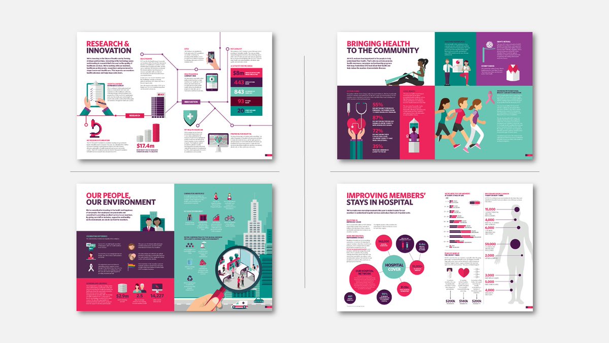
Visualize your company or government teams designing infographics. The new, revamped Infographics & Report Design workshop has launched. Take a look.
https://t.co/hdc6bpooC0
Hey #Canberra and all #government employees, we’re holding our new workshop in your backyard: Visual Storytelling for Government. #training https://t.co/QftUa9ovMT
We’ve curated a list of gold-standard interactive data visualizations which we hope will inspire you to try it for yourself. May your data never be boring.
https://t.co/GKZAiU46kN
#AnnualReport#reporting#interactive
Our 2023 Data Visualisation Format of the Year: Brand Guidelines for Data. Formatting standards for everything from infographics to BI dashboards. See the 'before' and 'after' »
https://t.co/LaQ1mx5ZTH
#brandambassador#analytics#communications#reportinganalyst
See the guide to the best data visualization conferences in North America, Australia, Asia, and Europe. Use this year's conference guide as a travel planner. https://t.co/hmfOTfxAV0
So which of these 14 data conferences would you log into? If you could go anywhere in the world — which analytics conference would you go to? See the Top 14 Data & Analytics Conferences of 2023-24 »
https://t.co/Eq5QQaeMb0
An all-encompassing teacher in visualization. Our new workshops for anyone who works with or communicates data are here. Get your team sorted. >> https://t.co/yRbjQsasJ3
Dashboard users are a fickle bunch. Get better insights into what they want by building an audience profile. Learn how with this free tutorial and checklist »
https://t.co/BhlzNdlP07
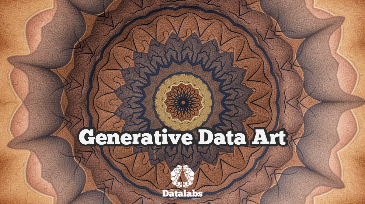
The sexy side of data comes out when making art with it. Here’s the output of an experiment run by Otto Ottinger, the Datalabs Agency’s Managing Director. https://t.co/H6gC9I2AY9
#datavisualisation#dataart#mandalas#generativeart
This is the golden age of data-driven videos. There’s never been a better time to visually explain concepts and insights in one of the most superior forms of data visualisation: animation. https://t.co/yYPtpTnNLw
#datavisualisation#motiongraphics#datalabsagency#animateddata
There’s beauty in the ‘collision’ of two different data sets. What’s in? What’s outside? How are they connected? Learn to think in systems. https://t.co/WvFWbc59Ji