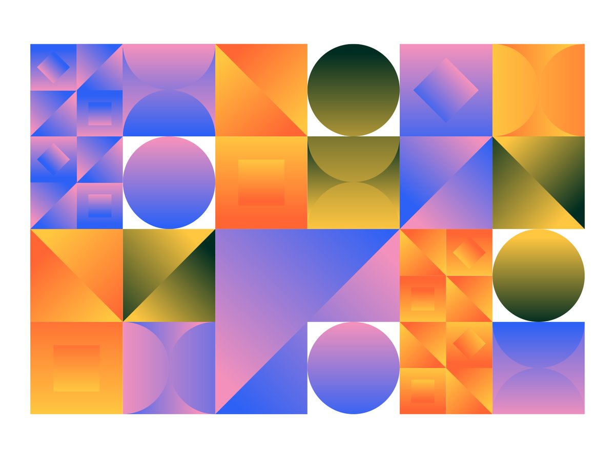
When creating a brand identity, we start with research and strategy, both business and visual. Every decision is intentional, designed to build clarity, relevance, and long-term consistency.
We strive for extraordinary: brands that look great and avoid common.
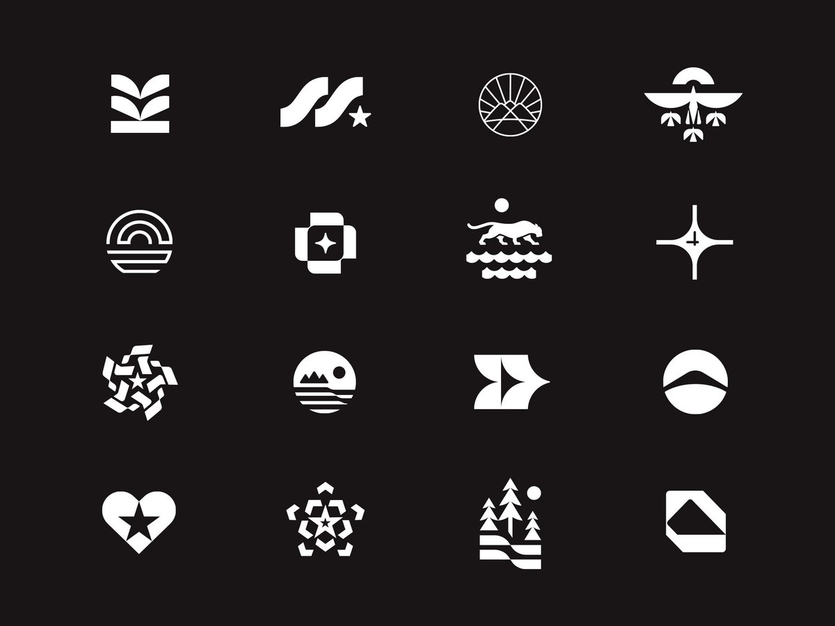
A selection of past & recent logomarks.
Each of these marks started with research, sketches, and lots of refining.
The goal is always the same: reduce everything down to a symbol that is simple & meaningful.
They’re all signals of a muse trying to say a lot with very little.
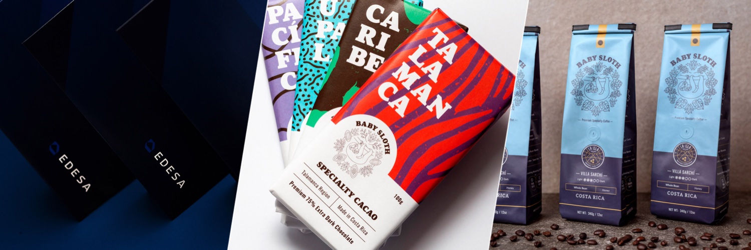
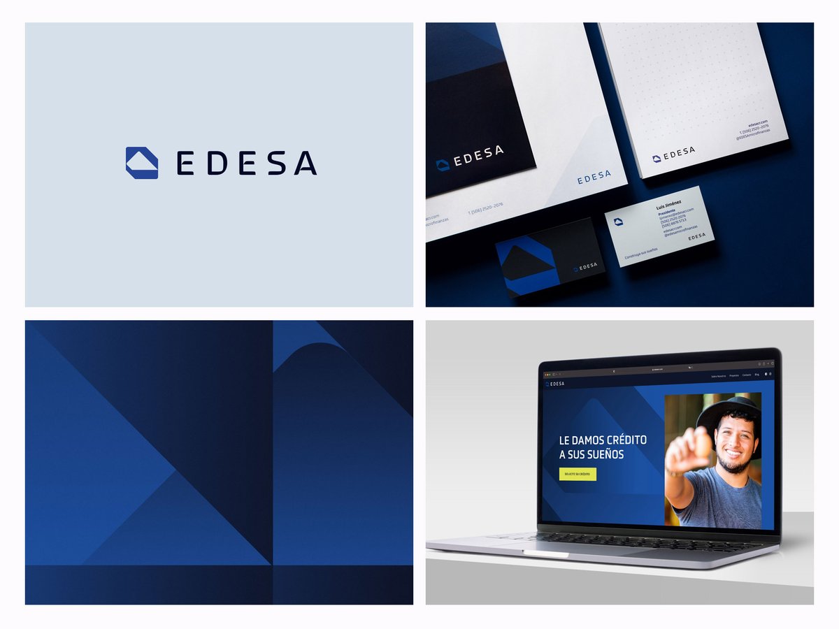
Social media assets for EDESA, a company that provides funding and capital to medium and small businesses.
👉 Send us a message and let's chat about your new business project.
Two Dobermans make up one of the complementary marks for Brand Club, our newsletter that talks about branding.
These dogs are the guardians of our design secrets!
Stop asking
“What should my packaging look like?”
Start asking:
“What is everyone else afraid to do?”
4 Brands that are breaking the rules with packaging:
https://t.co/tzZQ72SLCl
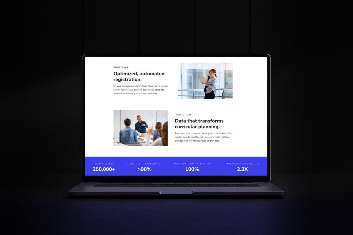
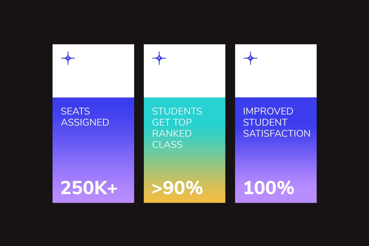
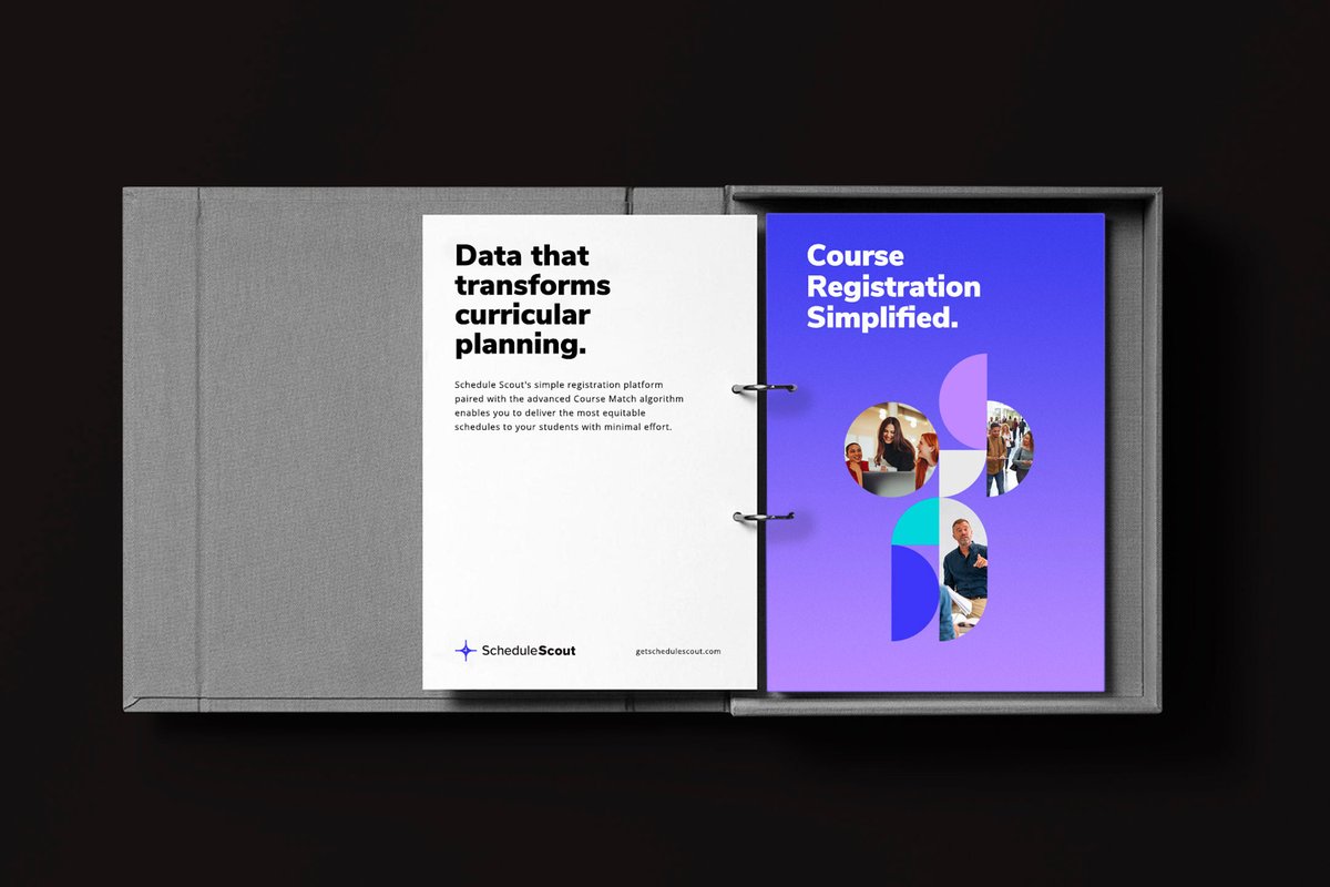
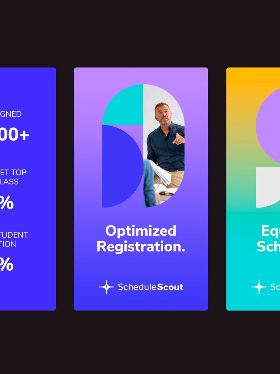
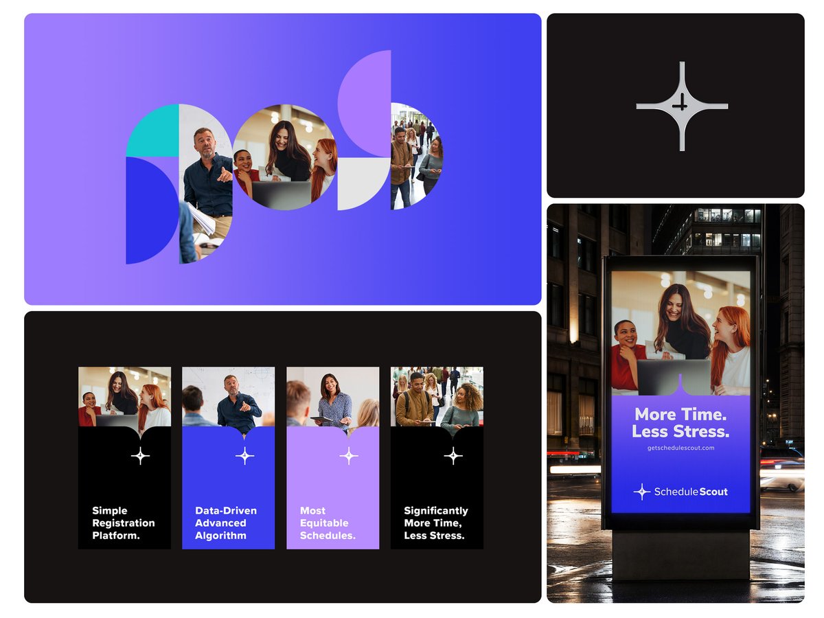
For Schedule Scout brand identity, we embraced the symbolism of the Northern Star, representing guidance.
We integrated a clock to symbolize the time-saving and efficient capabilities of the software in tailoring custom schedules for students.
#branding#brandidentity
Brand identity for Schedule Scout, a university registration platform that helps administrators create efficient schedules for students.
We used the North Star as a symbol of guidance and added a clock to show how the platform saves time and makes scheduling easier.
Icon designed for Schedule Scout, a cutting-edge university registration platform.
We embraced the symbolism of the Northern Star, representing guidance. A clock symbolizes the time-saving capabilities of the software in tailoring custom schedules for students.
#branding#SaaS
Our imagination? Unfiltered.
Our coffee? Strong.
Our obsession with branding and strategy?
That’s what makes brands stand out and sell.
Let’s build something bold
→ https://t.co/k30Uf3hBsD
Brand identity for Schedule Scout, a cutting-edge university registration platform.
Their mark blends the Northern Star, a symbol of guidance, with a clock that conveys efficiency and the time-saving features of their app.
👉Contact us for your next branding project!