Meet the new adaptive spacing system, announced at #GoogleIO.
Built on a flexible 8dp scale, it allows components and layouts to seamlessly adapt to any screen size.
Read how to implement it in your design system: https://t.co/y1X0p9XJty
Your interfaces should adapt beautifully across all devices. 📱⌚️🕶️
Our new adaptive layout tools will make your app look stunning on every screen size. Plus, we’ve updated our layout principles and guidelines to help you design across desktop, mobile, watches, and even immersive XR experiences.
Read here: https://t.co/mKOo7i0Xfe
Everything we announced at #GoogleIO, wrapped up in one blog post!
Get up to speed on our shift from Material Views to Jetpack Compose, as well as our new expressive layout guidelines, adaptive spacing system, and design guidance for watches and XR: https://t.co/4g3FdiDHVh
Design for every screen size without the headache. 📱💻
Catch our Google I/O session to learn how our adaptive components let you build once and deploy everywhere, from wearables to foldables → https://t.co/ZYsw8XeSe1
#GoogleIO#MaterialDesign#UserExperience
Ready to level up your app’s UI? 🎨 We’re introducing a sneak peek of the Styles API.
Discover how to customize Material 3 to match your specific visual identity — all without losing the accessibility and logic you rely on → https://t.co/PhApsH4Mr2 #UXDesign#GoogleIO
Want to add more personality to your UI? 🎨 Check out the expansion of the Material 3 Expressive kit in our I/O session. You'll get a first look at the latest components, including updated lists, search, and timepickers → https://t.co/hzdBl7KlZ8
#GoogleIO#AndroidDev #JetpackCompose
Build premium, adaptive apps faster than ever. 🚀 We’re officially going "all in" on Jetpack Compose!
While Material Views 1.14 is our final stable release for Views, we’re moving all our innovation to the Jetpack Compose library.
Tune into our I/O session to learn how we're supporting a more streamlined development experience → https://t.co/R2Ixk6RAXC
#JetpackCompose #MaterialDesign #AndroidUX #GoogleIO
Stop forking your design system and losing out on critical updates. 🛠️ You told us that keeping a custom brand identity in sync with Material was a major pain point, so we’re solving it.
Watch our "Make Material Your Own" session at I/O to learn how to stay connected to Material while building a look that is entirely yours → https://t.co/zMnS2HTGDE
#MaterialDesign #GoogleIO #DesignSystems #UX
We’re heading back to the stage for #GoogleIO — and our latest updates and breakthroughs are finally ready to meet the world.
What do you think we’ll be announcing this year? Drop your guesses ⬇️
Announced at #TheAndroidShow: Gemini Intelligence, the best of Gemini on our most advanced devices ✨
Gemini Intelligence handles the busy work so you can get back to what brings you joy. Coming soon to your phone, watch, laptop, and your car, too 👇🧵
ICYMI, it's our biggest and best Android Show ever ✨
✨ Gemini Intelligence brings a literal glow-up
📱New experiences only on Android
🚘 A huge upgrade for Android Auto
💻 Stunning new laptops, with Googlebook
Watch the full show now: https://t.co/2PeT4DWtSl #TheAndroidShow
📚 We're going back to the fundamentals of design with #GDBookClub! This month, we're diving into "Notes on the Synthesis of Form" by Christopher Alexander, a groundbreaking work that challenges traditional approaches to design thinking.
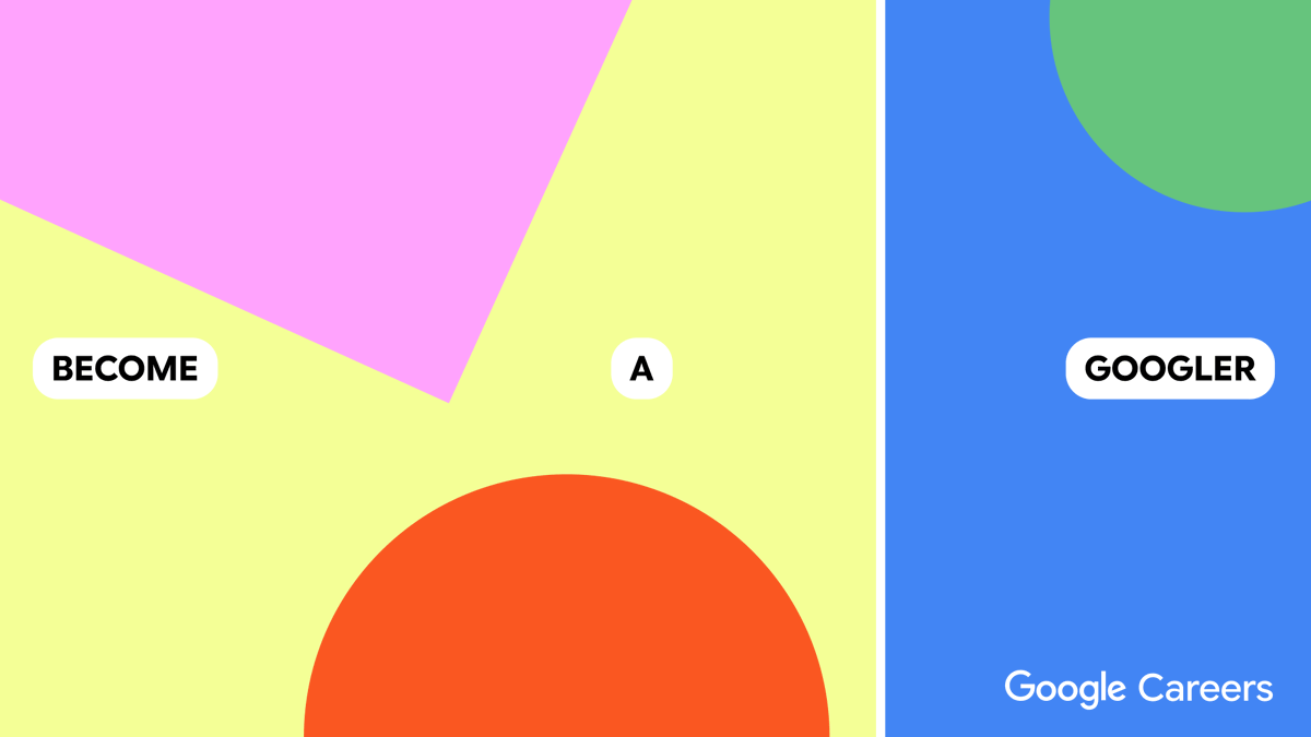
Design is more than just a job—it's a chance to make a difference. At Google, our designers are solving complex problems and shaping the future of technology.
Explore opportunities → https://t.co/Dbr976ybfh
To ensure accessibility and clarity, we pay close attention to contrast and visual cues in switch design. The ‘on’ state is clearly differentiated from the ‘off’ state through color, position, and animation, making it easy for all users to perceive the switch's status.
Material Design’s switches are more than just simple toggles – they’re carefully crafted components that provide a tactile and satisfying user experience for controlling binary states.
We recommend using switches when multiple options can be independently enabled or disabled, such as toggling settings or feature preferences within your app.


