Now that you’ve tagged me, I will drop my opinion.
This is 0/10
Why?
We are in 2026 not 2010, there are lots of competitors for this brand and this logo won’t help them grow or stand out.
Let’s start with the monogram you created, I see the D in negative space but this is just low effort, you could have done better.
The colors look so dull
The typography doesn’t work
Presentation looks like a throwback, not good and the mockups is a no.
If you’re just starting, it’s understandable, I wasn’t perfect from my first trial either.
How can you get better?
1. Get a proper branding course if you haven’t, so you can learn how to come up with concept, choose the right colors, how to present etc.
2. Follow people that are doing great at it already, learn from what they do.
3. Practice everyday, design daily and you will get better.
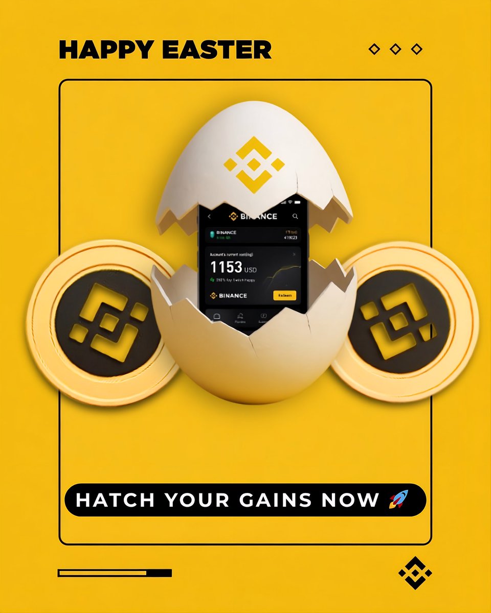
A fun, yet premium Easter visual, featuring a cracked egg revealing the @binance app with real-time gains, flanked by BNB coins. Clean, on-brand, and ready to drive action!
#BinanceEaster