The engineering demos for agentic AI are impressive.
But watch a real user and you'll see something the demos hide: confusion, hesitation, a quiet retreat from trust.
For 25 years, design meant less friction. Agentic AI inverts that. Sometimes the right answer is more friction.
Trust calibration. Progressive autonomy. Graceful interruption. No established UI patterns exist for any of them yet.
The engineering is solvable. The design is where differentiation lives.
https://t.co/4H8OknY5Uh
Headline: Google and @figma partner in bid to remake real-time design with Gemini 2.5
"The collaboration aims to let designers generate visuals and make edits almost instantly, eliminating the lag between an idea and its execution," via @FastCompany ↓ https://t.co/mADJJtuOxm
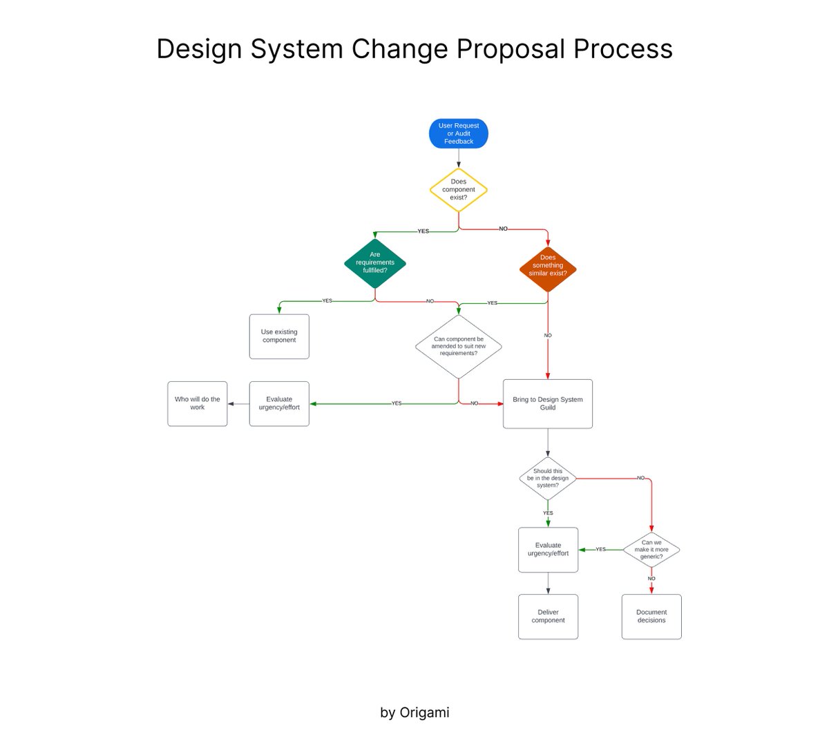
💎 Design system change proposal process
Great process to follow when you’d like to create a new component, improve documentation, or propose a new way of working
Designing for users is only half the job. The other half? Getting stakeholders on board! Kim Flaherty shows how to connect design changes to business impact: use metrics, calculate costs, & forecast value.
Watch here: https://t.co/yS4e7ppZCl
#StakeholderBuyIn#BusinessMetrics
Learn the User-Centric Content Design Process to Boost your Next Design Project! 🔥💥
Save to Bookmarks for reference 🔖
Empathise/ Understand
- Research user needs/ business needs
- Understand current landscape and assumptions
- Identify current user behaviour
Discovery typically includes:
- Capturing insights through research, analysis and stakeholder interviews
- Project canvas
- Empathy map
- Journey map
- Product strategy
Define
- Define strategy
- Define scope of work and resource/time needed
- Define success criteria and measures
Planning typically includes:
- Defining strategy including content
- Gathering requirements
- Creating epics and user stories
- Estimating time/resource
Ideate
- Co-design potential solutions (determine flow, features, format, structure
Ideation typically includes:
- Organising journey flow and features
- IA, content prioritisation and messaging hierarchy
- Sketching basic designs
- Journey mapping
- Language suggestions, defining voice/tone and key messages
Design/ prototype
- Collaboratively design solution
- Write the content that will be tested with users
- Document design decisions
Prototyping typically includes:
- Further design and content exploration
- Using collaborative tools to design your proposed solution including content
- Sharing design and rationale with key stakeholders
- Pair writing
Review
- Peer reviews
- Stakeholder reviews
- Tech feasibility reviews
Review typically includes:
- Crits
- Stakeholder feedback sessions
- Show and tells
Implement
- Document content (if necessary
- Work with dev to ensure accuracy of content
- Work with other teams to ensure content alignment
Implementation may include:
- QA
- Production of content including SEO requirements such as metadata and tags
- Launch management/ internal communication of new features
Test and learn
- Test your solution through
- AB testing, usability testing, or against success measures
- Report on progress
- Create hypotheses for optimisation
Measurement typically includes:
- Research methodology
- Data and sentiment analysis
- Content audits
- Creating test plans
By @minette_78
#ux #ui #uxdesign #uidesign #productdesign #content #contentstrategy #uxstrategy #visualdesign #graphicdesign #mobile #webdesign #appdesign #design #userexperience #business #marketing #startup #business
6 Types of Login Screen to Boost Your Next Design Project! 🔥🚀
FREE Cheatsheet attached! 🙌
Here are 6 Types of Login Screen to be aware of:
- Basic login
- Single sign-on (SSO) first login
- Hybrid login
- Stepped login
- Magic link
- Google One Tap Sign-in
By @TessGadd via @101babich 🙌
#ux #ui #uxdesign #uidesign #userexperience #design #productdesign #usability #webdesign #appdesign #html #css #javascript #login #react #learn #business #startup
Learn How to Use the 8 Gestalt Principles to Boost Your Next Design Project! 🔥🔥
These Principles determine how people naturally perceive visual elements. If you understand them, you understand how to create better UX.
1. Proximity
According to this principle, objects that are close to each other will be viewed as a group, rather than as separate, unrelated elements. This is often used in design to show that certain pieces of information are related or belong together.
2. Closure
The human eye likes to see complete shapes. If there are gaps or the shape is incomplete, the viewer's mind will fill in the missing information to create a cohesive whole. Designers use closure to create simple, recognisable shapes or to suggest forms that aren't explicitly shown.
3. Similarity
This principle states that objects that look similar will be perceived as belonging together or functioning as a part of the same group. Similarity can be achieved through color, shape, size, or other visual attributes.
4. Common Region
This is a perceptual organising principle that suggests that when elements are enclosed within a common boundary or region, people tend to perceive them as a group or unit rather than as separate individual elements. This principle highlights how our brains naturally group together elements that are spatially contained within the same area, even if they have distinct characteristics. Essentially, it emphasises the importance of spatial proximity and enclosure in shaping our perception of visual stimuli.
5. Continuity
This principle suggests that the eye will naturally follow a line or curve, favouring shapes that are smooth or flow in a particular direction over shapes that abruptly change direction. In design, this can be used to lead the viewer's eye across a layout or to important information.
6. Figure & Ground
In any composition, elements will be perceived as either figure (the focal point or subject) or ground (the background). The clearer the distinction between figure and ground, the easier it is for the viewer to understand the visual structure. Sometimes, this relationship can be intentionally made ambiguous for creative effect.
7. Symmetry
In the context of Gestalt principles, symmetry contributes to the sense of "good form" or Prägnanz; our eyes and mind find it easier and more natural to comprehend symmetrical forms. We often perceive symmetrical arrangements as belonging together as a unified whole, even if the individual elements are spaced apart.
8. Common Fate
This pertains to the perception of objects or elements as a group when they appear to share a similar direction or motion. When objects within a visual scene move or change in a coordinated manner, our brains tend to perceive them as belonging together. This principle is based on the idea that our perceptual system groups elements that appear to be moving in the same direction or exhibiting a common pattern of motion, even if they are distinct in other aspects. In essence, common fate suggests that when objects move together or show a unified motion pattern, we perceive them as a cohesive group rather than individual, unrelated elements.
Conclusion
These principles often operate simultaneously and are used in combination to create effective, comprehensible designs. Understanding how they work can give designers valuable insights into human perception, aiding in the creation of designs that are both aesthetically pleasing and easy to understand.
by @uxcam
#ux #uxdesign #ui #uidesign #uxlaws #gestaltprinciples #productdesign #uxprocess #userexperience #design #designthinking #research #userresearch #uxresearch #usertesting #usability #usabilitytesting #prototyping #agile #mvp #startup #digital #visualdesign #graphicdesign #business
Useful UX Principles Infographic, Detailing Three Critical Principles of UX Design in a Handy chart! 🔥
FREE Infographic attached! 🙌
Overview
UX Psychology: Human Behaviour:
#1 People Don't Want lo Work or Think More Than They Have To
#2 People Have Limitations
#3 People Make Mistakes
#4 Human Memory is Complicated
#5 People Are Social
#6 Attention
#7 People Crave Information
#8 Unconscious Processing
#9 People Create Mental Models
#10 Visual System
UX Heuristics: Guidelines to Follow:
#1 Visibility Of System Status
#2 Match Between System and The Real World
#3 User Control and Freedom
#4 Consistency and Standards
#5 Error Prevention
#6 Recognition Rather Than Recall
#7 Flexibility and Efficiency of Use
#8 Aesthetic and Minimalist Design
#9 Help Users Recover From Errors
#10 Help and Documentation
UX Laws: Applied Principles:
#1 Hick's Law
#2 Jacob's Law
#3 Miller's Law
#4 Occam's Razor
#5 Pareto Principle
#6 Tesler's Law
#7 Von Restorff Effect
#8 Zeigarnik Effect
#9 Miller's Law
#10 Serial Position Effect
by shaneketterman
#ux #ui #uidesign #uxdesign #design #productdesign #uxpsychology #uxlaws #usertesting #userresearch #usabilitytesting #research #iOS #android #mobile #design #business #startup
Some UI3 updates launching today based on your feedback:
→ Constraints now display inline when toggled on
→ Blend modes now display inline when the default is changed