Marathon Art Style (a short thread). First of all thanks to everyone for all the kind words and enthusiasm for the art style/direction in our announce trailer, it's been amazing to see. This was the result of many talented artists working together, with the support of an amazing
Nice to see Sparrow racing take one last lap. I know it was a bit polarizing but it was always easy for me to get excited about something like pod racing in the world of Destiny.
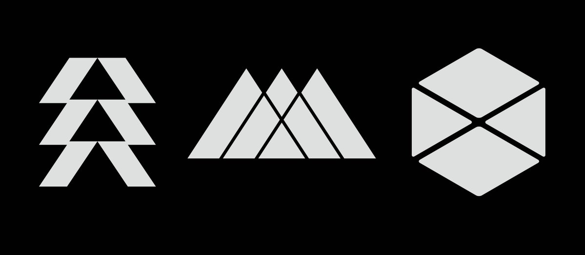
Not sure if I've posted these but I had the privilege of designing the class icons back in the day. Still lose sleep over rounding the Titan corners 🙃 #Destiny
@EeveesolutionSK When I designed them it was nothing literal, incorporating triangular shapes to reflect the "three" Hunter agressive and stealthy inspired by arrowheads and blades, Warlock "W" shape and suggesting a "vista" to channel their contemplative spirit:)
@YoungRenegadeRY Logos came first:) My goal was that they felt distinct from each other and embodied the spirit of each class, but also felt connected, like you could almost assemble them together and they would fit:)