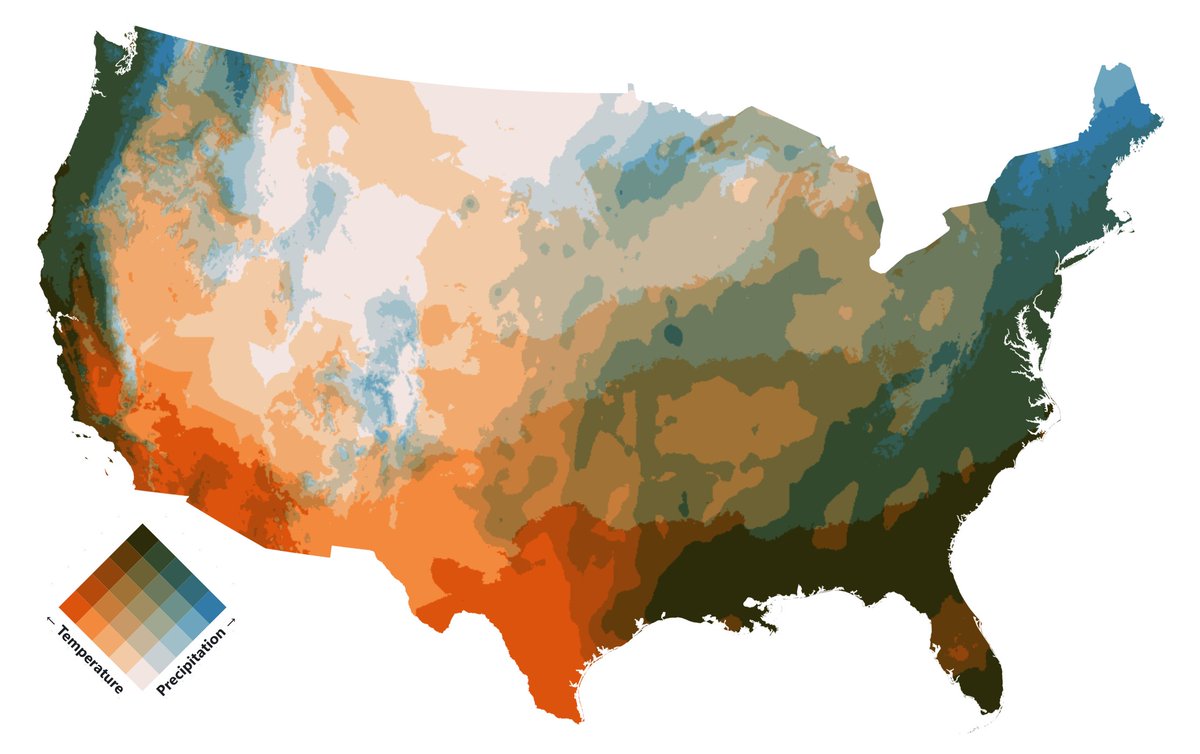
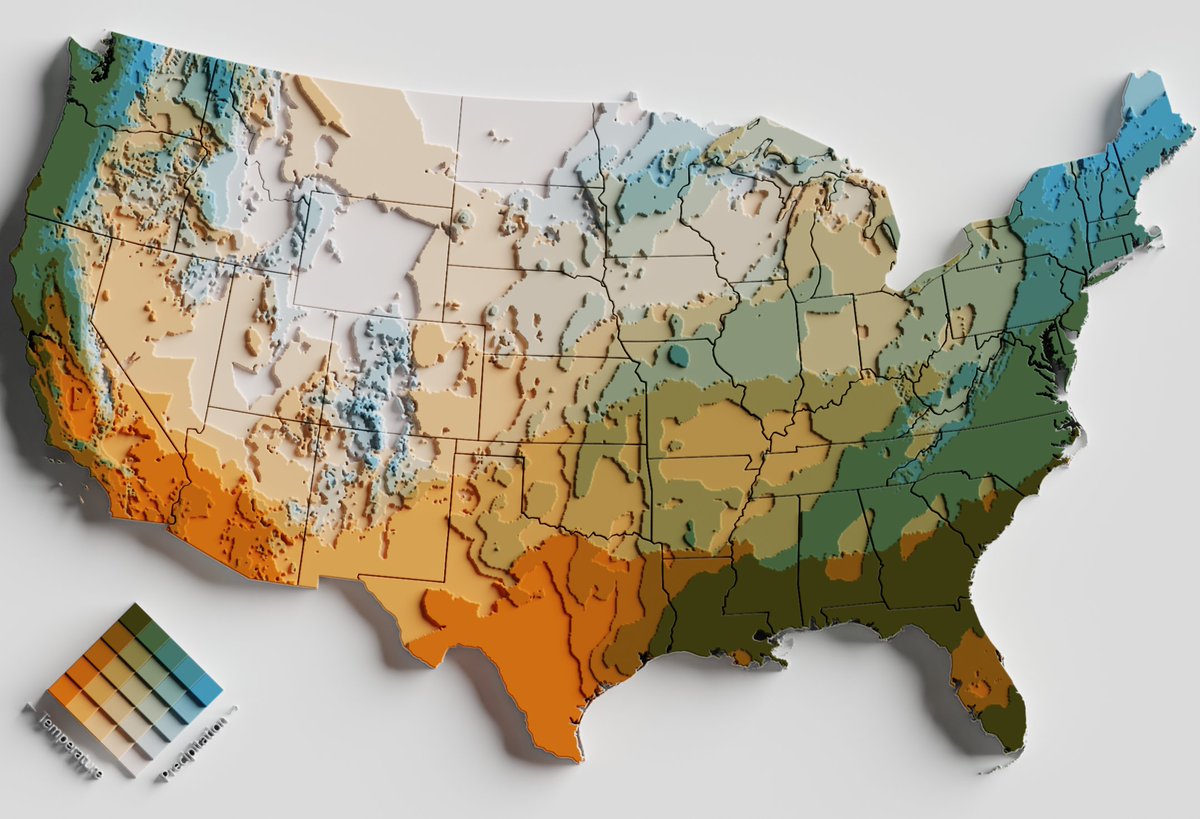
Bivariate maps showing the relationships between Temperature and Precipitation.
Made with Plot, based on a great tutorial by Fil: https://t.co/ZAptXTQmSH
Data from TerraClimate (1958-present).
#cartography#maps#mapping#climate#dataviz#SciArt
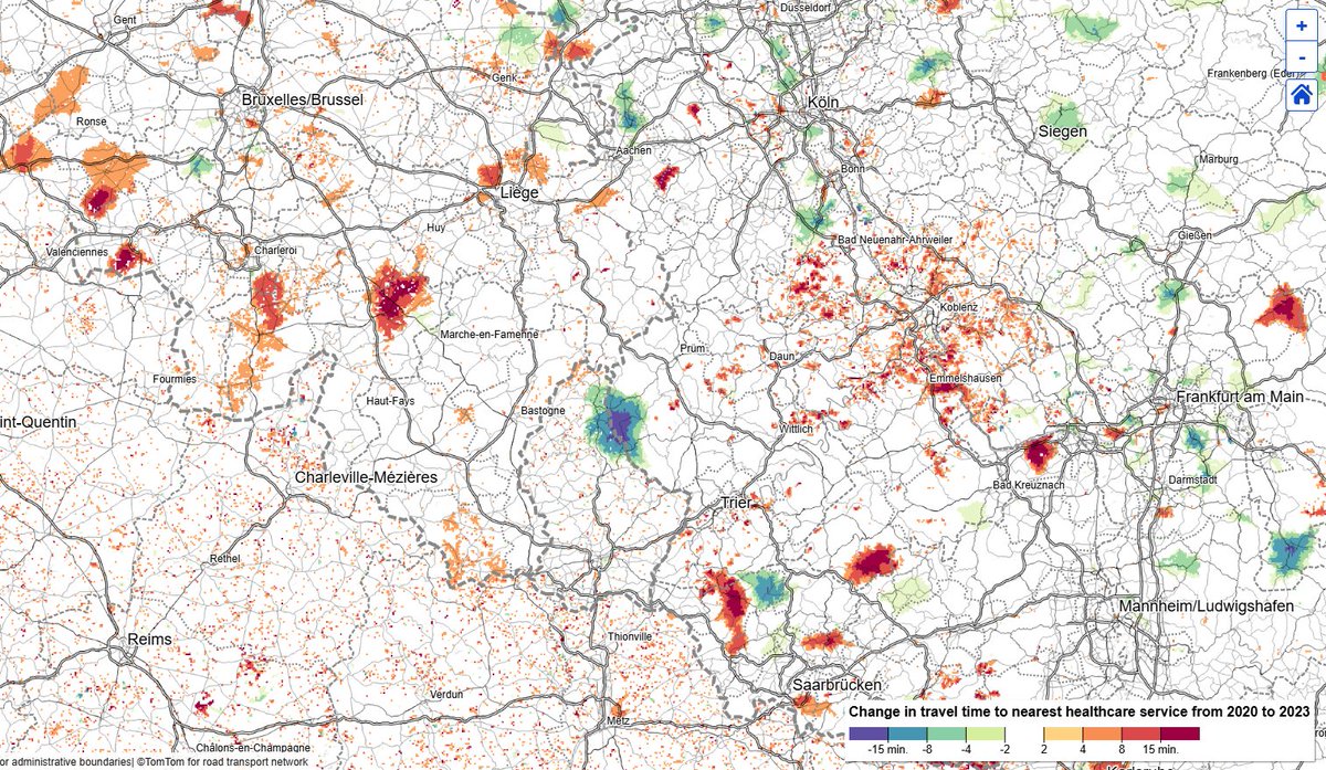
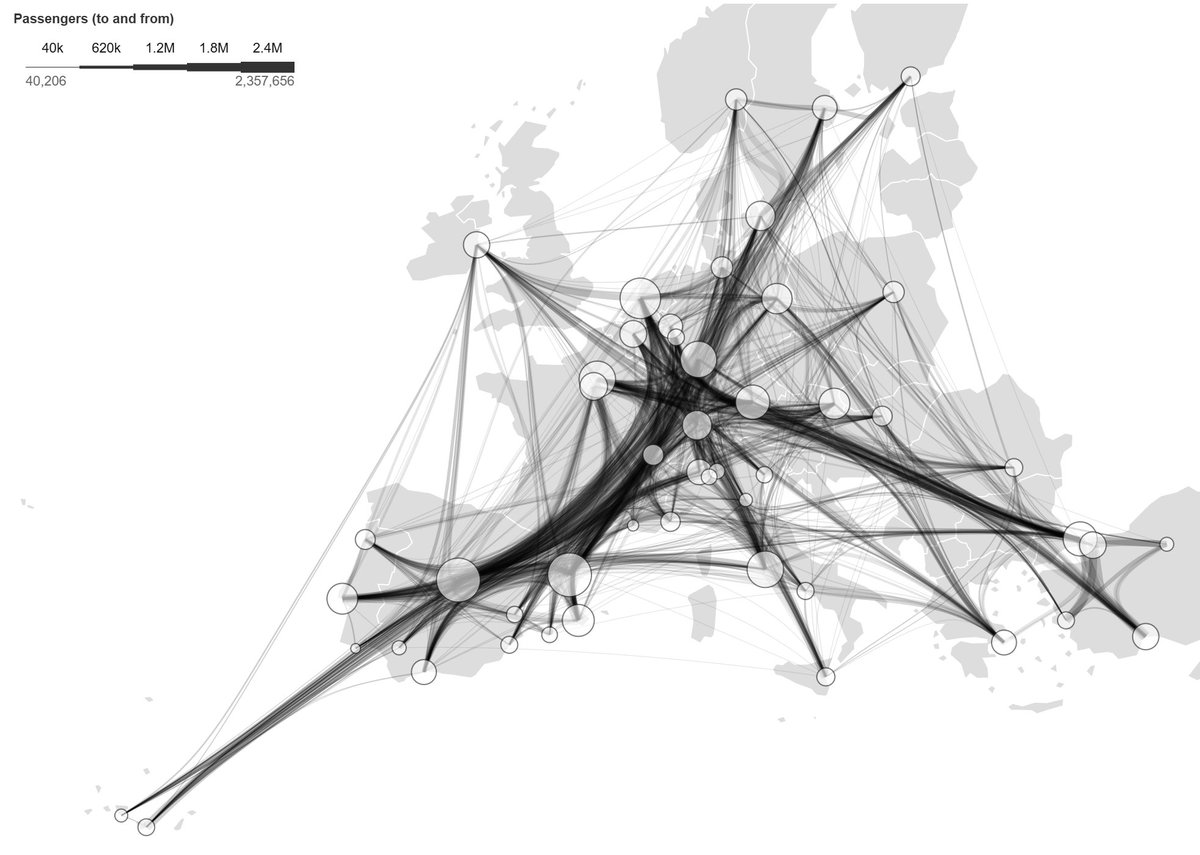
Travel times to healthcare & primary schools across the EU at 100m resolution
You can:
•View drive times to 1 or 3 nearest services.
•Compare 2023 vs 2020 to spot changes.
•Show all grid cells or only populated ones.
•Size cells by population.
https://t.co/9A7n9Wo13Z
Travel times to healthcare & primary schools across the EU at 100m resolution
You can:
•View drive times to 1 or 3 nearest services.
•Compare 2023 vs 2020 to spot changes.
•Show all grid cells or only populated ones.
•Size cells by population.
https://t.co/9A7n9Wo13Z
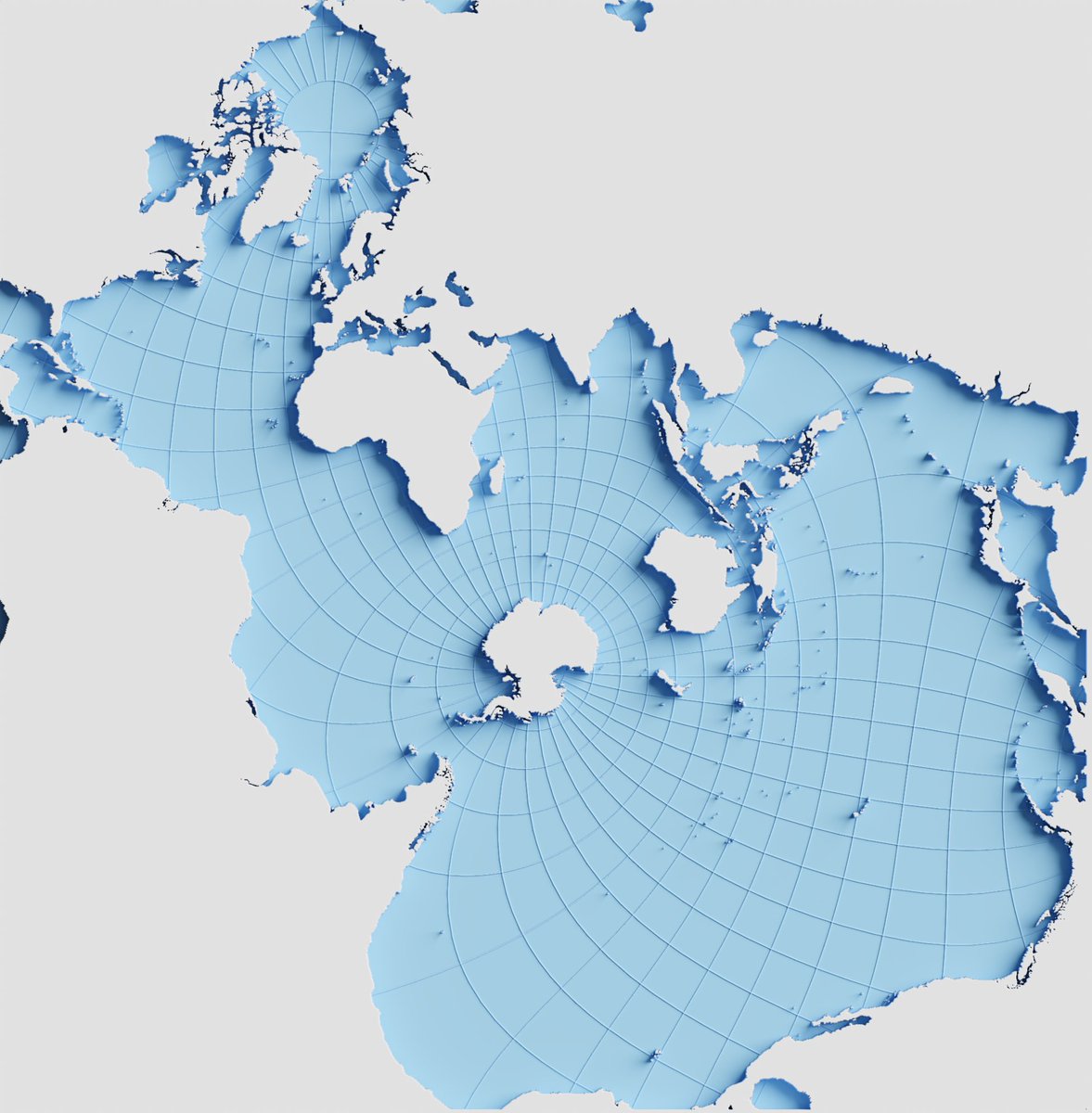
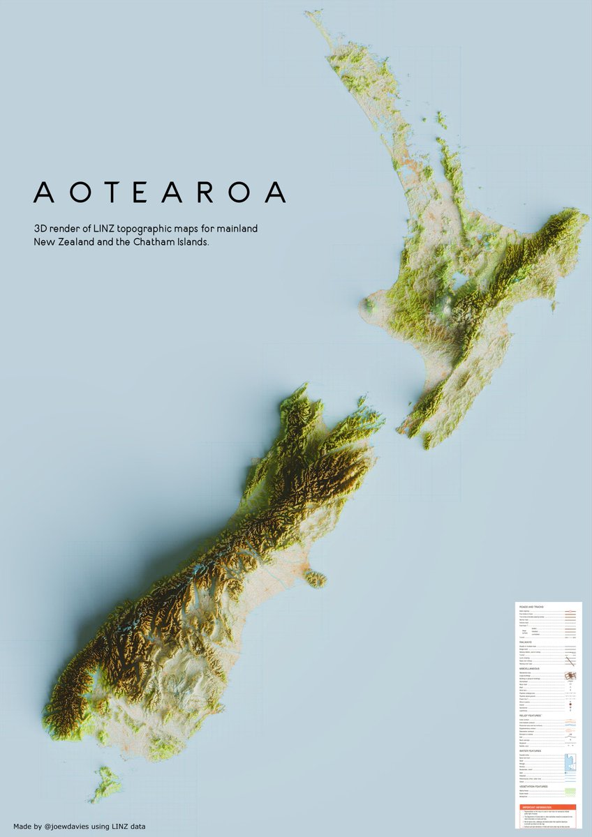
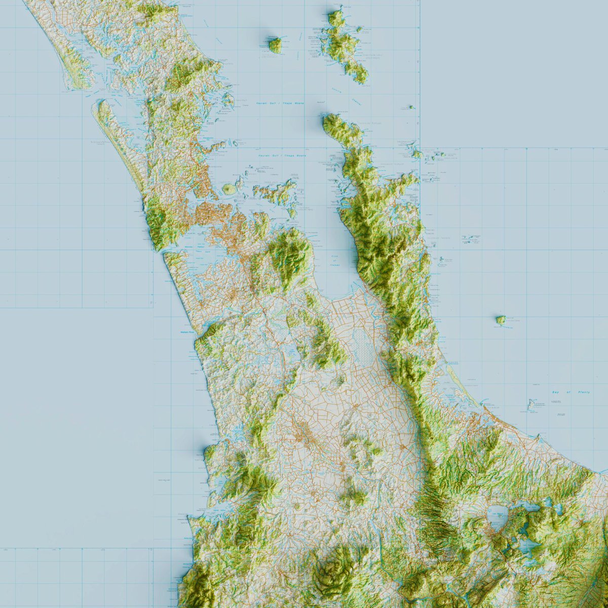
'Put it into Blender and see what happens' #4
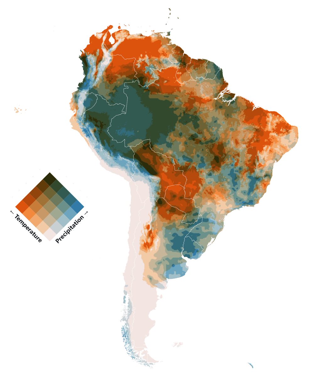
Bivariate maps showing the relationships between Temperature and Precipitation.
(Monthly data since 1958 by TerraClimate)
https://t.co/ZAptXTQmSH
#maps#blender#climate#sciart#cartography#gis
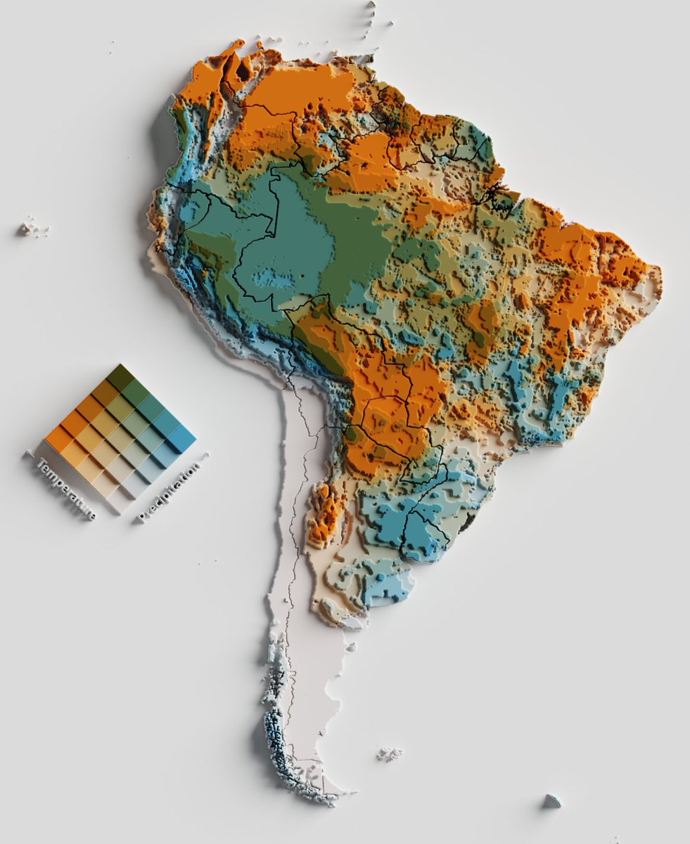
'Put it into Blender and see what happens' #4
Bivariate maps showing the relationships between Temperature and Precipitation.
(Monthly data since 1958 by TerraClimate)
https://t.co/ZAptXTQmSH
#maps#blender#climate#sciart#cartography#gis
Bivariate maps showing the relationships between Temperature and Precipitation.
Made with Plot, based on a great tutorial by Fil: https://t.co/ZAptXTQmSH
Data from TerraClimate (1958-present).
#cartography#maps#mapping#climate#dataviz#SciArt
Bivariate maps showing the relationships between Temperature and Precipitation.
Made with Plot, based on a great tutorial by Fil: https://t.co/ZAptXTQmSH
Data from TerraClimate (1958-present).
#cartography#maps#mapping#climate#dataviz#SciArt
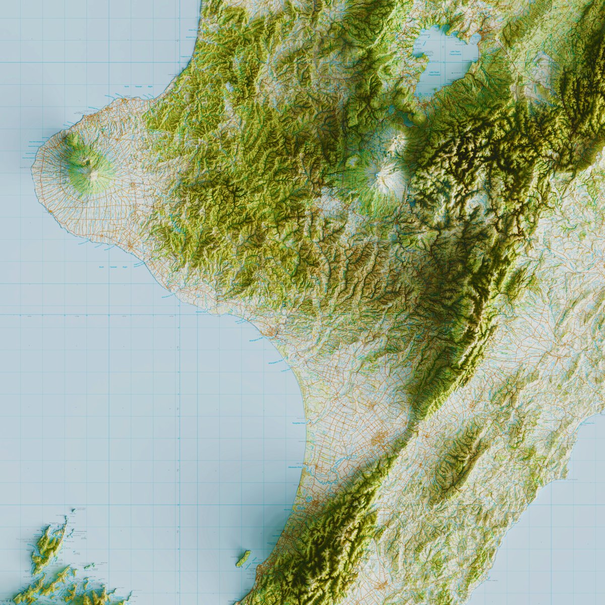
Map showing the percentage of primary schools in Wales that are Welsh-speaking 🏴
With the exception of Pembrokshire, there appears to be a higher percentage of Welsh speaking schools as you move away from the border with England.
👉 https://t.co/RBn5NkSu2I
#map#stats