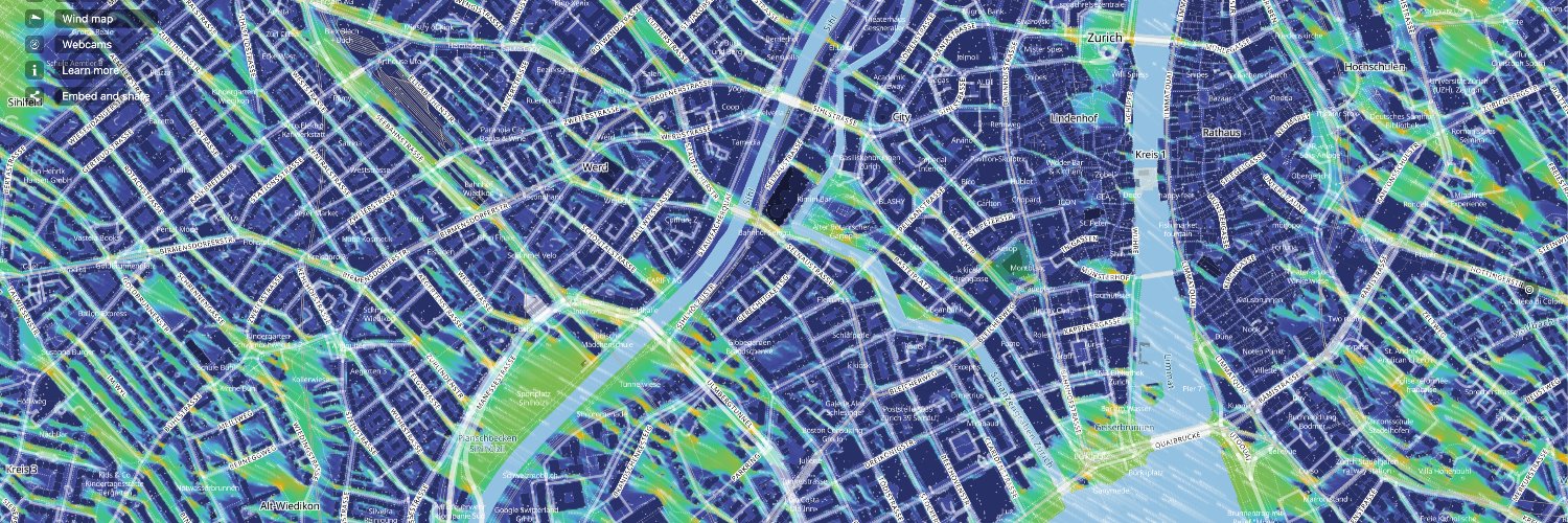
1/ 🌬️ Exciting news! We at meteoblue are thrilled to introduce our new 2x2 meter Urban Wind Map for Zurich. 🌆 Discover wind patterns with unmatched precision and real-time visualisations.
How far did Europe’s summer climate shift in 2026? 🔎📈
One way to understand an unusually hot summer is to compare it with a climate we already know.
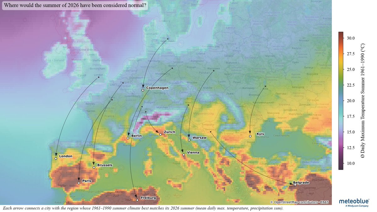
👉 For this map, we compared the summer 2026 conditions of selected European cities with the climate of 1961-1990, using mean daily maximum temperature and total precipitation.
👉 Each arrow connects a city with the region where a summer like 2026 would have been considered most typical during that earlier period.
👉 The result puts the season into a different perspective. For many of the cities shown here, the closest historical match lies well away from their present location, often in regions with a traditionally warmer summer climate.
That does not mean the climates are identical. Temperature and precipitation are only two parts of a much more complex climate system. But climate analogues can make change easier to grasp: instead of only saying that a summer was warmer or drier than average, they show where those conditions would once have been considered normal.
The map includes London, Paris, Brussels, Freiburg, Berlin, Copenhagen, Zurich, Vienna, Warsaw, Kyiv and Belgrade.
Take a look at the arrows – where would your city’s summer of 2026 have been considered normal a few decades ago?
#Climate #ClimateData #Europe #Summer2026 #ClimateChange #meteoblue
The September edition of our newsletter is here. 📧
This month, we’re looking back at 20 years of meteoblue, sharing what’s ahead at our Weather & Climate Summit in Basel, and letting you know where you can meet our team over the coming weeks. We also take a closer look at climate risk in residential housing through our work with NHW and Sustainable AG, as well as Europe’s 2026 drought and what it means for businesses.
Subscribe for future newsletters:
➡️ On LinkedIn: https://t.co/q5PxtRtz1U
➡️ Via the meteoblue website: create a free account and select the newsletter option in your account settings. Existing users can activate it directly in their settings: https://t.co/NdJnWloeXG
�� Read the September edition: https://t.co/ATqBWjQYxv
We’re heading to Meteorological Technology World Expo 2026 in Amsterdam from 6-8 October – and this year, https://t.co/oriei0bNOl is joining us at stand H30. 🌍
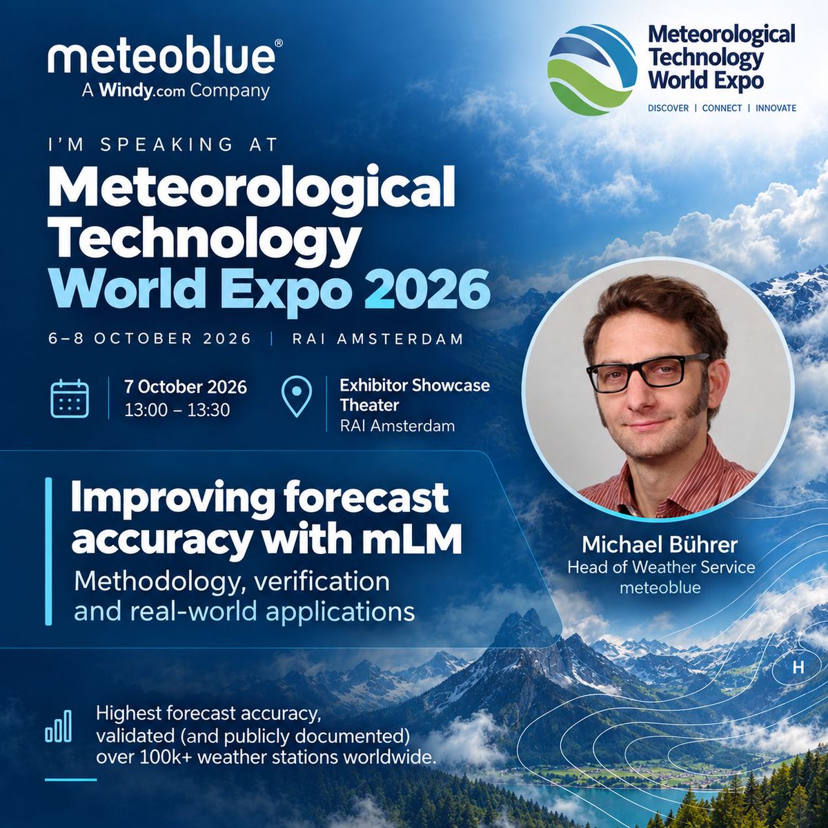
During the Expo, on 7 October from 13:00-13:30 at the Exhibitor Showcase Theater, Michael Bührer will present how mLM improves forecast accuracy through methodology, verification and real-world applications.
We’re looking forward to meeting partners, customers and colleagues from across the meteorological community.
➡️ Read more: https://t.co/KRffJQrDVa
🌀 Hurricane Nolo remains a major hurricane near Hawaii
Hurricane Nolo is continuing across the central Pacific after passing south and west of the main Hawaiian Islands. Although its centre has moved away from the most populated parts of Hawaii, the storm remains powerful and hazardous conditions continue farther northwest.
🚩 Category: Major hurricane
🚩 Maximum sustained winds: recently around 230 km/h (145 mph) in the latest official advisory available
🚩 Location: west-southwest of Honolulu, moving toward the northwestern Hawaiian Islands
🚩 Movement: west-northwest at around 19 km/h (12 mph)
🚩 Main hazards: heavy rainfall, flooding, dangerous surf, strong winds and very rough seas
Nolo became considerably stronger after moving away from the main Hawaiian Islands, undergoing rapid intensification and reaching Category 4 strength with winds of around 250 km/h (155 mph). Increasing wind shear and drier air have since started to weaken and disrupt the hurricane’s structure.
The storm has already affected Hawaii despite remaining offshore. Heavy rainfall brought flooding to parts of the Big Island, while large swells and hazardous marine conditions affected coastal areas. Tropical cyclones can have significant impacts even without making landfall.
Nolo has also followed an unusual path. The system regenerated from an earlier tropical disturbance, slowed considerably near Hawaii and then intensified rapidly once environmental conditions became more favourable. Within only a few days, it went through several major changes in both strength and structure.
Follow Nolo's movement on meteoblue Satellite Maps: 🛰️ https://t.co/xHoc0T1erX
#HurricaneNolo #TropicalCyclones #Meteorology #ExtremeWeather #meteoblue
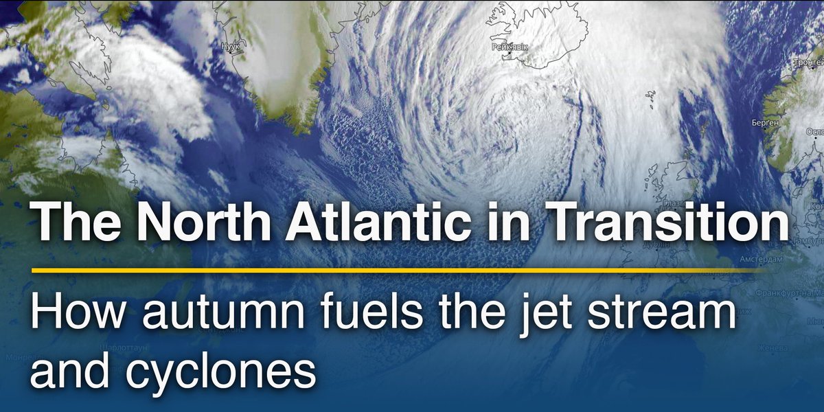
What happens over the North Atlantic can influence Europe’s weather days later. 🍂
During autumn, northern regions cool faster while subtropical areas and the Atlantic retain more of their summer warmth. The growing north-south temperature contrast helps strengthen the jet stream and creates a more favourable environment for Atlantic low-pressure systems to develop.
The jet stream helps steer weather systems and can also influence whether they intensify or weaken. Its position and shape affect which parts of Europe experience repeated fronts and strong winds, and where more settled conditions persist.
In our latest article, “How Autumn Changes the North Atlantic Circulation”, we explore:
➡️ How growing temperature contrasts contribute to the seasonal strengthening of the jet stream.
➡️ What drives Atlantic cyclone development and how warm ocean waters play a role.
➡️ How the jet stream’s position, blocking patterns and the North Atlantic Oscillation influence European weather.
➡️ What happens when tropical cyclones transition into extratropical systems and interact with the jet stream.
➡️ How meteoblue Weather Maps and Synoptic Charts reveal the connections between upper-level circulation and weather at the surface.
🔎 Read the full article: https://t.co/be4vWoQE9E
#meteoblue #Meteorology #WeatherForecasting
Join us in Basel for the meteoblue Weather & Climate Summit! 🌍
Celebrate 20 years of meteoblue and explore the future of weather and climate intelligence through keynotes, discussions and practical workshops.
📅 20 October 2026
📍 memox Basel SBB, Peter Merian-Strasse 80, 4052 Basel, Switzerland
🕘 Registration from 09:30 | Programme 10:00-17:40 | Networking reception from 17:40
All times local to Basel.
The programme brings together science, business and real-world applications:
10:20-10:50 – Opening keynote: The Future of Weather & Climate Intelligence, with Mark D. Miller (AEM).
11:30-12:20 – Panel discussion: Weather & Climate as Business-Critical Infrastructure, with Philippe Giraudet, Jessica Vollmer (Hanisch), Lukas Roessler, Peter Steiner.
12:30-13:10 – Science session: What Makes Weather & Climate Data “Decision-Grade”? with Dr. Moritz Burger, Frank Sehnke, Joachim Saalmüller.
14:10-15:00 – Applied Solutions Session, exploring weather and climate services in practice, with Prof. Dr. Lutz Heuser, Karsten Schwanke, Court Smith.
16:50-17:20 – Closing keynote on opportunities and risks in weather and climate markets, with Prof. Dr. Andreas Christen (University of Freiburg).
From 15:00-16:00, choose from four parallel workshops:
Communicating extreme weather effectively – Court Smith, Kpler.
Turning climate risk data into business decisions – Markus Goetz, Sustainable AG Unternehmensberatung.
Planning, installing and operating urban climate monitoring systems – Dr. Jens Lamping, Orbisens®.
Digital farm weather: requirements and the outlook to 2030 – Benedikt Pircher, METOS by Pessl Instruments.
Workshop results will be shared at 16:30-16:50. Coffee breaks, lunch and the evening reception offer time to exchange ideas and connect with speakers, partners and fellow participants.
👉 Register online for the meteoblue Weather & Climate Summit and join our sessions and workshops. Explore the full programme and sign up here: https://t.co/nM5t3mDRJ4
Follow meteoblue for updates! In the coming days, we’ll introduce all our speakers and share what to expect from each session and workshop.
#meteoblue #WeatherIntelligence #ClimateRisk #WeatherInnovations
🔎⚡ Forecast accuracy is not only about how well a forecast performs today, but how much skill it retains as the forecast horizon extends.
Our August 2026 forecast verification results for temperature, dew point and wind speed offer a useful way to look at this.
meteoblue evaluates forecasts against quality-controlled observations from weather stations worldwide and benchmarks the meteoblue Learning MultiModel (mLM) against major global raw weather models. The comparison is calculated at hourly resolution, which means the forecast has to reproduce not only the value, but also its timing.
Three metrics are particularly important:
➡️ MAE (Mean Absolute Error) describes the average size of forecast errors.
➡️ RMSE (Root Mean Square Error) gives more weight to larger errors.
➡️ ME (Mean Error) shows whether a forecast systematically tends to over- or underestimate conditions.
✔️ For August 2026, the mLM showed lower MAE than the best global raw model across every continent for all three variables. Depending on region, the improvement ranged from 25.3-32.8% for temperature, 19.5-34.7% for dew point, and 29.0-44.1% for wind speed.
But the most interesting result appears when we look at forecast lead time.
✔️ For temperature, global mLM MAE increased from 1.03°C on Day 1 to 1.61°C on Day 6, while the best raw model already had an MAE of 1.65°C on Day 1. For dew point, mLM reached a comparable level around Day 5, while for wind speed the Day 7 mLM forecast, with an MAE of 0.98 m/s, remained more accurate than the best raw model at Day 1, at 1.27 m/s.
This is what lead-time advantage means in practice: forecast skill is not only higher at short range, but is retained further into the forecast horizon.
There is an important distinction here. mLM is a learning multi-model forecasting system, while the benchmark models are raw global models, so this is not simply a competition between individual numerical weather models. It shows the value that can be added by combining model information and statistical learning into a forecast system.
And no forecasting system wins everywhere, every day. Weather situations change, regional performance varies, and uncertainty remains part of every forecast. That is why continuous verification is essential: it allows forecast quality to be measured rather than assumed. The August reports themselves stress that individual models can fluctuate from day to day even when one system performs best overall.
Forecast quality should not be judged by one successful forecast. It should be judged by how consistently skill is maintained across locations, variables and lead times.
meteoblue Forecast Accuracy Reports for January-August 2026 are available on our dashboard, covering temperature, dew point and wind speed: https://t.co/BfNsvtlYRi
#WeatherForecasting #ForecastVerification #WeatherData #meteoblue
🔎 What Meteorologists Watch When Nothing Dramatic Is Happening
Not every important weather signal arrives with a warning.
Periods without storms, heatwaves or heavy rainfall can still be meteorologically significant. During quieter conditions, forecasters monitor background factors that develop over days, weeks or even months and can influence the impact of the next weather event.
Some of the most relevant signals include:
🔸 Soil moisture – Dry soils reduce evaporation and can contribute to stronger surface heating during hot weather. Wet soils, in contrast, can increase runoff when heavy rain arrives.
🔸 Accumulated rainfall deficits – Drought develops gradually. Meteorologists therefore monitor precipitation over several weeks or months, not only daily totals.
🔸 Sea-surface temperatures – Oceans change more slowly than the atmosphere. Unusually warm or cool waters can affect moisture availability, heat exchange and regional circulation patterns.
🔸 Snowpack and snow-water equivalent – Stored snow influences spring runoff, river levels, water supply and, in some situations, flood risk during rapid warming or rain-on-snow events.
🔸 Persistent inversions – Stable layers can trap cold air, fog or pollutants close to the surface, sometimes producing large temperature differences between valleys and higher elevations.
🔸 Large-scale circulation patterns – A ridge or blocking high may appear uneventful at first, but if it persists, it can gradually contribute to heat, drying soils, lower river levels or deteriorating air quality.
These factors are often described as antecedent conditions or preconditioning. They do not necessarily cause an extreme event on their own, but they can strongly influence its severity once an atmospheric trigger arrives.
A heavy-rain event over saturated soils behaves differently from the same rainfall after a dry month. A strong ridge over dry land can produce more intense heat than the same circulation over moist soils. A warm sea can provide additional moisture when the right atmospheric setup develops.
This is why meteorology is not only about monitoring active weather systems, but also about understanding the state of the atmosphere, land and ocean before a high-impact event begins.
Quiet weather can still contain important signals about what may come next.
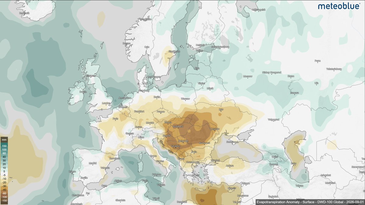
⬇️ The map below shows the evapotranspiration anomaly for September 2026, with below-average values across large parts of Central and Southeastern Europe. This can potentially influence surface heating, humidity, vegetation stress and the land surface’s response to subsequent weather events. Explore the Evapotranspiration Anomaly Map here: https://t.co/gWJ90Upylu
#Meteorology #WeatherForecasting #Climate #Forecasting #meteoblue
We are looking forward to seeing Michael Bührer, Head of Weather Services at meteoblue, on stage at the Meteorological Technology World Expo in Amsterdam! 🌍
➡️ His session will explore how meteoblue Learning MultiModel (mLM) improves forecast accuracy through nowcasting, multi-model blending, downscaling and other advanced methods.
➡️ Verification results will show how mLM performs compared with individual weather models, followed by practical examples of how these forecasts are used in https://t.co/oriei0bNOl, urban climate management, agriculture, energy, road transport, airports and ports.
📅 7 October 2026
🕐 13:00–13:30
📍 Exhibitor Showcase Theater, RAI Amsterdam
If you are attending the Expo, join the session and meet us there!
🔎⚡ Weather Data Explained: From Measurements to Climate Normals
Weather data can come from many different sources and each one is suited to a different type of question.
A station measurement tells us what is happening at a specific location. A forecast estimates how conditions may develop. Reanalysis reconstructs past weather using observations and models, while climatology helps us understand what is typical over longer periods.
In our latest article, we explain:
➡️ Observations – how weather stations, balloons, radar, buoys and satellites measure the atmosphere
➡️ Forecasts – how numerical models use the current state of the atmosphere to estimate future conditions
➡️ Reanalysis – how historical observations and modelling are combined to reconstruct past weather
➡️ Climatology – how long-term records are used to define averages, normals and typical conditions
➡️ Why the data source matters – and how choosing the right dataset depends on whether you are analysing the past, planning for the future or assessing long-term patterns
The same location can be described by a measurement, a forecast, a reanalysis value or a climate normal – but each provides a different type of information.
📖 Read the full article: https://t.co/2XzZB9Y2FM
#WeatherData #Meteorology #ClimateData #Reanalysis #Climatology #meteoblue
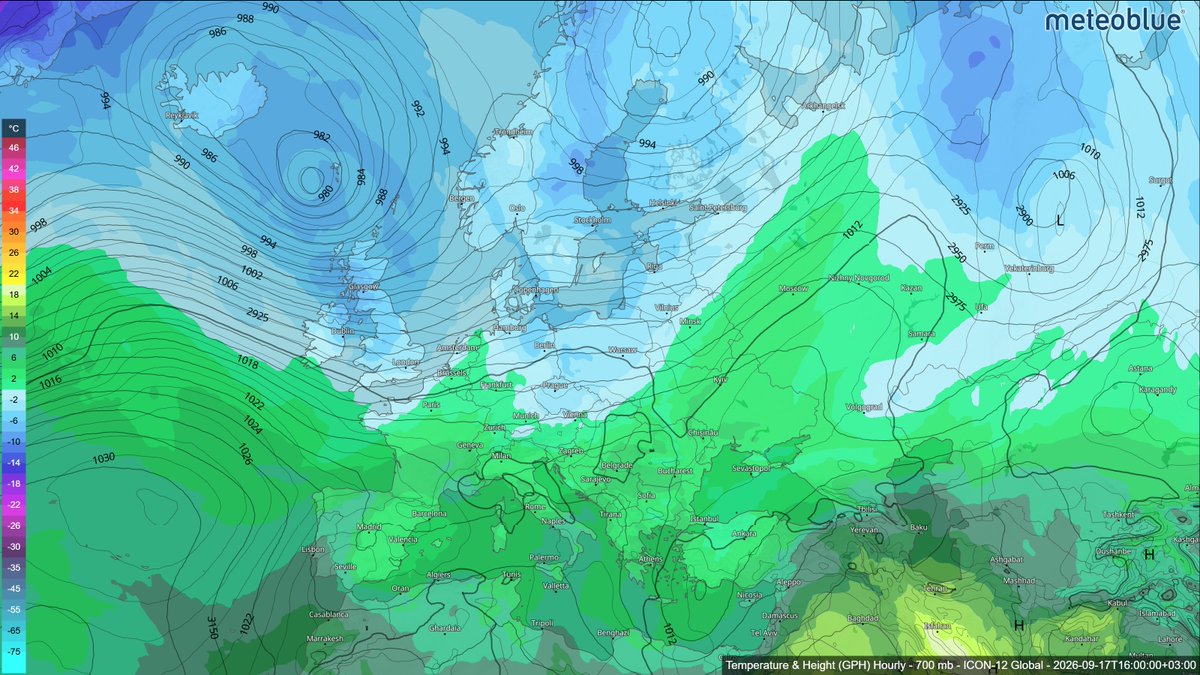
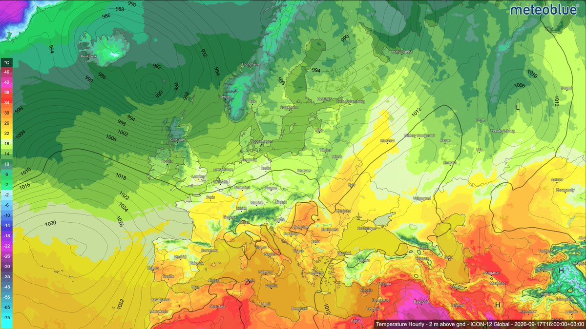
🔎 Pressure Levels Explained: What Meteorologists See at 850, 700 and 500 hPa
Surface temperature shows the conditions we experience near the ground, but it does not explain the atmospheric processes that produce these particular conditions. Meteorologists therefore examine the atmosphere vertically, using pressure levels such as 850 hPa, 700 hPa and 500 hPa to analyse what is happening several kilometres above the surface.
The four maps below show the same moment over Europe, but each reveals something different.
🌡️ Surface / 2 m – the weather we experience
This is where temperature is strongly influenced by sunshine, clouds, mountains, cities, vegetation and the time of day. It tells us what conditions feel like at ground level, but local effects can hide the larger atmospheric pattern.
🔹 850 hPa – roughly 1.5 km above sea level
Here, much of that surface “noise” disappears. Meteorologists use this level to identify air masses, warm and cold advection, frontal zones and incoming heat or cold. In simple terms: what kind of air is moving into the region?
☁️ 700 hPa – roughly 3 km
This level is especially useful for examining moisture, cloud layers and vertical motion. It can help reveal where moist air is rising, where dry air is moving in and where conditions may support clouds or precipitation.
🌀 500 hPa – roughly 5–6 km
This is where the large-scale structure of the atmosphere becomes much clearer. Meteorologists look for troughs, ridges and upper-level lows – features that help steer weather systems and shape the conditions we eventually experience at the surface.
The contour lines show geopotential height: the altitude at which a certain pressure is reached. These pressure surfaces are not fixed, they rise in warmer atmospheric columns and sink in colder ones.
➡️ And that is the key point: weather is three-dimensional.
The surface tells us what is happening.
850 hPa helps show which air mass is arriving.
700 hPa reveals moisture and lift.
500 hPa shows much of the large-scale circulation driving the pattern.
A forecast is not made from one map, it is built by reading the atmosphere layer by layer.
See how the atmosphere changes with height:
👉 Surface Temperature (2m): https://t.co/9uKqAvvZTz
👉 Temperature & Height (850 hPa; 700 hPa; 500 hPa): https://t.co/j1kLW4ahNL
#Meteorology #WeatherMaps #WeatherScience #Forecasting #meteoblue
20 years of weather intelligence. One day to look at what comes next. 🌍
Weather forecasting has changed dramatically over the past two decades. What was once mainly a public forecast is now part of daily decision-making across infrastructure, energy, transport, finance and many other sectors.
On 20 October 2026, meteoblue will mark its 20th anniversary with the Weather & Climate Summit in Basel – and the event will also be available online.
The programme will bring together experts and industry perspectives on questions such as:
🔹 Where weather and climate intelligence is heading next
🔹 What makes data reliable enough for operational decisions
🔹 What happens when critical decisions depend on a forecast
🔹 How weather and climate information is being applied across different industries
🔹 Which opportunities and risks are emerging in the weather and climate market
The day will include keynotes, panel discussions and applied sessions, alongside a look back at how meteoblue and the wider forecasting landscape have developed since 2006.
📅 20 October 2026
💻 Join online from anywhere
If you work with weather, climate data or climate-related decision-making, this is a good opportunity to follow the discussion and hear where the field is moving next.
👉 Read more: https://t.co/VevQJ09jh7
👉 Register for the online event: https://t.co/nM5t3mDRJ4
#Weather #Climate #WeatherData #ClimateIntelligence #meteoblue
meteoblue is heading to WindEnergy Hamburg 2026 ⚡
From 22–25 September, meteoblue team will be in Hamburg to meet customers, partners and industry specialists and present our latest weather solutions for the wind-energy sector.
You can meet our experts – Michael Bührer, Stefan Bohren and Sokrates Michalis.
At booth A3 350, we’ll be showcasing solutions designed to support weather-sensitive energy operations:
➡️ meteoblue Energy Dashboard for Situational Awareness
One of our main focuses this year. The dashboard brings asset-specific weather, risk and production monitoring into one view, helping teams see which sites may require attention and understand the relevant time window.
➡�� meteoblue Risk Forecast API & Weather Warnings API
The Risk Forecast API provides hourly risk probabilities and severity levels based on meteoblue forecasts. Combined with official weather warnings from 150 sources, it helps operators prepare for hazards such as thunderstorms, extreme winds, icing and more.
➡️ We’ll also be presenting our wind and energy forecasts, raw NWP data and extensive historical weather datasets for renewable-energy applications.
If you are attending WindEnergy Hamburg, come by booth A3 350 to meet the team, see the solutions and discuss your weather-data requirements.
📅 Book a meeting with us at the fair: https://t.co/hseSnxUjtE
See you in Hamburg!
#WindEnergyHamburg #WindEnergy #RenewableEnergy #Energy #WeatherData #meteoblue
Can urban wind help cities cope with heat? 🌬️🏙️
Hotter summers are changing how cities need to respond to heat. In dense urban areas, buildings and paved surfaces store heat, vegetation is unevenly distributed, shade varies from street to street, and airflow is constantly reshaped by the urban fabric. As a result, two places only a few hundred metres apart can experience noticeably different conditions.
A narrow street canyon can trap heat and remain poorly ventilated, while a nearby open square or waterfront may benefit from stronger airflow. Building height, street orientation, vegetation and surrounding obstacles all influence how wind moves through a neighbourhood. Research on urban microclimates shows that wind speeds can be substantially reduced in dense built-up areas, particularly at pedestrian level, while turbulence often increases.
These differences become especially relevant during periods of heat.
Air movement affects outdoor thermal comfort, but it also influences the ability of buildings to ventilate naturally. In dense urban settings, reduced wind can limit air exchange through windows and facades, making it harder to remove accumulated heat. Microclimate simulations show how strongly this depends on the geometry of the surrounding urban environment: airflow can be reduced in dense streets and remain particularly weak in sheltered courtyards.
For urban planning, it is important to understand how wind conditions vary across different parts of a city.
➡️ A weather station can describe the broader atmospheric situation, but it cannot show how a row of buildings blocks the flow, where a street channels it, or which courtyards remain sheltered. These variations matter when cities assess heat exposure, design public spaces, preserve ventilation corridors or evaluate how new development may alter the local microclimate.
➡️ meteoblue hyperlocal Urban Wind Maps make these patterns visible by showing how wind speed and direction vary across the built environment. The maps reveal sheltered zones, exposed areas and local airflow structures at a much finer scale.
➡️ Most heat-adaptation plans already consider shade, vegetation and surface materials. Local wind conditions should be part of that assessment too. Stronger airflow can help during hot periods, but too much wind can make public spaces uncomfortable at other times. The aim is to understand how streets, buildings and open spaces shape airflow locally.
Just as temperature can vary from one neighbourhood to another, so can wind. Mapping both gives planners a more accurate picture of the conditions people actually experience.
🔎 View the Urban Maps available for Zurich, Paris and Washington: https://t.co/R5wHyEWr8g
#UrbanClimate #ClimateAdaptation #UrbanPlanning #HeatStress #UrbanDesign #meteoblue
🌦️📱 A weather forecast on your phone may look simple – a temperature, a weather symbol, perhaps a chance of rain. But before those values appear, model data can go through comparison, local adjustment, observation-based updates and verification.
In our latest Weather News article, we look at what happens after a model run and how weather data becomes a forecast for a specific location.
🔎 Read the full article to follow the journey from model output to local forecast: https://t.co/jpMiQy0rWs
meteoblue Climate Talks | What summer 2026 tells us about heat, dryness and climate risk in Europe 🌍
Summer 2026 showed how closely different climate extremes can be connected.
Across western and central Europe, the season brought high temperatures, widespread precipitation deficits, lower relative humidity and reduced surface soil moisture.
According to the latest Copernicus Climate Change Service (C3S) bulletin, Western Europe recorded its warmest summer on record, with temperatures 2.54°C above the 1991-2020 average, while Europe as a whole experienced its third-warmest summer. Looking at temperature together with other variables helps explain how the season developed.
The warmth was not limited to Europe. Globally, June-August 2026 was the joint-warmest boreal summer on record, matching 2024. August itself became the warmest August in the ERA5 record and, unusually, was even slightly warmer globally than July.
Western Europe’s record also stands out in a longer-term context. The previous record dated back to the exceptional summer of 2003, but every summer in the region since 2015 has now been warmer than the 1991–2020 average.
The seasonal anomaly maps show a strong overlap between heat and dryness across large parts of Europe.
🌡️ Higher temperatures increase atmospheric demand for moisture.
🌧️ Reduced precipitation limits the amount of water available at the surface.
🌱 Lower soil moisture reduces evaporative cooling, allowing more incoming energy to heat the land surface and the air above it.
💨 Lower relative humidity often accompanies these hot and dry conditions, adding another indicator of atmospheric and surface dryness.
These processes can reinforce one another. Once soils become dry, less energy is used for evaporation and more contributes to surface heating. This can intensify hot conditions and prolong dry spells, especially during persistent high-pressure situations.
For sectors like agriculture, energy, water management and urban planning, it helps to look at these factors together. A season can have very different effects depending on how heat, rainfall, humidity and soil moisture combine.
🔎 Credit: Copernicus Climate Change Service/ECMWF
#meteoblue #Climate #ClimateRisk #Drought #Heat #Europe
🔎 3 meteoblue products you may not know (yet)
You may already use meteoblue to check tomorrow’s forecast. But have you tried finding sunshine nearby, choosing a night for stargazing or checking how unusual this week’s weather really is?
☀️ 1. where2go – Find better weather nearby
https://t.co/QIiGoyP7yu
A cloudy forecast at home does not have to decide your day out. where2go searches the surrounding area for favourable conditions based on sunshine duration and precipitation probability.
Choose your starting location, search radius, day and morning or afternoon. The map highlights the most promising area, with forecasts up to five days ahead.
Useful for a flexible day trip, walk or cycle ride: compare possible destinations without checking each town separately. Then check the detailed local forecast before setting off.
Access: Free – no point+ subscription required.
🔭 2. Astronomy Seeing – Choose your observing window
https://t.co/YFqMhQ3cl4
A clear sky does not always mean a sharp view through a telescope. Atmospheric turbulence can affect how steadily and clearly you see stars and planets.
Astronomy Seeing brings together cloud cover at different heights, seeing indices, jet-stream information and Moon information to help assess observing conditions. “Seeing” describes the effects of atmospheric turbulence, separately from cloud cover.
For amateur astronomers and astrophotographers, this helps identify promising hours before travelling to an observing site or setting up equipment.
Access: Three-day forecast free; extended seven-day forecast with point+.
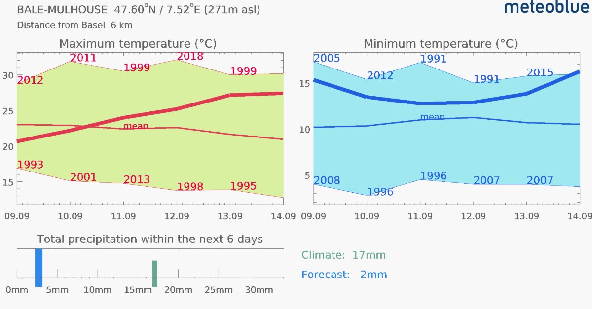
🌡️ 3. Climate Comparison – Put the forecast in context
https://t.co/WJPt00eGz3
“This feels unusually warm for September.” Does the data agree?
Climate Comparison places the six-day temperature and precipitation forecast alongside historical observations from a nearby reference station with at least ten years of reliable records.
The charts help show whether an approaching warm, cold or wet spell stands out from conditions recorded at this time of year. Useful for weather enthusiasts, educators and anyone who wants context beyond a single temperature value.
Check the station named in the chart: the comparison refers to that station, which may differ in elevation from your selected location.
Access: Free – no point+ subscription required.
Which of these have you already tried?
#meteoblue #Weather #WeatherTools #Astronomy #OutdoorPlanning
What happens between a weather model and the forecast on your phone? 📱 ☀️
You open a weather app and see 18°C, clear skies at 16:00 and a moderate wind. It looks like a simple forecast. But those numbers usually did not come straight from one weather model.
A numerical weather model calculates the future state of the atmosphere on a grid. That grid may cover mountains, valleys, cities and coastlines, but your location is one specific point within it.
And that is where the next part of forecasting begins.
First, several weather models may be available for the same location. They can disagree because they use different resolutions, update cycles, terrain representations and physical assumptions. One may predict 17°C, another 20°C. Rainfall timing or wind speed may differ even more.
Before these forecasts can be used together, their data has to be brought into a consistent framework.
Then comes the question of location.
A model grid cell is not the same as your exact coordinates. The elevation represented by the model may differ from the real elevation of your location, and smaller terrain features may not be fully resolved. A town in a valley and a nearby mountain summit can therefore require very different forecasts, even if they are geographically close.
meteoblue applies post-processing to turn raw model output into a more locally relevant forecast. This includes evaluating and combining different model forecasts, while terrain and elevation information help adjust the result to the requested location.
The meteoblue Learning MultiModel (mLM), for example, uses information about how different models have performed to determine a suitable forecast combination for a location. The goal is not simply to choose one “best” model every time, but to make better use of the strengths of several models.
For the immediate forecast range, recent observations can add another layer of information. Weather stations, radar, satellite data or lightning observations can help show what is happening now, especially when conditions are changing faster than an earlier model run anticipated.
And the process does not stop once the forecast appears on your screen.
New model runs arrive. New observations become available. Forecasts are updated. Later, archived forecasts can be compared with what was actually observed to see how well the system performed.
So the journey looks something like this:
Weather models → local adaptation → model combination → recent observations → point forecast → verification
That small weather symbol on your phone is therefore the end result of a much larger processing chain.
The weather model provides the atmospheric scenario. Turning that information into a useful forecast for a specific place is another important part of the job.
#WeatherForecast #WeatherModels #WeatherData #Forecasting #meteoblue
🔎 How do we actually know if a weather forecast was good?
Forecast verification sounds simple: compare the forecast with the observation and calculate the difference.
The difficulty starts when we try to judge the quality of an entire forecasting system. One correct forecast may be a lucky result. One large error may be an unusual case. Reliable conclusions require comparisons across many locations, hours, forecast ranges and weather situations.
Suppose a forecast predicted 27°C and a station measured 25°C. The error was 2°C. Repeating this comparison thousands of times allows us to calculate several verification metrics:
➡️ Mean Absolute Error (MAE) shows the average size of forecast errors, regardless of whether the forecast was too high or too low.
➡️ Root Mean Square Error (RMSE) gives more weight to large errors. Two systems may have a similar MAE, while the one with occasional major misses records a higher RMSE.
➡️ Mean Error (ME), or bias, shows whether a forecast tends to overestimate or underestimate observations. A bias close to zero does not automatically mean high accuracy: positive and negative errors may simply cancel each other out.
Each metric answers a different question, so they are most useful when interpreted together.
The comparison must also be fair. A day-one forecast should be compared with another day-one forecast – not with a prediction issued six days earlier. Performance can also vary by location, elevation, season, weather variable and atmospheric situation.
Timing matters as well. A forecast may correctly predict a temperature peak but place it three hours too early. Verification at hourly resolution captures this difference, which can be critical for energy production, transport, agriculture and other weather-sensitive operations.
The observations used for verification also require quality control. A weather station measures conditions at one sensor, height and exposure. Its siting, maintenance, surroundings, timestamp and elevation can all affect the result. Forecast and observation data must therefore be matched consistently.
MAE, RMSE and bias are also not suitable for every question. Precipitation and warning forecasts require additional measures for hits, misses and false alarms. Probabilistic forecasts need to be checked for calibration: when a 30% probability is issued many times, the event should occur in approximately 30% of those cases.
At meteoblue, archived forecasts are compared with quality-controlled weather-station observations. Our monthly Forecast Accuracy Reports compare the meteoblue Learning MultiModel (mLM) against global models and show how performance varies by region, variable and forecast horizon.
Forecast verification is therefore not about proving that one forecast was right or wrong. It shows how consistently a system performs, where its limitations lie and whether its accuracy improves over time.
👉 See how meteoblue forecasts perform in the latest Forecast Accuracy Reports: https://t.co/BfNsvtlYRi
#ForecastAccuracy #ForecastVerification #meteoblue
Autumn 2026: El Niño and the Seasonal Outlook 🌡️🌍
What can we actually say about the weather several months ahead?
Seasonal forecasts work differently from the forecasts we use for the coming days. At this range, we cannot predict whether a particular city will have rain on a specific afternoon. Instead, seasonal forecasts describe how conditions may differ from the long-term average – for example, whether a season is more likely to be warmer, colder, wetter or drier.
The meteoblue Seasonal Forecast Maps show these signals through monthly anomaly maps for temperature and other variables. Several seasonal models are available, including the meteoblue SA-ENSEMBLE, which combines multiple seasonal forecasts.
Seasonal forecasting uses coupled atmosphere-ocean models. The ocean is very important because it changes more slowly than the atmosphere, allowing temperature shifts to influence atmospheric circulation for months. One such pattern is El Niño, the warm phase of ENSO. It develops when unusually warm waters become established across parts of the central and eastern tropical Pacific, affecting convection, rainfall and pressure patterns far beyond the Pacific.
This year, a very strong El Niño is developing and strengthening further towards winter.
👉 For Europe, current ECMWF and NMME projections favour a generally mild autumn across much of the continent. The models indicate more frequent westerly to southwesterly flow, bringing relatively mild Atlantic air into Europe.
👉 There are also signals for wetter-than-average conditions in several regions, although their distribution differs between models. NMME, for example, shows a wetter signal across parts of northwestern, central and southeastern Europe.
👉 The El Niño influence is clearer over North America, where projections favour warmer conditions across the northern US and parts of western Canada, while a more active southern storm track could increase precipitation across much of the US.
👉 The pattern may also affect the start of the snow season. November projections indicate below-average snowfall across much of Europe, consistent with the milder signal. The western Alps could behave differently if higher precipitation coincides with sufficiently cold temperatures at elevation.
These signals are not forecasts for every day or location. A warmer-than-average autumn can still bring cold spells, while wetter conditions can include dry periods.
El Niño also doesn't determine the weather alone. Its influence interacts with other circulation patterns, and Europe remains especially sensitive to developments over the North Atlantic.
So seasonal forecasts are best understood as an indication of which broad weather patterns currently have a higher probability, rather than a prediction of exactly what the weather will be on a given day.
As autumn progresses, medium- and short-range forecasts will gradually provide the local detail that seasonal models cannot offer months in advance.
➡️ Explore our Seasonal Forecast Maps here: https://t.co/JDY5SJdF9S