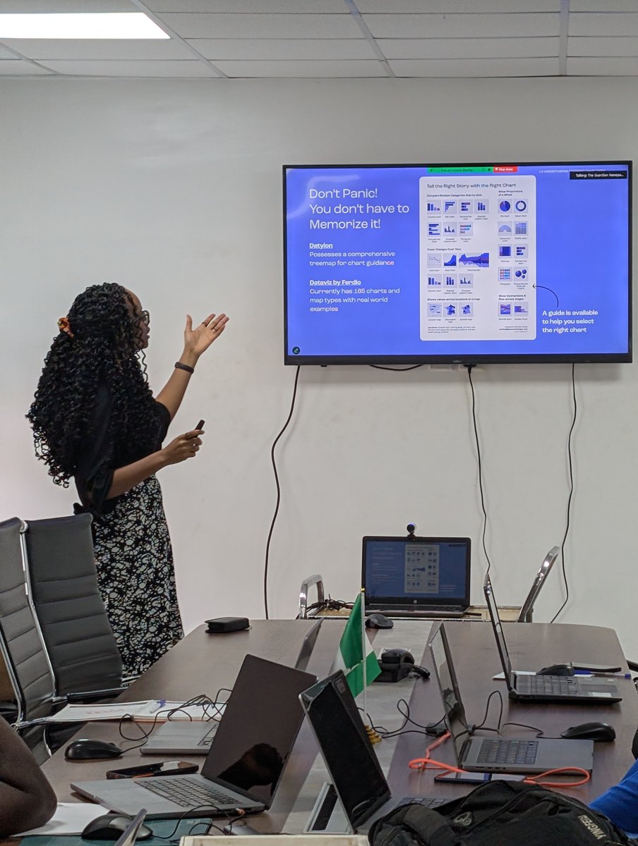
Just wrapped a masterclass with @GuardianNigeria graphics team. It felt like a full-circle moment, sharing what I’ve learned about using data to tell visual stories.
Grateful for the chance to teach, reflect, and grow. Hoping this is the start of something even bigger ❤️
This infographic took 30+ generations across multiple tools before I landed on a structure that actually communicated the data clearly.
Because the challenge isn’t generating images. It’s finding the right visual system for the story.
One statistic from the African Economic Outlook report changed how I think about Africa’s economy:
Africa loses more capital annually than it receives.
• $196.8B flows into Africa
• $587B leaves the continent
That’s a $390.2B net outflow every year.
Last year, I ran a session for the graphics team at Guardian Nigeria, and 100% said they’d recommend it.
What stayed with me wasn’t just the feedback, It was realizing that even pros working with visuals every day are still looking for better ways to communicate data clearly.
I didn’t expect Africa’s top mineral exports to reveal such clear regional patterns.
Gold dominates much of West Africa. Oil & gas concentrate across North and Central Africa
I love how much easier it becomes to spot patterns once data is visualized.
What stands out to you first?
I used to think choosing a niche meant picking & sticking to one thing.
It didn’t happen like that for me.
I paid attention to what I kept coming back to: data, research, and storytelling.
A niche isn’t something you pick.
It’s something you grow into.
Are you growing into yours?
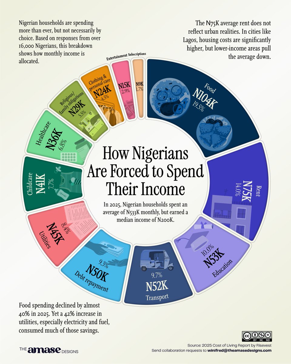
@davidetiosa Exactly! And it's so sad to see that’s the present reality of many people. It's much less about excess and more about how the cost of essentials keeps increasing.
I once saw an infographic on how Americans spend their money and got curious about Nigeria.
Found a report from @Risevest and explored it visually.
Does this breakdown reflect your own monthly reality?
Explore the full report: https://t.co/lWGPwXZEx9
I recently attended a session by @DataVizSociety led by Kinga Stryszowska on mapping with art + science.
She showed a project where she explored using charts as legends, and I decided to revisit a past project and do the same.
Which version tells the data story better?
@trustonailende@FinPlanKaluAja1 Sure, this is the primary data source: https://t.co/zq2dujxIPh
Here's the link to the spreadsheet: https://t.co/IkMmbbZTB5
Looking forward to what you create with it
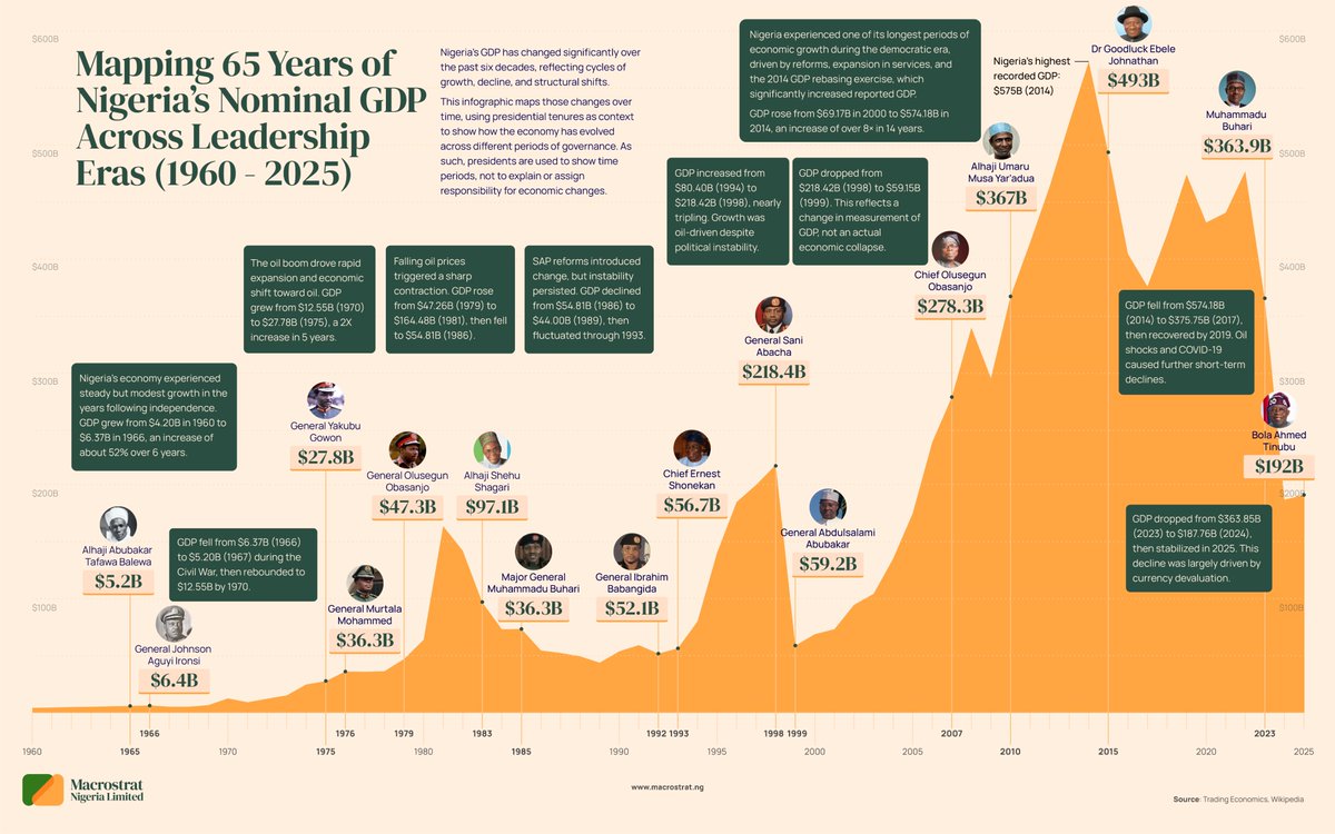
Nigeria’s economy has moved in waves, shaped by oil, policy shifts, and external shocks.
From rapid booms to sharp drops (like the early 1980s and the recent ~50% fall driven by naira devaluation), the pattern tells a deeper story.
Visit https://t.co/ERbMpl2M69 for more insights
Three months ago I shared an Annual Reflection template.
Now that Q1 of 2026 is over, I’m doing my own check-in.
If you downloaded it earlier, check your inbox for my Q1 reflection.
If not, https://t.co/28HMOVxPwD
Pause. Reflect. Adjust.
Food doesn’t just carry nutrients.
It also carries a footprint.
We often focus on what we eat.
But this is a look at everything that happens before it gets to the plate.
Explore the full breakdown: https://t.co/V1wjov1WCr
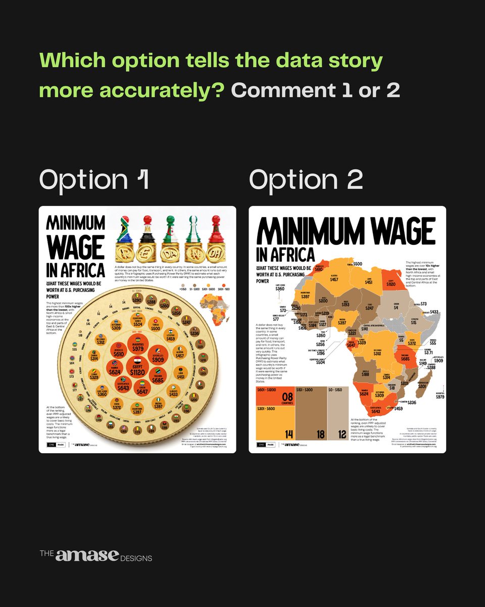
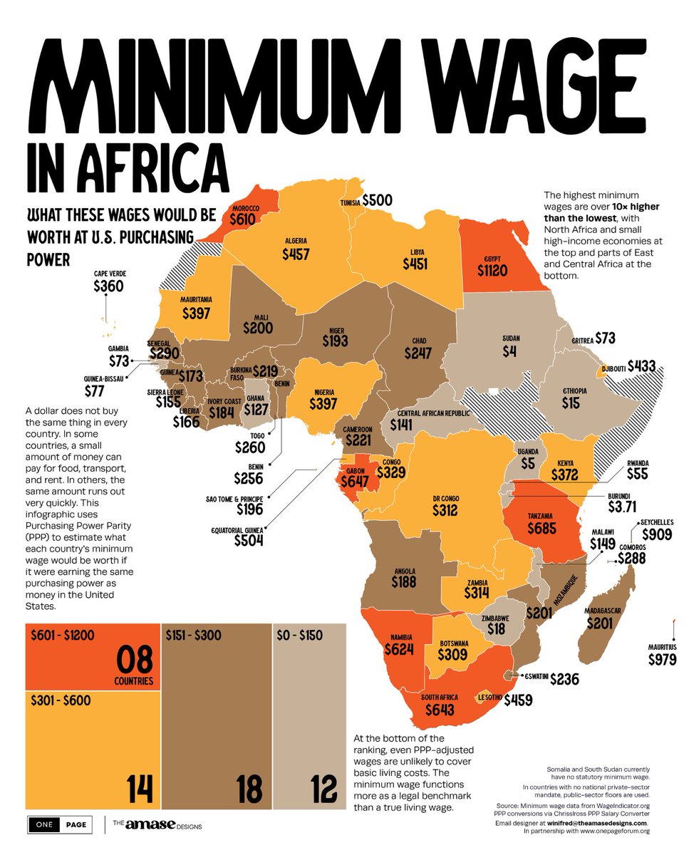
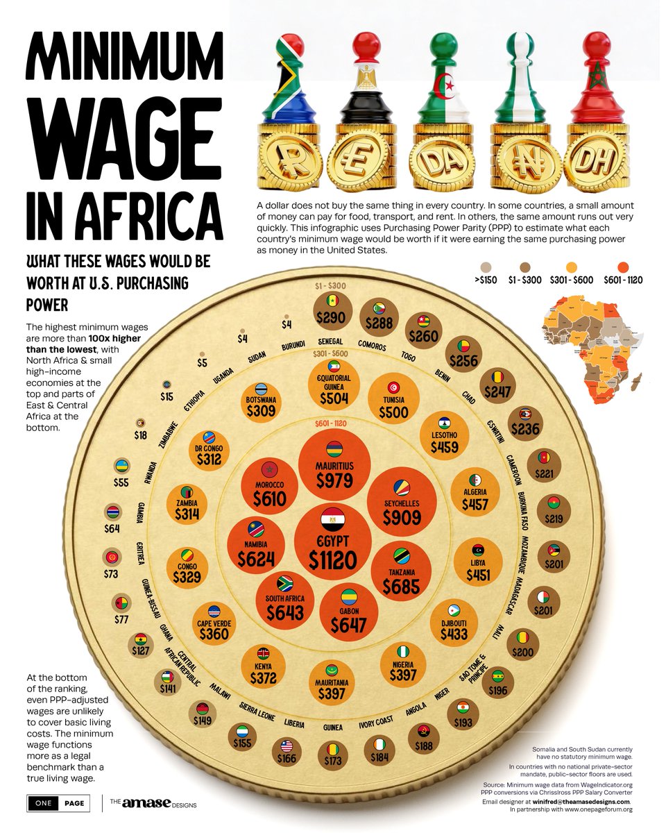
A dollar doesn’t buy the same thing everywhere.
Using Purchasing Power Parity (PPP), this visualization estimates what minimum wages across Africa would look like at U.S. purchasing power.
Which result stands out to you?
Collab with @onepageforum
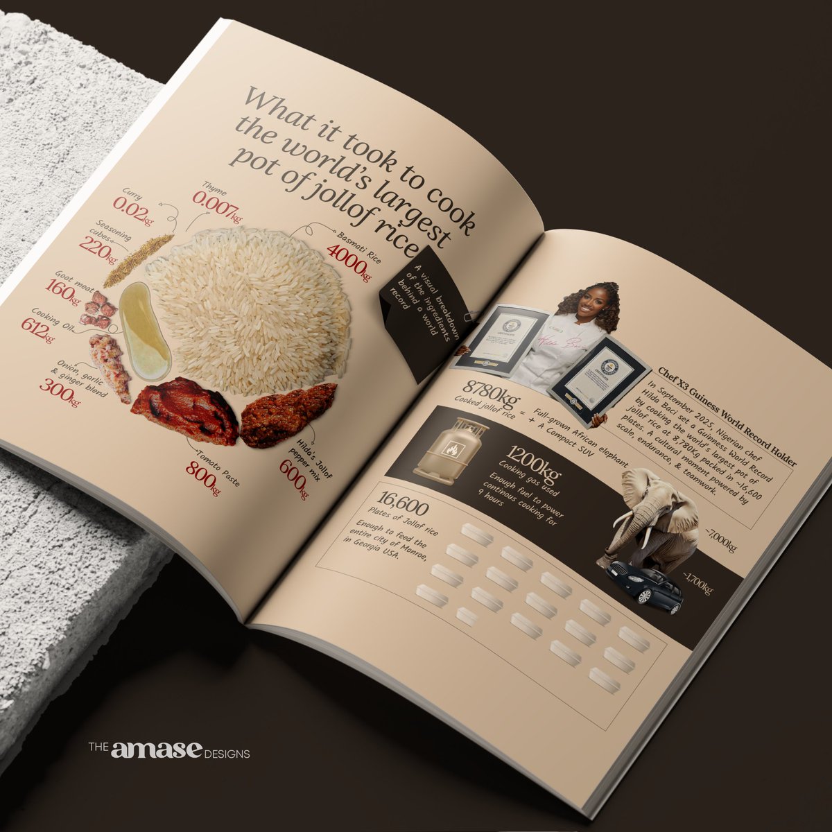
When I designed this infographic about the scale behind the world’s largest pot of jollof rice, I kept thinking about the cooking magazines I grew up with. The kind that made food feel almost touchable.
That memory shaped how this piece came together.
What the data says about dodo...
This is part of Your Food in Data, a series where we examine
everyday meals through numbers.
If you’re curious about the full breakdown, the complete project is worth a closer look: https://t.co/V1wjov1WCr
When @hildabacicooks cooked the world’s largest pot of jollof rice, it wasn’t just a record, it was a moment defined by scale, endurance, and teamwork.
Some achievements are easier to understand when you can see what they required.
This visual breaks it down.