📢 Public service announcement for #rstats users and learners working with geographic data: Geocomputation with R's Binder link is working again 🎉🎉You can give it a spin at https://t.co/l18mwGUlMS and then clicking on the "Binder" link. #DataScience#geocompx
The smartest traffic forecaster in the world wasn't built for traffic at all.
It actually turns out that cities are drowning in traffic models. A big city today might run dozens of separate prediction systems, one for car flow on the ring road, another for the metro, another for the bike-share docks, each built and trained from scratch, each useless the moment you point it at a different road or a different town.
That's the strange tax nobody talks about. These systems do somethingpretty useful: they guess how many cars or buses or bikes will hit a given stretch in the next half hour, which is what lets a city time its lights, warn drivers, and send a tram before the platform fills up.
The trouble is every one of them is basically a narrow specialist. Move it to a new city, a new mode of transport, or even a weekday-to-weekend shift, and it falls over. So rich cities maintain a whole zoo of bespoke machinery, and smaller towns, the ones without the data or the engineers, get nothing at all.
A new paper takes a large language model, and pointed it at traffic instead. The bet underneath it is lovely. A city's movement has a grammar. Rush hour rises and falls, Tuesdays read nothing like Sundays, a quiet road and a clogged junction sit in relation to each other the way words sit in a sentence. If a model can learn the shape of language, maybe it can learn the shape of a city breathing.
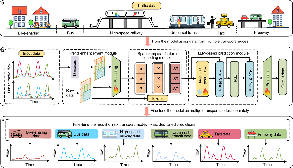
Their system, called LLM-UTP, has three working parts.
1. One cleans up and sharpens the underlying trend in the messy raw readings.
2. One tags every measurement with where it came from and when, so the model grasps the map and the clock at once.
3. The language model itself stitches that together and makes the forecast.
What I find interesting is that none of this is wired to one place. It's a single general framework meant to swallow many cities and many modes through the same pipe.
Then they stress-tested it properly. Eleven big real-world datasets, drawn from 29 cities and regions, covering different transport modes, different traffic situations, and readings sliced at different time intervals. Across that whole spread, it beat the existing specialist models that had each been hand-built for their one job.
You've gotta admit, this is pretty odd...
A model trained on sentences turned out to read the rhythm of a city well enough to outdo systems designed for nothing else. The pull here is the same one that reshaped language AI. Instead of a fragile patchwork where every road and every mode needs its own fussy little model, you move toward one foundation model for urban movement, something a city could plug into and get usable short-term forecasts from straight away.
Anyway, there are a bunch of caveats as usual. These are short-term flow forecasts, not long-range planning. But the direction is pretty interesting. Let's see if it holds up...
link to full article: https://t.co/qCPSPYaF1x
There's now a free website that lets you watch any city on Earth sprawl outward twice a year for a decade, and then shows you exactly where it grew into danger.
Picture a family moving to the edge of a fast-growing city. The land is cheap because it floods, or because the ground beneath it is slowly sinking, or because it bakes in summer heat the city centre never sees. Nobody planned for them to be there. The city simply spread outward faster than anyone was watching, and by the time the danger is obvious the houses are already full of people who can't easily leave.
That gap between how fast a city grows and how slowly we measure it is the problem a new free tool sets out to close. The German Aerospace Center, MindEarth, the European Space Agency and the World Bank built it together and launched it at World Bank headquarters in Washington. ESA's Fabio Cian described it as space agencies, industry and development partners designing the answer side by side. The result is the World Settlement Footprint Tracker, and what it does is simple to say and pretty difficult to pull off.
It watches cities grow from orbit. Every six months, continuously from 2016 to 2026, it maps where human settlement exists and where it has just spread, at a resolution of ten metres. That's roughly one pixel per small building plot. So instead of one static snapshot of a city today and maybe a blurry one from years back, you get a decade of the city breathing outward, frame by frame, twice a year.
Then it lays that growth over danger. Five hazards, to be exact: flooding, sinking ground, earthquakes, extreme heat and cyclones. And the overlaps are stark. In Hanoi, a huge share of the past decade's expansion pushed straight into suburban flood zones, and not the shallow kind, the areas where water tends to sit deepest. In Xi'an, fresh development sprawls across ground that's projected to subside, meaning the buildings going up now sit on land that is forecast to drop out from under them. The same lens covers Bangkok, New Cairo, Goma, Pucallpa, Chengdu, Warsaw, Cologne and more, and anyone can open it, zoom in and download the numbers for free.
Why this matters comes down to timing. Roughly two in three people will live in cities by 2050, which means the buildings that will house that surge are being sited right now, this decade, often in places where growth and hazard are colliding before anyone has drawn the comparison on a map.
Steering a new neighbourhood away from a floodplain is cheap. Moving one after it's built, or rebuilding it after a disaster, is ruinously expensive, and that bill usually lands on the people who could least afford to be there.
More info here: https://t.co/mS3ihfepLi
Finally published my map app exploring the accessibility of public toilets in Hong Kong 🚽
https://t.co/5mVbqsmzCC
Play with the catchments and check where the absolute worst place is to experience the call of nature
New paper out in Nature Computational Science
neuroGravity is a physics-informed deep learning model that reconstructs mobility networks from what's almost always available
https://t.co/ybFzLpeHuP
https://t.co/IyBHGC97o6
Best Commentary: https://t.co/j6hpxz0jLt by Ryan Qi Wang
Refugee flows out of Ukraine each year since 2022. Source: UNHCR. Reproducible #datascience source code to reproduce this map: https://t.co/FeT1QPsoV5 Looking forward to presenting this later today!
Great to be in #Estonia again! I'm here for the #MobileTartu conference and will be teaching Data Science for Transport Planning. For anyone unable to make it in person but interested in the topic, you can follow the #openaccess materials here: https://t.co/ORosOg7n0D
My free letterpaths library now has:
- A freehand writing app for use with stylus
- Print and pre-cursive worksheet generation
- A font (.otf, .ttf, .woff2) that you can use in desktop apps e.g. Word or on web
- Capital letters
- Kerning between each letter pair set manually
Sounds like an endorsement of teaching that emphasises practical skills to me, "learning by doing" is what I teach in the Transport Data Science module, I had no idea it was backed-up by an economics paper!
Nobel Prize winning economist Kenneth Arrow wrote about "learning by doing" decades ago. He knew that productivity and expertise improve through experience.
The messy, repetitive works is often where you learn the patterns that eventually become judgment. Knowledge can be taught, but judgement is built through lived experience.
The first draft you rewrite. The customer call you listen to. The bug you fix and fix again. The factory floor you walk.
Small decisions you make every day teach you judgement. And, judgement is the thing everyone wants from senior people in the workplace. If we automate away every entry-level task without replacing the learning loop, we are removing a part of the process that creates experts.
The goal should be to use AI to accelerate learning, remove friction, and give people better tools to build expertise faster.
https://t.co/MpFZzCk1An
Thanks @Fortune & @tbove4 for sharing this story. Link in the comments.
The #FOSS4G UK conference website is live and ready for you to buy tickets and submit talks. It's a friendly and informative conference, highly recommended for anyone interested in this space. For details, see https://t.co/GcXwPvoDcD
Our paper “Difference-in-Differences Designs: A Practitioner’s Guide” is now published in the Journal of Economic Literature. It took us a while but we are happy!
We put together a lot of material to make the paper useful in practice: https://t.co/30TbAgihlz
Hope you like!
How do you know if a tree is 200 years old?
I've decided to become a tree nerd.
It turns out a tree can be 40 years old or 200 years old and still fool you if you’re only looking at size. Height helps when trees are young, but once they get older, the relationship starts to break down. Some old trees stop getting much taller. Some younger trees grow fast in good conditions. Some suppressed trees can sit in the understorey for decades and remain small.
That’s why forest scientists still often need to drill into trunks to know how old trees really are.
The standard method is increment coring. You basically take a narrow core from the stem, bring it back to the lab, and count the rings. It’s accurate, but slow, invasive, expensive, and hard to scale. Even national forest inventories usually measure tree age for only a small subset of trees.
So we know a lot about forest height, canopy cover, and biomass. We know far less about the actual age structure of forests at the level of individual trees.
A new paper in Remote Sensing of Environment tries to close that gap with 3D deep learning.
Researchers built FOR-age (great name, I know)... a benchmark dataset linking individual tree age to dense 3D laser scans. It covers 992 trees and 1,775 individual tree point clouds from Norway, Sweden, and Finland.
The age range runs from 1-year-old seedlings to trees around 350 years old. The species are Norway spruce and Scots pine, two of Europe’s most important conifers. The scans come from terrestrial, mobile, and high-density airborne laser scanning, which means the model isn’t being tested on one neat scanner setup in one tidy forest.
The idea behind the work is pretty simple: a tree’s age leaves traces in its architecture.
Old trees don’t just get taller forever. Their crowns change. Branches thicken. Growth slows. Apical dominance weakens. Crown shape, branch angle, stem form, and the wider 3D structure of the tree all carry information that height and crown area miss.
Foresters can sometimes read these signs by eye. The problem is doing it consistently across thousands, or eventually millions, of trees.
The researchers compared three approaches.
The simplest model used tree height and crown projection area. This is roughly the old logic: bigger tree, older tree.
Then they trained Point Transformer V3, a 3D transformer model, directly on the tree point clouds.
Finally, they fine-tuned ForestFormer3D, a model originally built for forest panoptic segmentation. In simple terms, it had already learned how to interpret complex 3D forest structure, including individual trees. The researchers reused that structural knowledge to predict age.
The difference was pretty big.
The simple height-and-crown model had an RMSE of 34 years and started to saturate around 100 years. That failure is revealing. Once trees get old, size alone stops being a reliable clock.
Point Transformer V3 reached an RMSE of 23 years.
The best model, the fine-tuned ForestFormer3D, reached an RMSE of 21 years, a mean difference of 2 years, and an R² of 0.74.
For a trait normally measured by physically sampling the tree, that’s a strong result.
The model also classified trees into age classes with overall accuracy around 76 to 77%. It performed best across most age groups and was the only approach that correctly classified some trees older than 200 years.
That old-tree result is probably the most interesting part.
For conservation, the exact difference between a 220-year-old tree and a 245-year-old tree may be less important than knowing that the tree has crossed into an old-growth age class. For forest management, younger trees often need more precise age estimates because thinning, yield modelling, and harvest scheduling depend on timing.
The model’s errors increased with age, partly because very old trees were rare in the dataset. That’s a limitation, but a useful one. More old-tree training data would probably be one of the highest-value ways to improve the benchmark.
The sensor results also matter.
On trees where both ground-based and airborne scans were available, the model worked with both. Airborne data achieved an RMSE of 16 years. Ground-based data achieved an RMSE of 22 years.
That suggests the model is learning something about tree structure, rather than simply memorising the quirks of one scanning platform.
Then the researchers tested whether one model could handle both species.
A common assumption in forestry is that age relationships should be species-specific. Pine and spruce grow differently, so separate models can feel safer.
Here, the joint model trained across both species outperformed the species-specific models, improving RMSE by up to 6 years.
Part of that is a data story. Splitting an already specialised dataset by species leaves each model with less to learn from. But it also suggests that some age-related structural patterns are shared: branch mortality, crown development, slower vertical growth, and the gradual shift from young architecture to mature architecture.
For large-scale forest monitoring, that’s useful. A unified model is easier to deploy than a collection of narrow species models.
The paper also includes a practical trick for cheaper scanning.
Dense point clouds are expensive. Walking or flying multiple passes around every tree gives rich data, but operational forestry needs methods that can survive cheaper, sparser scans.
The researchers used GPS-time augmentation. Laser scanners record when each pulse was emitted, so the full scan can be sliced into simulated passes: one walk line, every second pass, every third pass, and so on.
Training with this augmentation didn’t improve performance on full-resolution scans. But it made the model much better on sparse scans.
That’s important because the path to scale is rarely “collect perfect data everywhere”. It’s usually “train on rich data, then make the model robust enough for messier and cheaper data”.
The wider implication is that forest inventory is shifting from stand averages to individual-tree digital measurement.
A traditional inventory might describe a stand by mean height, basal area, volume, and age class. Laser scanning and 3D deep learning move the unit of analysis down to the tree: individual crowns, individual stems, individual growth stages, and now individual age estimates.
That opens up a different kind of forest map.
Instead of only saying a stand is mature, we can begin to estimate how many old trees are present, where they sit, whether they’re clustered or isolated, and how age structure varies within the same forest.
That has direct value for biodiversity, because old trees often provide habitats that younger trees don’t. It helps carbon modelling, because age and growth dynamics shape how forests store and accumulate biomass. It also helps conservation, because identifying old-growth structure has always depended on information that is hard to collect consistently over large areas.
There are real caveats.
The dataset covers two species in Northern Europe. The model still needs testing in denser forests, mixed-species forests, more complex canopies, broader climates, and continuous-cover systems where old suppressed trees may look deceptively small.
The age labels also contain uncertainty. Coring can miss the pith. Whorl counting can fail in suppressed trees. Even the reference data has measurement error.
And the model remains hard to interpret. It can predict age from 3D structure, but we don’t yet know exactly which structural traits it relies on. For ecology, explanation usually matters alongside prediction.
[Tip de R] · [Paquete 📦] · googletraffic: Un paquete para generar datos de tráfico georreferenciados directamente desde la API de Google Maps.
Necesitás datos de tráfico en tiempo real para tus análisis espaciales pero no sabés cómo obtenerlos? El paquete googletraffic te permite crear rasters georreferenciados con información de tráfico de Google Maps, facilitando la integración con otras fuentes de datos y análisis espaciales.
✔️ Crea rasters de tráfico georreferenciados: Obtené una capa espacial con la densidad de tráfico para un área y momento específico.
✔️ Facilita el análisis espacial avanzado: Podés combinar estos datos con otras capas geográficas (población, infraestructura) para entender patrones de movilidad, congestión y su impacto.
✔️ Acceso a datos en tiempo real: Usá la información más reciente de Google Maps para tus proyectos y tomá decisiones informadas.
💡 Tip
Acordate que para usar este paquete vas a necesitar una clave de API de Google Maps. Asegurate de configurarla correctamente con la función google_api_key() para una gestión eficiente de tus credenciales.
🔗 https://t.co/4Yk3uVXZqT
✍️ DIME-World Bank
#RStats #Rtips #RStatsES #GoogleMaps #DatosDeTrafico #Georreferenciacion
Hi everyone, I recently contributed to a new (and very comprehensive !) study on disaster mapping. IMO very much worth a read for anyone working on disaster response or geoAI more broadly.
🧵 From the main authors:
My colleagues do statistical analysis with R. They use RStudio specifically.
Can you use Claude with RStudio ?
Of course, you can. Here is my demo. I got Claude to do Climate Research.
Creating reports by hand every time your data changes can slow you down significantly.
Each update often means adjusting tables, rerunning analyses, and rebuilding visualizations manually. This takes time and makes it easy for inconsistencies to slip in.
Quarto in R provides a much more efficient approach.
It allows you to write your analysis, text, and code in one place. When you render the document, all results, tables, and plots are generated automatically based on your current data. Everything stays consistent without extra effort.
Once your report is set up, updating it is simple. Just refresh the data and render the file again.
The example below shows how code and output are directly connected, making the entire workflow transparent and reproducible.
For more topics like this, join my newsletter and receive practical tips on statistics, data science, AI, and coding with R and Python.
Take a look here for more details: https://t.co/ktUcWo9XpO
#DataAnalytics #datascienceenthusiast #VisualAnalytics #Statistics #RStats
New resource for anyone looking to research uptake of EVs and geographical distribution of EV-readiness - lot's of interesting research questions can be answered with the full dataset!
Stats out today show that there were 119,080 public EV chargers in the United Kingdom as of 1 April 2026. Read the full report here: [https://t.co/sq5RwrJazw] #EVcharging ⚡🚘
Output Area counts for licensed vehicles in the UK at the end of 2025, released by DfT following FOI request https://t.co/mzW2agtVZQ
This is the most granular dataset available to the public for mapping and analysis of where vehicles are registered
#FOI#opendata#transportdata





![estacion_erre's tweet photo. [Tip de R] · [Paquete 📦] · googletraffic: Un paquete para generar datos de tráfico georreferenciados directamente desde la API de Google Maps.
Necesitás datos de tráfico en tiempo real para tus análisis espaciales pero no sabés cómo obtenerlos? El paquete googletraffic te permite crear rasters georreferenciados con información de tráfico de Google Maps, facilitando la integración con otras fuentes de datos y análisis espaciales.
✔️ Crea rasters de tráfico georreferenciados: Obtené una capa espacial con la densidad de tráfico para un área y momento específico.
✔️ Facilita el análisis espacial avanzado: Podés combinar estos datos con otras capas geográficas (población, infraestructura) para entender patrones de movilidad, congestión y su impacto.
✔️ Acceso a datos en tiempo real: Usá la información más reciente de Google Maps para tus proyectos y tomá decisiones informadas.
💡 Tip
Acordate que para usar este paquete vas a necesitar una clave de API de Google Maps. Asegurate de configurarla correctamente con la función google_api_key() para una gestión eficiente de tus credenciales.
🔗 https://t.co/4Yk3uVXZqT
✍️ DIME-World Bank
#RStats #Rtips #RStatsES #GoogleMaps #DatosDeTrafico #Georreferenciacion](https://pbs.twimg.com/media/HJZ6aXHW4AQGxVM.jpg)








![estacion_erre's tweet photo. [Tip de R] · [Paquete 📦] · googletraffic: Un paquete para generar datos de tráfico georreferenciados directamente desde la API de Google Maps.
Necesitás datos de tráfico en tiempo real para tus análisis espaciales pero no sabés cómo obtenerlos? El paquete googletraffic te permite crear rasters georreferenciados con información de tráfico de Google Maps, facilitando la integración con otras fuentes de datos y análisis espaciales.
✔️ Crea rasters de tráfico georreferenciados: Obtené una capa espacial con la densidad de tráfico para un área y momento específico.
✔️ Facilita el análisis espacial avanzado: Podés combinar estos datos con otras capas geográficas (población, infraestructura) para entender patrones de movilidad, congestión y su impacto.
✔️ Acceso a datos en tiempo real: Usá la información más reciente de Google Maps para tus proyectos y tomá decisiones informadas.
💡 Tip
Acordate que para usar este paquete vas a necesitar una clave de API de Google Maps. Asegurate de configurarla correctamente con la función google_api_key() para una gestión eficiente de tus credenciales.
🔗 https://t.co/4Yk3uVXZqT
✍️ DIME-World Bank
#RStats #Rtips #RStatsES #GoogleMaps #DatosDeTrafico #Georreferenciacion](https://pbs.twimg.com/media/HJZ6aXRWQAADol7.jpg)


![DfTstats's tweet photo. Stats out today show that there were 119,080 public EV chargers in the United Kingdom as of 1 April 2026. Read the full report here: [https://t.co/sq5RwrJazw] #EVcharging ⚡🚘 https://t.co/Nka2lhJYeI](https://pbs.twimg.com/media/HIxeopSXUAAbvG3.jpg)


