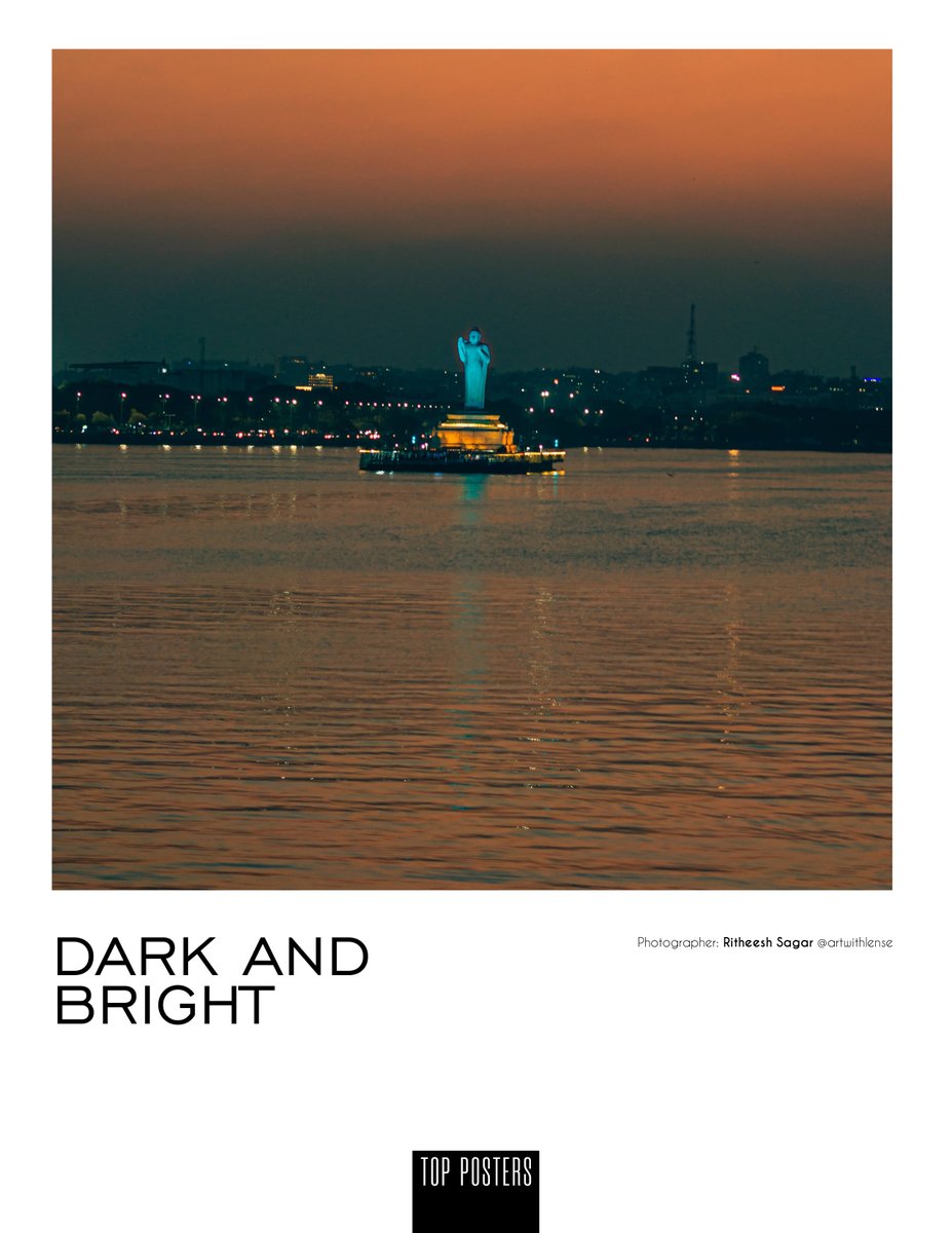
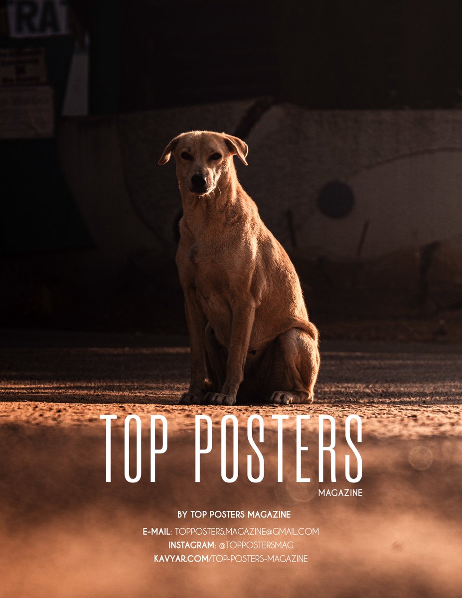
now that I have received my first ever magazine publication tear sheets, that I could officially share.
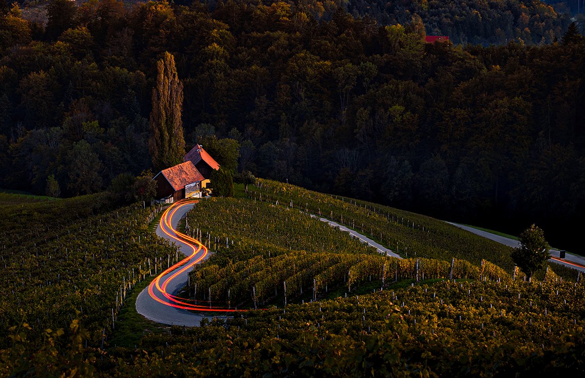
I am glad that my images have been selected for the July issue of “Top Posters Magazine”, for the Theme “Dark and Bright”.
available @ :https://t.co/DS7VJtLoJg
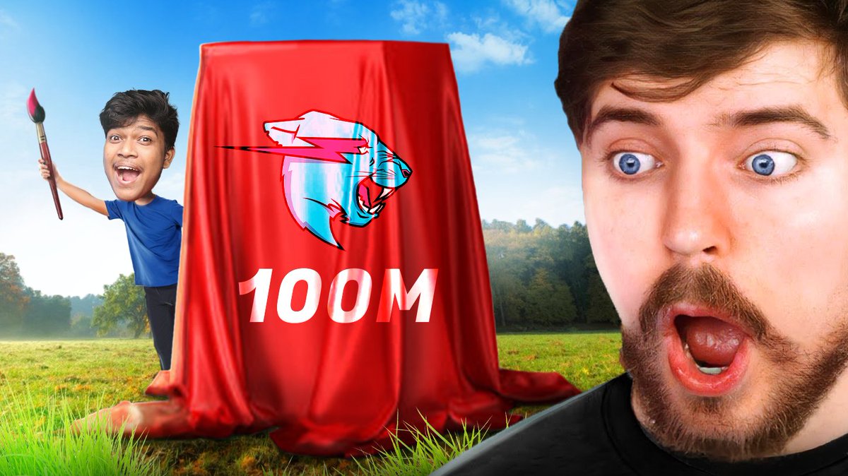
Hey @MrBeast@Reedjd
I made Your World's largest Concept Painting on the occasion of 100 Million Subs .
A big Congratulations to you from me and my Subscribers.
Do watch it once I guarantee you'll love it !!
https://t.co/4Gh3imvlxB
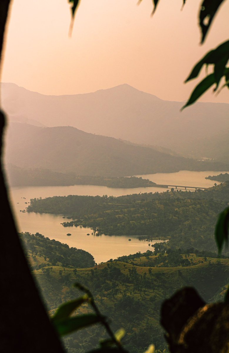
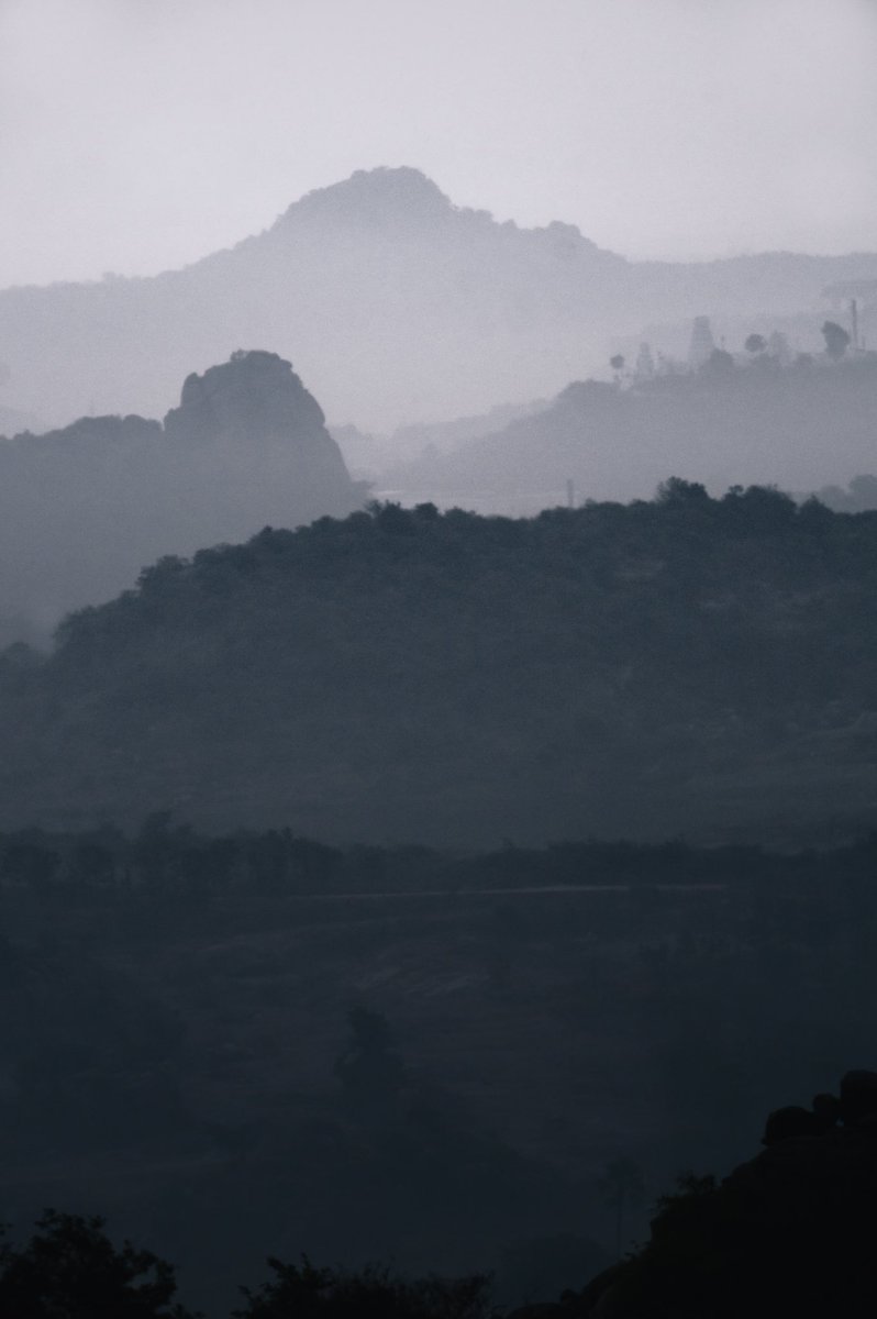
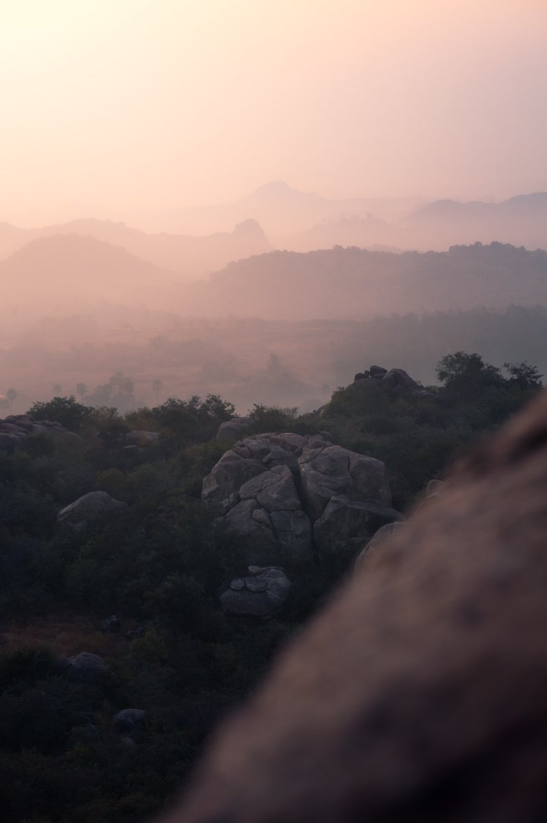
@TheActual22 For me, seems like B has a bit more contrast and clarity cranked a bit high…where as A looks more soft to the eye….and the rocks 🪨 in the very end of the horizon looks clean in A….soo I would prefer A..no offence..it’s just my opinion