Happy b-day to #OpenStreetMap, the free, volunteer-created map of the world!
We've worked w/ #OSM data since the very beginning, and a few years ago we wrote a 2-part history of Stamen's long relationship with OSM: https://t.co/geQ1XOkZ0r
Stay tuned for pt. 3 dropping next week!
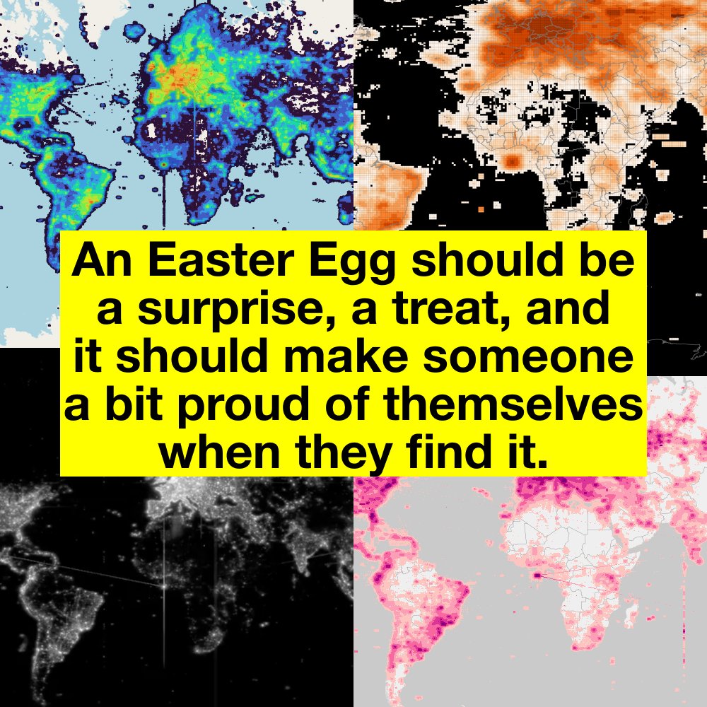
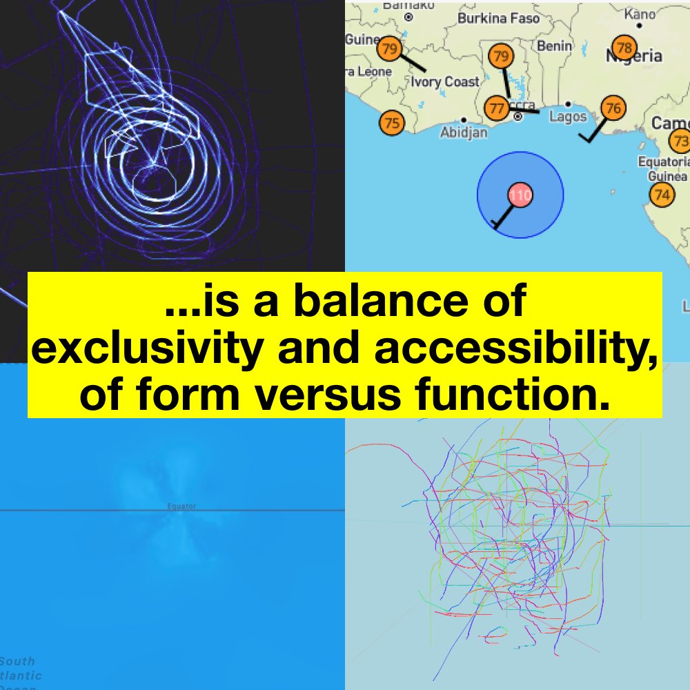
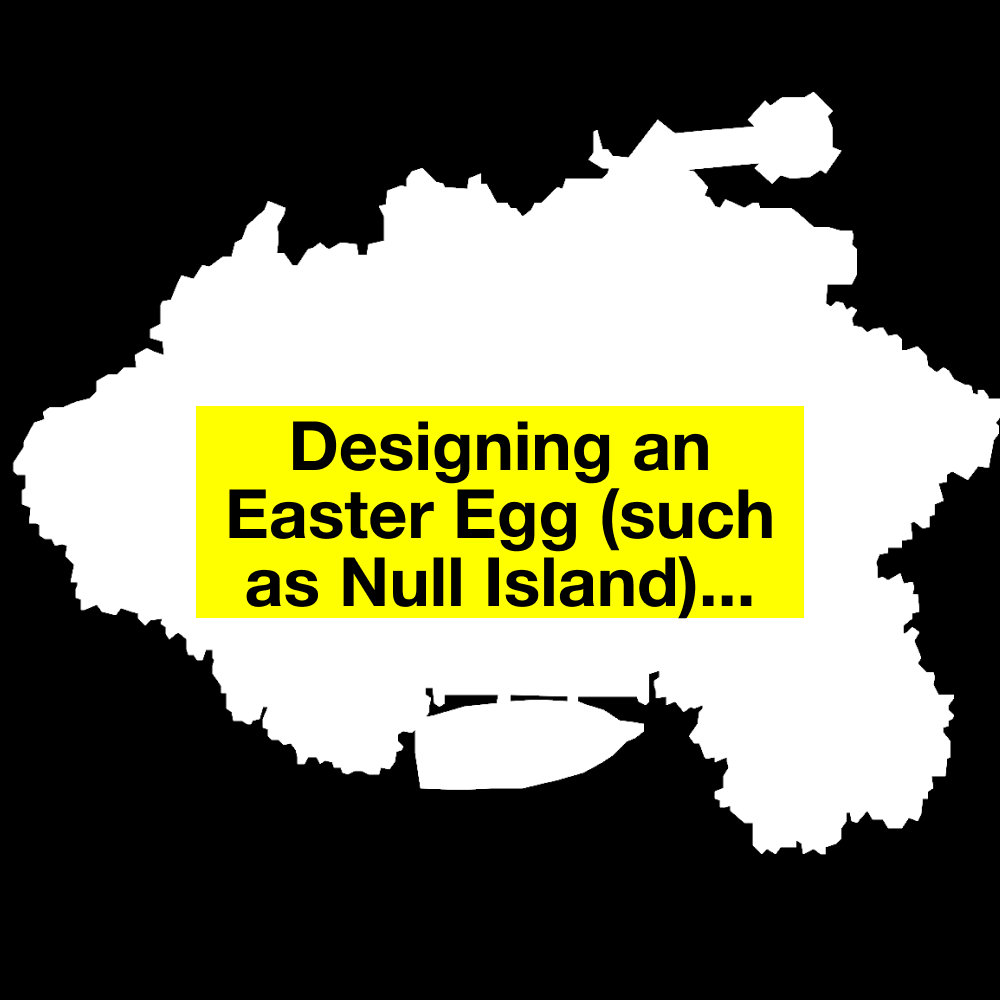
Sad news. It has come to our attention that the @NOAA weather station moored at 0º, 0º (nicknamed @NullIslandBuoy) no longer exists! Check out the update at the end of @mapppingmashups's @nullisland blog post for more details of the buoy's untimely demise. https://t.co/CxzHSMNmSQ
We've been enjoying the #ShadowoftheErdtree DLC for #EldenRing! With new noteworthy map features (and some that we missed the first time around), check out the update to our review of the map!
https://t.co/oAr7uEb2fv
An ecosystem is a complex web of relationships between flora and fauna 🐟🦆🌱🦌
We worked with MPG Ranch to create a tool that models how a change in one species will affect everything else!
Read more on our blog:
https://t.co/z1wk27vtcQ
Interactivity allows users to engage with data in more impactful and enjoyable ways!
Read our latest blog post to learn from Stamen designer Caroline Carter about how we employ interactivity in our work:
https://t.co/73c82lyZHA
In our latest blog post, Stamen cartographers Kelsey Taylor & @mappingmashups dig into "The World of Ice and Fire in Maps".
Get your fix of nerdy #GameofThrones#cartography analysis before you watch season 2 of #HouseoftheDragon on Sunday!
https://t.co/kNuQFUoVDj #GoT#HotD
Last week @mappingmashups gave a talk about how we recently modernized all of our basemaps... except for one. Updating Watercolor to a new pipeline would be challenging, but Steve Gifford from @WetDogWeather wrote some thoughts about how it might be done:
https://t.co/lto6GF9Gg9
It's been a year since we first booted up #Zelda#TearsOfTheKingdom! ⚔️🛡️ What do professional cartographers think of this #map of Hyrule? How does it stack up against the perfect 10 out of 10 map in #BreathoftheWild?
Check out our review of the map:
https://t.co/gkmHAa6MlW
Read about our work with @InnovateEconomy where we created a dashboard that uses the Distressed Communities Index (DCI) to highlight how socioeconomic factors impact communities across the United States:
https://t.co/tGZpVkh24G
New post: "Designing for all audiences: Mapping the future of food". Stamen designer Caroline Carter shares how we worked with @the_plotline from @EarthGenome to visualize which food crops are best-suited to the changing climate in Africa.
Read more: https://t.co/8leit5Ugvm
We just launched a new map w/ the Economic Innovation Group (@InnovateEconomy), showcasing their Distressed Communities Index.
Explore maps & dataviz that illuminate how local economic conditions correlate with life expectancy, social connections, & more.
https://t.co/3LRWtOiA2j
A few years ago we created a website for the #MaxPlanckInstitute to visualize complex urban transformations due to immigration for a project called "Superdiversity". Recently we updated it to make it easier to add new cities & updated datasets. Here's how: https://t.co/VciWCgvC35
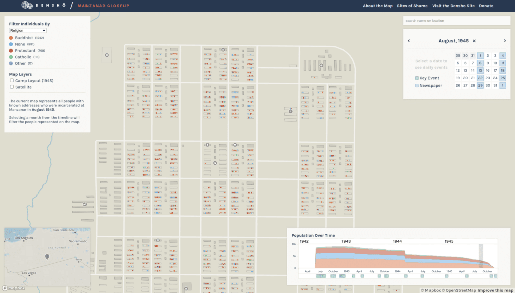
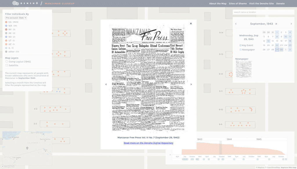
New post: we go behind the scenes of our recently-launched project "Manzanar CloseUp" with https://t.co/FJUl5jn9oj. Explore the human stories of the Manzanar concentration camp where Japanese Americans were incarcerated during WWII.
Read more on our blog: https://t.co/1bzPWGxwYN
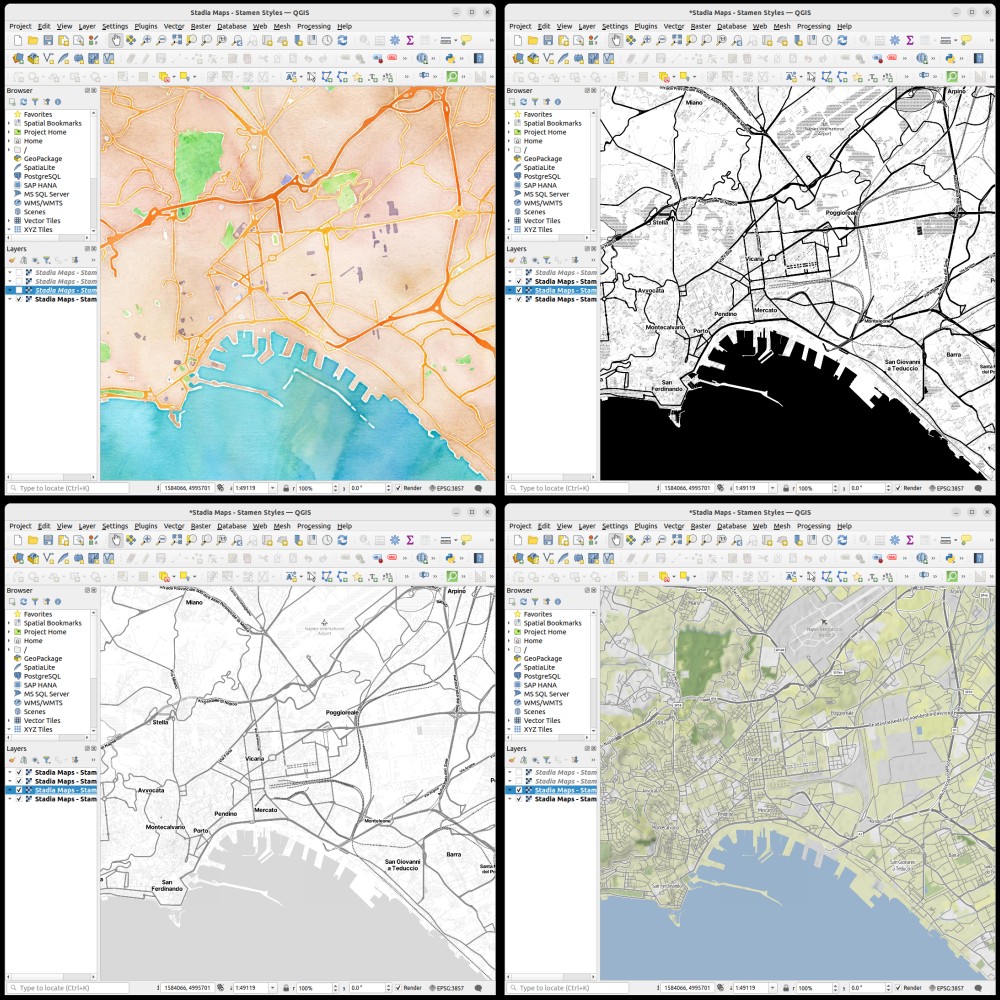
🌍 Elevate Your Maps w/ Stadia Maps & @qgis!
🚀 Dive into our tutorial to seamlessly blend @stamen styles into your projects. Perfect for GIS pros, researchers, & hobbyists. Unlock cartographic storytelling today!
Tutorial: https://t.co/2fZytE9s0z
#GIS#Mapping#QGIS#DataViz