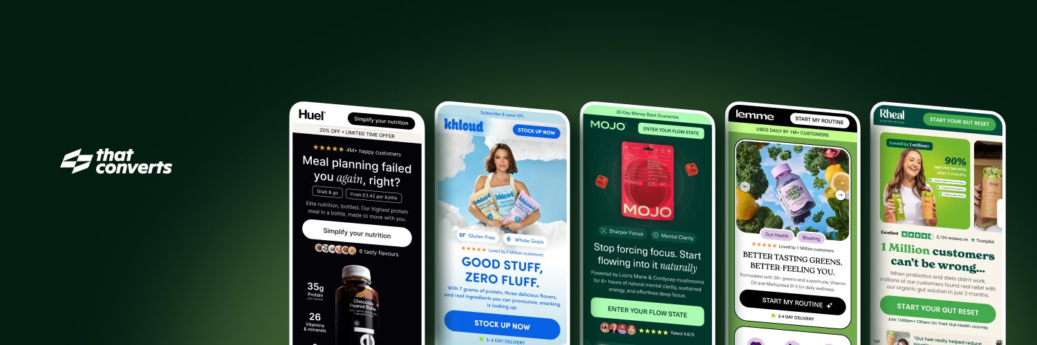
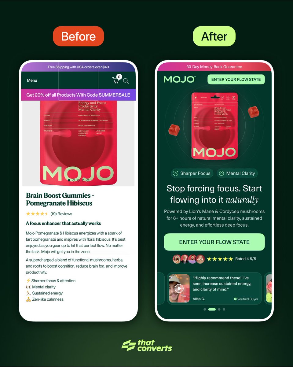
Your landing page has 3 seconds to prove you understand your customer's problem.
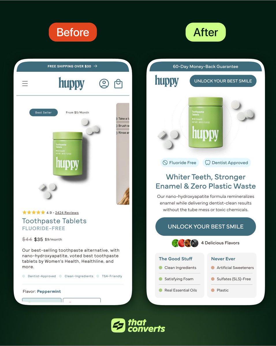
Here are 5 optimisations I made that show the difference between product-focused and psychology-focused design:
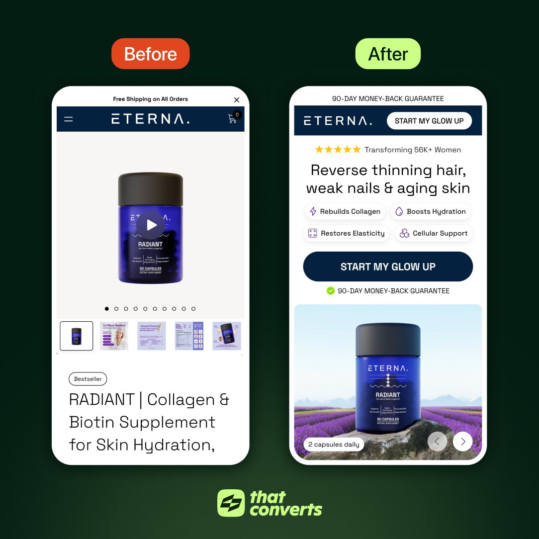
Most supplement brands can't explain what their product actually does.
I designed Eterna's hero section to:
→ Call out specific problems
→ Explain how it works
→ Remove purchase risk
Result: A page that educates and converts.
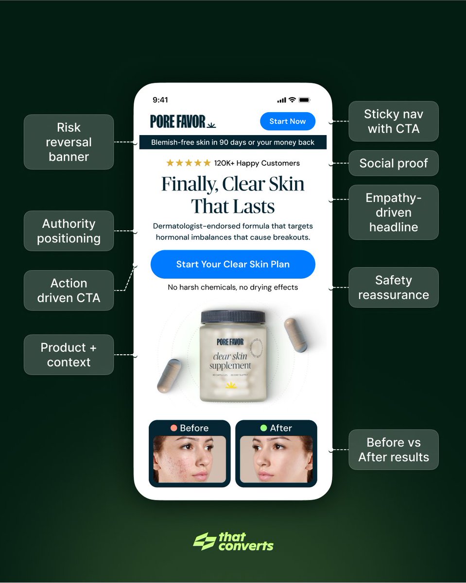
60% of landing page visitors aren't ready to buy.
They're researching solutions.
Yet most brands optimise for immediate conversion.
Here's what a hero section optimised for problem-aware traffic looks like:
@MarkPivko Thanks! It's one of those subtle trust builders, showing the problem is widespread makes the product feel more necessary rather than "nice to have"
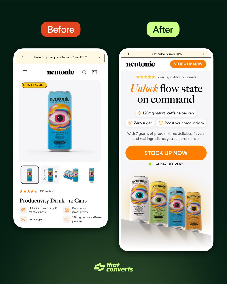
🟢 Change #8: Friction reduction
"🟢 3-4 DAY DELIVERY" below CTA
Addresses "when will I get this?" immediately.
Green dot = available/fast
Reduces hesitation at commitment moment.