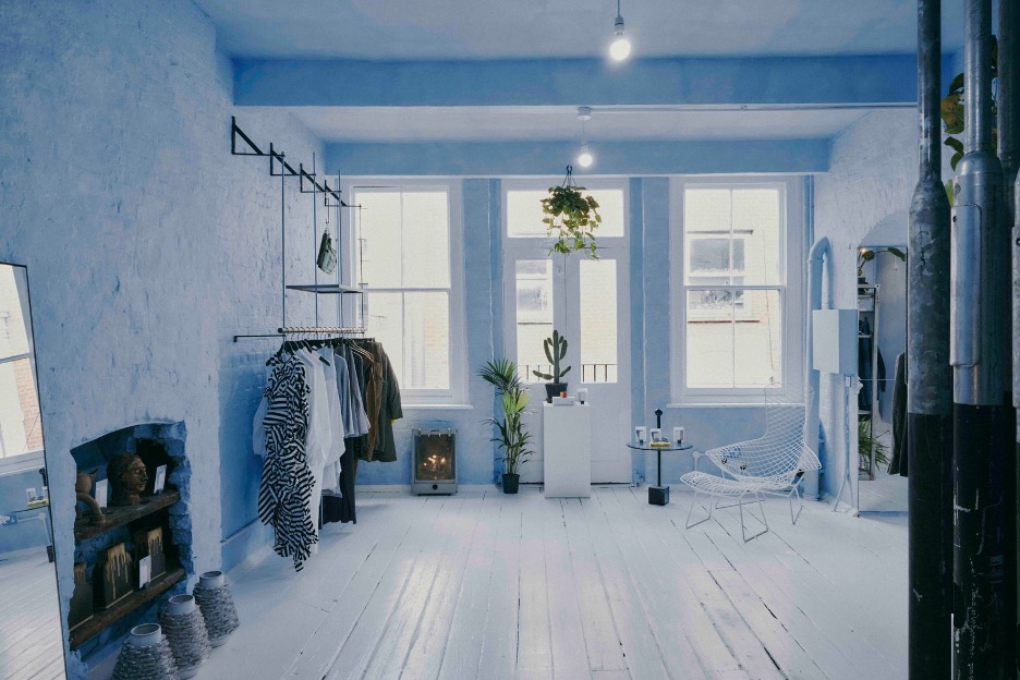
White is the most versatile color to work with. It sets the foundation for a space while inviting creativity and expression. Timeless yet modern, it embodies both classic and contemporary styles.
Explore and request samples: https://t.co/hf4rxACSSK
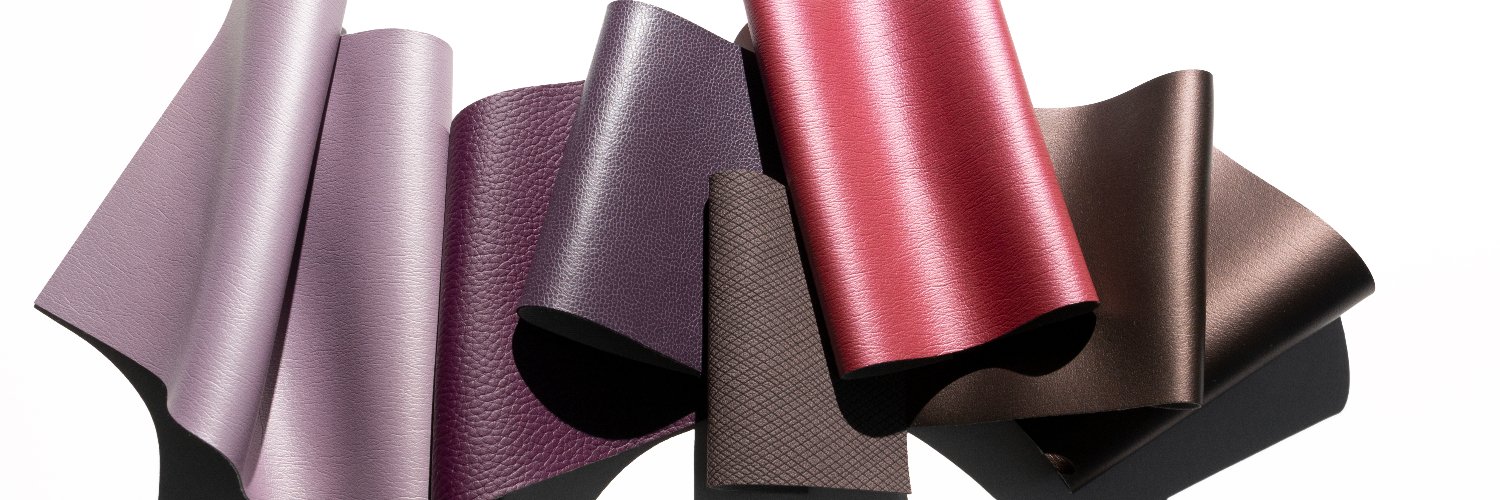
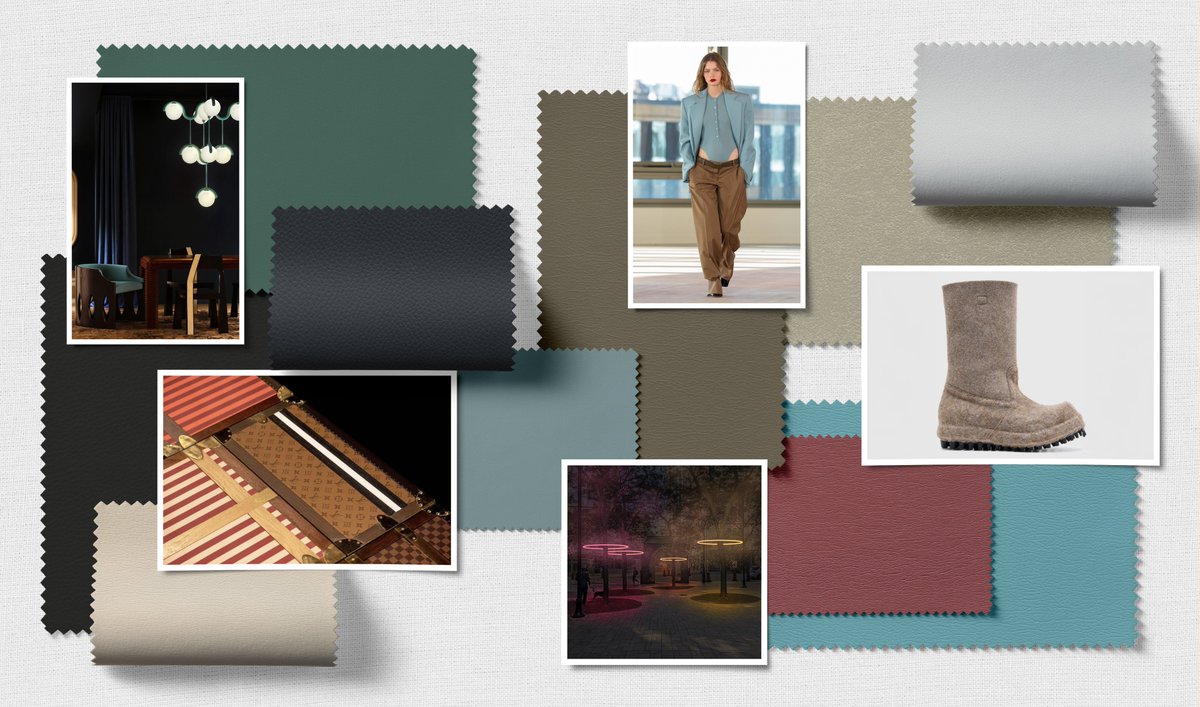
Dynamic design often begins with geometry. Our latest Edge blog explores how architectural form and intersecting lines inspire Ultrafabrics’ Wired collection, defined by movement, dimension, and modern texture.
Explore our latest blog: https://t.co/Wgp0MtZk2p
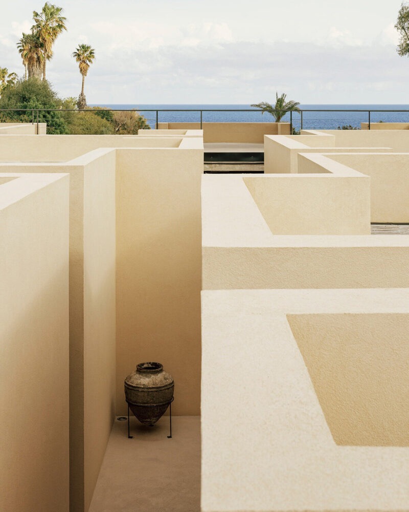
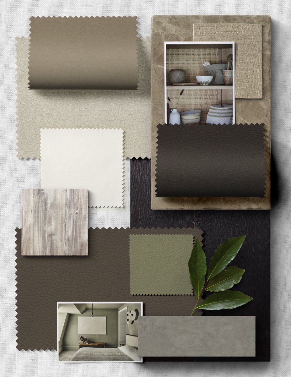
The Japanese interior design style wabi-sabi emphasizes authenticity and a connection to nature, reflected in its neutral palette and use of textured materials.
Our annual Color Impact report delves into the anticipated influence of color and texture on design for the year ahead and beyond.
For 2026/2027, we invite you to Savor the Journey with us.
Join us as we dive into these 5 key concepts https://t.co/gmWH124Xpb
A new era of premium cabins is here, where elevated materials, thoughtful features, and modern aesthetics meet passenger expectations.
For more inspiration and to read our latest blog, visit the Uf Lounge, https://t.co/VwU3ESMMNt
Featured on Qantas First A350
Meet Bali Bliss
A refined teal from Tottori that makes a gentle yet impactful statement. Its subtle, sea-inspired tone adds visual serenity while enriching the room with a fresh, contemporary edge.
Request samples of Bali Bliss today: https://t.co/bT2Vb3GCpP
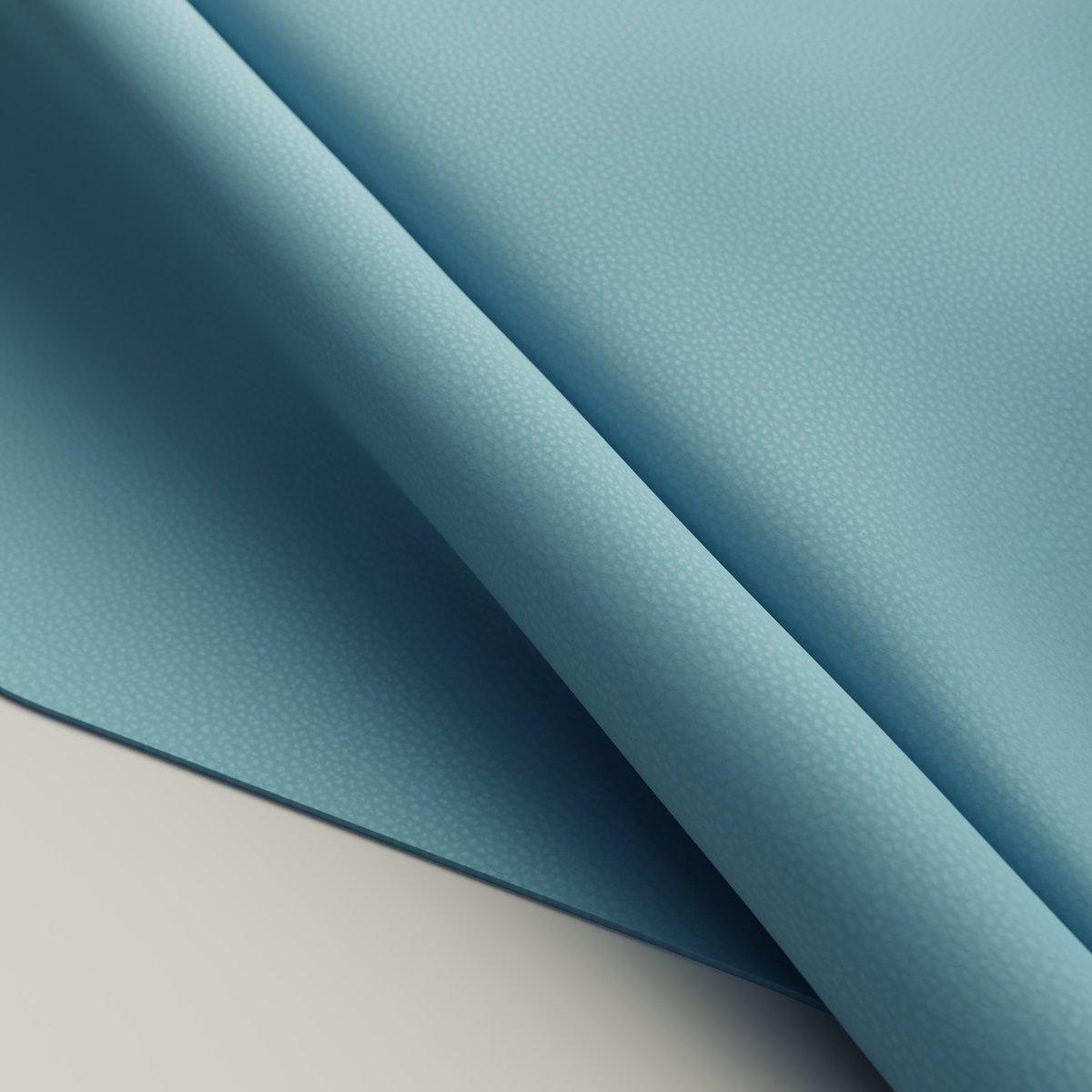
Meet Woad from our Volar Bio collection. A softly textured, nature-inspired blue that brings quiet depth and sustainable beauty to every design.
Explore and request samples of Woad today: https://t.co/9dEdzCqobn
#VolarBio#Ultrafabrics#SustainableDesign#MaterialInnovation
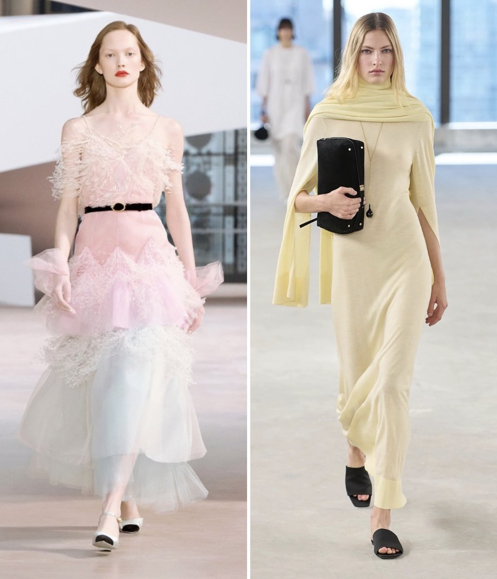
From butter-yellow runways to candy-hued interiors, pastels are reshaping the creative world.
Explore the full story in our latest Color Perspective blog: Exploring the Depth of Pearlescent Design: https://t.co/EfRbeiYFNN
#ColorPerspective#PastelDesign#InteriorInspo
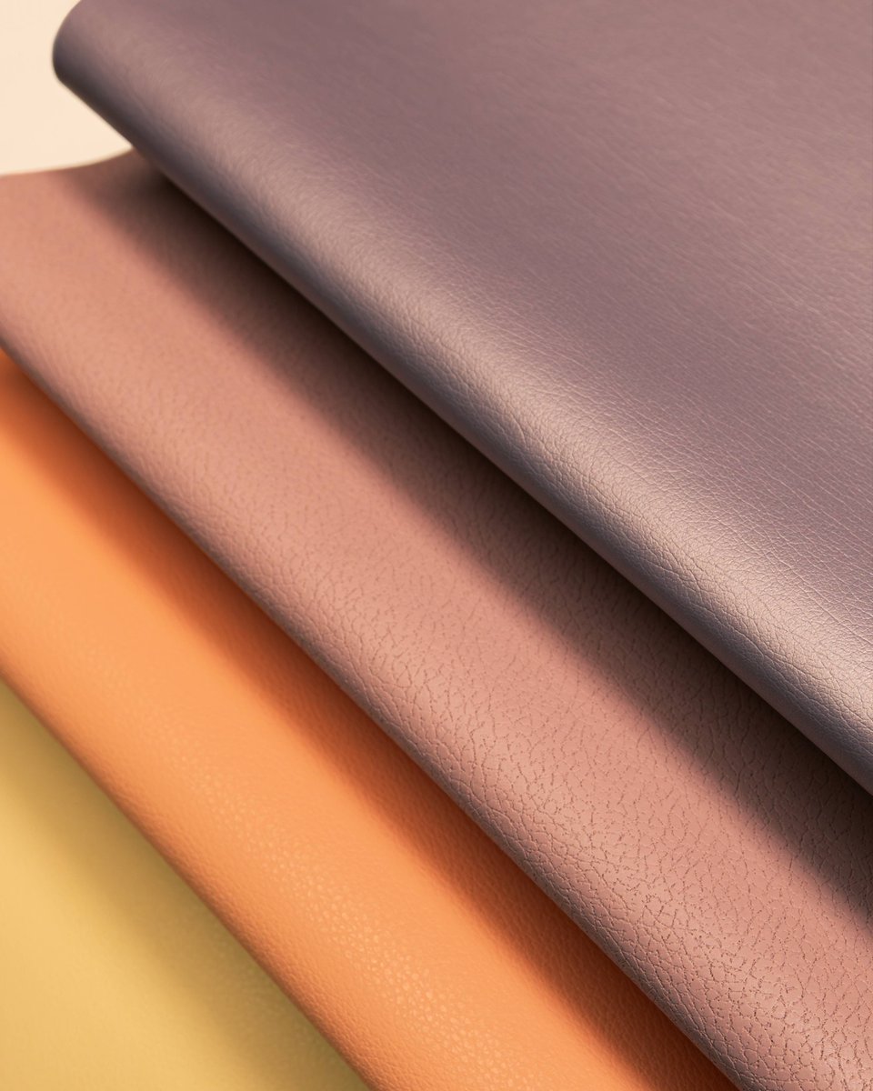
Moving beyond pale shades, our latest Color Perspective palette explores richer, more saturated pastels. Paired with deeper tones and subtle iridescence, these hues create a balance of lightness and depth.
https://t.co/EfRbeiYFNN
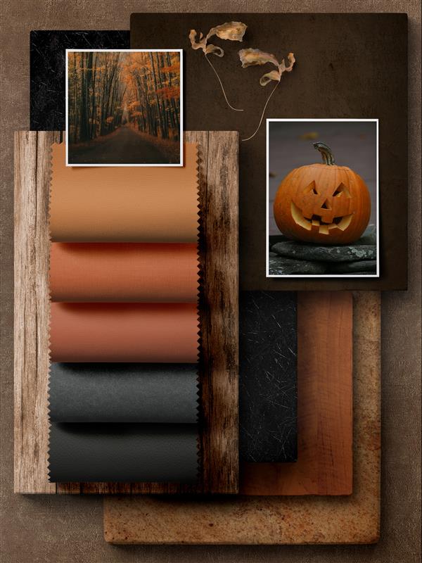
Happy Halloween! 🎃
Today, we’re embracing the moodiness of the season with shades inspired by pumpkins, forest bark, and autumn leaves.
A palette where vibrant oranges and midnight black come together to set the tone for a spooky night.
#HalloweenPalette#AutumnDesign
Soft, muted, and undeniably fresh, Ice Pink offers a contemporary twist on a timeless pastel.
Explore the full palette in our latest Color Perspective: https://t.co/EfRbeiYFNN
#ColorPerspective#DesignInspiration#ColorTrends2025
Our latest Color Perspective embraces a fresh take on pastels, from dusty pinks and pale lilacs to buttery yellows and warm peaches. Together, they create a palette that is both sophisticated yet approachable.
Request samples of our Color Perspective: https://t.co/EfRbeiYFNN