@UnitedStandMUFC So management expected Amorim to come in, change the culture, win the prem and some other trophies, all in one season, with those weaklings of players?
Our last summer transfer was "okay" and the results are there.
GIVE AMORIM TIME. BACK HIM UP
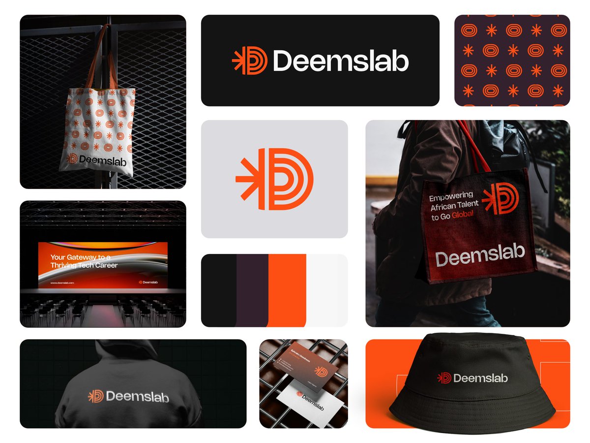
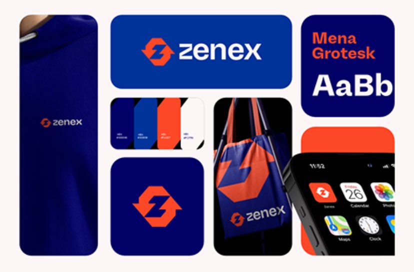
Four brands. Four different visual systems doing the same job: making you remember them.
This is what actual brand assets look like in action. Not just a logo and some colors. A language. A structure that holds across every execution so recognition builds instead of resets.
MetroExit owns bold color blocks and 3d product-led simplicity. BrownsView uses illustration and energy. When Women Lead roots everything in pattern and heritage. Savlen leans into editorial restraint and portraiture.
Different strategies. Same outcome: you see it once, you know who it is the next time.
If your brand doesn't have this kind of system, every post is starting from scratch. And that's a waste of money and attention.
🚀 FREE BRAND PROPOSAL TEMPLATE
I’ve put together a clean, Brand proposal template to help you land clients with confidence.
Want it? Here’s how to get it:
❤️Follow me
🔁Retweet this post
🗨️Comment “Pro” below
I’ll send it right to you! 👇
Once upon a time, I submitted 3 logos. & This won. This one that I sketched on my notebook 🫢 not even sketch book 😂
& We proceeded to print menus, fliers, banners and then branded the restaurant🥳
Niko na mushene Kwa thread. 🤭 Go see
Hey there,
I am Ephraim, a Brand and Visual Designer with many years of experience in bringing brands to life. I craft captivating visuals that forge lasting connections
I am writing to let you know I am open for Logo and Brand Design Roles and Gigs
https://t.co/lgDKBNuwRx
🚨 Now Live On Behance guys! 🚨
Meet Swoon—a luxurious lifestyle brand dedicated to empowering women. From career talk shows to beauty and fashion, Swoon has it all.
Check out the full project on Behance: https://t.co/qjb2xgiJyN
Let’s redefine empowerment together. 💫
I want to thank everyone for so much feedback (mostly positive) on my previous post!
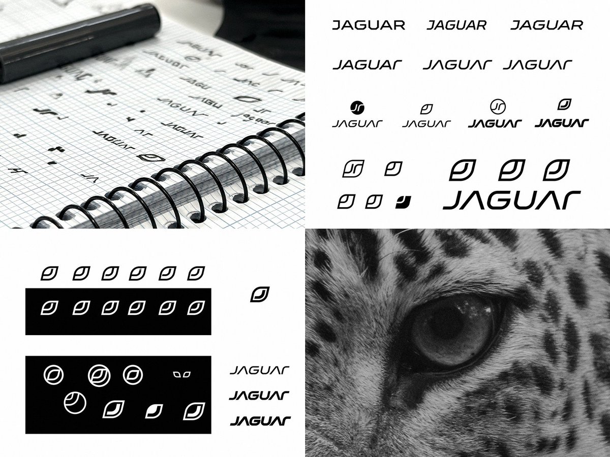
Many people asked me about the process of creating the logo, but honestly, it went much simpler than it seems 😅
The whole process took no more than an hour:
- a bit of hand drawing,
- experimenting with an aggressive and dynamic font, - exploring a symbol that would retain something of a jaguar while being simple and abstract at the same time.
And voilà — the idea didn’t take long to appear!
No secrets or complex techniques — sometimes the best ideas come from simplicity.
P.S. The comments about kerning are especially funny. Relax, guys, this is just a rough draft and a stream of consciousness! 😊