You need to see these 42 Power BI report designs 👀
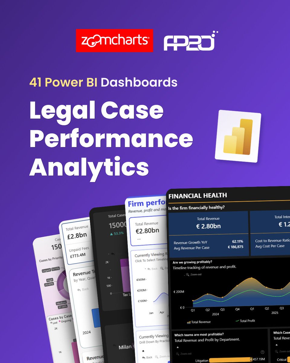
The FP20 Analytics ZoomCharts Challenge 39 brought together 42 talented Power BI creators, all working with the same legal operations dataset and producing remarkably different dashboards: https://t.co/Qi79Tsnjiw
Have you ever wondered why some law firms consistently outperform others, even when they handle a similar number of cases?
The answer isn't always more clients. It's having the visibility to understand where cases slow down, where profits leak, and where client satisfaction begins to decline. Without that clarity, leaders are left making critical decisions based on assumptions instead of evidence.
That challenge inspired my latest project.
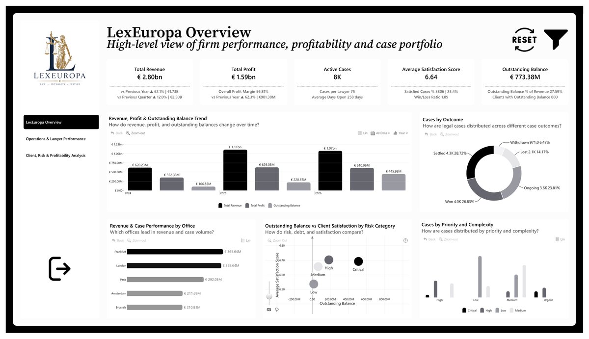
As part of the FP20 Analytics Challenge #39, participants was told to analyze a legal operations dataset from LexEuropa Legal Group, covering legal cases, lawyers, clients, financial performance, workload, risk, and client satisfaction.
My goal was to transform that data into a decision-making tool rather than just another dashboard. The result was the LexEuropa Legal Performance Dashboard i built in Power BI.
The dashboard begins with an executive overview that answers the questions every leadership team asks:
• Are we growing?
• Are we profitable?
• Are we meeting our targets?
• Where should we focus next?
From there, it explores performance across practice areas, client industries, profitability, outstanding balances, risk, and client satisfaction. Every visual was designed to answer a specific business question, allowing one insight to naturally lead to the next.
One of my favorite visualization was analyzing the relationship between case complexity, risk, profitability, and client satisfaction. Instead of viewing these metrics in isolation, it reveals patterns that help decision-makers ask better questions:
• Are complex cases reducing client satisfaction?
• Do higher-risk cases generate higher returns?
• Which practice areas deserve more investment?
A big thank you to the FP20 Analystic Community, Federico Pastor, and @ZoomCharts for another realistic and thought-provoking challenge.
Read project documentation on GitHub: https://t.co/heg8eNBoYr
#FP20Analytics #ZoomCharts #PowerBI #BusinessIntelligence #DataAnalytics #DataVisualization #DashboardDesign #LegalAnalytics #DataStorytelling #SQL #MicrosoftPowerBI
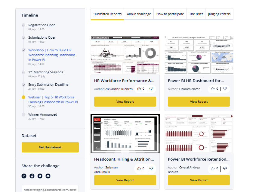
Voting is now open for the July 2026 ZoomCharts 4U Reports Challenge!
Explore 34 Power BI Dashboards for Human Recourse (HR) Analytics: https://t.co/fpftmufZgX
Hello #datafam,
Here's my submission for the July @ZoomCharts 4U Reports Challenge.
I built a 3-page Power BI report that transforms thousands of employee data points into a connected workforce story, from headcount growth through engagement to termination reasons.
Looking for Power BI dashboard inspiration?
Use the ZoomCharts AI Assistant to find relevant dashboard and report examples faster. Just describe what you need, and explore templates you can adapt for your own Power BI projects.
Ready to level up your #PowerBI skills? 🚀
Join our FREE data challenges, build real business dashboards, get expert feedback, mentoring, webinars, and compete for prizes!
👥 HR Analytics: https://t.co/ex1Wa7nTfw
⚖️ Legal Analytics: https://t.co/QHUDkKd7gh
New Power BI report template examples are now available in the ZoomCharts Template Gallery.
Explore new HR Analytics and Legal Operations Examples report examples: https://t.co/LFkvVjNFis
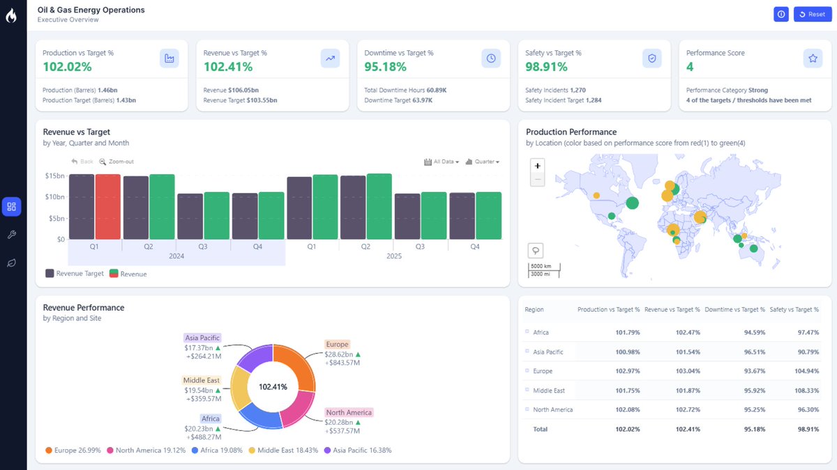
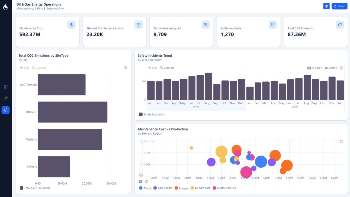
How can Power BI help energy companies understand production performance, operational efficiency, safety, sustainability, and financial results in one report?
Our new Oil & Energy Power BI Dashboard Example shows one possible approach: https://t.co/7iAhKlskd0
👏 Great work by @kudehinbu_jr on this impressive healthcare analytics dashboard built for the ongoing FP20 Analytics Challenge!
Interested in testing your Power BI skills and gaining visibility for your work?
Join challenge: https://t.co/67RnagKDhq
Hello #datafam,
For this months FP20 Analytics Challenge, I built a 3-page Power BI report on a 12-hospital NHS network—tracking patient volumes, wait times, ICU, readmissions, mortality, staff burnout, and finances, all in one model.
Not every Power BI report needs to be built from scratch.
Sometimes, the best way to improve a report is to see how others have solved similar challenges: from filtering and navigation to storytelling and user experience.
Explore 4U Reports:
https://t.co/4L7ZOAnNPJ
Data Challenges are a practical way to move from watching tutorials to building complete Power BI reports.
You get a dataset, a clear brief, a deadline, feedback, and a chance to learn from other report creators working on the same business case.
https://t.co/iSvb2NoDp3
What Power BI visual would you like to see next?
From Sankey and Gantt charts to KPI Cards, Flow Charts, Organization Charts, and other new concepts, we're gathering feedback from the Power BI community before deciding what to build next.