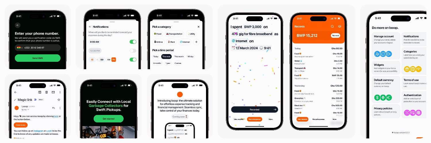
Happy to share some designs I recently created for https://t.co/KO3CNCVXBg. I had a lot of fun collaborating with the team to build this product. I will share details more soon.
A lot of designers are too pigeon-holed in their 9-5, you need to experiment, CREATE time for self-initiated projects, this is probably the only way to stay relevant and materially advance your skill.
The monotony of your 9-5 is not helping your creativity especially if you already have a design system.
The only instance this advice doesn’t apply is if you are constantly dealing with new problems you need to translate to deisgn at work.
@TheDumbTechGuy has something to say at @ZelosHQ
Builder's Day! A Live walkthrough of 'Vibecoded' products .
A panel of working developers and product designers will critique the result — UX choices, performance, and security — and share what could have been done better.
A candid look at adopting a new skill without grinding through a coding language first. sign up https://t.co/QGN9LeKcyQ
Lately, I’ve been thinking a lot about how fast product design is changing.
Not just visually, but how people work, think, prototype, communicate ideas, and execute.
Every week there’s a new AI tool, a new workflow, a new opinion, and honestly, it can feel overwhelming trying to figure out what’s actually useful and what’s just noise.
That’s one of the reasons I wanted us to host this webinar.
Not to have another generic “AI is the future” conversation, but to bring together designers actively using these tools in real workflows to share practical insights, live walkthroughs, and honest perspectives on what’s actually changing in product design.
If you’re a designer trying to understand where all of this is going and how to adapt intentionally, I think you’ll genuinely enjoy this session.
Cc: @uxderrick@_ayivi@kwabenaess
Meet @jayanaman , the founder building the talent infrastructure in Africa.
Mande is an AI-powered career companion designed specifically to help students and young professionals navigate their career paths.
Visit: https://t.co/fPklVAlnmb
Actually, it’s one of the best-designed screens, and I’ll tell you why.
1. The huge time display is doing some heavy lifting because when the alarm wakes you up, your eyes are not fully open, so having it big makes sense. You can try squinting your eyes and see which version is easier to read. There’s also another reason for this, which I’ll touch on in my second point.
2. The dark background is there for a reason. Do you know how annoying it is to see a bright screen the moment you open your eyes? You don’t want that. Plus, it gives the best contrast with the numbers, making them easier to see immediately.
3. The buttons are also big because you’re most likely going to be clumsy since you’re not fully awake, so we need to make it easy for you to make a decision.
Now, why is Snooze the primary CTA? First of all, the likelihood of you pressing that is higher when you’re deep in sleep. Remember, you’re not fully awake, so your brain is slower at processing information. It naturally defaults to the path with the least resistance, which is the Snooze button. Funny enough, this will save you on many occasions where your brain is just telling you to stop the noise, even though there’s work or something important you need to attend to.
Now, the Stop Alarm being a slider is for two reasons. First of all, it’s a very critical action because you might miss something important if you accidentally touch it. Second, the brain power required to use the slider means you have to be almost fully awake to complete the action.
P.S. With improvements to the contrast, I think the Snooze CTA could work better as black text on an orange background.
Started this bi-weekly newsletter on LinkedIn about a little over a month ago. Im at 999 subscribers. I have a good email open rate with an okay audience interaction.
This has been one of my biggest goals this year
Be the 1000th subscriber 🥳
https://t.co/WJ6Ro8CWUG