Hey friends! 👋🏾
Day 9 of the Redesign Challenge is here! 🎉
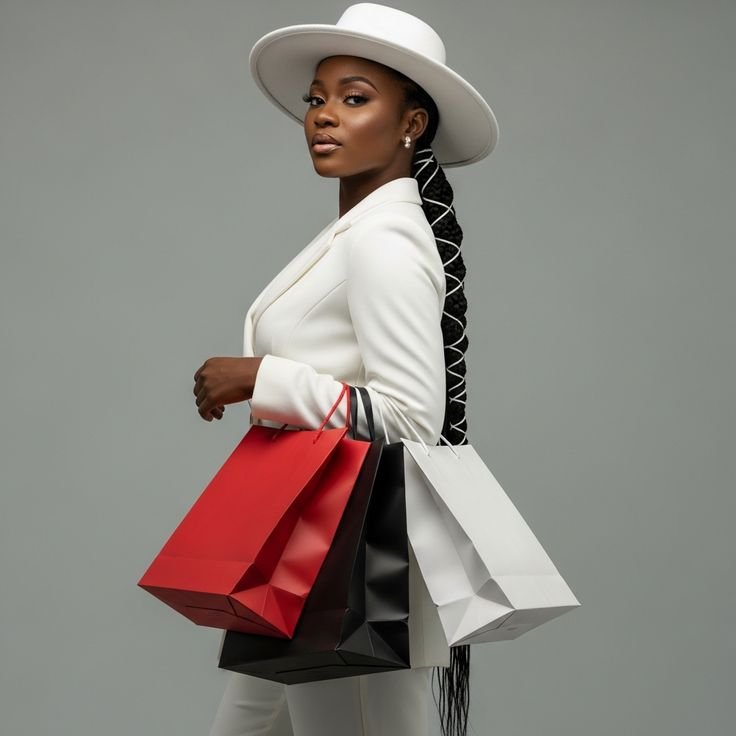
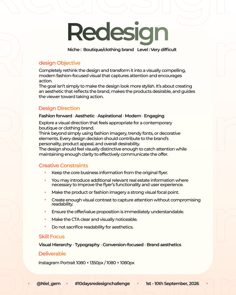
We’re moving into a new niche: Boutique & Clothing Brands. 👗✨
This time, we’re putting more focus on aesthetics and functionality.
The goal is to create a design that catches attention, makes the product desirable, communicates the offer clearly, and ultimately encourages people to take action.
Think beyond just making it pretty. Think about how the visual direction, layout, typography, imagery, and CTA work together to create a better experience.
Make it aesthetically pleasing. Make it work.
Once you’re done, quote this post with your redesign alongside the original flyer, and briefly explain how your design decisions improved the aesthetic appeal, functionality, and overall effectiveness of the design.
Don’t forget to tag me and use #10daysredesignchallenge.
Day 9 of 10.
Let’s see how far you can push it. 👀🔥
Yippie!🎉
It's a wrap
10 days. 10 redesigns. A lot of learning and growth
It was an honour to participate alongside all you creative geniuses.
#10DaysRedesignChallenge
Hey friends! 👋🏾
Day 10 of the Redesign Challenge is here! 🎉
We made it to the final day! 🚀🔥
For our last challenge, we’re staying in the Boutique & Clothing Brand niche. 👗✨
Same task : Focus on creating a design that is aesthetically pleasing, engaging, and functional .
Something that not only catches attention but also communicates effectively and encourages action.
Think about how your visual direction, layout, typography, imagery, and CTA work together to create a design that feels intentional and complete.
Make it aesthetically pleasing. Make it work.
Once you’re done, quote this post with your redesign alongside the original flyer, and briefly explain how your design decisions improved the aesthetic appeal, functionality, and overall effectiveness of the design.
Don’t forget to tag me and use #10daysredesignchallenge.
Day 10 of 10.
Let’s finish strong. 🚀🔥
Hey friends! 👋🏾
Day 9 of the Redesign Challenge is here! 🎉
We’re moving into a new niche: Boutique & Clothing Brands. 👗✨
This time, we’re putting more focus on aesthetics and functionality.
The goal is to create a design that catches attention, makes the product desirable, communicates the offer clearly, and ultimately encourages people to take action.
Think beyond just making it pretty. Think about how the visual direction, layout, typography, imagery, and CTA work together to create a better experience.
Make it aesthetically pleasing. Make it work.
Once you’re done, quote this post with your redesign alongside the original flyer, and briefly explain how your design decisions improved the aesthetic appeal, functionality, and overall effectiveness of the design.
Don’t forget to tag me and use #10daysredesignchallenge.
Day 9 of 10.
Let’s see how far you can push it. 👀🔥
Hey friends! 👋🏾
Day 8 of the Redesign Challenge is here! 🎉
The task remains the same: take the provided flyer, identify what isn’t working, and rethink the design with intention.
Read through the brief, get creative, and let’s see how you approach it. 👀🔥
Once you’re done, quote this post with your redesign alongside the original flyer, and briefly explain:
• What problem you identified
• What design decisions you made
• How your redesign solved the problem
Don’t forget to tag me and use #10daysredesignchallenge.
Day 8 of 10.
Final day in crypto trading.
Let’s see how far you can push it. 👀🔥
Hey friends! 👋🏾
The Redesign Challenge Day 7 is here! 🎉
We’re moving into a new niche: Crypto Trading. ₿📈
And this one is definitely going to test your design thinking.
The task remains the same: take the provided flyer, identify what isn’t working, and rethink the design with intention.
This time, the challenge is to turn a crypto trading visual into something that feels credible, modern, clear, and conversion-focused without falling into the usual crypto design clichés.
Pay close attention to information hierarchy, data presentation, typography, and the CTA.
Read through the brief, get creative, and let’s see how you approach it. 👀🔥
Day 7 starts now.🔥
#10daysredesign
New week, new creative possibilities.
These concepts are a small reflection of exploration.
Here’s to a productive week of creating, collaborating, and building. 🚀
Open to working with brands and creatives. Let’s build.
Turning in for Day 6
I focused on giving the design a more premium look and easier to glance through layout. I also included a clearer CTA.
Aimed for simplicity...and, I think I got close
How did I do?
#10daysredesignchallenge
Hey friends! 👋🏾
The Redesign Challenge Day 6 is here! 🎉
We’re wrapping up the Real Estate niche today. 🏠
Yesterday, we focused on making a real estate flyer not just look better, but work better.
Today, we’re taking that a step further.
For this final real estate challenge, I want you to push your thinking even more.
Study the original flyer, identify the biggest opportunity for improvement, and rethink the design from the ground up.
Think about hierarchy, information, functionality, visual appeal, and how quickly a potential buyer can understand what’s being offered.
The goal isn’t to add more.
It’s to make every design decision count.
Once you’re done, quote this post with your redesign alongside the original flyer, and briefly explain:
• What problem you identified
• What design decisions you made
• How your redesign solved the problem
Don’t forget to tag me and use #10daysredesignchallenge.
Day 6 of 10.
Final day in Real Estate. 🏠
Let’s see how far you can push it. 👀🔥
My Submission for Day 5✨
The original design lacked information. So, I improved my version by adding a prominent CTA, and more details on the property
How did I do?
Fingers crossed🤞
@Niel_gem#10daysredesignchallenge
Before vs After
Hey friends! 👋🏾
The Redesign Challenge Day 5 is here! 🎉
We’re moving into a new niche: Real Estate. 🏠
And we’re turning things up a notch.
Today’s task is a bit difficult , so I want to see how you approach a more demanding design problem.
The task remains the same: study the original flyer, identify what isn’t working, then rethink the design and create your own solution.
Look for ways to improve the functionality of the flyer by making important real estate information easier to find, understand, and act on.
Consider things like property details, pricing, location, key features, contact information, and the CTA — but how you organize and present them is entirely up to you.
Once you’re done, quote this post with your redesign alongside the original flyer, and briefly explain:
• What problem you identified
• What design decisions you made
• How your redesign solved the problem
Don’t forget to tag me and use #10daysredesignchallenge.
Day 5 of 10.
New niche. New challenge. Let’s see what you come up with. 👀🔥