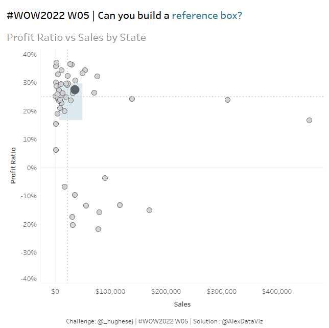
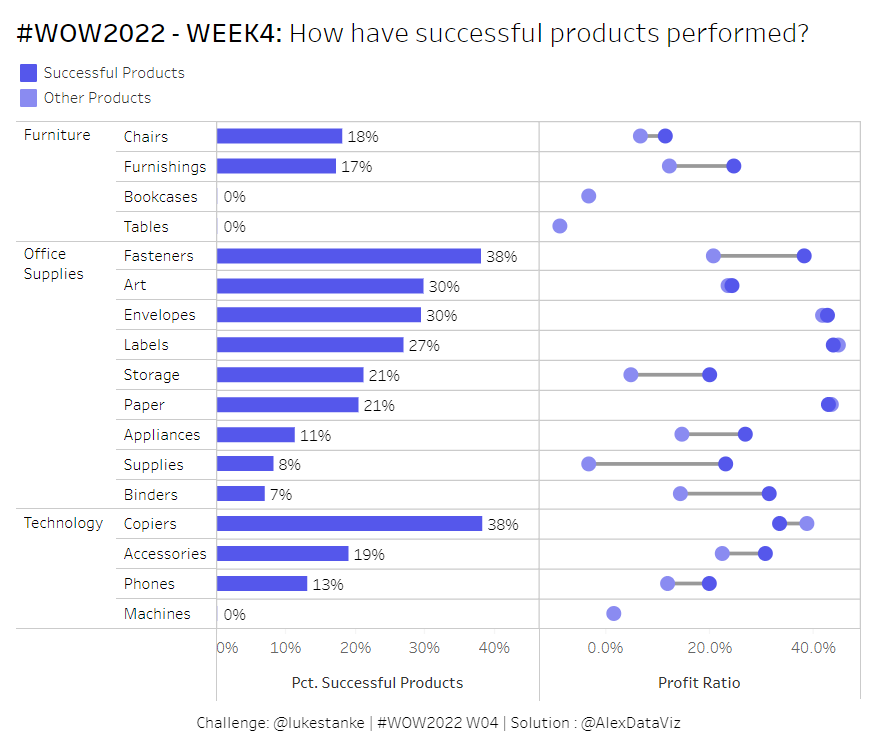
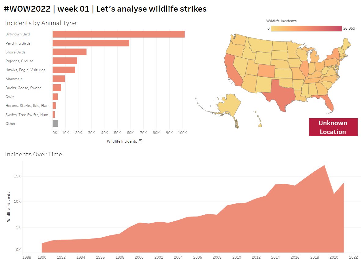
Another challenging #WOW2022 this week from @YetterDataViz - thanks Kyle!
I found the most challenging aspect was adjusting the dates from previous years to match the data in the example. Very satisfying once I cracked it!
https://t.co/ZucVz3XWYU
It was great to show how we're using @Tableau at Rugby Australia to provide insights across all levels of our game, from grassroots rugby to our high-performance teams
Check out my presentation at the link below👇.
https://t.co/eV3E0OVunw
#sportsanalytics#datafam
Great day at the @NRL Data Jam yesterday with team @DataSchoolAu . Very happy to be awarded the people's choice award for our Controlling Space analysis using Voronoi charts 🏉📊🏆
Huge congratulations to the @dataschoolau Cohort 3 Consultants as they finish their 16 weeks of intensive training and head out on placements with our client partners!
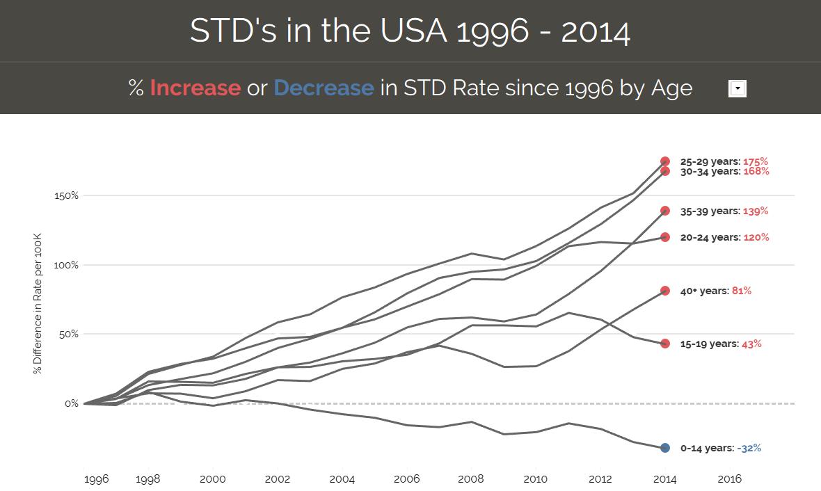
My #MakeoverMonday submission - kept it simple with a parameterised line chart showing %increase or decrease in STD rate since1996
@DataSchoolAu
Tableau Public: https://t.co/z4j4ZkDwgB
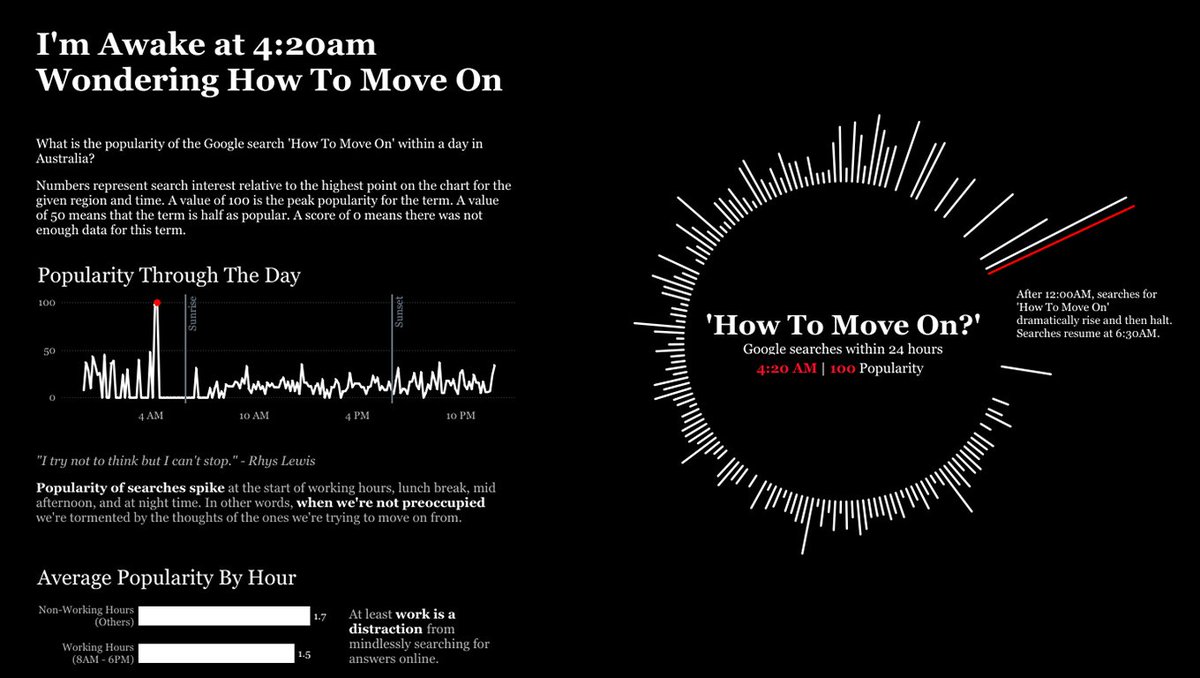
Moving on is hard— but when does it hit hardest? In this #VOTD, @pris_lam uses data from Google Trends to visualize the popularity of the search term “how to move on?” Check it out: https://t.co/IjKlqxAvF4
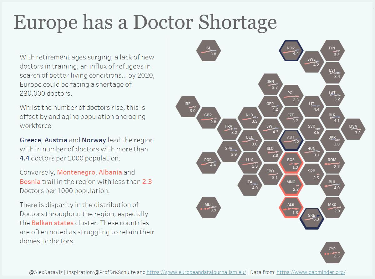
Europe has a doctor shortage - This #DashboardWeek hexmap viz by @AlexDataViz is inspired by @ProfDrKSchulte and shows that while the number of doctors in increasing, the aging population more than offsets that. https://t.co/0X12rgAwQ7