Created a visualization to try and better view the trending scale and frequency of layoffs in what has become a weekly topic in games industry coverage. Dataset from https://t.co/SSxMsNFO36 by @dekaf
Started building an explorable chart of the NYC Transit fare history during the last proposed (but postponed) increase and just updated it to reflect the one coming this month. https://t.co/I5HfybkxJ7
@2AvSagas I made a visualization of the live dataset that you might find interesting. The summary section was partially inspired by your updates. https://t.co/eBMMDGvtEG
Very pleased to release the final version of our report outlining how the Adams Administration, the new City Council, and other NYC electeds have the opportunity to use technology to improve the lives of New Yorkers and the efficiency of city government.
@JanWillemTulp I find keeping good notes helps. It ensures you've worked out enough detail on an idea to start. And for projects underway, it records what you've done/learned and next steps, so even if you need to pause, you can decide which are worth continuing and pick up where you left off.
Couldn't help drafting an unofficial context map around the recently announced Interborough Express by @GovKathyHochul and referencing some past work around @RegionalPlan's Triboro. Glad to see the idea moving forward.
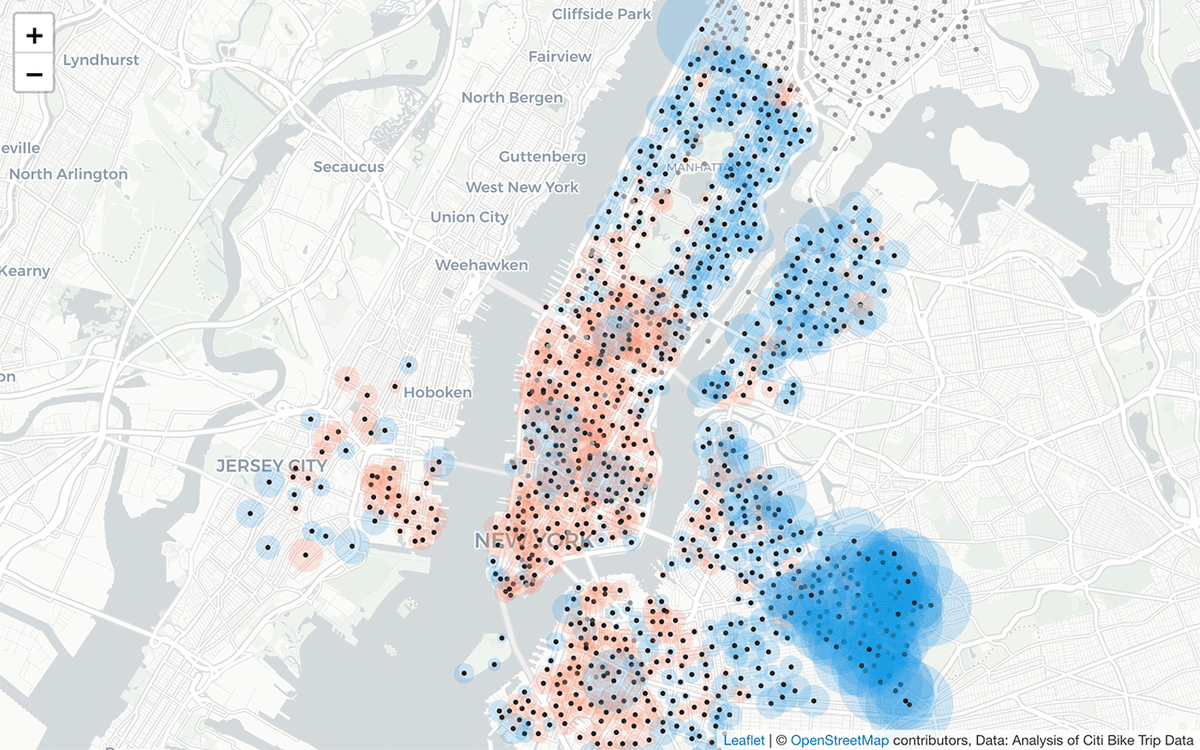
@goaliegirl44@bikenewyork@CitiBikeNYC I looked into the change in trips by station from 2019-2020. Astoria was one of many areas that saw a significant increase. https://t.co/zTPbJDzNJh
Finally got to the visualization of @CitiBikeNYC trips data I've wanted to do thanks to @chris_whong's shared process for aggregating the raw trips by station. Created an @observablehq to explore changes from 2019-2020 and test some design ideas. https://t.co/zTPbJDzNJh
Between watching #f1 Drive to Survive on Netflix and listening to the @shiftf1podcast this year, it's been interesting to learn more about @F1 and explore visualizing some of its dynamics. Made an @observablehq on the 2010-2019 Constructor Standings https://t.co/rVVuCcHNaX
@MTA Share some of @transitmap's concerns on design but interested to see how the map develops. One content issue is that considering the emphasis on accessibility, the map really should flag stations that are not fully accessible, like the 4/5/6 platforms at 14th St/Union Sq.