✷ Rebooting Our Agency & Brand ✷
2023 is going to be a fun and exciting year for Blue Cyclops!
We are internally updating our brand, website, and content engine.
Be sure to follow us on this epic journey! (:
I don't like to gatekeep my process, so I built a Figma file that showcases what a 4-week branding sprint looks like.
The file includes:
→ 2x 4-week deliveries
→ 7x case studies
→ My design process overview
→ Over a dozen client testimonials
A designer messaged me after a call: "How did that feel? To say no to him?"
He'd worked with the guy for three years and never once pushed back.
I'd known him for a week.
Most agencies and freelancers send a PDF proposal and hope for the best.
I open a Figma file on the call and walk through the entire sprint.
Process, case studies, deliverables, timeline.
The prospect isn't reading about the work. They're seeing it.
One of them signed the next day.
This file has the CRAFT Process, five case studies, and every deliverable mapped out frame by frame.
It's my best sales tool and it's not even a sales tool.
Our brand for Ticketro. NFT ticketing platform for live event venues.
Dark palette, electric green, monospace type.
One of my favorites from last year.
Figma just opened the canvas to AI agents. An engineer can now generate a full component set from the command line.
That's going to feel like a threat if you sell execution.
It shouldn't if you sell clarity.
The agents pull from your design system. Your components. Your variables. Your naming conventions.
If that system is clean, agents ship clean work faster.
If that system is a mess, agents ship that mess faster.
Across every screen, every flow, every touchpoint.
AI doesn't fix broken thinking. It just ships the consequences faster.
The constraint has to come from outside the tool. It always has.
OpenAI hired Jony Ive.
Gamma, Perplexity, and Superhuman all hired the same branding studio.
Every AI company selling “you don’t need a designer” is quietly paying designers to build their own brand.
The companies closest to the technology are the ones least willing to trust it with.
You don't always need a full rebrand.
For this HR SaaS client, we kept the logo and rebuilt the color palette, from muted and forgettable to brighter, more confident, and differentiated from their competitors.
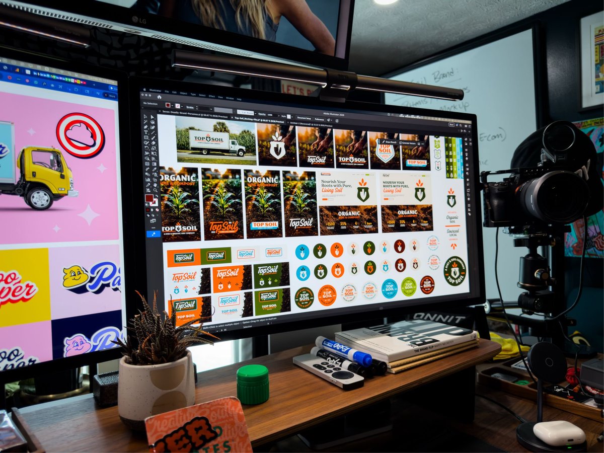
Starting back today on the Top Soil branding project.
I decided to take a little break and come back to the project with fresh eyes.
Between today and tomorrow, I’m going to be working on:
→ Brand Elements (Patterns, Textures, Motifs, etc.)
→ Mockups (Soil Bag, Billboards, Ads, etc.)
→ Ad Sets + Marketing Materials
→ Landing Pages
→ Illustrations/ Graphics
It’s a lot to tackle in two days, but we’ll see how far we can get.
#branding #BehindTheScenes
Available for New Projects!
👉 I’ve got a few openings for February/March and would love to help if you (or someone you know) need support from a senior brand + web designer.
What I offer:
→ Branding & Identity
→ Web Design + Webflow
→ Illustration
→ Ongoing Design Support
→ Fractional Creative Leadership
Intros, referrals, or quick chats are always welcome. (:
#freelance
Behind the Scenes: The color ways are coming along nicely on the Top Soil brand.
My favorite part of the visual brand process is choosing the colors.
#branding#design#bts#workinprogress#freelance
New work: I had the honor and pleasure of creating the hero illustration for this year's Creative South website.
I've gone to this event every year since 2013 and have been helping internally for the last few years.
There's more work to come from this!
#designtwitter #illustration #branding #creativesouth
New Founders:
Here's a list of things you DON'T need when building your brand for an early-stage startup:
❌ Brand Guidelines (You’re not an enterprise yet.)
❌ Email Signatures (Nice to have, but not needed.)
❌ Digital Letter Head (Why?)
❌ Print Collateral (2001 called and said “NO!”)
❌ Swag / Merch (Slap your logo on a t-shirt, DONE!)
❌ Zoom Backgrounds (For the love of god, NO!)
❌ Professional Headshots (Not needed for everyone.)
❌ Video Thumbnails (Ok Gary Vee, slow down!)
❌ Custom Illustration Style (Nope!)
❌ Custom Icons (Definitely not!)
❌ Custom Fonts (HECK NO!)
❌ Custom Photography (Why?)
❌ 20+ Page Website (SEO is dead.)
❌ Design System (You’re not Enterprise!)
❌ Full Visual Identity (Don’t waste your money!)
❌ In-House Design Team (Save by hiring externally.)
———
What do you think? Did I miss anything, or am I wrong about some of these?
Comment below!
I’m rebuilding my brand, @BlueCyclopsDC , in 7 days.
Today, the planning begins.
Why rebuild my brand publicly?
Because transparency creates trust. And trust creates opportunity.
Here’s what I’ll be figuring out over the next week:
→ Exactly what I’ll tackle each day.
→ How I’ll track progress and results.
→ How I’ll document the wins (and failures).
Am I scared? 100%. But excitement beats fear every time.
Because pressure creates diamonds. And brands.
Building a brand openly, for everyone to see, critique, and judge?
Yeah—it’s gonna be stressful, nerve-racking, and uncomfortable.
But that’s exactly why it’s worth doing.
Pressure is a privilege. Let’s go.
Follow along to see what happens next.
In 6 days, I’ll be rebuilding my brand, @BlueCyclopsDC in public.
Today, I’m diving into the history of the brand and my studio.
I’m always asked, “Why blue cyclops?” There’s a story there that transcends almost three decades of my life.
It’s the foundation of everything I have built.
Brands evolve, and mine has a lot over the last 15+ years.
Logos change, mascots evolve, colors shift.
But the core idea? Always constant.
One eye on creativity and two eyes on clarity. (Yes, Cyclops only have one eye—precisely the point.)
Looking back, it’s incredible to see how far I’ve come and how far my blue cyclops buddy, Bob, has, too.
Looking forward, I’m more excited to see what comes next.
Later today, I'll share a video that goes deeper into "Blue Cyclops" history and why that name is so important to me and my history.
Follow along, 6 days till the next chapter.
One of my favorite parts of the new Blue Cyclops website is a carryover from the previous site.
This fun hover interaction occurs when you hover over the case study images.
We're still adding more interactions and animations, but small things like this bring a smile to my face.
Great job @colourfulchris (;
🔗https://t.co/8ylrLEAOjA
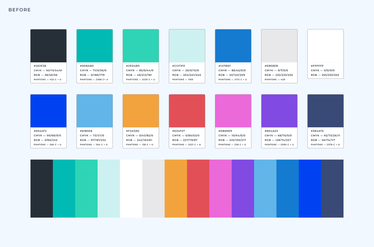
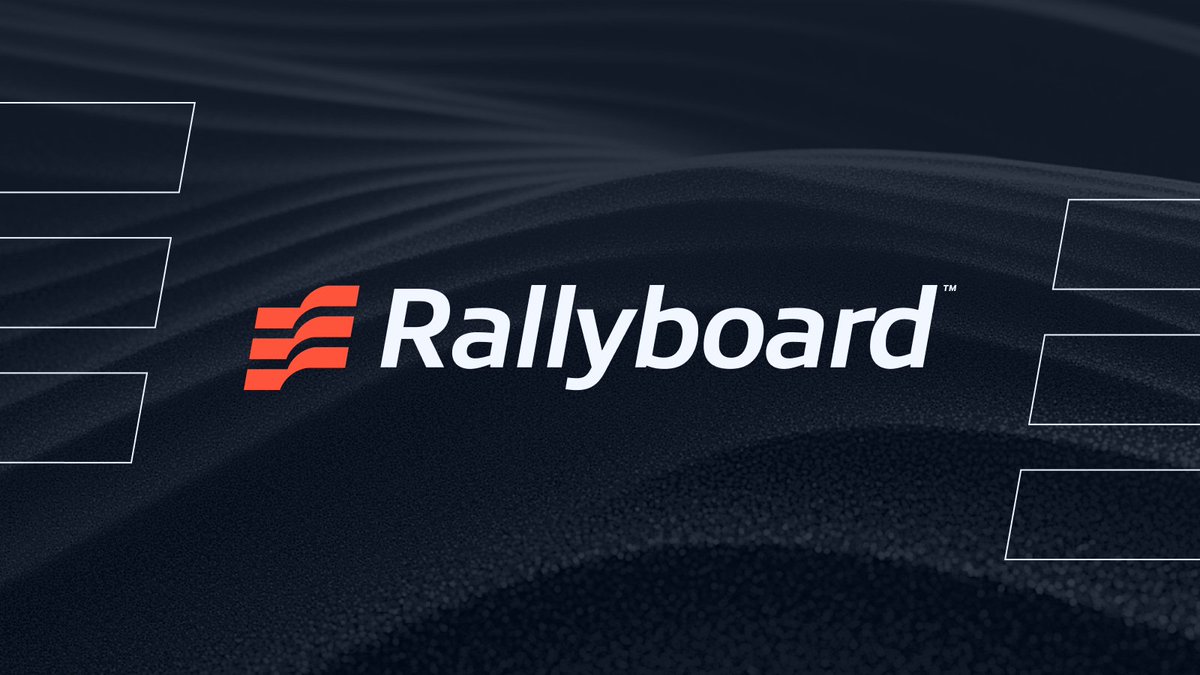
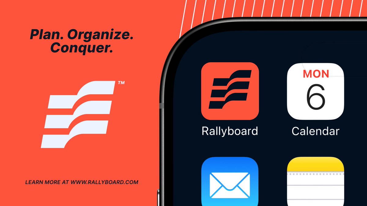
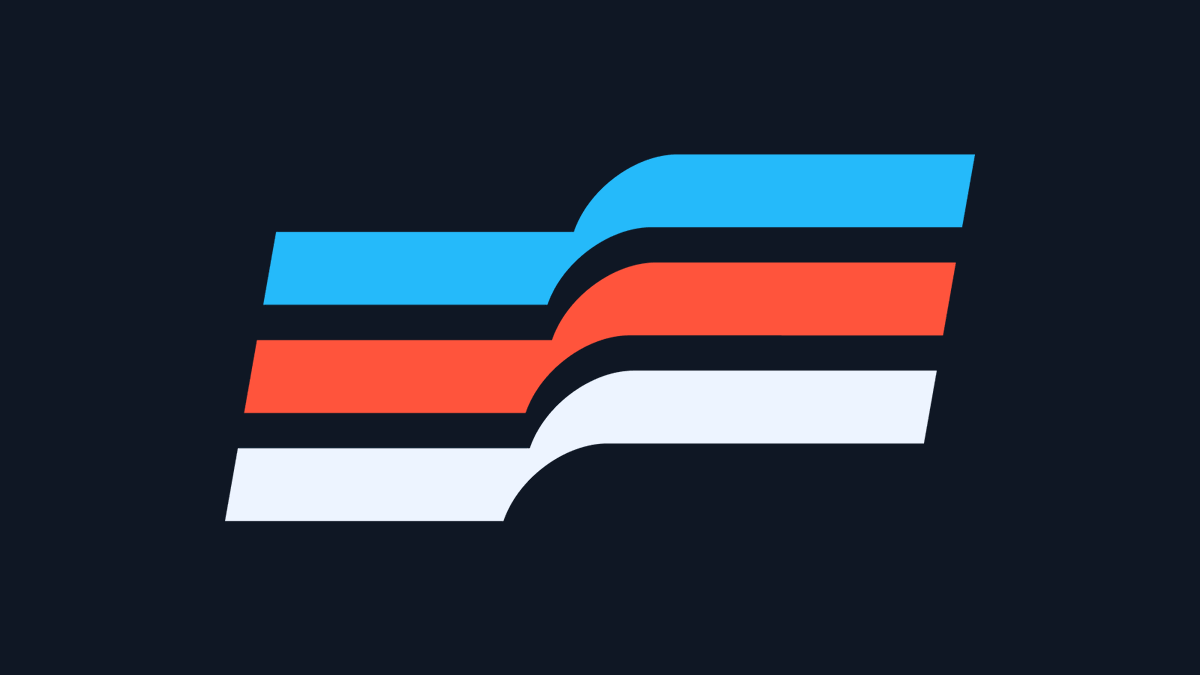
The Rallyboard™ branding sprint took a slight pivot halfway through the project, and I'm glad we did.
We felt that the original mark we landed on wasn't the best we could do, so we refined it further and removed the "R" shape and instead focused on creating an abstract mark that was both "flag" and "r".
The new mark is much stronger and more unique for the brand. It feels simpler and modern.
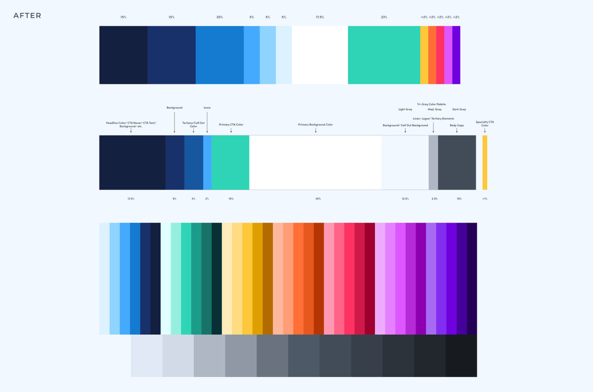
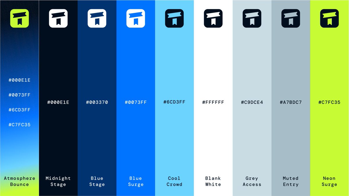
My favorite part of any branding project is color exploration and refinement.
Color is an essential part of any brand's visual identity, and with Ticketro, we wanted to give them a color palette to help them surge forward.