Our new identity and website for hormone specialists London Swiss Medical embraces the concept 'find, fit, flourish'. Hormones seek cells shaped to fit them, like pieces of a puzzle. We use shapes and counter shapes to illustrate this process.
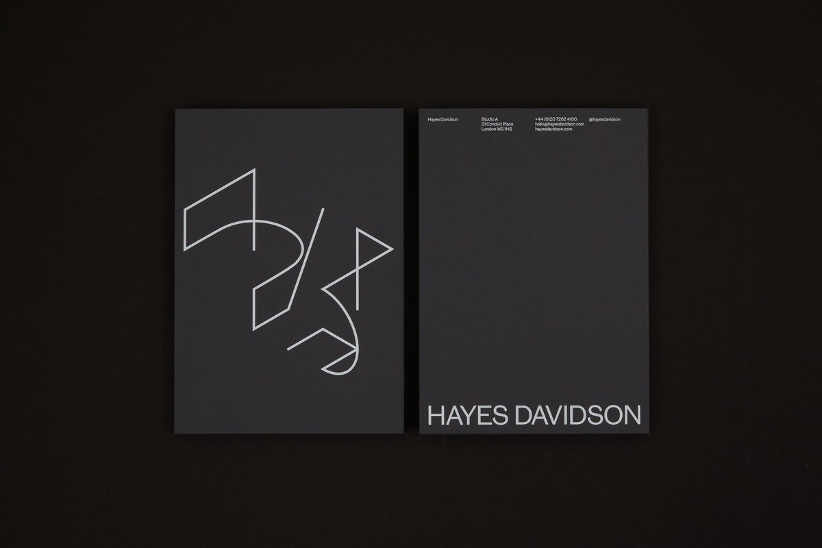
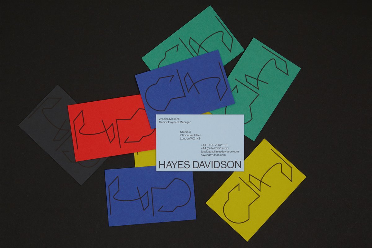
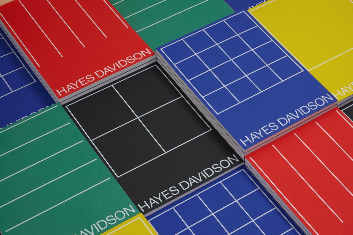
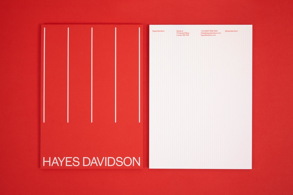
Hayes Davidson @hayesdavidson is a leader in the field of visualisation, working in the built environment for over 30 years. We created a new identity and site led by a living mark that prompts audiences to 'take another look’.
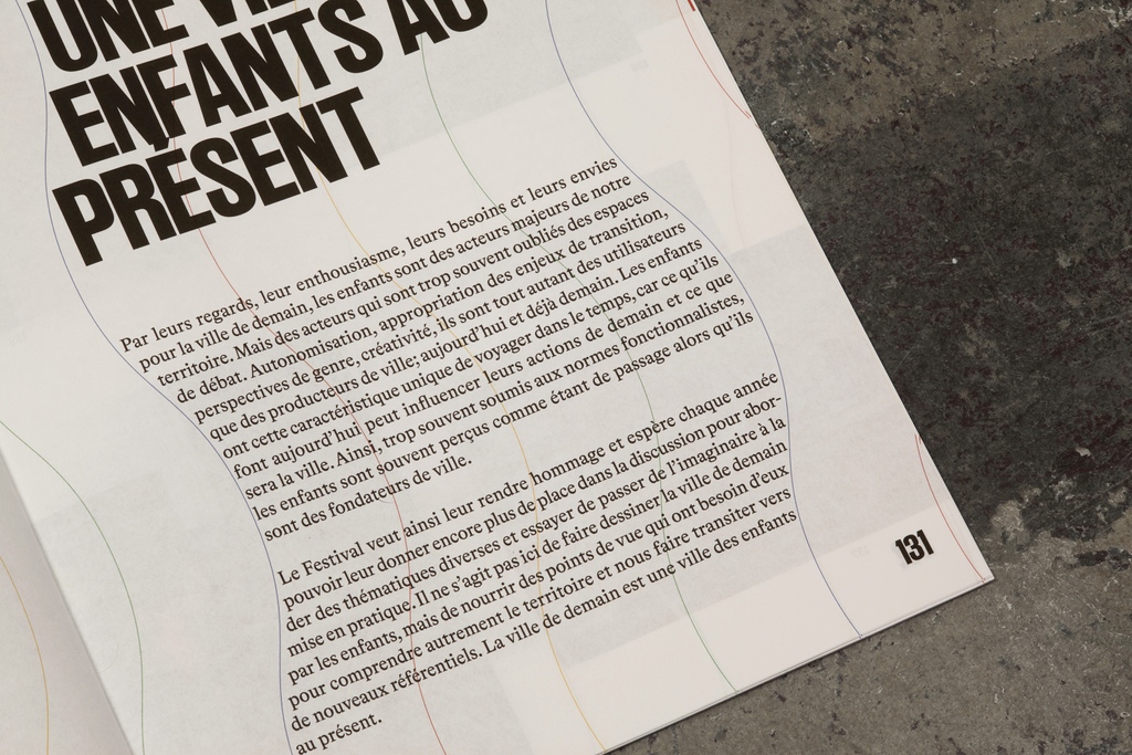
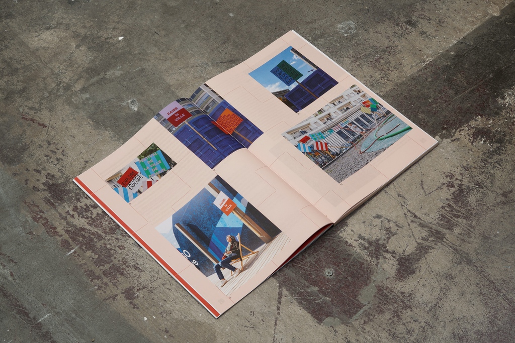
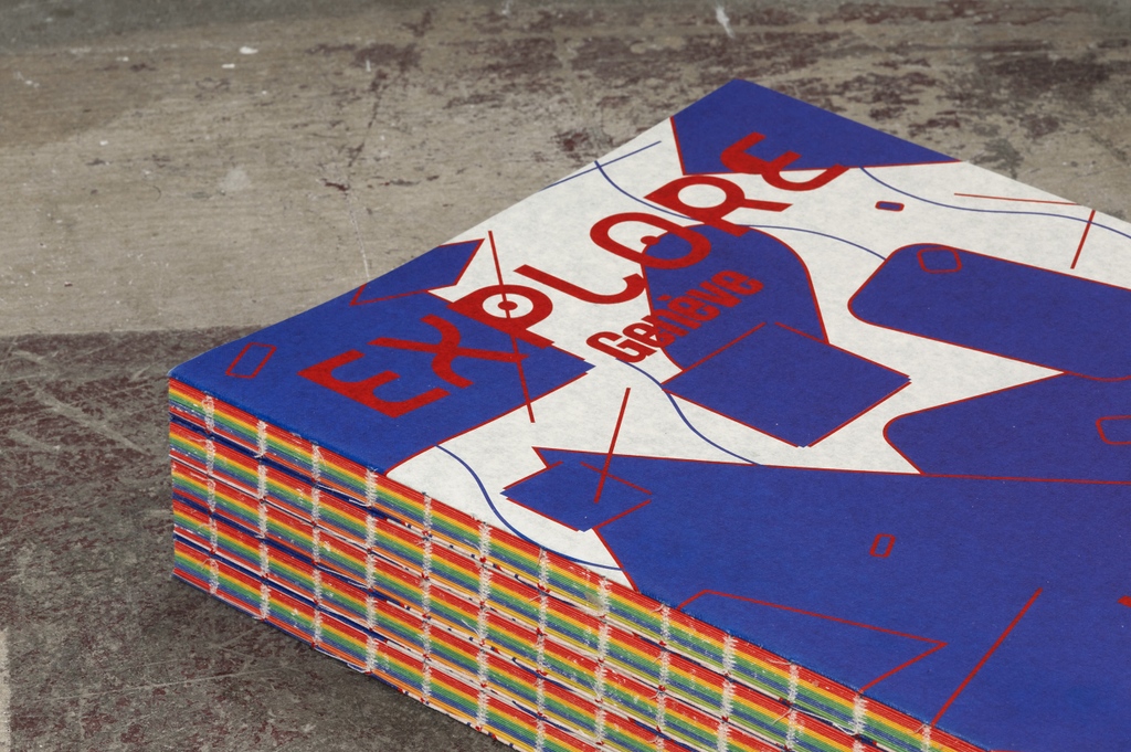
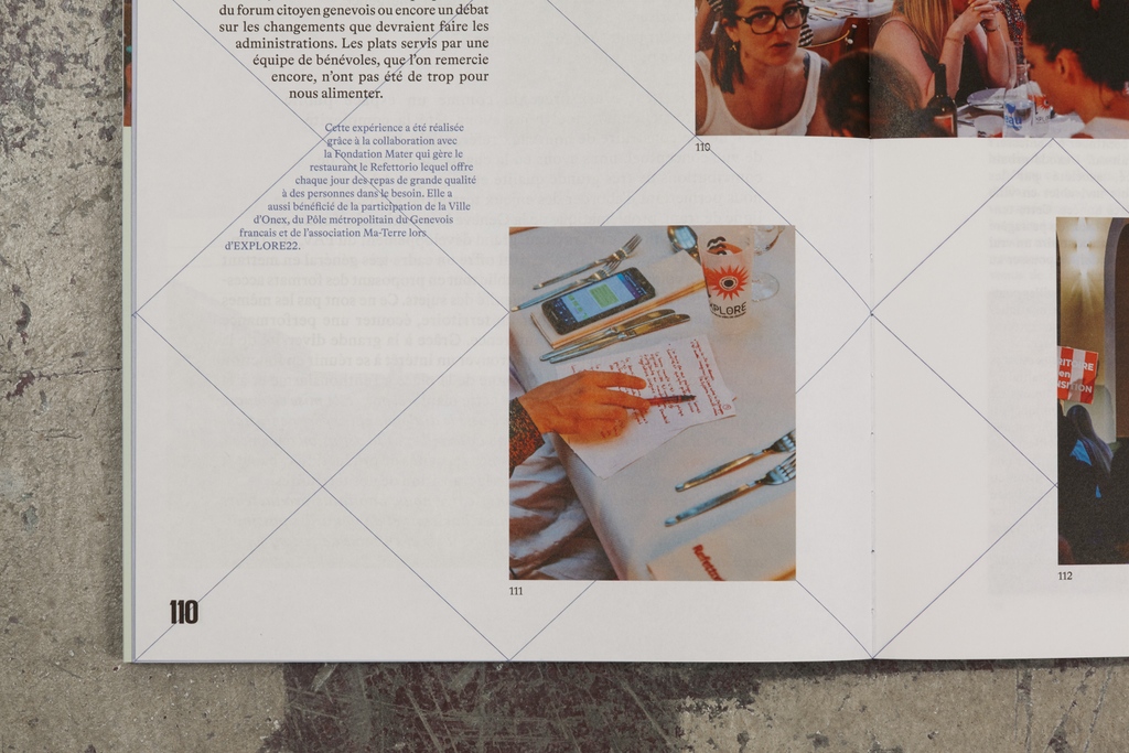
EXPLORE is an annual festival held in Geneva— ‘a programme of meetings, experiments, discoveries and exchanges to prompt the city of tomorrow’. We created a book to capture the festival’s evolution over its first four years and evoke its sense of playfulness and surprise.
This week sees the launch of the @KingstonSchArt show 2023! We worked with alumna Cicely Pilkington to develop the visual identity and website—a further evolution of the digital showcase space we first created with Kingston and @archivestudio in 2021. https://t.co/B7Gs0fapBE
. @up_landscape bring together landscape and architecture founded in empathic and enabling approaches to city, society & environment. We created a fresh identity and website combining the optimism of this practice with its fitting initials ‘UP’.
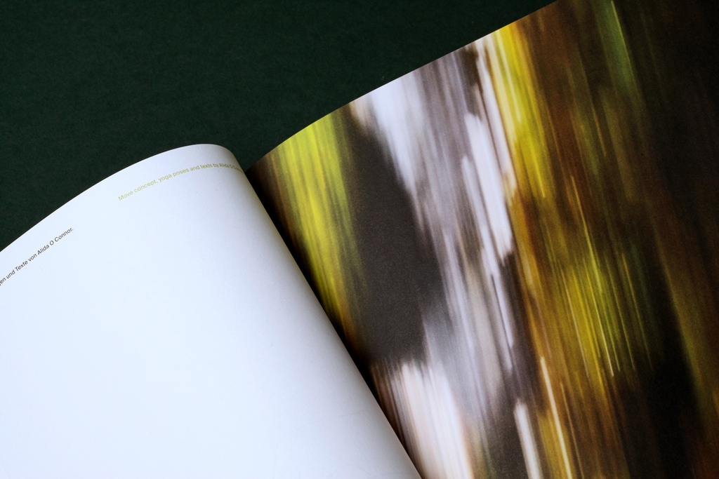
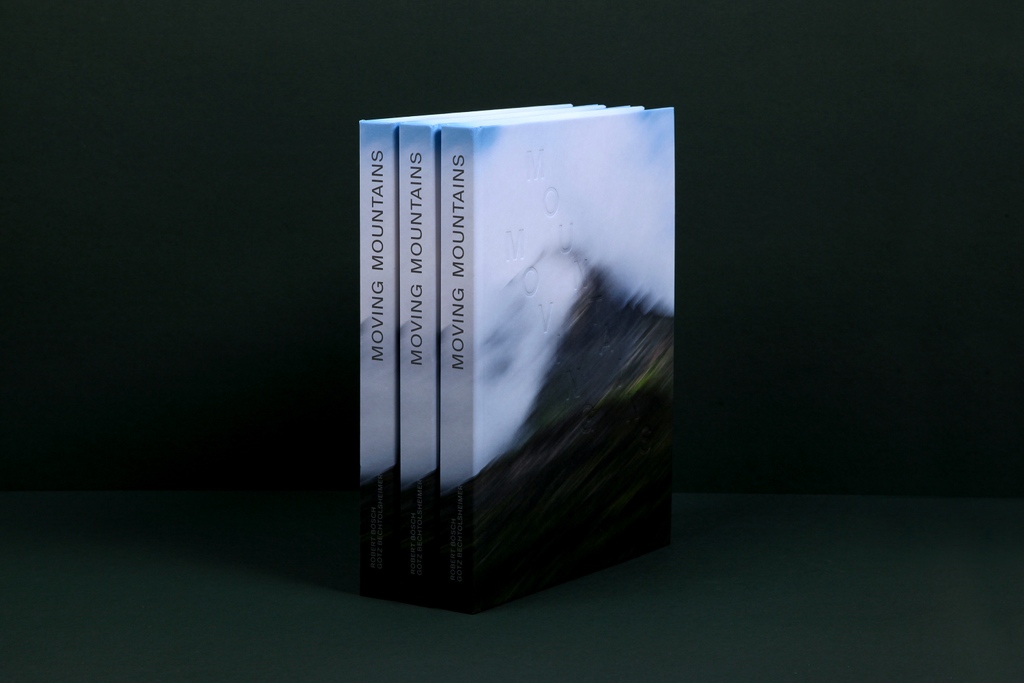
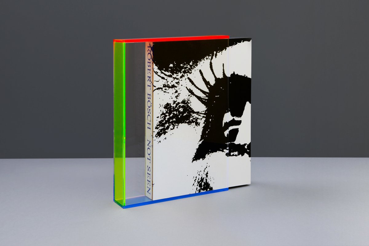
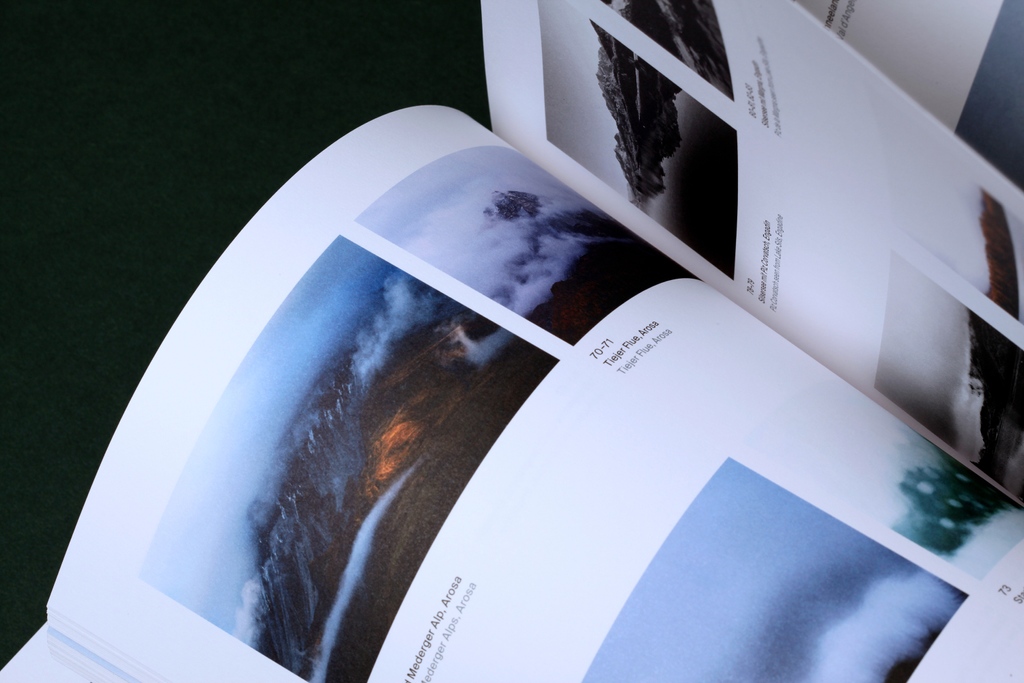
Book design for #MovingMountains by Götz Bechtolsheimer (Tschuggen Collection) with photos by Robert Bösch. It celebrates mountains across Engadin, Ticino and Arosa.
Print: Wolfau Druck
Binding: @bubu_ch
Illustration: @itsjoeyyu
Edit: @FreeEmma
Translation: Carolin Sommer
This winter, we’re celebrating Kerzenziehen—the Swiss folk tradition of candle-making. We’ve turned our studio into a cosy corner of Zürich by learning about this craft. The candles are made with pure beeswax, cotton, vegan dyes and lots of love from BOB.
#BOBaglow#BOBDesignLtd
The last award tonight is the Best Overall Category sponsored by @shermanscci - the winner is @SheppardRobson who have been on a huge journey overhauling its brand while bringing disparate parts of the business together.
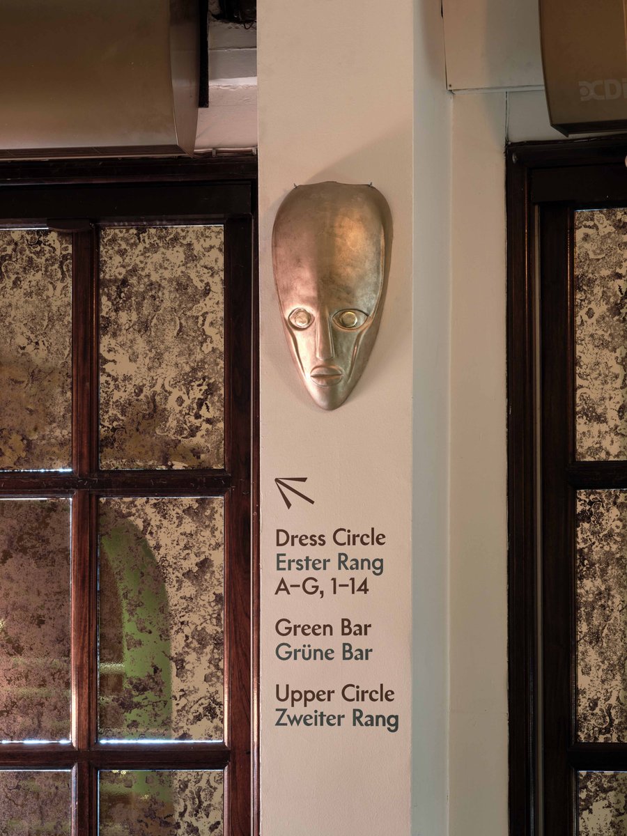
Signage and wayfinding for Cabaret @kitkatclubldn. Working closely with @tomscuttdesign, we blended typefaces Chap and Supreme to evoke themes of ambiguity. This subtle interplay is echoed in our hand-drawn pictograms.
📸 @thomasadank
Chap @schicktoikka
Supreme @lineto_com
Architects and urbanists @tatehindle are design custodians of places where people can live, work and enjoy every shade of life in between. We created their refreshed identity and website, with a concept centred on shape, space and shade.
https://t.co/JkQNuJ0cyL…
✍️ @FreeEmma
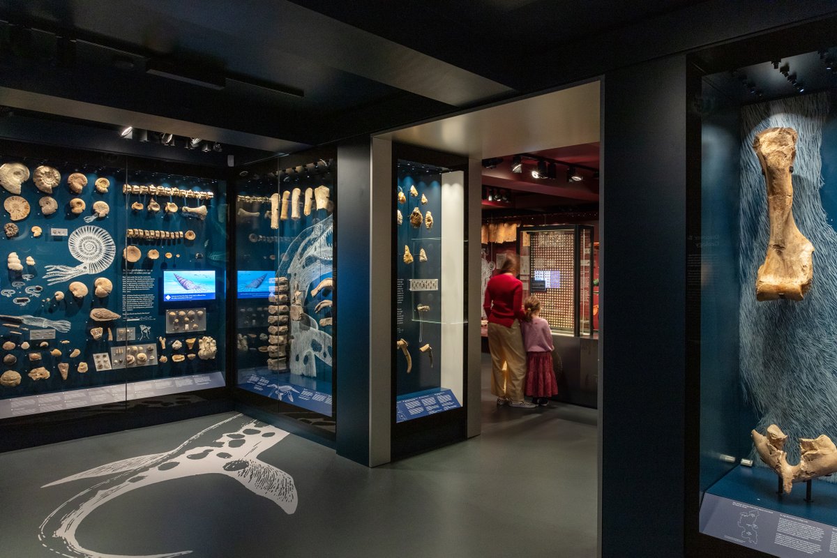
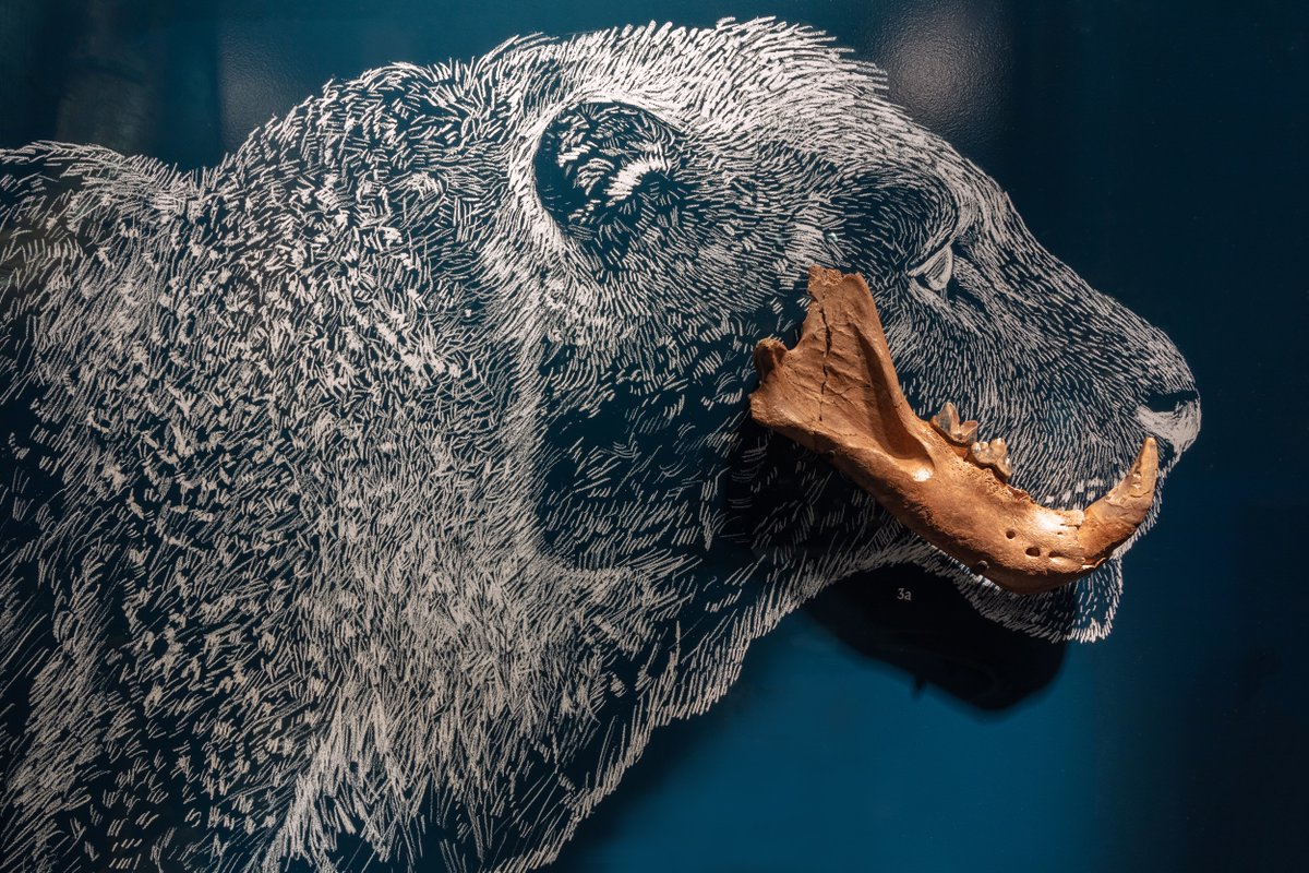
@BucksMuseum tells the story of Buckinghamshire and beyond, from 200 million years ago to the present.
With @gibsonthornley we transformed the space through the design of 5 new galleries themed on geology, archaeology, people, art and wildlife.
Illustration: Matthew Lewis
On Tuesday 26th July we are hosting "Fight Club: Rumble in the Concrete Jungle", the third in our Fight Club programme, a series of provocative conversations on today’s big issues, hosted by @SITESuperNature.
Tickets are free and are available:
https://t.co/2PDNNbW77q
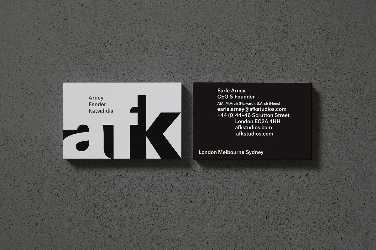
Our new visual identity for architecture practice @AFK_studios explores the concept of duality, reflecting their work as architects and interior designers, southern and northern hemisphere influences and deeper interplays in their practice.
🖥️Official Business
✍️Diane Hutchinson
We're excited to see the launch of the @KingstonSchArt show 2022! We worked closely with Salah Kritchen from KSA’s Black, Asian and Minority Ethnic Alumni Advisory Group to develop the show���s identity, website, and onsite posters, wayfinding and printed literature.
Eòlas is a fashion brand taking its name from the Gaelic word for knowledge, echoing the Scottish roots of founder Colin McNair and the traceability of every material and making process.
We've created their identity inspired by historic Gaelic manuscripts.
📸by Jenna Jones