12 Day Giveaway! 🎁
In this thread, I will be giving a course, book, or workshop for the next 12 days. 📚🏫⌨
To enter, just retweet the daily tweet. At the end of the day I will select one (or more) of the retweeters. 📅
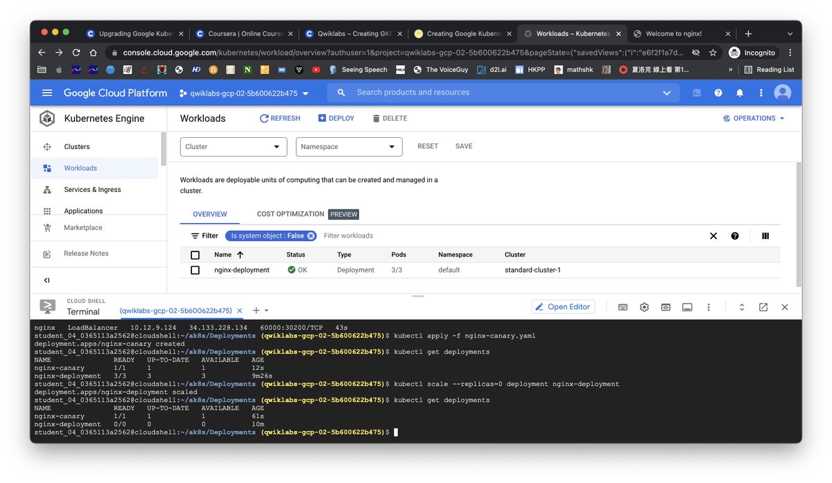
Day 50 of #66DaysofData with
@KenJee_DS#Kubernetes#GoogleCloudLearn
I have done the Deployment training of Kubernetes on GCP today. It is interesting to see how to scale up and down the number of Pods in the deployment.
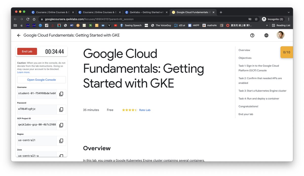
Day 43 of #66DaysofData with
@KenJee_DS
To access the GCP training, Google Qwiklabs has required me to use Icognito mode on Chrome. However, it doesn't work until I have created a new user account on my Mac. What an experience!
#GoogleCloud
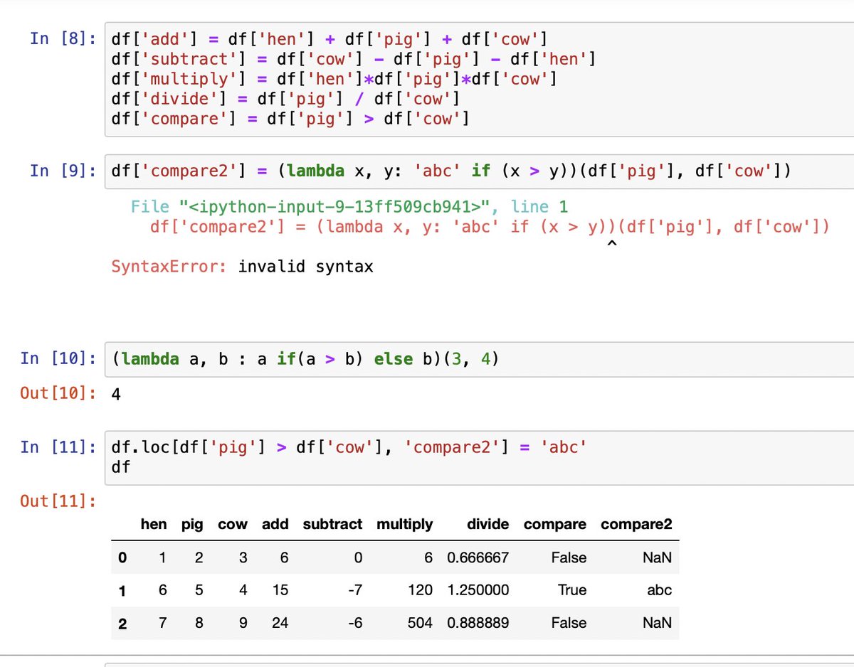
Day 42 of #66DaysofData with
@KenJee_DS
(cont'd) Lambda functions work for scalar (line 10) but not vectors (line 9). You can make it work with more complex code. However, I recommend the form (line 11) - more readable, easy to maintain.
#coding#visualization # Python
Day 41 of #66DaysofData with
@KenJee_DS
When you convert legacy Excel into Python, there will be a lot of vectorisation. I would show you that in Pandas, you can do simple operations in vectorisation (line 8).
#coding#visualization # Python
Day 40 of #66DaysofData with
@KenJee_DS
It is easy to combine lambda function and loc[] in Python. This receipe offers excellent control of the pivot table generation compared to Excel. It is scalable for multiple subgroups.
#coding#visualization # Python
Day 39 of #66DaysofData with
@KenJee_DS
In excel, we use reference methods to group sums and proportion. In Python, we could use the loc function to locate a group and then make reference to the columns for sums.
#coding#visualization # Python
Day 38 of #66DaysofData with
@KenJee_DS
This is Florence Nightingale's visualization of her data on the causes of mortality in 1855. She was a pioneer in statistics.
#coding#visualization
Day 37 of #66DaysofData with
@KenJee_DS
Statisticians call these the Datasaurus Dozen datasets. They have 12 different patterns but have the same summary statistics. The takeaway is: always try to visualise your data but not just read the summary.
#Coding#visualisation
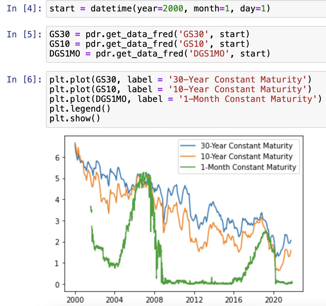
Day 34 of #66DaysofData with
@KenJee_DS
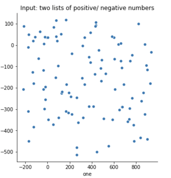
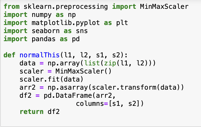
I have built a function to normalise two lists of arbitrary range with Scikit Learn functions. The function transforms the lists into an array for fitting and then publishes the result in a data frame.
#Coding#Python#visualisation
Day 33 of #66DaysofData with
@KenJee_DS
This is solar dataset @kaggle . It has lots of features to practise Pandas. This table shows that although Sun is massive, its density is only slightly higher than Jupiter. The chart visualises this.
#Coding#Python#visualisation




![CFAcodes's tweet photo. Day 40 of #66DaysofData with
@KenJee_DS
It is easy to combine lambda function and loc[] in Python. This receipe offers excellent control of the pivot table generation compared to Excel. It is scalable for multiple subgroups.
#coding #visualization # Python https://t.co/LlEjNBlXji](https://pbs.twimg.com/media/E_AX9N1VEAA3zJR.jpg)