We had fun with the language for our rebrand of Awon Golding, which suited the people wearing the hats.
See more on our website:
https://t.co/XOWEQWwJgU
New work for hat maker Awon Golding.
Awon’s creations have graced the heads of global icons, but the brand needed a glow up to compliment the hats.
We designed an elegant & joyful visual identity inspired by the hats, with a playful tone of voice. Topped off with a new logo.
We recently went to Toulouse-Lautrec & the Masters of Montmartre exhibition on at the Victoria Art Gallery in Bath. It’s got some great lettering & lithography. We can recommend visiting it.
We picked out some favs on our blog:
https://t.co/aaEHUUaDn0
Beyond a new symbol, we introduced an identity system to be used across stationery, members’ handbook and invites. The new look balanced crisp, modern typography and a strong graphic structure with expressive letterpress printed type from our collection.
—
https://t.co/1WO3OujKqu
Named after the father of Fleet St, The Wynkyn de Worde Society is dedicated to excellence in all forms of printing. Last year, as honorary designers, we created an updated version of their sun identity using the WDW initials.
—
https://t.co/1WO3OujKqu
This year, our client Ava Investors hosted their second Masterclass, where they were joined in conversation with world leading economist & ex-world leader Mario Draghi.
As Ava’s long-term brand partners, we created the comms for the event—from digital invites to venue graphics.
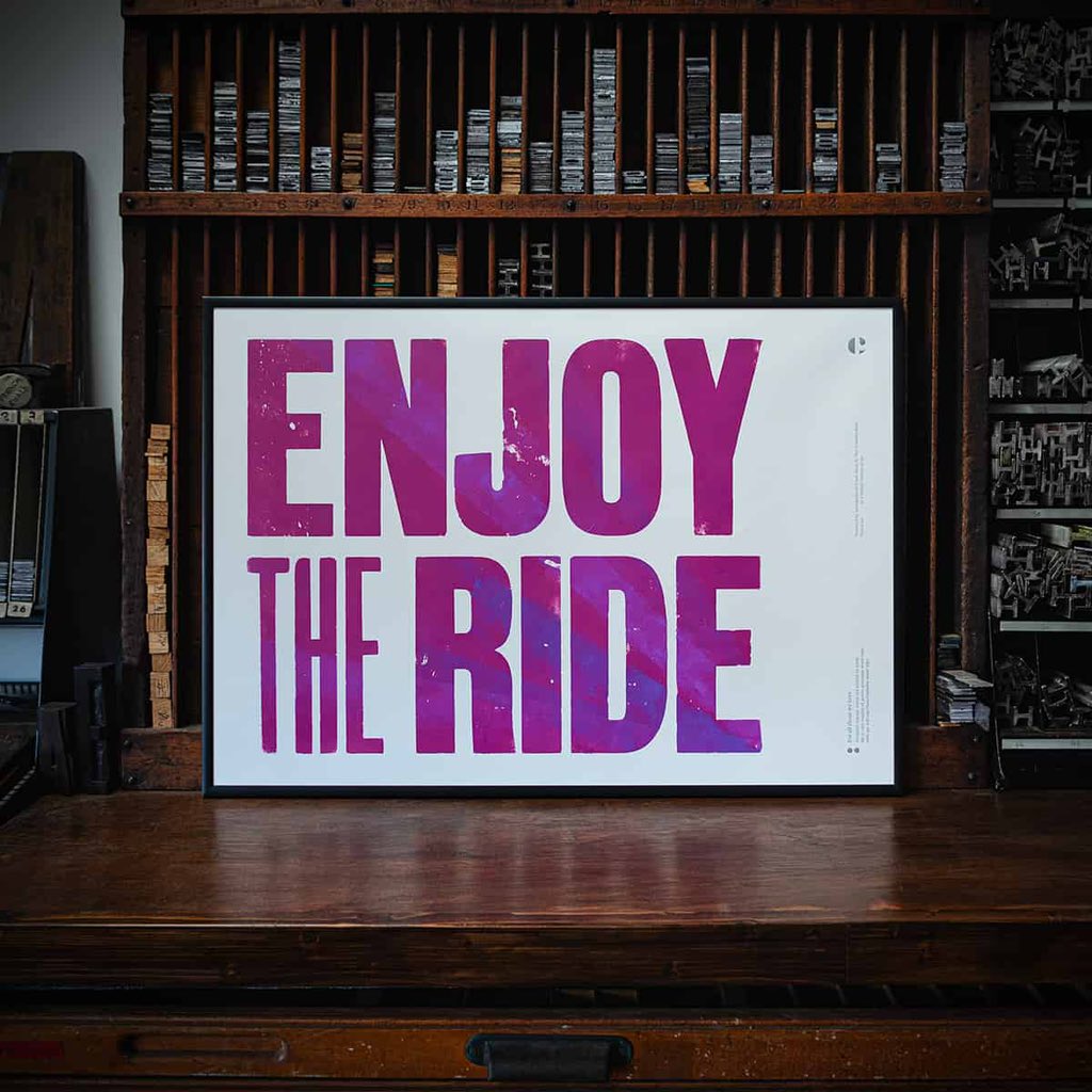
Our new print in memory of those we love and in aid of Cancer Research is available to buy now!
It’s a limited edition #letterpress print, inked by hand, making each one unique.
—
https://t.co/D5x8X4NmgA
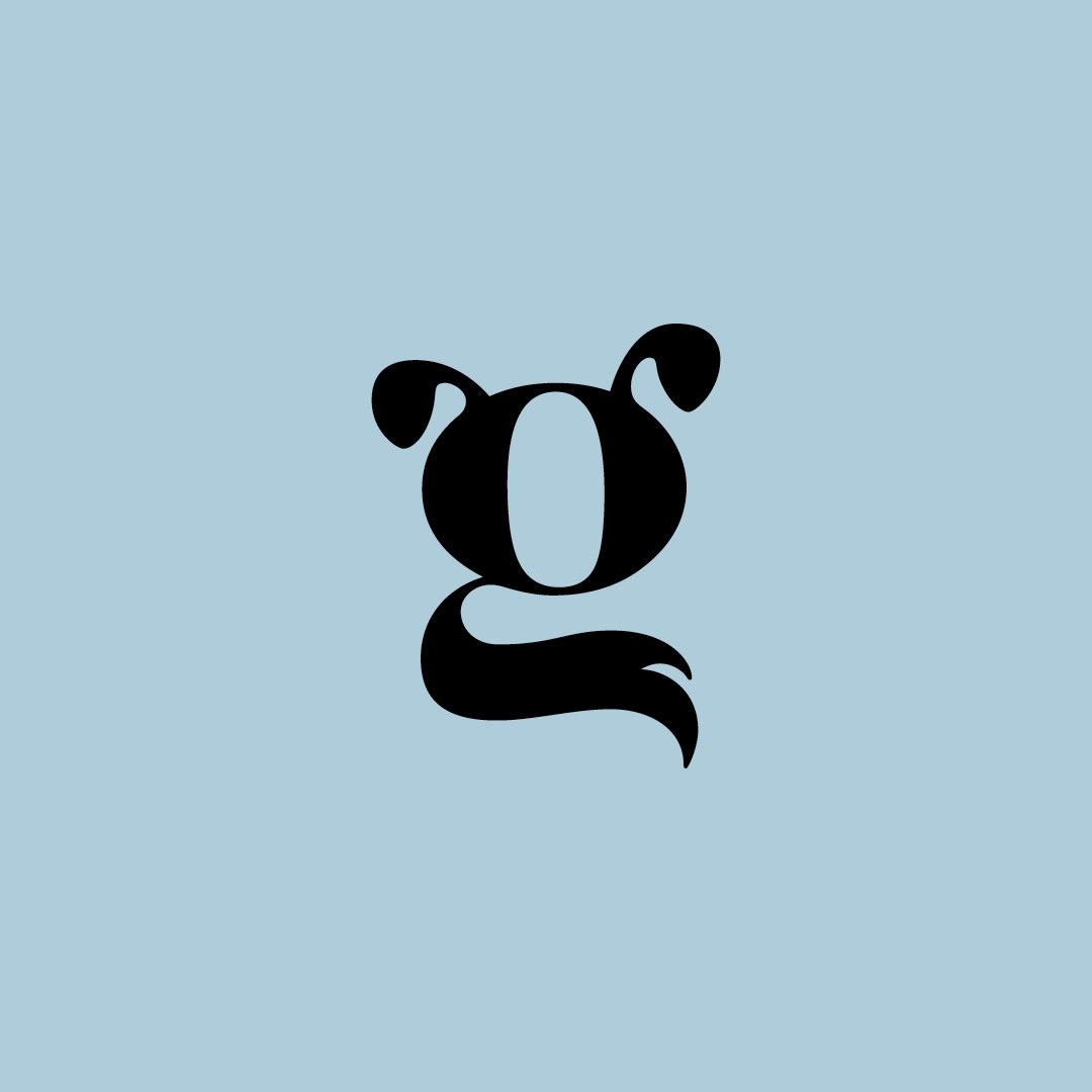
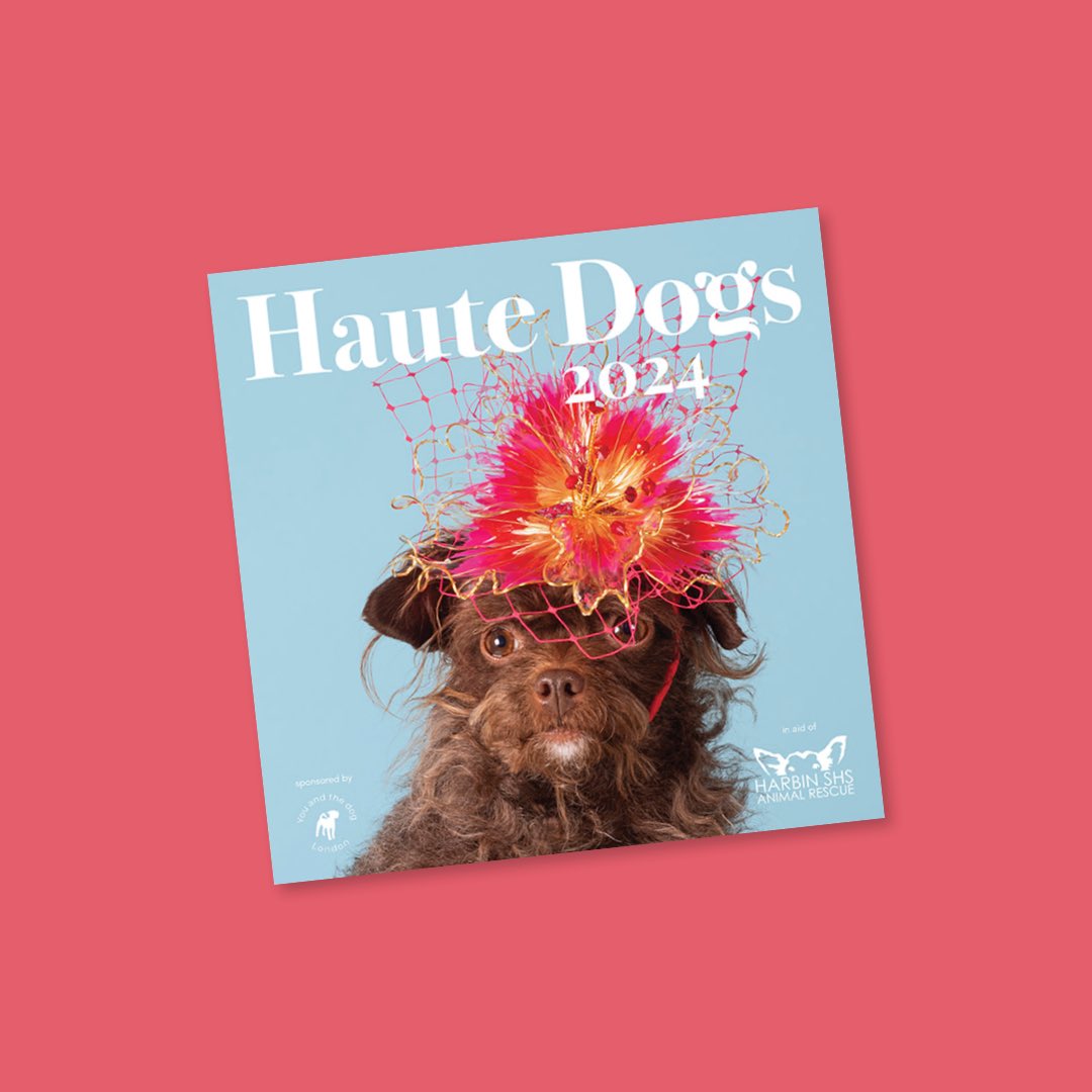
We’ve enjoyed working on the new Haute Dogs logo, because who doesn’t love dogs in hats for charity?
Go and grab yourself a calendar for 2024 : https://t.co/044lxS31JR
This time last week we were at @3daysofdesign in Copenhagen. These was so much inspirational design to see, but we’ve captured our favourite bits on our journal.
We’d recommend a visit next year.
https://t.co/WgWln2zfAm
Last weekend we went to Raw Wine’s first fair in Copenhagen. It was brilliant to see the brand in action and taste some incredible wines.
See more on our journal 👀🍷
https://t.co/v3vOO5ViOI
New Work: naming, strategy and identity for WeAre – the world’s first social network and publishing platform dedicated to family history and genealogy. A place to collect, organise and share the story of who we are…
🚨Tickets are out for our first Turn Up event.
Our wonderful speakers are: @MrCraigWard@katiecad@admrodgers @engyelboreini, we're super excited.
🎟https://t.co/tExij3W3OP
Almost 6 years after starting it, Extra Condensed No.3 is almost finished. So now felt like the right time to share our amazing contributors… We’ve convinced @espiekermann, @PauloBarnesi, @bodoni20, and @AstridStavro to be involved!
See more: https://t.co/nvMIbbjEbH
Last week we were out of office in and around Bordeaux checking out some of the great ghost signs and lettering.
See more on our journal
https://t.co/a2imVYzYQq
Each job we do starts in a different place, so inspiration comes from different places too. For our rebrand of Cyprus Kitchen, we looked to founder Nick’s Cypriot heritage and discovered a world of pottery from 11th–4th Century BC.
See more on our journal
https://t.co/vMTrZJ9JLl
Over on Instagram we’re delving into our logo library each week.
We’re biased, but this is still one our favourites for our letterpress workshop and private press @thecounterpress