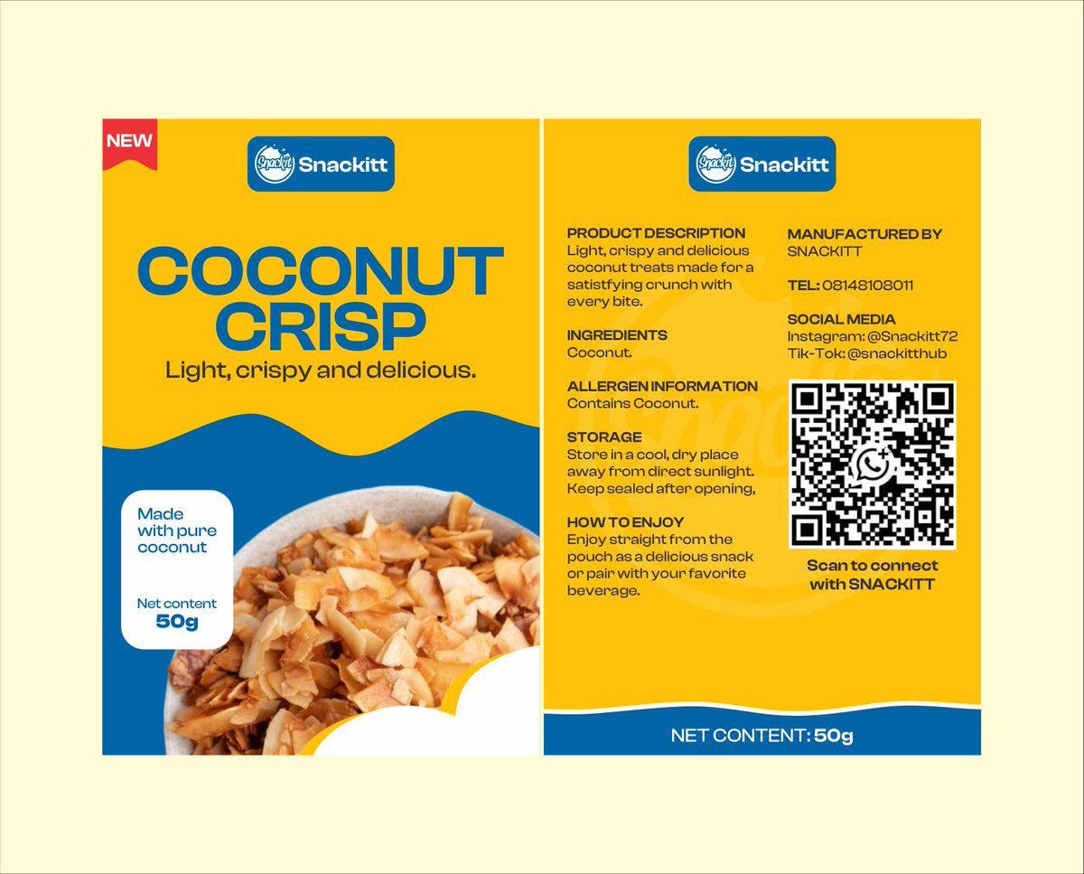
Two snacks, one brand, and a label that has to work in 3 seconds on a shelf and still carry the facts a food buyer needs.
Here's how I designed it, from the brief to the final label 🧵:
I'm 19.
A packaging and marketing designer.
I design packaging and launch ads for product brands.
Happy to connect with fellow designers, marketers and builders 🤝
Clean ads sell better than busy ones.
One product, one message, and benefits that are easy to scan. That's the Orelle products ad.
Need ads like this for your skincare or wellness brand? DM me.
Someone said my Snackitt ad "makes it clear who it's for."
That's good marketing design. A pretty design gets compliments. A design that tells one group "this is for you" gets orders.
Before you design, ask: who should stop scrolling?
The packaging was step one. Now the launch ads for Snackitt.
Same yellow and blue as the pouch, so the ad and the shelf feel like one brand.
Campus-ready, scroll-stopping, and built to get both flavors noticed.
Which slide is your favourite?
Two snacks, one brand, and a label that has to work in 3 seconds on a shelf and still carry the facts a food buyer needs.
Here's how I designed it, from the brief to the final label 🧵:
Two snacks, one brand, and a label that has to work in 3 seconds on a shelf and still carry the facts a food buyer needs.
Here's how I designed it, from the brief to the final label 🧵: