Been working on an activity discovery app
The idea is to make it easier to discover things to do, find communities, and make plans around shared interests.
Right now, I’m working through the activity discovery experience, event details, RSVP flows, bookmarks, and how everything connects to My Activities.
Still a work in progress, but I’m enjoying figuring out the product beyond just the screens.
More soon😃
#WIP 🚧#UIDesign
I think Figma make for me actually because the first section says curated & tranding and it’s the only one that has more than one item the rest have just one hero like card
Then the top playlist it actually gives a list amd using numbers to indicate the top ones claude so off and chat gpt would have been my choice but that curated and trending section killed that decision for me.
Working on Ayce a FoodTech consumer app making multi-restaurant food ordering and delivery easier.
One of the things I paid a lot of attention to was typography.
Because when you’re designing a food app, there’s a lot competing for attention, food names, prices, ratings, offers, categories, buttons…
If everything is loud, nothing is important.
That’s where typography comes in, it can make or break your design.
Size. Weight. Spacing. Hierarchy.
Small decisions, but they completely change how quickly someone can understand a screen.
#WIP
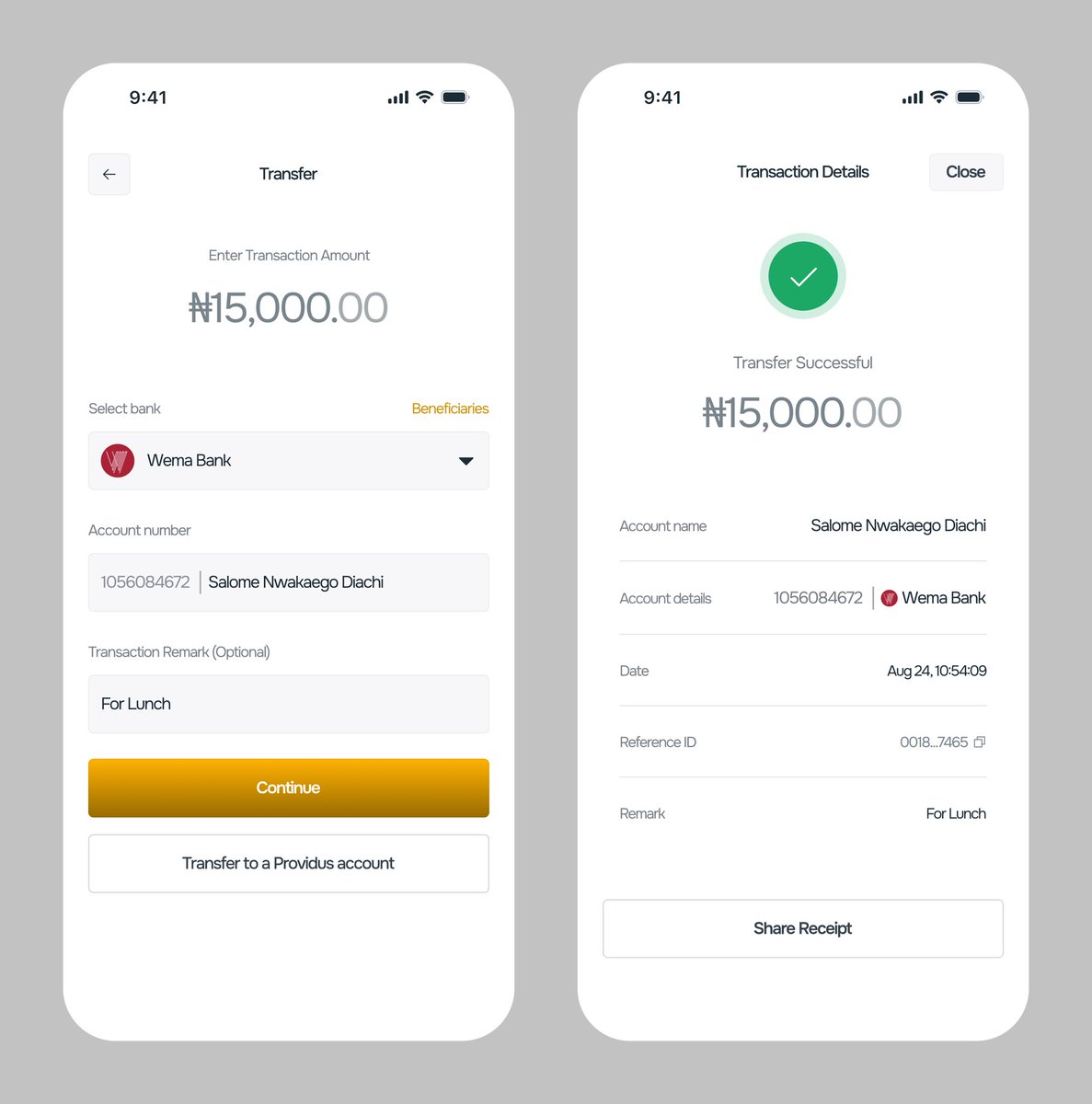
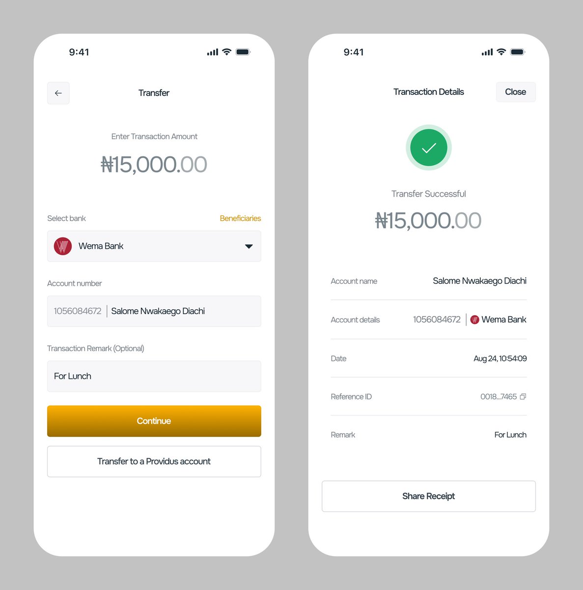
Been exploring the ProvidusUnity mobile app lately, wondering how I could make the experience feel better.
Looked closely at the existing experience, questioned some decisions, and experimented on what could be improved
A few screens from the exploration so far
@Providusunity
Working on Ayce a FoodTech consumer app making multi-restaurant food ordering and delivery easier.
One of the things I paid a lot of attention to was typography.
Because when you’re designing a food app, there’s a lot competing for attention, food names, prices, ratings, offers, categories, buttons…
If everything is loud, nothing is important.
That’s where typography comes in, it can make or break your design.
Size. Weight. Spacing. Hierarchy.
Small decisions, but they completely change how quickly someone can understand a screen.
#WIP