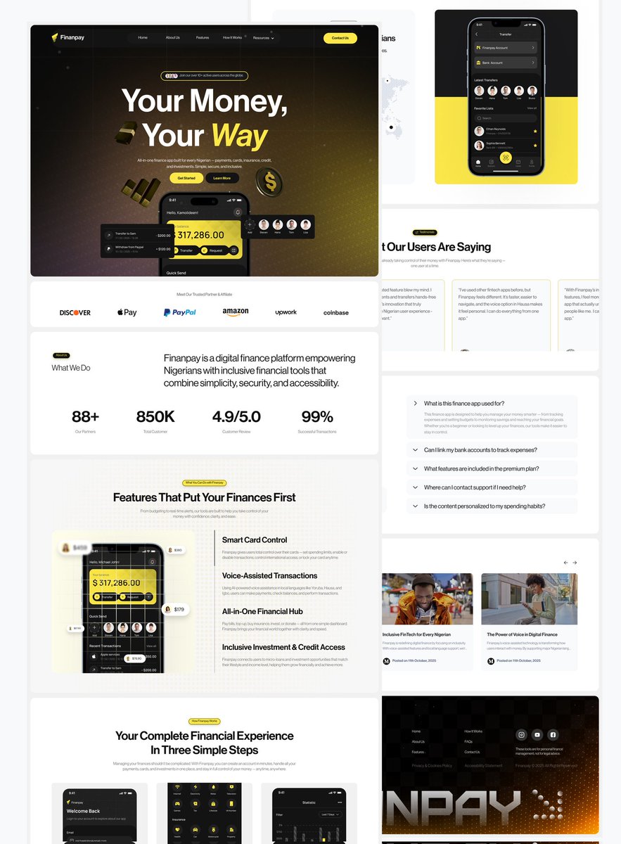
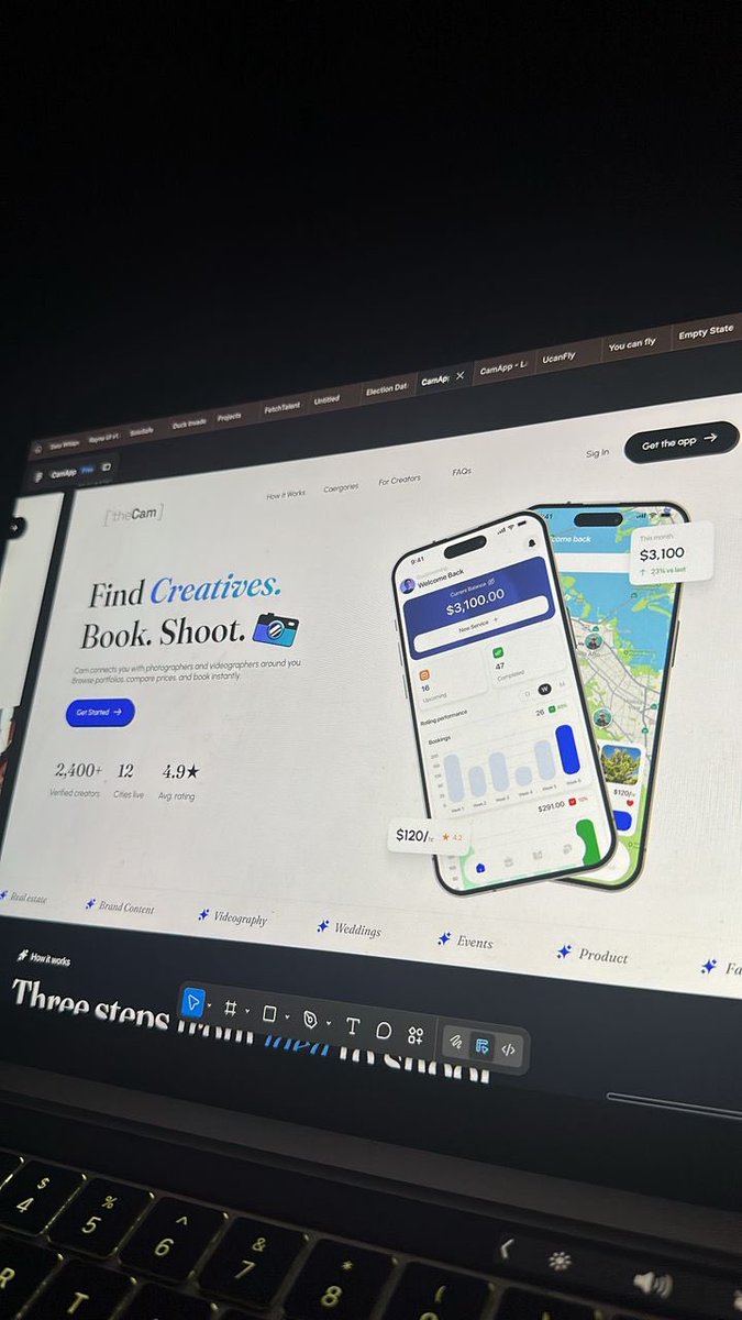
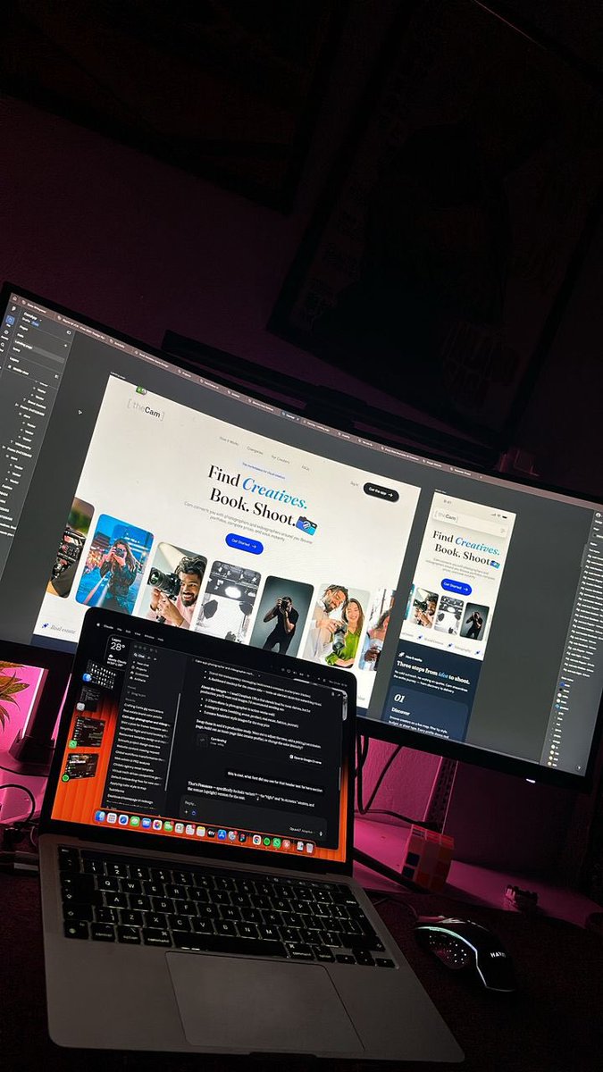
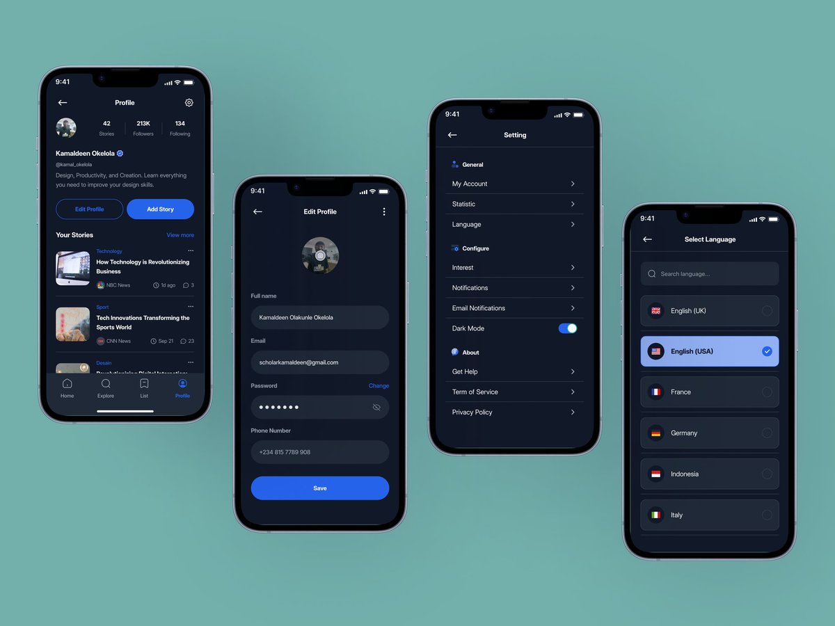
Your landing page isn’t just a homepage — it’s your first pitch.
Make it clear. Make it simple. Make it convert.
If you’re a business owner or startup founder looking to design or revamp your landing page for better conversions, I can help.
Let’s build something real together.
19 days after @figma FIGMA MOTION dropped and I was able to squeeze this out of it. For a software in Beta, not bad.. 🚀🔥💜
I did my best to pay as much attention to the original as I could😄.
I've been seeing alot of fancy & cool stuffs done with it, but I actually wanted to see it do the hard stuff that brands could pay $$ for.
Thank you all once again for your support, following the process from the day I started. It gets better from here🚀💜.
UI design & Motion - @figma
Sound & Video edit - @capcutapp
Just published my latest UI/UX case study — PedalDrop 🚲
PedalDrop is a bicycle-powered campus delivery platform I designed from scratch for university students at the University of Ilorin.
Check it out here 👇
https://t.co/JESjcek1ko
#uiuxdesign#ProductDesign#CaseStudy
Most people jump straight into design. I don’t.
I understand the problem, study users, analyze competitors, and define clear goals before touching a single pixel.
Design isn’t decoration. It’s strategy. ✔️
Looking to work with a designer, Send a Dm let’s talk 📩
You don’t need more motivation.
You need structure, pressure, and people who won’t let you slip.
That’s what accountability partners give you. Find one if you are build a career or anything. It’s easier to succeed that way.
Users don’t leave because your product is bad.
They leave because it’s unclear.
If people don’t instantly know:
- what to do
- where to go
- what happens next
you’ve already lost them.
Clarity > aesthetics.
More features ≠ better product.
Every new option = another decision for the user.
Too many decisions = confusion.
Good design is not about adding more.
It’s about making things easier.