11 rounds of chemotherapy. 💔
Looking at how far my sister has come and everything she has had to endure fighting cancer, I honestly just want to see her win this battle. So much pain, yet she is still fighting.
Please don’t give up on her. We’ve come too far already. Help us get Lauretta to the finish line.
Donation link is in my bio.
For direct transfer
0247265533
GTB: Duke, Margaret
Nothing is small 🤲🏾🤲🏾🤲🏾
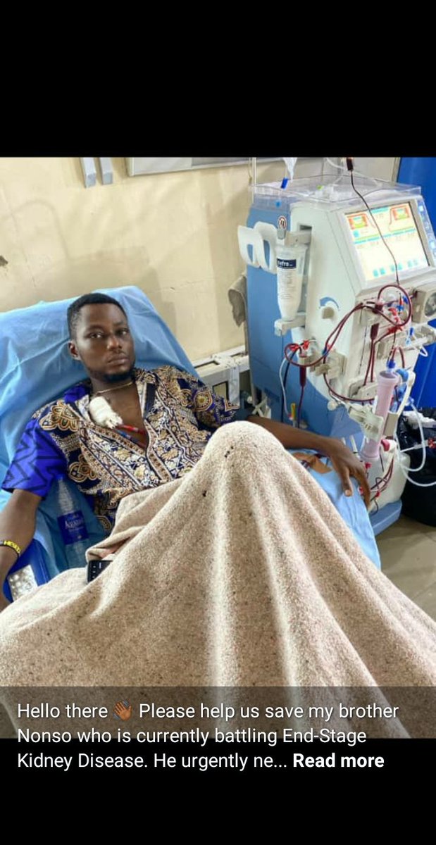
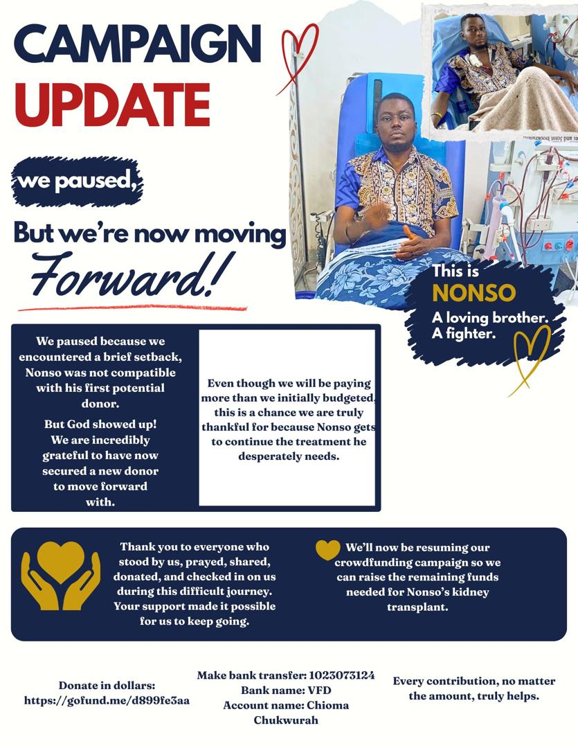
We paused for a moment after a painful setback, but we're back with a renewed hope.
Nonso still-has a fighting chance.
Thank you for-standing with Us.
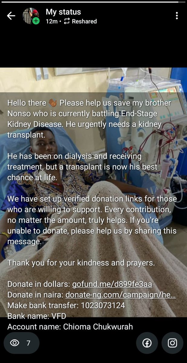
Donate in dollars: https://t.co/sUlgjitWL0
Make bank transier: 1023073124
Bank name: VFD
Account name: Chioma Chukwurah
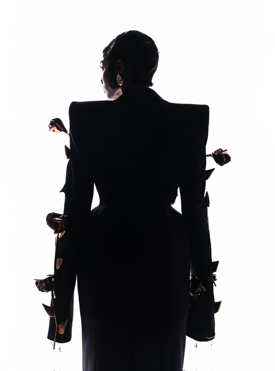
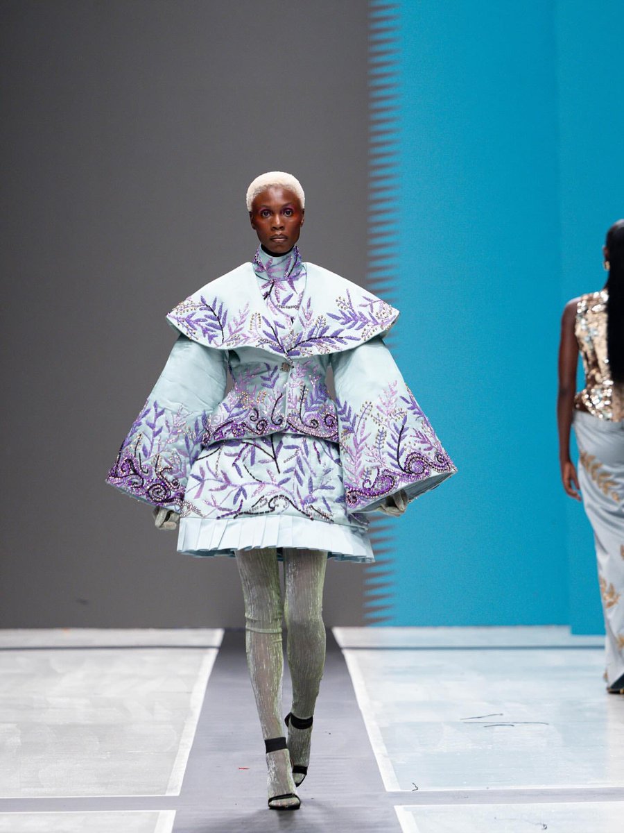
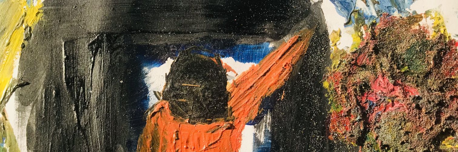
Four brands. Four different visual systems doing the same job: making you remember them.
This is what actual brand assets look like in action. Not just a logo and some colors. A language. A structure that holds across every execution so recognition builds instead of resets.
MetroExit owns bold color blocks and 3d product-led simplicity. BrownsView uses illustration and energy. When Women Lead roots everything in pattern and heritage. Savlen leans into editorial restraint and portraiture.
Different strategies. Same outcome: you see it once, you know who it is the next time.
If your brand doesn't have this kind of system, every post is starting from scratch. And that's a waste of money and attention.