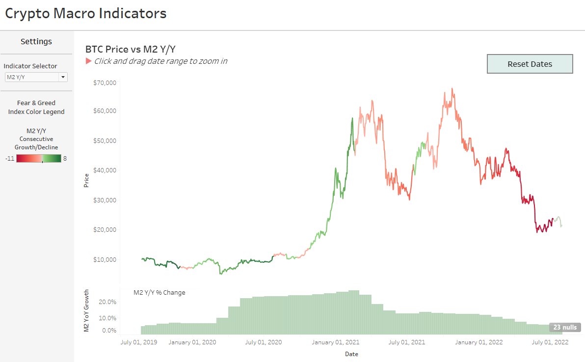
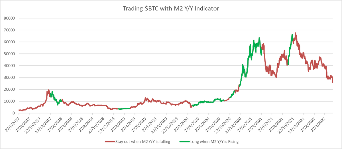
@0xroborosCap recently highlighted the close knit relationship between $BTC/#Crytpo and M2 Money Supply.
I've built an interactive dashboard that builds on their work that I've made publicly available.
I have a tendency to reflect in a bear market and ask not could've been done differently but rather which part of the investment framework could've been better. Presenting the one indicator that could have saved us all.
With $BTC aproaching all time highs, I wanted to revisit an old dashboard of mine, looking at the relationship between price, sentiment and M2 money supply.
Sentiment levels have now reached 'Extreme Greed'
@Chinchillah_ @GMX_IO Great work! I like that you've looked at profits in relation to OI%.
I made a dashboard looking at something similar (albeit with a shorter date range sample) if you want to check it out
https://t.co/k6IfbjtQB8
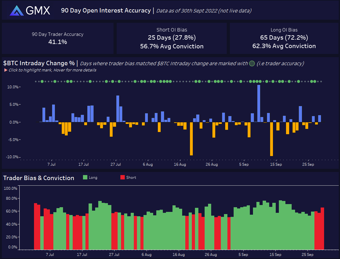
I've seen suggestions that @GMX_IO open interest could be used as an reverse indicator to go long/short. (i.e GMX OI is majority short, enter a long position)
I've built a dashboard that looks at the numbers from the last 90 days: https://t.co/mBIPEbkfd2
Short 🧵:
@jimcramer has turned himself into a bit of a meme, so much so the existence of the #InverseCramer ETF may soon be a thing (@CramerTracker)
I've built a dashboard that looks at the performance of his more recent stock picks:
https://t.co/DGIkDLLsMM
🧵with some highlights:
Many thanks to @QuiverQuant for collecting all this data. (please dm me if you can share the full dataset of CNBC's stock recommendations, it'd be interesting to look at their entire history, rather than just recent picks)
@YahooFinance was used for Ticker pricing data.