@Jasonforrestftw@petermckeever@DataVizSociety We’re so waiting for our prints to arrive. 🤩 Is there any knowledge if issues to Germany, Sweden or Portugal are already send off soon? Thanks!
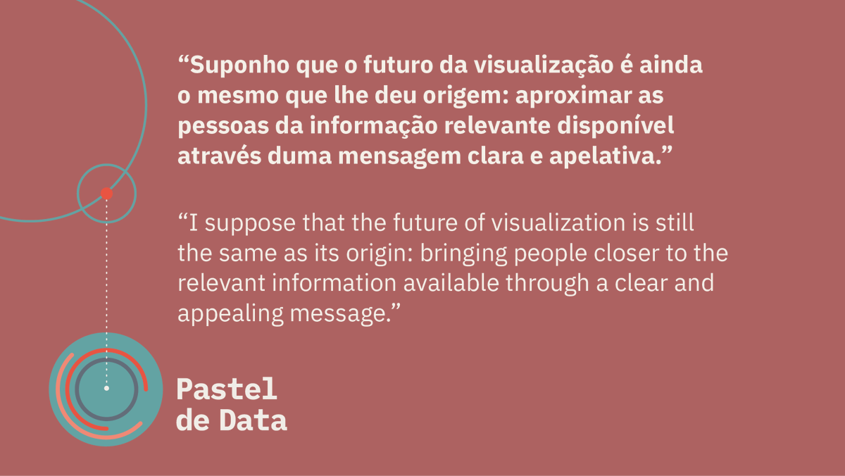
🇵🇹 Os nossos convidados estavam cansados de trabalhar com dados chatos. Quem nunca? O que fizeram em relação a isso?
🇬🇧 Our guests for last month's newsletter were tired of boring data. Who isn't? Curious about what they did about it?
👉 https://t.co/7DD1cHLLf4
🇵🇹 Na estreia do novo Pastel de Data, apresentamos o projeto "Mapa Animado da Ocupação do Solo em Portugal", criado por Pedro Tarroso. Espreita o novo formato da nossa newsletter, agora centrada em projetos de visualização de dados. Subscreva para não perder a próxima edição.
🇺🇸 The new Pastel de Data newsletter has been released! We featured the project 'Animated Map of Land Occupation in Portugal,' created by Pedro Tarroso. Check out our new format, now focused on Dataviz projects. Subscribe and don't miss the next one
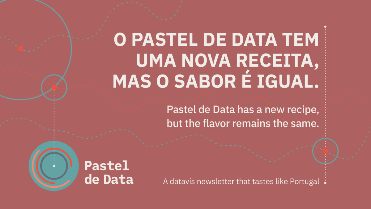
🇵🇹 Voltámos do Verão cheios de ideias para uma nova receita do Pastel de Data. Ingredientes ainda mais saborosos e um formato melhorado. Não fiques com água na boca e subscreve a nossa newsletter!
https://t.co/JsFhk2Nlz7
🇬🇧 We're back from summer with plenty of ideas for a new Pastel de Data recipe. Even tastier ingredients and an improved format. Don't miss out and subscribe to our newsletter!
https://t.co/JsFhk2Nlz7
As summer winds down, we're sharing #summertips. @resteffen caught a stunning sunset with @nigelblue "Joyful Infographics." It's a delightful read, bringing data to life with humor and simplifying complex concepts. Whether you love data or design, it offers insights and tips.
#SummerBreak share #3:📚🌞@RSalomeEsteves brings #DataViz to the pool, showing summer's not just for rest but also prep. "Making with Data" expands Data Visualization into art, engaging the senses. "So far, it is a fascinating read." ✨
#SummerBreak share 🙌: Explore @refikanadol's data-driven public art, recommended by @MesquitaSra. It challenges reality with data and #machineintelligence. Watch his TED 🎙️https://t.co/J8msnpA7pG or visit exhibitions in BCN, NYC, and Istanbul.
Unearthing the 'to-see-later' list this summer, @medical_vet_art found gold in @T_Weissgerber's innovative #DataViz. Rethinking bar charts for small studies – a total game-changer. Explore her article: https://t.co/QcoozTach6. More summer tips on the way! 📊📖 😎
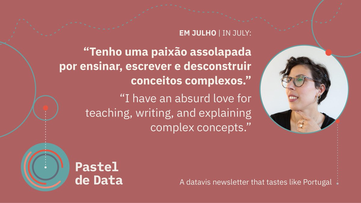
🇬���� @RSalomeEsteves , our achiever, conquered most goals by 30—just penning a #dataviz book remains! Proud of her students' strides, we're equally proud to have her with us at @DatavisLisboa! Follow her journey at @Renascenca and subscribe for updates: https://t.co/m4N0L7WwFl 📚📊
🇵🇹 @RSalomeEsteves, a nossa conquistadora, concretizou os seus objectivos até aos 30, faltando-lhe escrever um livro sobre #dataviz. Diz-se muito orgulhosa do trabalho dos seus alunos, e nós orgulhosos estamos por a ter no @DatavisLisboa! Subscrevam 👉https://t.co/bhOiQY9U0Q
We are incredibly proud of her journey and wanted to take a moment to express our gratitude, not only for her contribution to data visualization in Portugal but also for all the work she has done for Data Viz Lisboa. Congratulations, Salomé!
🇵🇹 Este mês foi mais bonito, não só porque as férias estão à porta, mas também porque a nossa querida @RSalomeEsteves teve, no passado dia 20 de julho, a defesa da sua tese de doutoramento intitulada "A notícia viva: design de visualização de dados em jornalismo de imprensa".
🇬🇧 This month was even more beautiful, not only because the holidays are just around the corner but also because our dear Salomé Esteves successfully defended her doctoral thesis on July 20th, titled "A notícia viva: design de visualização de dados em jornalismo de imprensa"