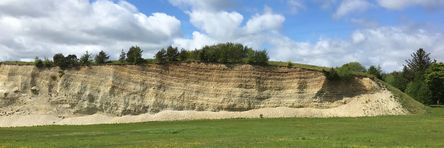
In case you need the English translation of the terms behind the DGU-symbols (e.g. kk - danien kalksandskalk, ds - glacial smeltevandssand etc.) used in the Jupiter database and some GEUS maps, see pages 94-104 (pdf p. 96-106) https://t.co/rFtjjT71H6
Updated R Studio and everything works painfully slow on the network drives. Basically cannot work. Even opening a simple R script is taking few minutes. I found few suggested solutions, but they all work only for some people, so I’m dreading the process of fixing this problem.
@GeoSurvey_DK_GL I have that poster on my wall in the office :) I think we need to make one for the drinking water supply system in Denmark. Let's talk next time I'm in Copenhagen.
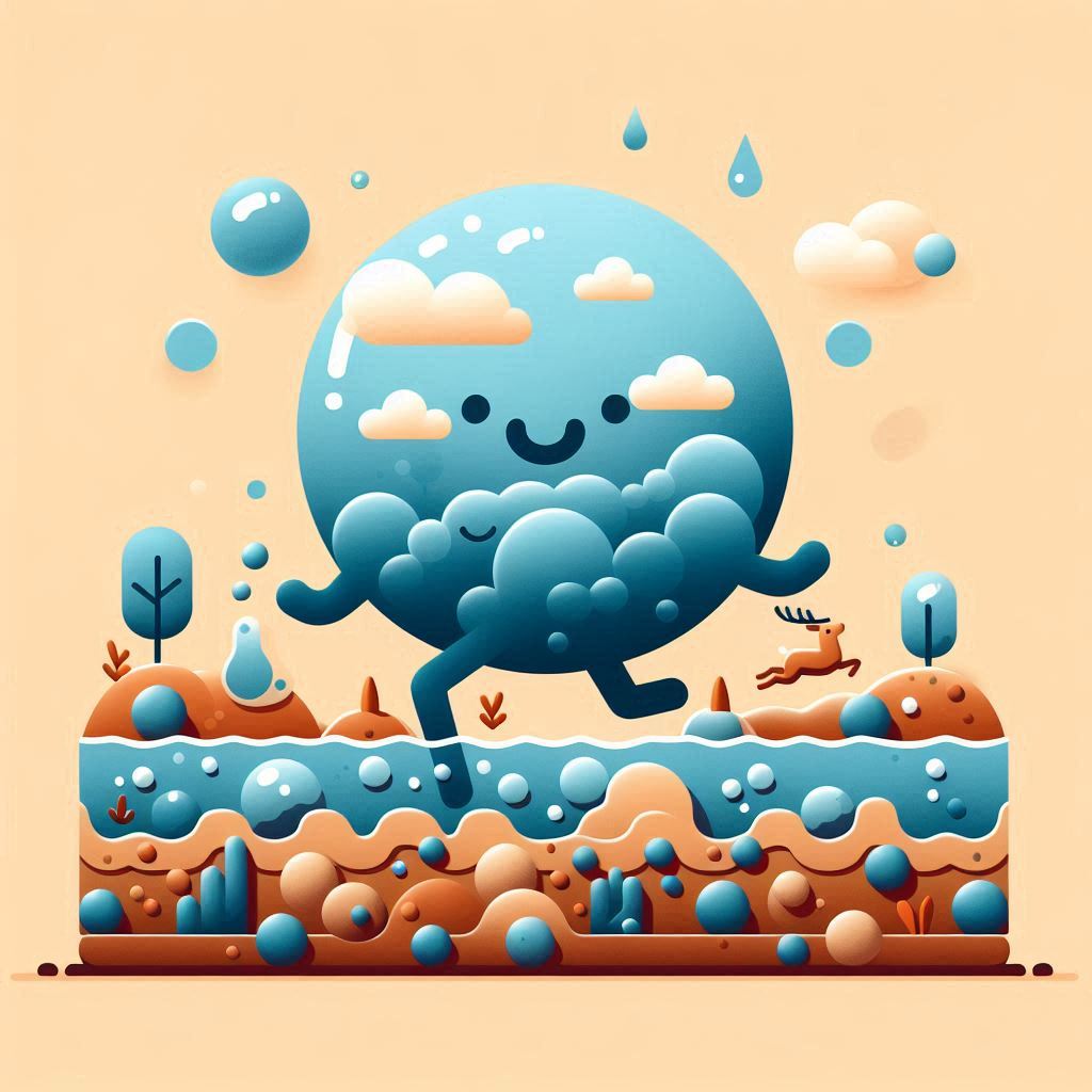
Here is what happens, if you ask #Copilot to create some figures/logos for groundwater research or #groundwater and #Denmark. It was fun :) All results with the exact prompts are in the link: https://t.co/4mCyppPFGC
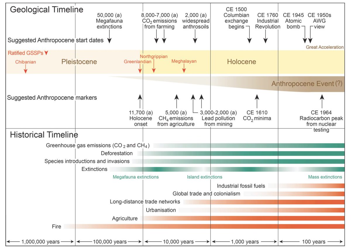
Yes we are in the #Anthropocene. But it was right to reject Anthropocene as a geological epoch
Anthropocene is better understood as an ongoing, intensifying planetary 'Event'. Opening up interdisciplinary advances on crucial planetary issues & solutions.
https://t.co/9HgVGFKLnK
last entry for the #30DayChartChallenge, #day28#trends: few years back I made this R shiny app, which allows you to explore the effect of parameter choice on the local polynomial regression (loess): https://t.co/lH5zOswGho
a blog post about it: https://t.co/6IAg3i8tT2
base R :)
I’ve had only good experience with the peer-review and publishing process at @GeusBulletin
Ppl are very focused on prestige (h-index), which takes time and collective effort. Let’s make it prestigious (at least in EU & earth sciences)!
GEUS Bulletin is the official peer-reviewed journal published by GEUS. We are diamond open access: free for authors (no APCs) and free for readers to view/download articles. Special issues are still printed & can be purchased from our web shop: https://t.co/4yaUE8NzZz
I’m preparing a short #Rstats course for some of my colleagues focused on the routine groundwater & drinking water analyses we do. I thought I could reuse my tutorials from NUS (2018). Great mistake! Maybe 5-10% only, my coding style has changed so much! Base R to tidy R.
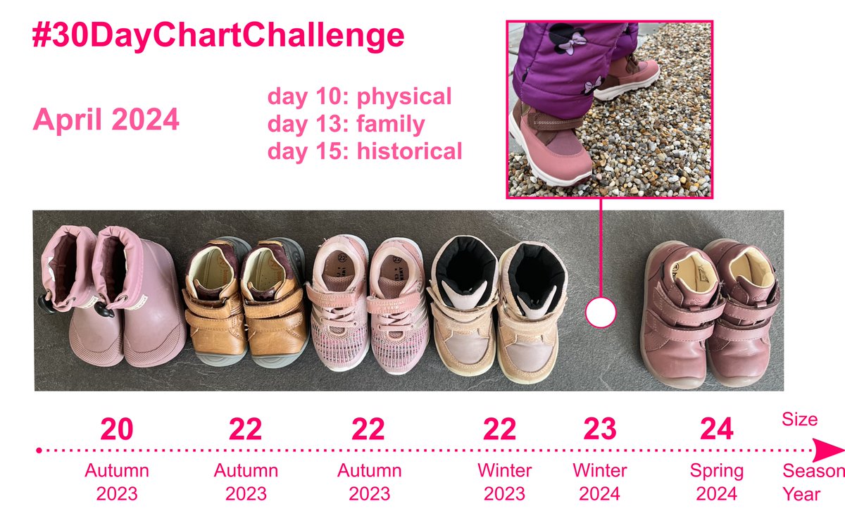
Here's some personal time-series :) Sofie's shoes (missing two pairs from when she could not walk yet). and that's my dose of daily procrastination while revising a manuscript.
This fits with #day10, #day13, and #day15 of #30DayChartChallenge
New Maximum Contaminant Levels (MCLs) on PFAS in drinking water by USEPA. Four compounds get individual enforceable limits (PFOA, PFOS, PFHxS, PFNA, and HFPO-DA), plus one for mixtures. See details here https://t.co/IdKBCw2XW1
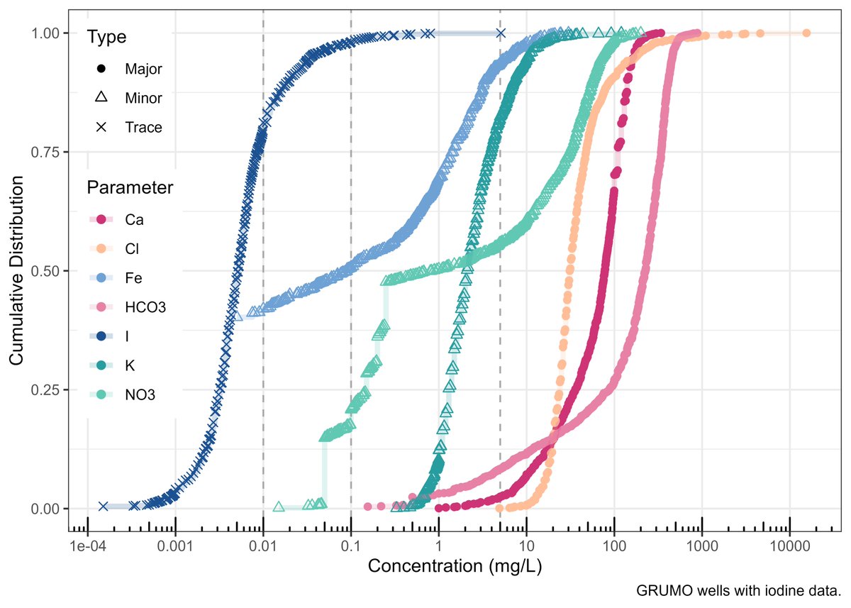
Major/Minor #day9#30DayChartChallenge
Distribution of selected major, minor, and trace elements in groundwater.
Incl. only the monitoring wells with iodine data (GRUMO). The vertical lines are at 0.01, 0.1, 5 mg/L (Figure 50 of https://t.co/7jidTSmCLm) @groundwaterproj#ggplot2
trying out Quarto documents in #RStudio... does that count as #30DayChartChallenge? I have been a bit behind with the new things, so I thought I should finally have a look.
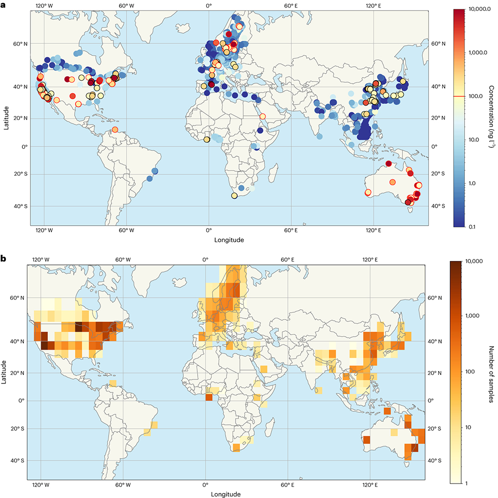
A paper in @NatureGeosci suggests that a large fraction of global water resources may be contaminated by per- and polyfluoroalkyl substances (PFAS) at levels that exceed some national regulations. https://t.co/5CC3xdXLKG
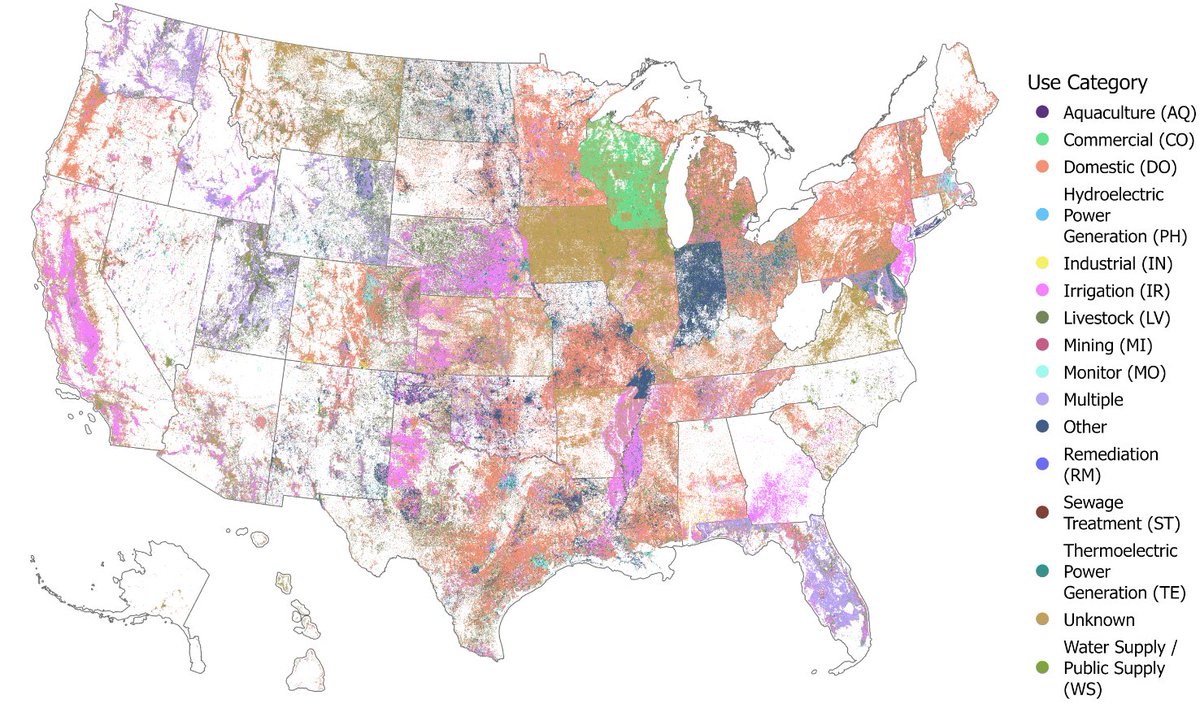
We introduce the United States Groundwater Well Database (USGWD), which contains 14.2+ million use and monitoring wells across the US. 1/9
Paper: https://t.co/H8bMJbBkgL
Data: https://t.co/wdNX2yyhiY
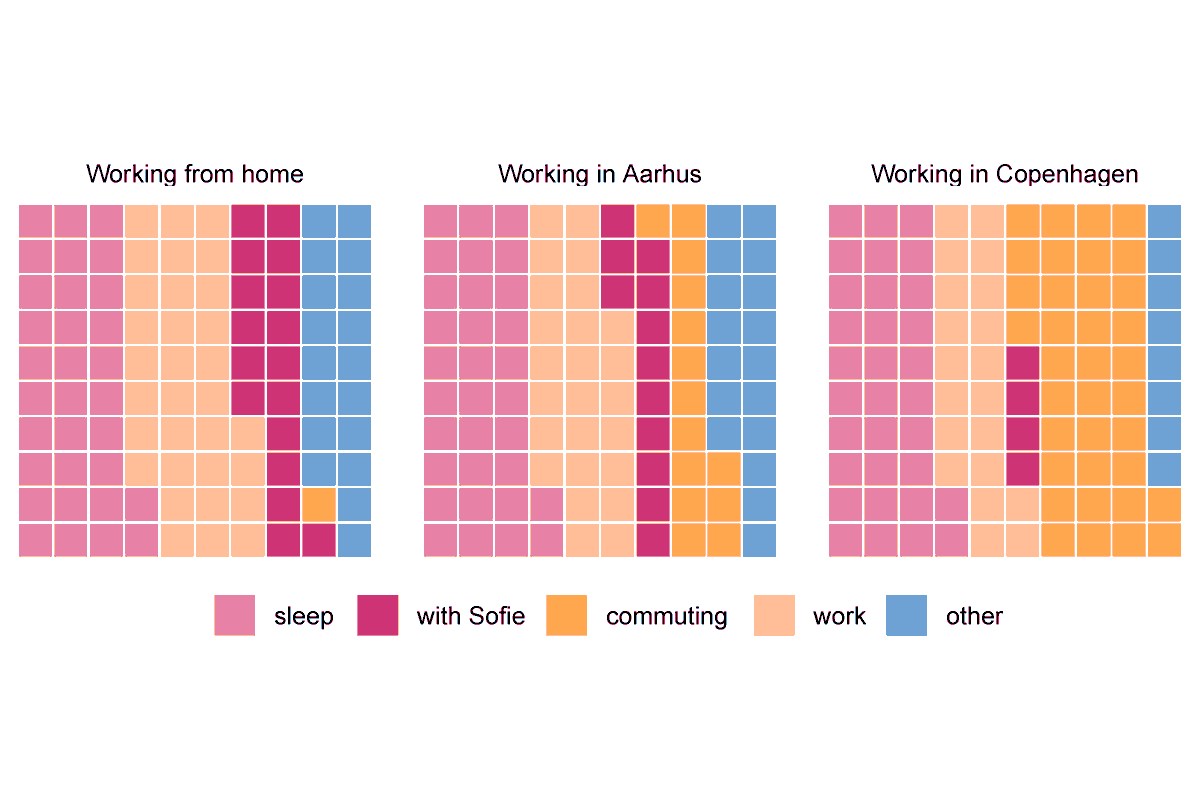
My 1st waffle ever! #day4 of #30DayChartChallenge
It shows average 24 hours within my work week. I work, while commuting sometimes.
The color palette is "Pairings" from #Pantone featuring the color of 2024 #PeachFuzz (#FFBE98) in the "work" category. https://t.co/fYaYSYfcFX
"Makeover" #day3 of #30DayChartChallenge
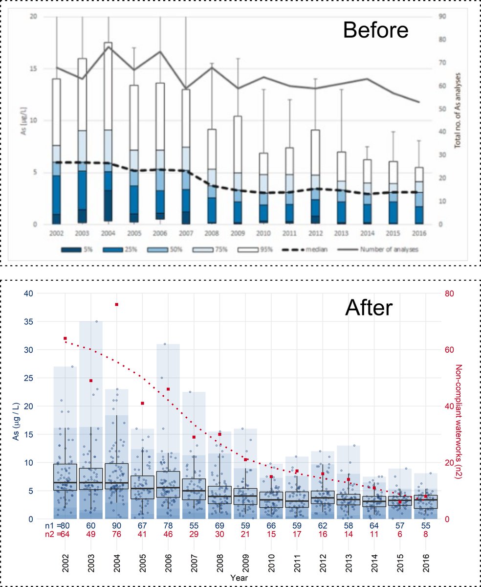
In 2021 we published a paper about As in drinking water and the effect of lowering the Danish standard from 50 to 5 μg/L (https://t.co/NqeNg2y8fA). I gave a makeover of the original figures (here shown Fig. 3). Not sure it is better :)
A bit late, but here is my #day1 entry "Part-to-whole" for #30DayChartChallenge
It's from a paper under review, so let's label it as "preliminary". Made with #ggplot2#Rstats, based on drinking water data from Jupiter database https://t.co/sFuoGtZ0ju
black line - right side axis
Our editorial this week focuses on a timely question - Are we in the Anthropocene yet?
The absence of an agreed marker and a specific start date should not detract from the reality of a discernible human fingerprint on Earth systems. #natureeditorial
https://t.co/sTec7sGp1q