Redesigned https://t.co/DacE33uEa6 leggings page for free.
Before: Weak CTA, no subscription option.
After: Bold CTA, Subscribe & Save, mobile-first layout.
Which would you buy from? 👇
Tradespeople: make booking your next free strategy call simple.
I designed a booking section with clear time slots, easy scheduling, and space for real client stories.
Better UX. Less friction. More bookings.
#LandingPageDesign#WebDesign
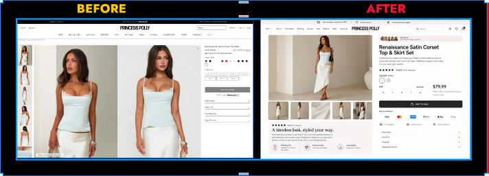
I redesigned the product page for https://t.co/O4YtHlsV5o for free.
Original: Cluttered layout, weak size selector, no mobile-first thinking.
My version: Cleaner hierarchy, bold CTA, thumbnails below image, trust badges up top.
Which one would you buy from?
@Vaibhavpaul_UI Hey Vai happy to share my portfolio, but first: here's a 30-second teardown of a common issue I see with client web projects.
Most landing pages fail because the hero section tries to say 5 things at once. A single, specific promise above the fold usually doubles demo signups.
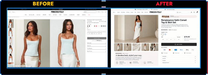
I redesigned the product page for https://t.co/O4YtHlsV5o for free.
Original: Cluttered layout, weak size selector, no mobile-first thinking.
My version: Cleaner hierarchy, bold CTA, thumbnails below image, trust badges up top.
Which one would you buy from?
Redesigned https://t.co/DacE33uEa6 leggings page for free.
Before: Weak CTA, no subscription option.
After: Bold CTA, Subscribe & Save, mobile-first layout.
Which would you buy from? 👇
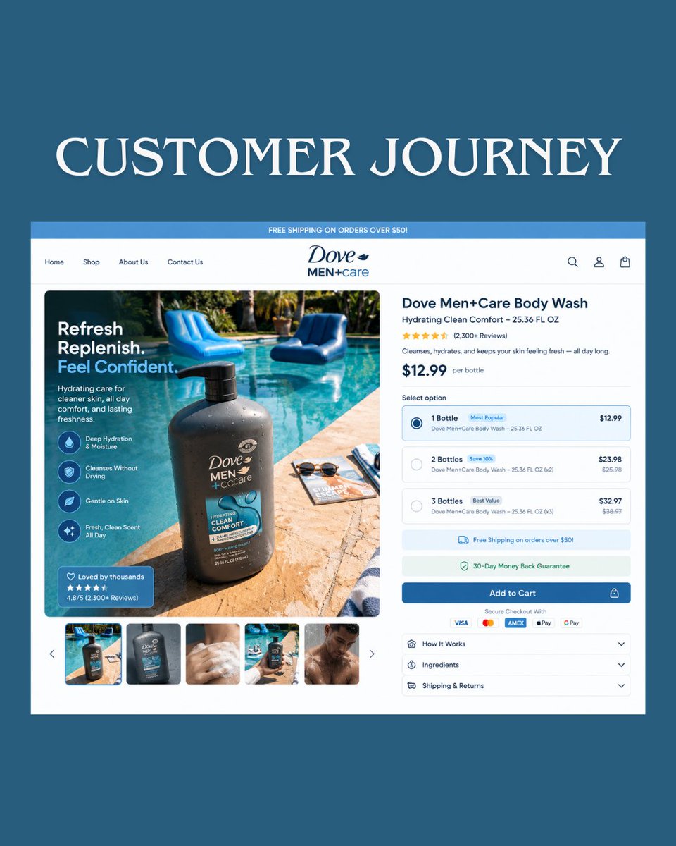
More traffic won’t fix a weak Shopify landing page.
If visitors aren’t converting, fix the customer journey:
→ Clearer messaging
→ Stronger hierarchy
→ Better trust
→ Less friction
Good UX makes buying easier.
#Shopify#CRO
A strong product page should make the buying decision feel easy. For this fashion Shopify PDP, I focused on:
Clear product hierarchy
Strong visuals
Trust signals
Easy size/color selection
Frictionless checkout
Design should sell not just look good.#ShopifyDesign#ecommerce
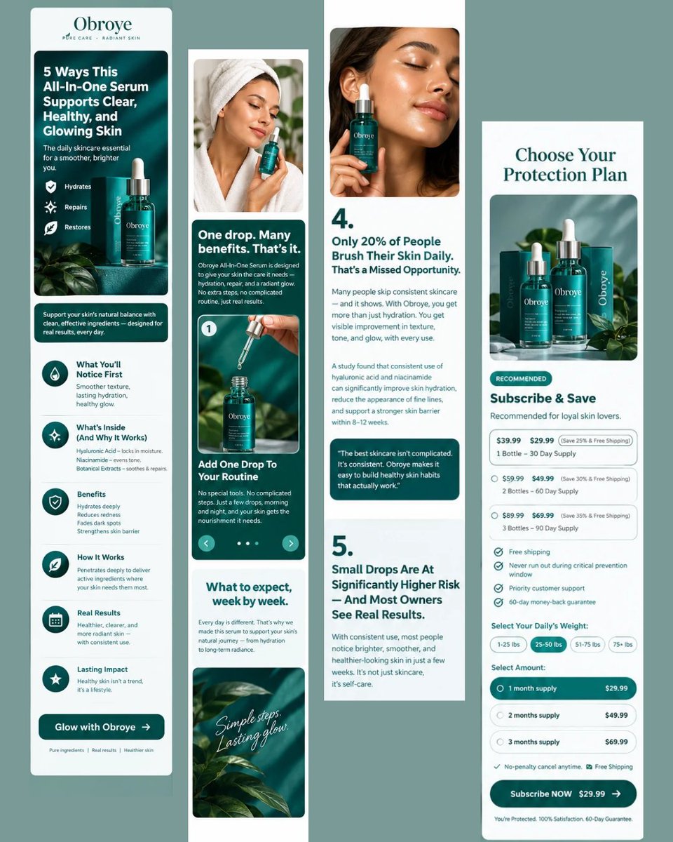
Listicle-style mobile layout: benefits, how-it-works, week-by-week expectations, and a subscribe & save offer section.
Designed in Figma → built in Replo.
Need a landing page that converts on mobile? DM me.
#LandingPageDesign#UIDesign#Figma#Skincare#Ecommerce
If visitors are dropping before checkout, the problem could be:
→Weak product messaging
→Too much friction
→Unclear pricing/options
→Missing trust signals
→Weak CTA flow
A better customer journey can turn more clicks into customers.#Shopify#Ecommerce#CRO#LandingPageDesign
More traffic won’t fix a broken customer journey.
If visitors aren’t buying, check for:
→ Unclear product benefits
→ Weak visual hierarchy
→ Too many choices
→ Missing trust signals
Your landing page should move customers from “I’m interested” → “Add to cart.”
#Shopify#CRO
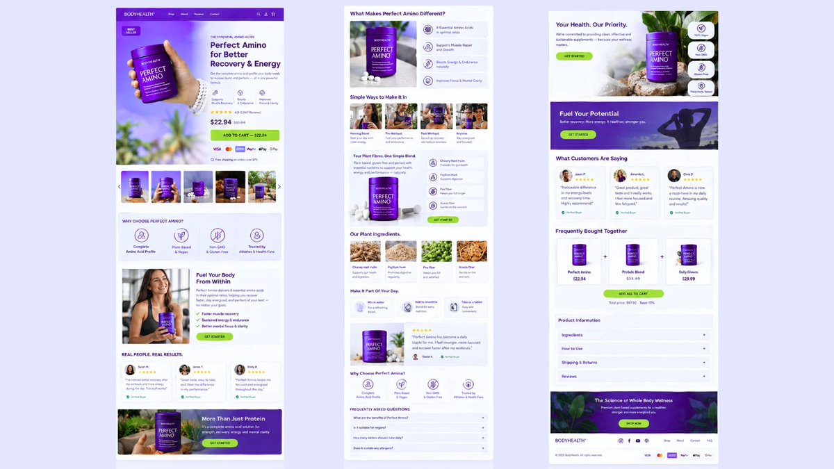
Landing page design for a supplement brand 🌿
Built in Figma → Replo
Product page, comparison table, video testimonials, FAQ + CTA sections designed to boost conversions.
Need a high-converting landing page? DM me.
#LandingPageDesign#UIDesign#Figma#Ecommerce#Shopify
Designed with CRO in mind, so the page doesn’t just look good it guides visitors toward taking action.
Building conversion focused Shopify pages with Figma + Replo.
#Replo#Shopify#CRO#Ecommerce#Figma
Redesigned Premind Biotics FOKUS 🧠 in Replo with clearer storytelling, stronger hierarchy, trust signals, and a smoother Add to Cart flow.
Built for better UX + conversions.
#Replo#Shopify#CRO#ecommerce
Turned a basic supplement page into a conversion-focused Shopify experience with benefit-led messaging, reviews, trust signals, bundles, FAQs, and stronger CTAs.
Built to increase AOV and reduce buying friction.
#Replo#Shopify#CRO#ecommerce
I focused on clear hierarchy, product storytelling, trust signals, and a stronger CTA flow to make the page easier to understand and built for conversions.
Designing for Shopify brands with CRO in mind.
#Figma#Shopify
Took a supplement landing page from basic product display to a conversion-focused experience. Clear product benefits, ingredient education, customer reviews,trust signals,bundles,FAQs,and stronger CTAs all designed to increase AOV and reduce buying friction. #Shopify#ecommerce
Redesigned this eCommerce product page for Premind Biotics FOKUS 🧠 Built for clearer product storytelling, stronger visual hierarchy, benefit-led messaging, bundle selection, subscription options, trust signals and a frictionless Add to Cart flow. #ecommerce#Shopify