Dear family,
I am grateful for the trust you have placed in me, both in choosing me and in considering me for your upcoming projects.
I am dedicated to serving you all and ensuring the delivery of top-notch pages with @replohq#landingpage#ecommerce#EcommerceSolutions
People don’t read long content.
They scan.
That’s why this works:
7 clear, focused reasons easy to follow, hard to ignore.
Structure changes everything.
Not every product needs a loud landing page.
For Doze Tea, the approach was simple: Calm design. Clear story. Subtle conversion. An advertorial experience built to match the brand’s energy and turn attention into action.
What if your landing page didn’t feel like an ad?
This NurtureBio advertorial page is designed to feel like a story, building trust through content rather than just selling.
From structure to visuals, every section is crafted to guide attention and drive action naturally.
Great ad interrupts.
Great advertorials engage.
This wireframe shows how to structure content that feels natural, builds trust, and still drives action.
Because the best marketing doesn’t feel like marketing.
Advertorial Page
What if your content could sell… without looking like an ad?
That’s exactly what this advertorial is designed to do.
Clear message. Strong visuals. Real impact.
See how it works and imagine what it could do for your brand.
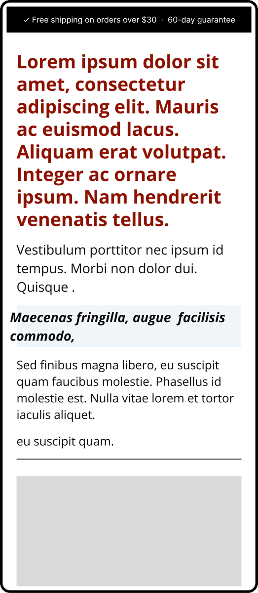
Mobile experience can make or break an advertorial.
This layout was designed to feel natural on mobile while guiding users through the story without friction.
Simple structure. Clear messaging. Better conversions.
If your content feels messy…
It’s probably missing structure.
This listicle wireframe is my go-to for turning ideas into scroll-stopping posts.
Simple. Repeatable. Effective.
Try it and watch your engagement change.
The best advertorials don’t feel like ads.
They feel like discovery.
Built this page to blend storytelling, trust, and conversion into one smooth experience