New branding and signage for Kinsale Dental. Using the interior of a mandibular which is often called the seagull within dentistry, we created a connection between both the geographic location of Kinsale and dentistry.#kinsale#cork#branding#dentistry#signagedesign#ireland
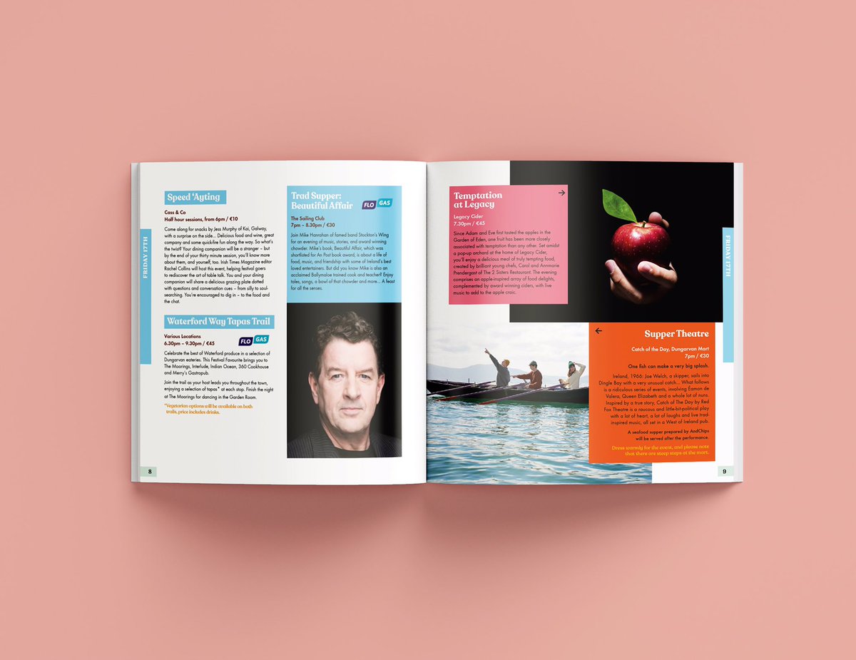
Due to Covid-19 we never really got the chance to showcase our redesign for the West Waterford Food Festival this year. 😢 So here it is... we’re working on alternative ways for them to showcase exciting talent within the food industry. #branding#identity#print#advertising
"The difference between beauty and ugliness is caring. 99.5% of everything that is ugly in the world is ugly not because someone wanted it to be, but because someone didn't care" #GDFS
A refreshed identity for the iconic Linda’s of Kinsale. Taking inspiration from shards of light within a diamond, we created a new word mark that incorporates slices in the type. And the design of the website. #brandidentity#logodesigner#webdesign#graphicdesign#kinsale#cork
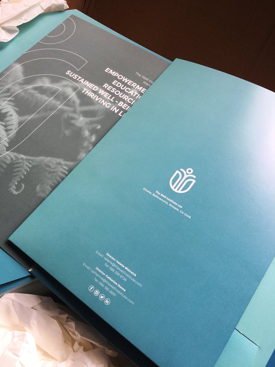
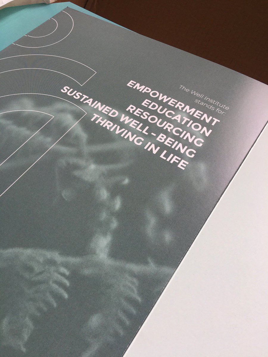
Continuation of branded material The Well Institute, which helps its reach in finding new markets. The identity colour palette was brought through into the full colour print. The project includes the new logo and monogram. #cork#branding#typography#colour#identitydesign