The new "New Zealand Tsunami Database" of @gnsscience is an updated version of the old "New Zealand Palaeo Tsunami Database" of @niwa_nz which, as the name suggests, also includes prehistoric records
New: https://t.co/MTQB9awAhV (preliminary)
Old: https://t.co/B7nylEezsV
Thanks to new @EQCNZ & @gnsscience data, we now know which parts of NZ are most at risk from tsunami. "When you look at the map its quite heavily distributed around our east coast in particular," says @UCNZEarthEnv@Dr_TRob. https://t.co/onbn3nXCal
Main upgrade was the inclusion of source events responsible for triggering the tsunamis and linking them to the tsunami records and observations on land
Ich kam bislang noch nicht dazu, dieses Hammer-Programm angemessen zu würdigen - jetzt aber:
🔔🔔🔔 Aufgemerkt #ddj-folks, #dataviz-people & #maplovers Beginnt das neue Jahr mit einer kleinen, aber sehr erlesen interdisziplinären (Online)-Konferenz rund um Landkarten... 1/n
Much better of course with an image preview showing the 3 principal science layers:
- Floating plastic concentration (Eriksen et al 2014)
- Mismanaged plastic waste (Lebreton & Andrady 2019)
- River emissions (Lebreton et al 2017)
https://t.co/qxownLA54s
Have been pretty silent here lately but today we are especially excited about the launch of the Global Plastic Navigator we developed with WWF Germany to show the extent of marine plastic pollution, as well as WWF's efforts and countries' commitments to combat it.
Have been pretty silent here lately but today we are especially excited about the launch of the Global Plastic Navigator we developed with WWF Germany to show the extent of marine plastic pollution, as well as WWF's efforts and countries' commitments to combat it.
Die Ozeane sind voller Müll. 🌊🧃😖Man kann sie sich fast als Plastiksuppe vorstellen, mit großen Plastikteilen und kleinstem #Mikroplastik. Aber wo sind die Quellen? Und wo geht das Plastik hin? Unsere interaktive Karte zeigt's euch: https://t.co/C81rcEVpyk #StopPlasticPollution
Calling all FOSS technologists, journos and human rights defenders from around the world. We URGENTLY need you to sign this letter for the US Congress to save OTF and
Internet Freedom. Mobilize others! #SaveInternetFreedom
https://t.co/wu9GmAoHX9
Wicked demonstration by @geo_spatialist of what is possible with quality elevation data, a historic map, the right tools and mad skills. This rendering is recreating the perspective of a photo taken in Glacier National Park with Mt Carter towering in the back
We are still looking for help with two exciting human rights projects in the coming months, both open source and paid opportunities. DM me up for further details and please feel free to retweet - cheers!
🤩The campaign goal for RAW 2.0 is finally reached!
This wouldn't have been possible without all of your help! THANK YOU SO MUCH!❤️
Bear with us because stretch goals are just behind the corner! Please continue to show your love! 🙌
18 hours to go!
#dataviz#opensource
Only 4 days left to support the new version of the excellent and open source @rawgraphs. Glad to have finally made our little contribution and we look forward to the release in 2020
Have you backed our campaign?NO??!?!...well...it’s not too late.
You still have 4 days to donate and support us!
Are you one of the 242 backers? You can still contribute by sharing the campaign on social media and within your network.
https://t.co/yKxRI1Xjhm
#Dataviz
Adjusted? Nominal? What is @AlbertoCairo talking about? You still have time to find out until we discuss his book on Nov 27. Learn more about our book club here: https://t.co/y09GqfrXy1
Thanks @EU_opendata for organising the excellent #EUDataViz conference in Luxembourg! So important to share knowledge about better informing citizens & policy makers for better decisions. They are needed urgently to address the challenging issues of our time
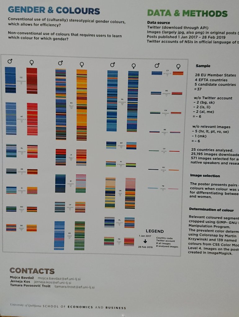
Comprehensive composition of (inconsistent) colour use for genders in official statistics by country and over time (from 2017, top to bottom) by Mojca Bavdaž et al of University of Ljubljana, presented at #EUDataViz
I'm trying something new: Until the book club discussion on Nov 27th, I'll tweet a quote from @AlbertoCairo's "How Charts Lie" almost every day. Let's start: