I took a break from Twitter for the last year to breathe and work on my main business that I've been building offline since 2021 -- Saucy 🚚
I haven't formally announced it on Twitter besides a couple replies here and there, but under Saucy, I launched a custom packaging manufacturing business called Paking Duck 🐤 with the goal of helping brands save $$ on their packaging needs
My thesis for Paking Duck was simple:
1) Most brands get their packaging from their core product supplier (who then marks up to sell to the brand)
2) As a result of #1, most brands are overpaying for their packaging
3) 100% of the brands in the world will need some form of packaging
While I was in China, I worked with 2 factories to acquire equity in their business, to expand their operations outside of China.
Through Paking Duck 🐤 Brands can get transparent and factory-direct pricing, and work with a team that are ex-merchants and understands your specific needs.
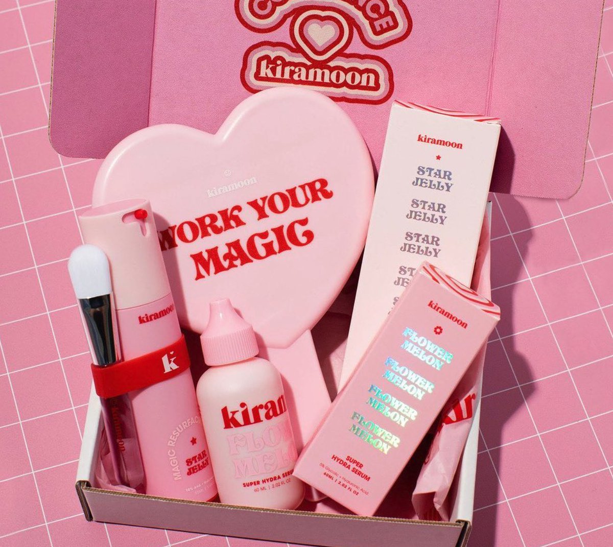
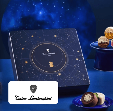
Here are some stuff that we've produced so far:
If you have any packaging needs and is curious about cost savings that we can give you, please don't hesitate to give me a shout :)
I'll be back on Twitter to yap about all things manufacturing and giving you guys a behind the scenes look at how packaging is made.
Trait that I’ve always had that found out later in life was crazy valuable - irrational positivity.
I just always think it’s gonna work. I always think we’re gonna crush. I expect to win.
Do I always win? No, I have spectacular L’s, “it’s all over” and the bank account backs it up moments.
But I always knew I was gonna win. It was just a matter of a time.
Little did I know - that’s literally it.
That’s the key to success - you set the vision, burn the ships, keep walking till it works - but if you’re not constantly optimizing what reality is giving you back, if you’re not constantly sharpening the vision, then you’re NGMI.
anytime someone asks how I’m doing, I’m doing great, because I am so grateful for all my problems, I’m not lying.
Levi’s wasn’t an official World Cup sponsor, so FIFA made them cover their stadium logos.
They covered the name and color, but left the Batwing shape visible.
Everyone still recognized it.
That’s the highest level of branding: when people know it’s you before they can even read the name.
A lot of brands talk about what the product does before showing why anyone would want it.
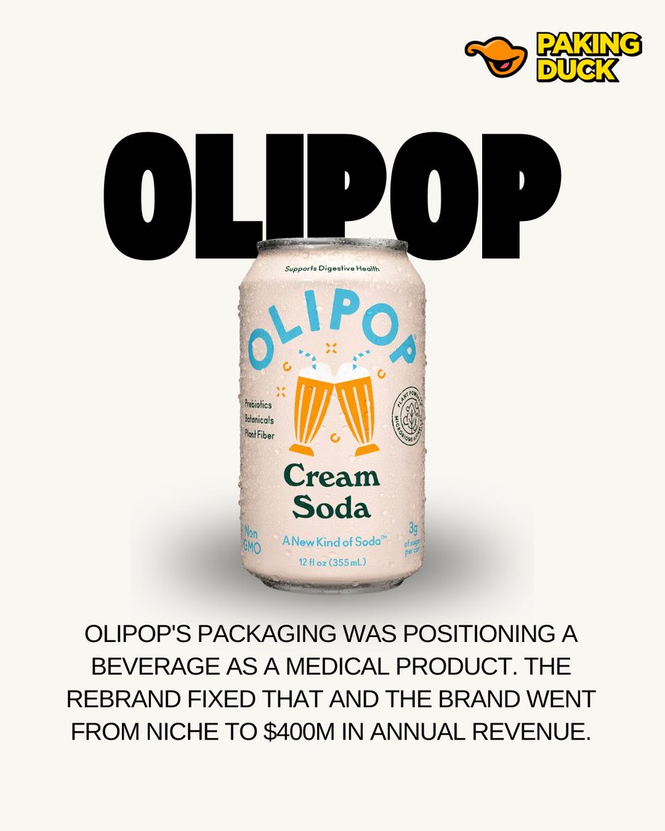
OLIPOP reversed that.
The health benefit stayed. The packaging finally made the drink feel desirable first.
7/8
The rebrand didn’t create all of that growth by itself.
But it gave the brand a much wider doorway.
More people could understand the product quickly, and retailers had something that looked easier to place, explain, and sell.
6/8
The formula didn’t need to be rebuilt.
The packaging needed to translate it better.
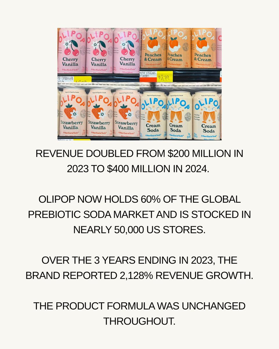
OLIPOP later grew from $200M in revenue in 2023 to $400M in 2024 while expanding into nearly 50,000 US stores.
5/8
The visual system changed too.
Brighter colors, more appetite-driven illustrations, and clearer flavor names made the cans feel familiar enough to compete with traditional soda.
The product could still be healthy without looking medicinal.
4/8
The rebrand changed the order of communication.
Flavor became easier to notice.
The health message stayed, but it was simplified to “supports digestive health” instead of forcing the customer to decode what a digestive tonic was.
3/8
That wording made sense from a product perspective.
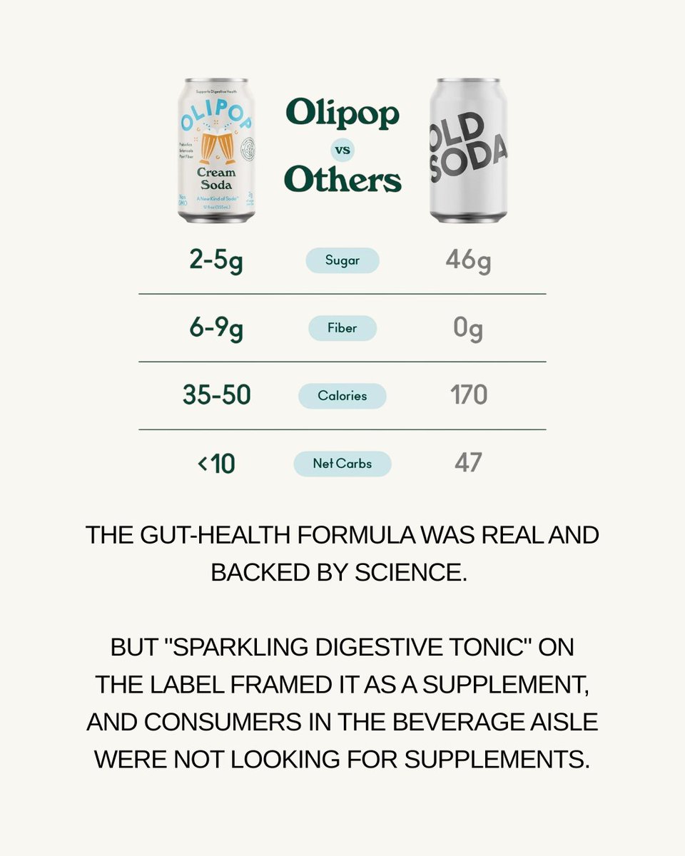
OLIPOP was built around gut health, prebiotics, and lower sugar.
But shoppers don’t enter the beverage aisle looking for clinical language. They’re looking for something that sounds good to drink.
2/8
OLIPOP’s product wasn’t holding the brand back.
But the original can described the drink as a “sparkling digestive tonic,” which made it sound closer to a supplement than something you’d casually grab from the soda aisle.
1/8
A disposable honey spoon sounds like a gimmick until you realize it fixes almost every annoying part of honey.
Jars are sticky.
Bottles aren’t portable.
Packets feel cheap.
And separate spoons always create some tiny mess you didn’t ask for.
This spoon combines the honey, the container, and the utensil into one molded piece.
The head holds about 10g of honey, then gets sealed with film so it stays fresh, doesn’t leak, and still gives the brand room to print.
That makes it perfect for hotels, coffee shops, airlines, camping kits, and gift sets.
Basically anywhere single-serve honey needs to feel cleaner and more premium.
The business angle is even better.
Once the mold and filling setup are done, unit costs can get really low at scale.
But the perceived value is way higher than a packet because the experience feels intentional.
That’s the part brands should pay attention to.
Good packaging design isn’t always about louder graphics or nicer materials.
Sometimes it’s just removing one tiny annoying step from the customer’s day.
And this same format could work for coffee concentrate, jam, nutrition gels, probiotics, or supplements.
Tiny structure change.
Very different customer experience.
Most retail displays start getting expensive before they even reach the store.
The material matters, sure. But the real cost is usually the space they take up.
Traditional display stands are bulky, awkward to ship, and annoying to store. A lot of brands are basically paying to move empty air across the country.
That’s why foldable POP displays are becoming so interesting.
They fold down into a flat panel only a few centimeters thick, then open into a full retail shelving system in under a minute.
The setup is the part that makes it feel almost unfair. One person can unfold it, lock it into place, and have it ready for product without calling in an install team or dealing with loose hardware.
The real value isn’t that it looks clever.
The value is that it cuts down shipping volume, warehouse space, setup time, and labor cost in one move.
In some cases, flat-packing can reduce shipping volume by roughly 70% to 90%.
That changes the math completely.
A display that used to eat up container space can suddenly ship in bulk, sit in a warehouse without taking over the room, and get deployed fast for pop-ups, trade shows, supermarkets, and retail launches.
It’s basically IKEA thinking applied to retail packaging.
Make the structure flat enough to ship cheaply, but strong enough to become useful the second it opens.
The best packaging design doesn’t always scream for attention. Sometimes it quietly removes cost from every step of the operation.
#packaging #retail #design
Category conventions exist for a reason.
But when every brand follows them too closely, the shelf turns into ten companies saying the same thing in different fonts.
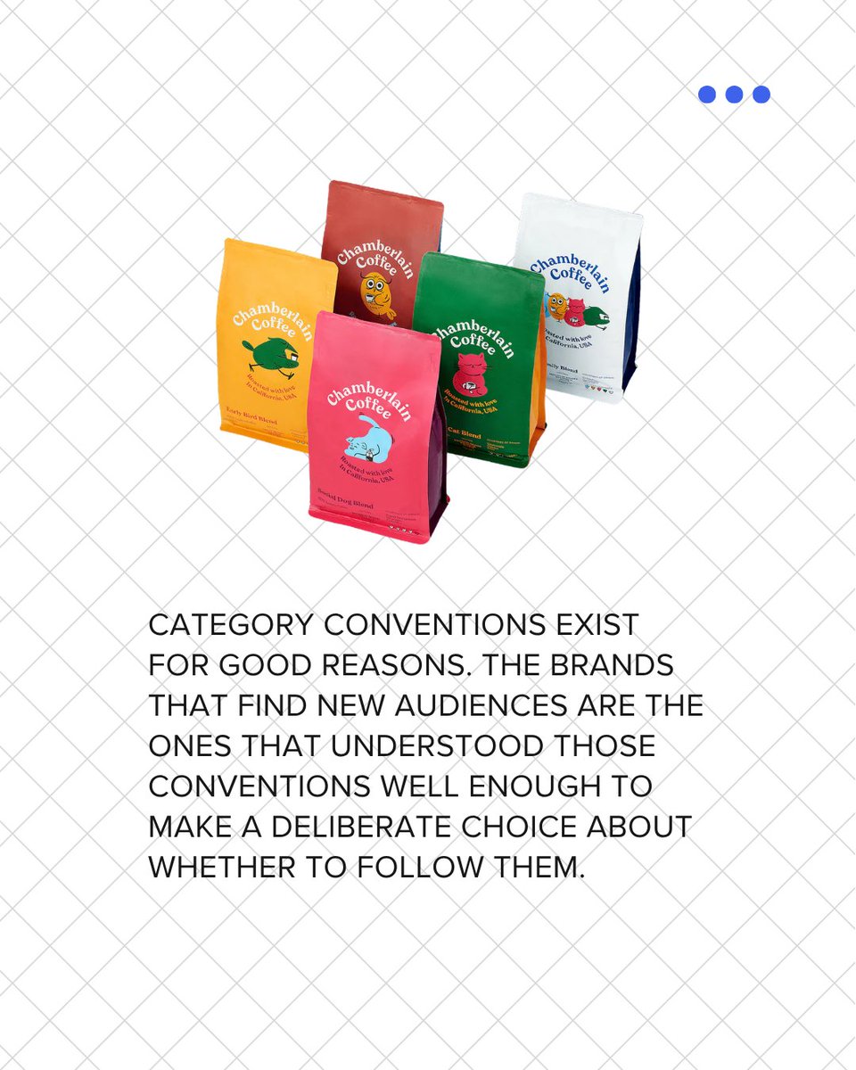
Chamberlain Coffee didn’t win by looking more like coffee.
It won by making coffee feel less intimidating.
That’s a way bigger packaging lesson than people realize.
Retail buyers don’t just look at whether a product is good.
They look at whether the audience is obvious.
Chamberlain’s brand packaging made the audience visible from across the aisle.