Dorinda Skin Naturals case study live on Behance.
Kindly click the link below to take a look and also drop your thoughts in the comments box.
Looking for a unique logo or visual identity? Let's collaborate! Send me a DM.
https://t.co/aWX56dHald
https://t.co/Hbrsq09Zzi
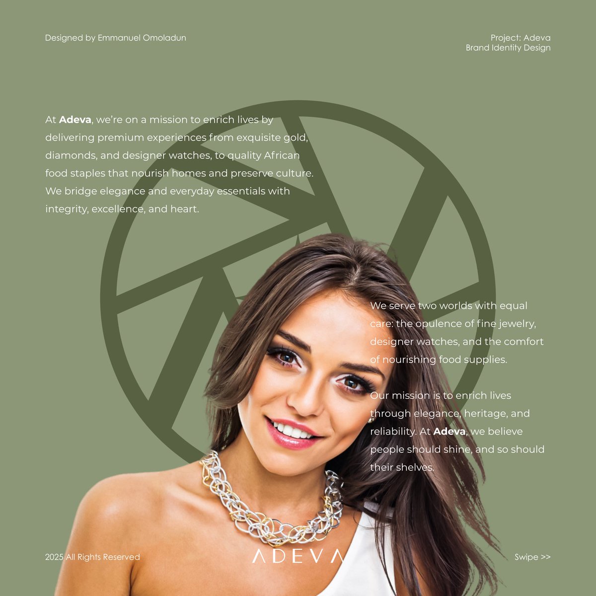
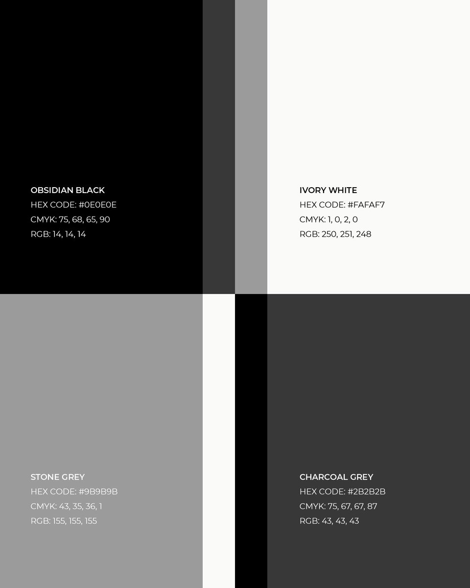
Adeva Case Study is live on Behance!
Kindly click the link above to take a look and also drop your thoughts in the comments box.
Looking for a unique logo or visual identity? Let's collaborate! Send me a DM.
#logo#brandidentitydesign#logodesign
@myaccessbank Why is none of your customer care line going? @myaccessbank@access_more. Had a failed transaction, money was deducted, it’s been more than 48 hours and it hasn’t been refunded yet.
@timxdesign B is obviously better.
Unnecessary repetition of actions in ‘A’,
Better visual hierarchy in ‘B’
I don’t think “forgot password” in ‘B’ should be in red though, UX wise.
@Abmankendrick@iamAbiodunAA@Daviowhite@its_YOGO I think I’ll go with A, it gives you option of using other icons on the right hand side; for instance, you want your password to be hidden or shown while typing.