@GreenThumbLawns absolutely outrageous that you think it is OK to charge my aged parents over £550 to scarify and aerate a modest sized lawn and also leave them with 28 black bags of thatch to dispose of themselves. They complained and have been treated very rudely. Shameful
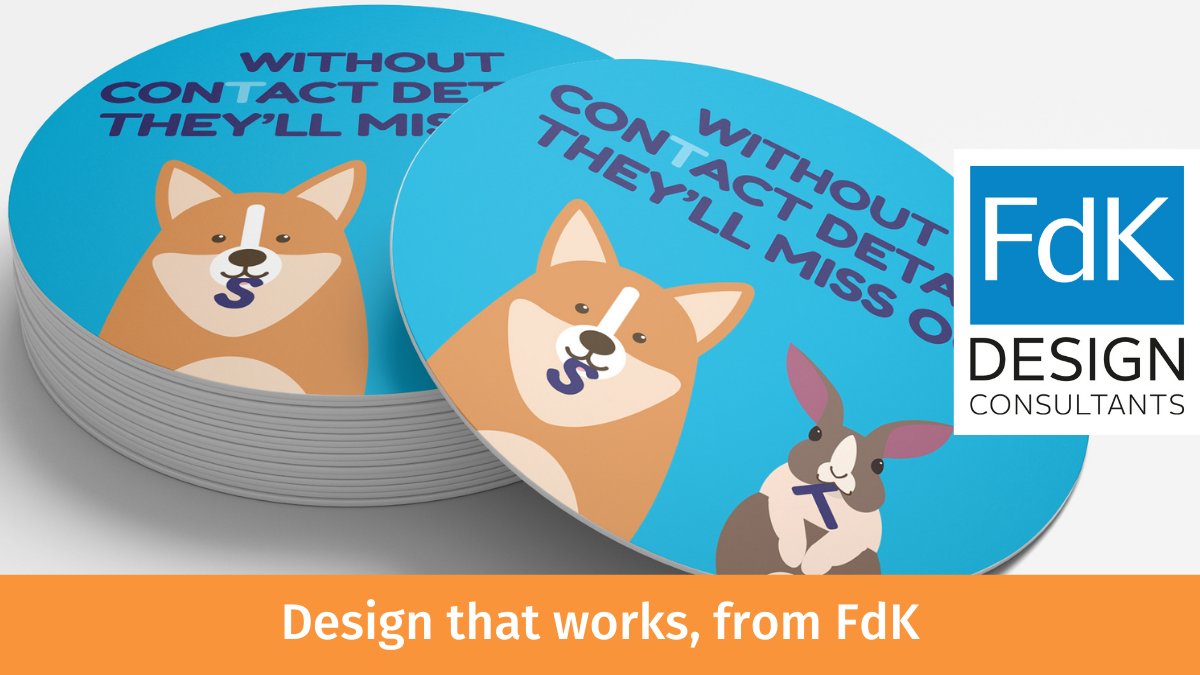
Virtual Recall asked FdK to design an engaging set of materials to include in their new practice welcome pack. Designed to encourage practice customers to check and correct the contact details the practice held.
https://t.co/fkQdxKStEH
Look at the market place & competitors and create a ‘Scrapbook’ of images and text. Get to understand your audience – what pains do they have? where do they go to find information? what colours/images/styles attract them?
Design TiPs from the DiBRC by FdK https://t.co/8F8DJ42PJM
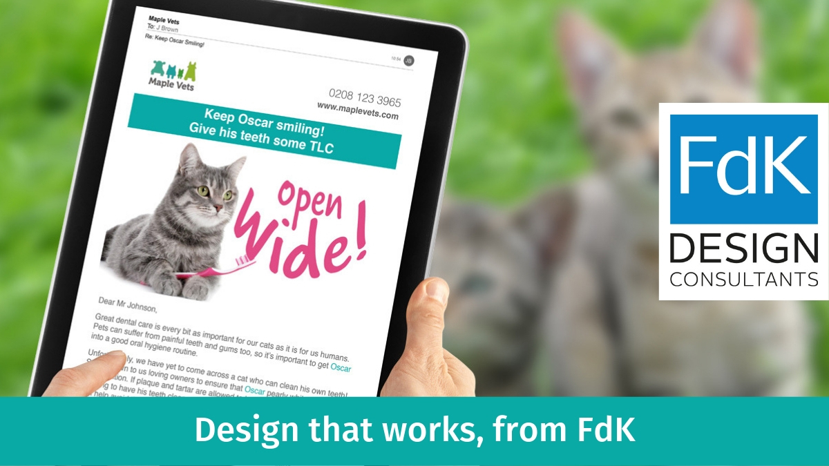
Challenging stuff! For iRecall, we developed a template-based design system that enables the creation of new email campaigns with a predictable appearance across a wide range of devices & operating systems.
Have a look: https://t.co/5EKN8OqCxk
Creativity can't always be produced to order, and spending more time burning the midnight oil is not the solution. As soon as your thinking starts going round in circles, take a break to recharge your creative batteries.
Design TiPs from the DiBRC by FdK https://t.co/8F8DJ42PJM
The North Downs Way is a 153-mile footpath leading from Farnham to Dover. Surrey County Council asked FdK to design and create a visible and appropriate start maker to be installed at Farnham.
It was quite a challenge, but we were pleased with the result: https://t.co/Nke4PxVaGt
Oakleaf, a Guildford-based mental health charity, and social enterprise asked FdK to help refresh their branding and website to better connect with their key audiences of clients, volunteers, customers and supporters.
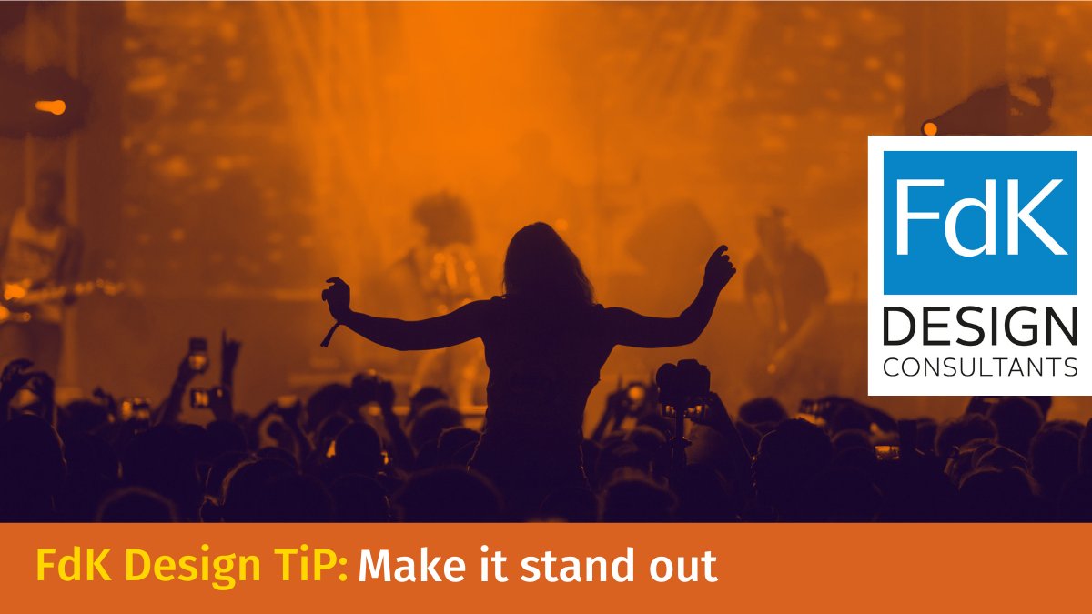
Contrast is one of the most imperative parts of the design for mood, legibility and to make it stand out.
A good rule of thumb is if you have a light coloured background then you should use a dark font (and vice versa).
Design TiPs from the DiBRC by FdK https://t.co/LYgDzD4HzM
Our friends at The Trafalgar Way asked us to design a printed map, showing the full length of the route with facts & figures, key characters, and the era in which the journey was made.
See more here: https://t.co/XYjyIiobaq
Buy a copy of the map:
https://t.co/Yx7FpKjhdx
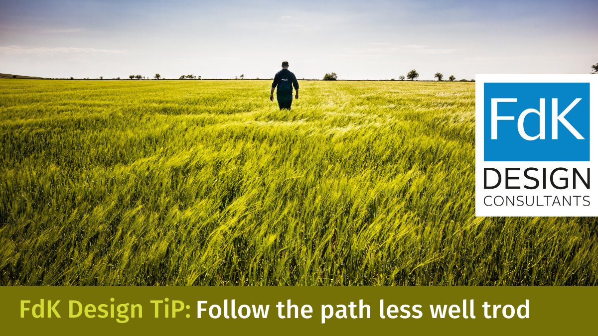
When you are approaching a new creative task, try and think differently, it's very tempting to follow the latest trend or fashion, and sometimes that’s appropriate, but more often, being different gets you noticed!
Design TiPs from the DiBRC by FdK https://t.co/LYgDzD4HzM
As regular visitors to Suffolk, we loved working on all aspects of this project, developing a logo, the 'Relax, Refresh, Return' strap line, brand guides, and a number of other printed materials including postcards.
For more, visit: https://t.co/2md0zuQqY0
We loved developing the Lab Rats family for a new start up aiming to put the pops, bangs and smells back into classroom science for young children, in the hope of inspiring the scientists of the future.
Check out our work at: https://t.co/djS67Hj26g
Whilst not suggesting that every design should be symmetrical, it’s important that you get to grips with the idea of ‘balance’ in a composition, whether that is a page, web page or graphic element.
Design TiPs from the DiBRC by FdK https://t.co/8F8DJ42PJM
Brand design that unifies.
SocialOptic have developed superb software for improving planning, management and decision-making.
They asked FdK to design a brand style that would unify the different elements of the platform and allow for additions: https://t.co/AP916dfqHE
The most visually dominant feature in a design should be the most important part of the message. This is generally the thing that you want the viewer to see first and/or to remember above all else.
Design TiPs from the DiBRC by FdK https://t.co/8F8DJ42PJM
Even pets like to look good, and even better if they are using product made in the UK - https://t.co/6LIOhpw3kX
Lillidale asked FdK to design the packaging for a new range of equine shampoos and treatments.
Check them out at: https://t.co/TAOPGtc6Fb
#design#packaging#equine
FdK were asked to create interior and exterior graphics showcasing the newly-designed BHV branding, providing a welcoming and attractive environment for clients, pets, Vets, Nurses and admin staff - it was great fun!:
https://t.co/XXTLVYpwYY
As you create any new piece of design, make sure that every element has a reason to be there – the clearest communication uses the minimum amount of items and is the hardest to achieve!
Design TiPs from the DiBRC by FdK https://t.co/8F8DJ42PJM
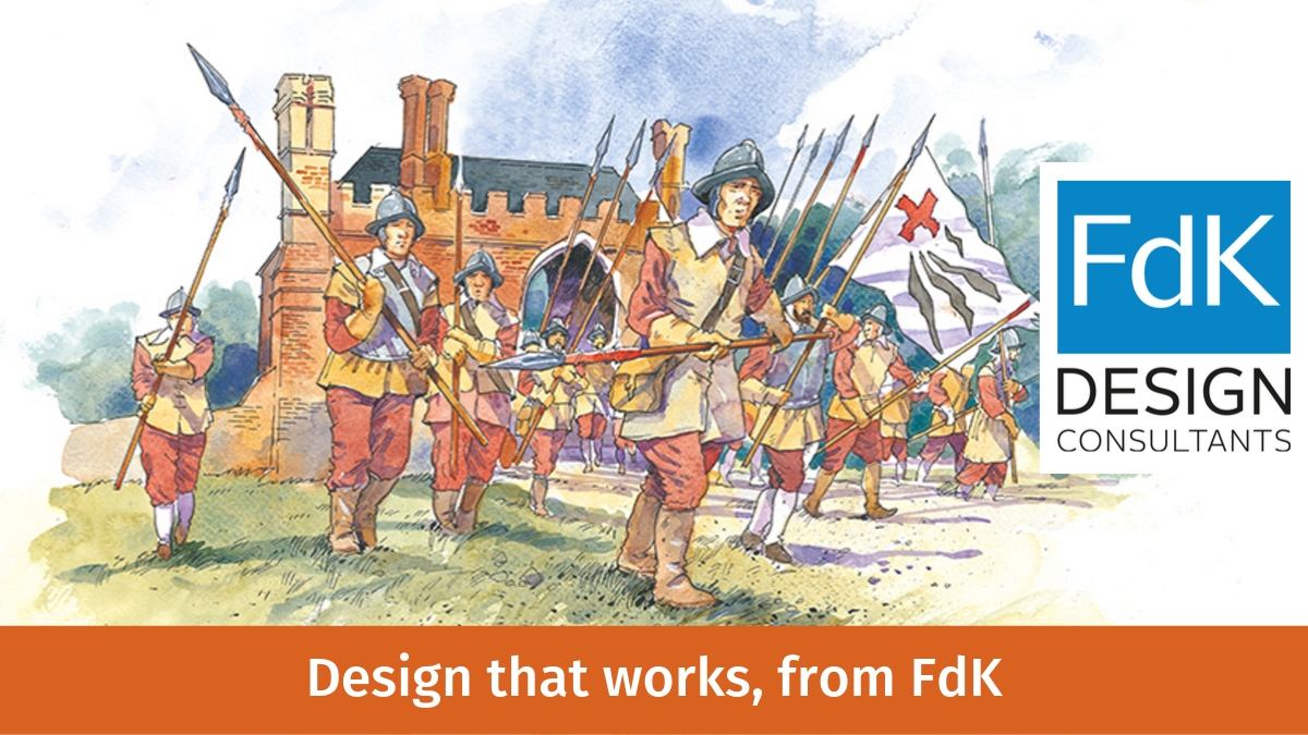
For Farnham Castle, we designed and produced a range of signage and printed materials to explain the history of this ancient building.
It included commissioning some unique and fabulous illustrations that brought the story of the castle to life! : https://t.co/h2OITzlpP7