Why do strong design decisions lose impact in strategic conversations?
PitchPivot is an experimental AI prototype helping designers reframe their reasoning into business impact — and prepare for tough stakeholder questions early.
→ https://t.co/PjjQSsjxR3
#lovable#AIDesign
Die Interaction Week 2023 startet bald und es gibt noch Tickets! An der Agency Tour durch Zürich sind unsere Türen für euch geöffnet 🙌 Wir freuen uns auf zahlreiche neue Gesichter und einen spannenden Austausch! 👉 https://t.co/vVXLXUqufi
#interactiondesign#conference
Die Interaction Week 2023 startet bald und es gibt noch Tickets! An der Agency Tour durch Zürich sind unsere Türen für euch geöffnet 🙌 Wir freuen uns auf zahlreiche neue Gesichter und einen spannenden Austausch! 👉 https://t.co/vVXLXUqufi
#interactiondesign#conference
Wir sind unsere eigenen User! So wie Flore, die das Design der Offline-Nutzung in der SAC-CAS App mitentwickelt hat und jetzt auf ihren Touren abschalten kann 🧘♂️ #WirSindUnsereUser
https://t.co/46zW5ykHcy
I'll be attending Config 2022 for the first time. I'm excited to discover conference and various talks! @figma@Official_FOFPH#Config2022 : https://t.co/UEVUKSruFn
Heute um 0:01 haben wir SwissCovid deaktiviert. Ein aussergewöhnliches, interdisziplinäres Pionierprojekt mit internationaler Strahlkraft. Grossartige Zusammenarbeit zwischen Wissenschaft, Bundesverwaltung und Privatwirtschaft.
https://t.co/EX3Y7XVtfF
Nach zwei Monaten "steiler" Entwicklung: Preview-Version der SAC-CAS-App in den Stores! Vielen Dank an den #SAC-CAS für die tolle Zusammenarbeit!
https://t.co/L75DWP8pD0
"But, when interfaces keep changing according to the profit incentives of vast technology corporations, it’s hard to feel that the things we publish and collect in our digital spaces really belong to us" by @chaykak#uxdesign#appdev#Apps
https://t.co/F8dzOQtS0h
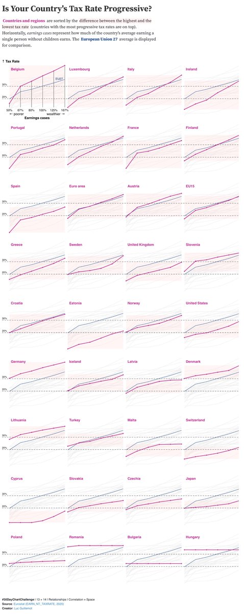
#13+14 - Relationships - Correlation + Space
Are tax rates always correlated to earning tiers? In Belgium, tax rates are the most progressive, but in Hungary, tax rates are the same for everyone, no matter earning levels.
→ Code https://t.co/5YvLQ6PMgf
@30DayChartChall
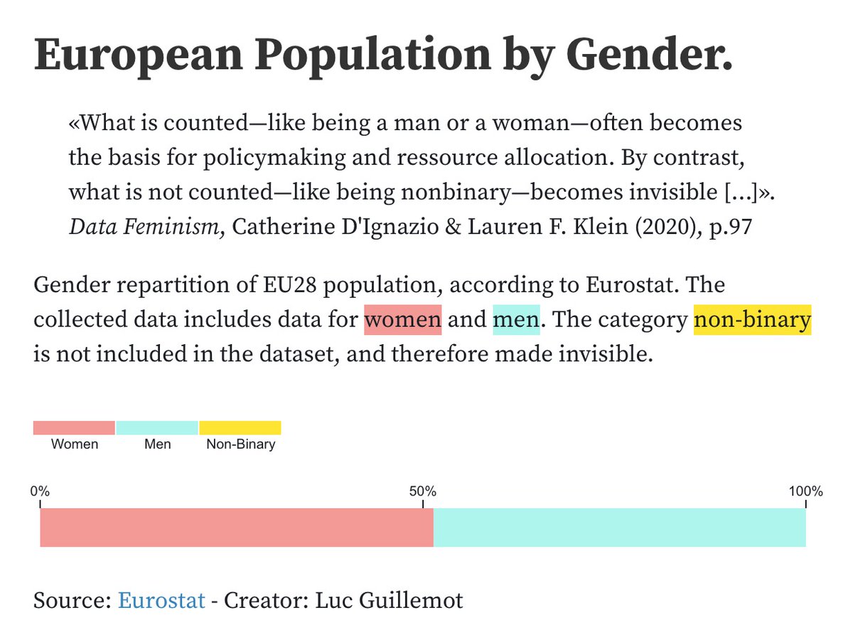
#04 - Comparisons - Magical
Chart inspired by @laurenfklein & @kanarinka 's chapter of Data Feminism: "What Gets Counted Counts". Nonbinary persons are made invisible by most data that includes gender.
#30DayChartChallenge @30DayChartChall
#datafeminism#missingdata
#01 - Comparisons - Part-to-whole
Gender Balance in the European Parliament.
Stacked chart of the percentage of women in the European Parliament since 1999. Data from the European institute for Gender equality.
Code: https://t.co/kBvlbColFC