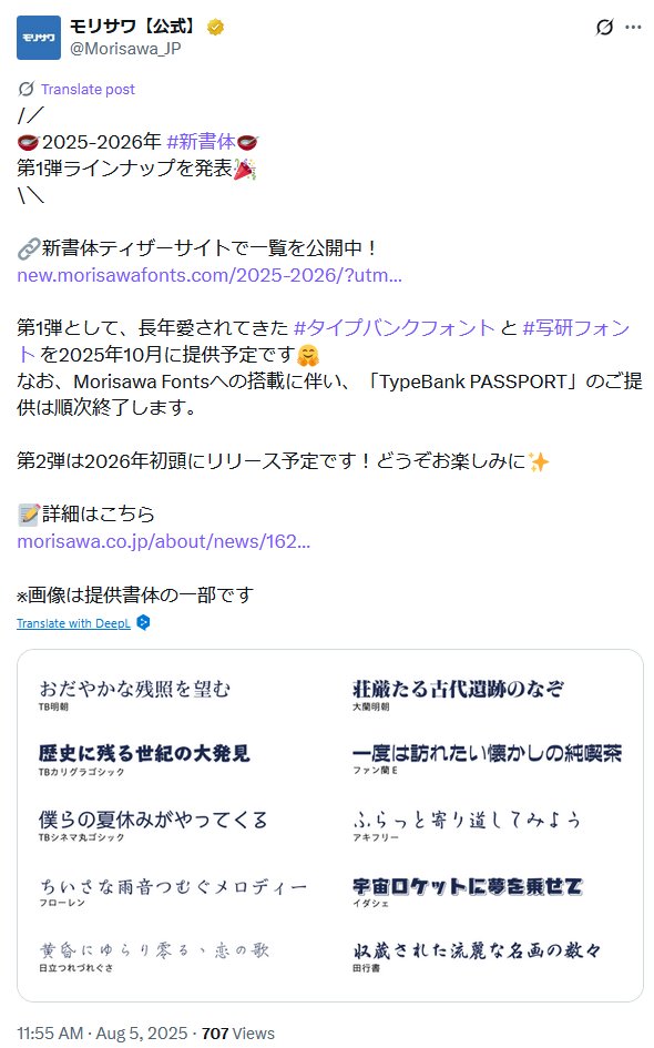
Identified & documented fonts, obscure & otherwise from games & other media.
Created by @KaihatsuYT
Was not affiliated with any companies. いかなる会社とも提携していなかった。
Fontendo is no-longer active.
フォン天堂の活動を終了しました。
Archive / 投稿アーカイブ: https://t.co/CbzwGAwNrR
Videos / 動画: https://t.co/tPlLKeRF07
Future font-related posts & videos will be via @KaihatsuYT.
今後のフォント関連の投稿や動画は上記アカウントでお知らせします。
I have re-released my personal website which contains information about fonts I have created, with some available to download.
Please note the downloads are old versions as I am unable to release updates at this time. This site also excludes any of my official type design work.
After many years of "maintenance", I'm proud to release my improved website! On there you'll find info about what I do in Japan, as well as my most recent videos and previous fonts I made as a student (and some newer projects).
Please do check it out! https://t.co/NpBpeAdupE
All of the fonts used by NHK over the years to announce the dissolution of the House of Representatives (lower house of the National Diet of Japan). They started out with Fontworks fonts, before moving on to Dynacomware. Now they use UD Reimin by Morisawa.
Due to both domestic backlash and international coverage, Monotype Japan has announced that it is extending its game-embedding subscription of its LETS font programme until March 2026, while promising to develop a new subscription programme tailored to the Japanese market.
While Fontendo is no-longer active, for those interested in learning a little more about the Japanese type design industry (and the reasons why Fontendo went inactive), please check out the two following podcasts which I was recently interviewed on.
Anyway, for some insight into the Japanese type design industry and what it's like to work as a type (font) designer in Japan, check out these two podcasts I was interviewed on:
Tokyo Game Life: https://t.co/xqCXsv4yn4
Japan Station: https://t.co/mSZRxSn8K5
For people panicking about what this means for certain games:
No, this will not affect already released games like Splatoon 3. Big developers like Nintendo don’t license fonts the way smeller devs did, and Nintendo owns the rights to any custom projects produced by Fontworks.
Since the acquisition was announced I was expecting that things would get worse for customers that stuck with Fontworks as it was subsumed into Monotype.
Good opportunity for their Japanese competitors to step in. Shame that Fontworks will probably lose its position this way.
I renewed this domain recently and it’s looking like it’s going to cost about $60 a year to run… I’m not a fan of soliciting donations like this but if anyone would like to support the legacy of Fontendo then please follow the link on the main page to donate!
I was invited on to this podcast to talk about Japanese typefaces and how I got into type design, and moved to Japan.
Thank you for bringing me on to talk!
Fontendo is no-longer active.
フォン天堂の活動を終了しました。
Archive / 投稿アーカイブ: https://t.co/CbzwGAwNrR
Videos / 動画: https://t.co/tPlLKeRF07
Future font-related posts & videos will be via @KaihatsuYT.
今後のフォント関連の投稿や動画は���記アカウントでお知らせします。
[NEW VIDEO / 新しい動画]
I have just uploaded a short follow-up to this video, with some news about the FanRan typeface which I introduced as the closest typeface to Nintendo's Japanese logo.
Link in the next tweet.
[NEW VIDEO / 新しい動画]
The final Fontendo video is now available.
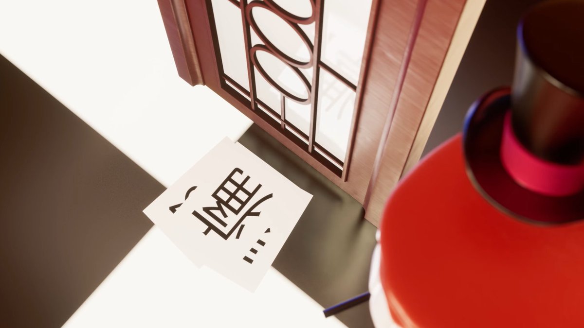
It discusses the origins of Nintendo's logos - specifically how the styles of lettering in them evolved, as well as revealing the closest typeface to Nintendo's kanji logo.
Link in the thread below.
Slight correction:
The font will be available on Morisawa Fonts. Morisawa Passport is Morisawa's older font service platform which has been closed down.
Five days after I upload my video which talks extensively about FanRan E, the closest typeface to Nintendo's Japanese logo, type foundry Morisawa has just announced that it has been digitised into an OpenType font and will be available on Morisawa Passport starting this October.
[NEW VIDEO / 新しい動画]
The final Fontendo video is now available.
It discusses the origins of Nintendo's logos - specifically how the styles of lettering in them evolved, as well as revealing the closest typeface to Nintendo's kanji logo.
Link in the thread below.
【Video Update/拡散希望】
English and Japanese subtitles are now available for this video. Please enjoy watching with either subtitles or translation.
任天堂のロゴ文字を検討・検証する動画に、英語および日本語の字幕を追加いたしました。
ぜひ両言語にてご覧ください。


![Fontendou's tweet photo. [NEW VIDEO / 新しい動画]
I have just uploaded a short follow-up to this video, with some news about the FanRan typeface which I introduced as the closest typeface to Nintendo's Japanese logo.
Link in the next tweet. https://t.co/E9bIfTAMRR](https://pbs.twimg.com/media/Gx1ORgJbsAQFGhx.jpg)
![Fontendou's tweet photo. [NEW VIDEO / 新しい動画]
The final Fontendo video is now available.
It discusses the origins of Nintendo's logos - specifically how the styles of lettering in them evolved, as well as revealing the closest typeface to Nintendo's kanji logo.
Link in the thread below. https://t.co/jRPu14Lavu](https://pbs.twimg.com/media/GxROwOEboAAFYRc.jpg)


