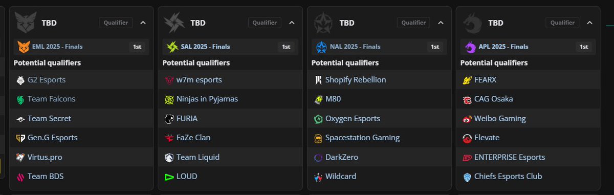
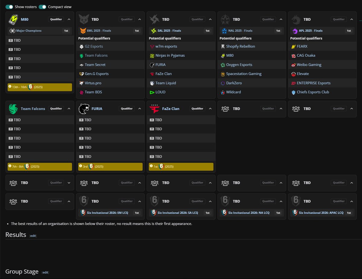
@Mauisnake@LiquipediaCS Yeah, we know, we didn't like it either, so we have a PR to move back to basically what it was before (check screenshot)
This and things like the placements in these tables are elements we're iterating on closely as we update the table styles
@ION_WARRIOR @ChainsSoul Ah, yes, there will always be edge cases like these that we can't catch during development (unfortunately, beta testing of features on LP is quite limited)
Now that we are aware of more issues around the wiki, it makes it easier to iterate and improve ^^
@JesseJChick@Okidokie98@LiquipediaR6 Lower than the major esports, sure, but does that exclude them from being supported? If one feature works well for all types of competition, and the other doesn't, why would you pick the latter.
Taste is subjective in the end :)
@JesseJChick@Okidokie98@LiquipediaR6 We don't like the old design because it made for bad experience 1) on mobile; 2) for wikis with huge rosters like WoT or sports
Looks amazing on more common roster sizes like RL/R6, etc. but not much else. The hover functionality is also not something you can do on mobile
@JesseJChick@Okidokie98@LiquipediaR6 Again, bias aside, I think giving editors the option to do this adds way more value to me as a regular user
And I think once the rosters are locked, you might be able to see like 15 at a time
@JesseJChick@Okidokie98@LiquipediaR6 Bias aside, I'm a fan of how the new UX better supports player/staff roles display, trophies, qualifier placements, and potential qualifier teams for a slot
I get the feedback for "Main/Staff tabs too big", will relate to design, but it also has to be big enough for mobile users
@CHR1STPHR_RL@LiquipediaRL And that's annoying on a small game like Rocket League already. Try going to the 15v15 World of Tanks tournaments and browsing the old Team Participants :P
@rocket_pringle@rhawkets Also, we've had an API since forever, we're even allowing a limited free use for it for certain use cases.
Check https://t.co/ZnPbd5ULwZ
Goal for next year is to clean up our data a lot to make it more reliable and easily accessible by B2C and B2B clients
@CHR1STPHR_RL@LiquipediaRL IDK, for me the coach shows on the main tab already, so no extra click needed. By specs, if there's only 1x staff, they're shown on Main Roster
We removed the hover functionality because it's not a good behavior on mobile + the old code was so bad it had to be thrown out
@KevdogCasts@LiquipediaRL We're bug fixing day 1 issues atm, and I assume we will develop this with more functionality on per-need basis, yes.
Part of the work on this mean standardizing the code, so maintenance and development on it can be much easier/faster
I 100% prefer this Liquipedia update to the previous way how teams were displayed on event pages.
But the switches for "Show rosters" and "Compact view" don't work on some pages.
@reidthesloth@rhawkets Having led that project myself, it warms my heart to read your comments, guys <3
Huge shoutout to our design and dev team, they took my boring docs and cooked a mega looking feature