

Top Tweets for #Designwithaisha

And honestly?
No color controls human emotion faster than red.
That’s why you feel it before you even think about it.
#DesignWithAisha Ep28
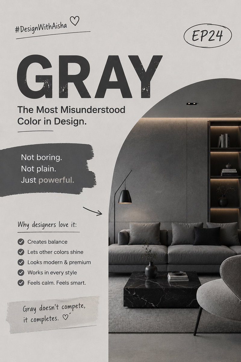
Gray is not boring.
Gray is mature.
It’s the color equivalent of someone who doesn’t need to shout to be respected.
And honestly?
That’s power. 🩶
#DesignWithAisha EP24 ✨
The most expensive-looking designs in the world all know one secret… they don’t rely on loud colors.
And somehow, the color people call “boring” is usually the reason they look so premium. 👀
Welcome to #DesignWithAisha EP24 — let’s talk about the quiet power of Gray 🧵✨
I miss posting my designs ngl 😭
Maybe it’s time to bring back the series…
Should I continue from where I stopped or start fresh?
Pls drop ur opinion in the comment section.👇
#DesignWithAisha

8️⃣
This was #DesignWithAisha Ep20 🎀
In Ep23, we’ll uncover a color that hides in plain sight —
you see it every day, but never feel it.
Any guesses? 👀
GM CT
1️⃣
💗 Pink — the color everyone thinks they understand, but don’t.
It wasn’t always “girly.”
Once upon a time, pink was powerful and masculine.
So… how did it go from royal to romantic?
Let’s talk psychology 🎀
#DesignWithAisha Ep20

This was #DesignWithAisha Ep19 — The Color People Overlook.
In Ep20, we’ll reveal another hidden color that most designers ignore —
but once you learn its secret, you’ll never skip it again. 👀
5. The real secret?
Luxury isn’t loud.
It’s confident.
It walks in quietly — and everyone still looks.
—
That’s a wrap on #DesignWithAisha Ep18 💛
Next up: Ep19 — Texture.
We’ll talk about how to make flat designs feel alive 👀
See you guys🧡
GM 😭
Everywhere just red 😭😭
My portfolio almost fainted 💀
UPtober don turn DOWNtober 💔😂
#DesignWithAisha


✨ The combo you’ve seen your whole life but never really looked at…
This is #DesignWithAisha Ep17, we’re exploring the psychology behind GREEN + WHITE 🌿🤍
The same combo in our flag, hospitals, skincare brands, and even WhatsApp.. and yes, there’s a reason for all that.
Green represents life and growth, it’s literally the color your eyes rest best on.
That’s why nature feels peaceful to look at.. it’s not just trees, it’s color psychology at work.
No wonder brands that want to look trustworthy and calm (like WhatsApp, Spotify, and Android) all picked green.
White, on the other hand, is purity, clarity, and balance.
It gives designs breathing space , it’s what makes green look fresh instead of messy.
Ever notice how doctors, nurses, and health apps use Green + White?
It’s not random.. that combo relaxes your brain and builds instant trust.
Together, they create a calm yet powerful contrast.
Green gives life 🌿
White gives order 🤍
Mix them right, and your design will feel peaceful and confident at once.
Designer tip:
Use pastel green + soft white for peaceful and clean vibes.
Use emerald green + pure white for luxury or nature-based brands.
And yes — that’s why our flag works so well 🇳🇬
It’s not just “Green and White,” it’s growth + peace — two energies every country and brand needs.
So next time you open WhatsApp or see a “green and white” post, pause for a sec…
It’s not just color.. it’s communication. 🌿🤍
This was #DesignWithAisha Ep17.
In Ep18, we’ll enter the world of luxury colors — the ones that silently scream money.👑
Any guesses???

6.
So next time you see a green logo or design, pause…
It’s not just “green.”
It’s a message. 🌿
This was #DesignWithAisha Ep16.
In Ep17, we’ll pair GREEN with WHITE 🇳🇬 and see how this combo carries deep cultural and emotional power (even in our flag 😉).
Now I’m curious…
Do you see Black + White as classy timeless or still boring outdated? 🖤🤍
Drop your take 👇
#DesignWithAisha
✨ The secret most people ignore in design…
Everyone is running away from Black + White.
They call it boring, plain, or old-fashioned.
But here’s the truth; Black & White is timeless.
It never goes out of fashion 🖤🤍
This is #DesignWithAisha Ep15 🧵👇


@kaita_aisha @S_M_Danpullo @SBanagus Black + Gold always delivers that timeless mix of elegance and strength, can’t wait to see what #DesignWithAisha Ep15 brings!
GM fam🧡
People are already saying me & Red are 5&6 😂 so let’s switch it up today.
We’re diving into a new combo that screams luxury + power —
Black + Gold ✨
This is #DesignWithAisha Ep14 🧵👇

GM fam 🌞✨
Align your goals today the way you align text in Canva… because if not, everything go just dey waka anyhow 😭😂
#DesignWithAisha

So next time you see red & yellow together, ask yourself…
Is this design making me hungry, or is it just smart psychology? 👀
What other color combos do you want me to break down in the next episode? 🦋
#GraphicDesign | #DesignWithAisha
Some colors don’t just decorate, they manipulate your brain.
Red + Yellow is one of the deadliest combos in design.
This is #DesignWithAisha Ep13 🧵👇

That’s it for Ep12 of #DesignWithAisha 🦋
Next, we’ll explore another color mix that brands secretly use to control how you feel. Stay tuned..
Last Seen Hashtags on Sotwe
Most Popular Users

Elon Musk 
@elonmusk
240.9M followers

Barack Obama
@barackobama
119.2M followers

Donald J. Trump
@realdonaldtrump
111.8M followers

Cristiano Ronaldo
@cristiano
111.5M followers

Narendra Modi
@narendramodi
107.1M followers

Rihanna
@rihanna
97.9M followers

NASA
@nasa
92.2M followers

Justin Bieber
@justinbieber
91.1M followers

KATY PERRY
@katyperry
88.1M followers

Taylor Swift
@taylorswift13
82M followers

Lady Gaga
@ladygaga
73.5M followers

Virat Kohli
@imvkohli
70.7M followers

Kim Kardashian
@kimkardashian
70M followers

YouTube
@youtube
68.7M followers

Bill Gates
@billgates
64.2M followers

Neymar Jr
@neymarjr
63.5M followers

The Ellen Show
@theellenshow
62.4M followers

CNN
@cnn
61.9M followers

Selena Gomez
@selenagomez
61.2M followers

X
@x
60.8M followers