Top Tweets for #tinycsstip

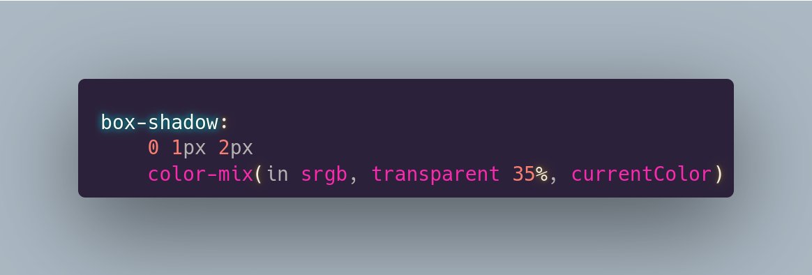
Nowadays, we can do better:
```
box-shadow: 0 1px 2px
rgb(from currentcolor r g b/ .65)
```
#tinyCSStip
#tinyCSStip
Want the shadow of an element or some other visual to be a semitransparent version of the `currentColor`?
Use `color-mix()`!
Because I often see this and it's a major CSS pet peeve of mine, makes me want to scream "do you even understand what `cover` does?" at the screen every time...
#tinyCSStip

#tinyCSStip We can have boolean logic in container queries!
And this works cross-browser!
Live test on @CodePen: https://t.co/gp8slNayCu
#CSS

#tinyCSStip Want the same border, but only for 2 edges, not for the others?
Don't set borders on the 2 edges to the same value. Set border and override border-width. If you later need to make the border thicker/ thinner/ pink/ green, you only need to make that change in 1 place.

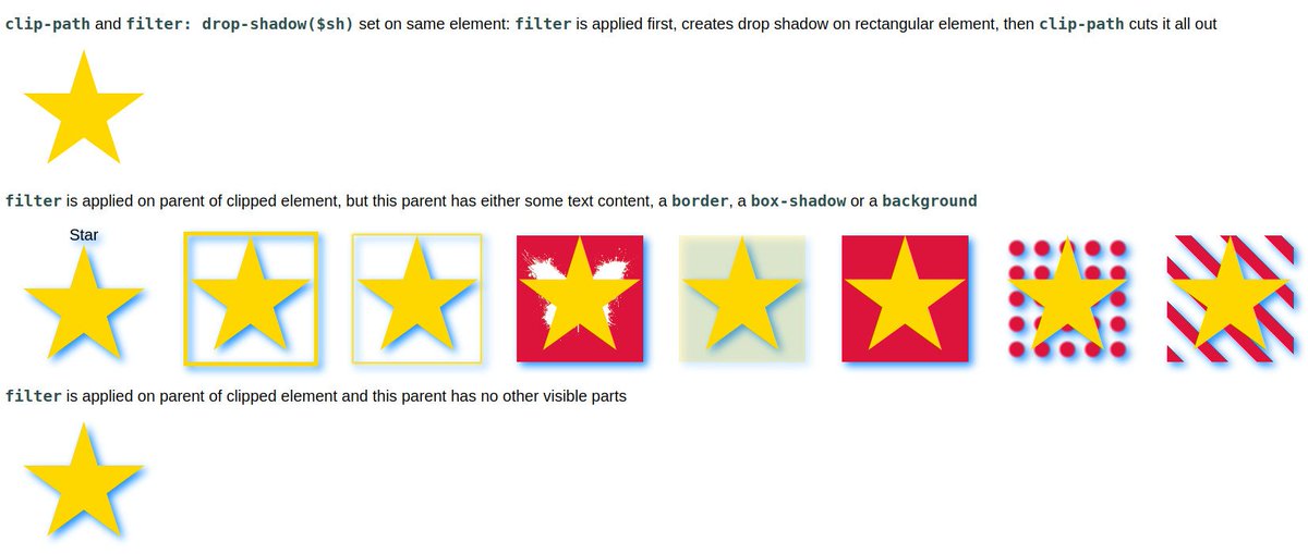
#tinyCSStip `clip-path` & `mask` are applied after `filter`.
This means we can't clip/ mask, then add a `drop-shadow()` on the same element for the clipped/ masked shape.
We need to apply the `filter` on a parent of the clipped/ masked (pseudo-)element.
https://t.co/fTU8kc3acq

#tinyCSStip Simplifying animations with CSS variables and mathematical functions.
Same result, just not writing almost the same `text-shadow` a bunch of times in a bunch of keyframes.
Live test on @CodePen: https://t.co/D3zWn2Hrja

#tinyCSStip
Revert animated parent transform (like a scale or skew) on child without an extra animation using registered custom properties.
https://t.co/4Ybjeh1mbA

#tinyCSStip
🚫 DON'T use layered text-shadows for text outlines just because text-stroke is broken (https://t.co/JlwITdw01C), they are going to produce ugly corners, thickened roundings and angled lines.
✅ DO: use `paint-order: stroke fill` instead!


Most cursive fonts are unusable with text-stroke. Yeah, there's paint-order, but I want to have a semi-transparent stroke *on top* of the fill in order to create a font-size-relative double stroke, so just covering up the stroke where it intersects the fill defeats that purpose.
#tinyCSStip Create a fancy double border with dashes in between without any pseudos and with minimal CSS!
The relevant code is just 3 simple CSS declarations!
Live demo:
https://t.co/QZemgXFqc5

#tinyCSStip Want to avoid ugly checkerboard edges when pattern size depends on viewport?
Round it to be a multiple of 2px so every square edge is an int number of pixels!
--s: round(10vmin, 2px);
background:
repeating-conic-gradient(red 0% 25%, tan 0% 50%)
0 0/ var(--s) var(--s)

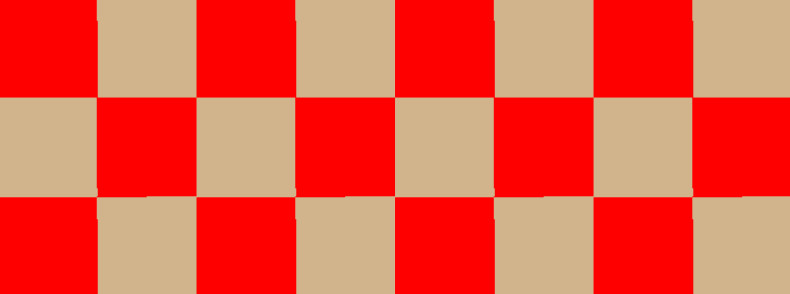
#tinyCSStip
Pretty sure I've posted about this before, but a quick search at this hour of the morning didn't find it, plus saw someone ask about it yet again¹, so... fixed aspect-ratio box within variable size container!
Live on @CodePen https://t.co/dP4MEw0ikX

#tinyCSStip
Ever want to mask something out of an element, but not cut out blur or box-shadow or a pseudo outside the element's border box? 🤔
Well, subtract whatever you want masked out from a fully opaque layer with `mask-clip` set to `no-clip`! 💡

#tinyCSStip
Want the shadow of an element or some other visual to be a semitransparent version of the `currentColor`, which was given as a hex or keyword value?
No need to convert to rgb() or hsl() anymore!

#tinyCSStip Want your page background to contain an integer number of dots?
Use `background-repeat: space`! This inserts a bit of space in between background repetitions so we have an integer number of them. Well-supported for ages. 🥳
Live on @CodePen https://t.co/wrj6mzCWh3
#tinyCSStip Container queries on the body? Why, when media queries have better support?
Well, container queries make it an IF depending on the width of the body's content-box.
That is, subtracting the scrollbar IF we have one (we can't know).
Live demo https://t.co/5D7kVqoE1J

#tinyCSStip/ fun fact: same aspect ratio is also what we need for a regular hexagon because that can made up of only equilateral triangles!
We just need more points for the clip-path (6 for a hexagon vs. 3 for a triangle).


#tinyCSStip Want to create a triangle with all edges equal?
Such a triangle also has all vertex angles equal = (sum of angles in a triangle)/3 = 180°/3 = 60°
👉 https://t.co/u5gIIDq05b
Knowing its edge length a, its height is a·sin(60°).
Aspect ratio of the box a/(a·sin(60°))


#tinyCSStip Want to create a triangle with all edges equal?
Such a triangle also has all vertex angles equal = (sum of angles in a triangle)/3 = 180°/3 = 60°
👉 https://t.co/u5gIIDq05b
Knowing its edge length a, its height is a·sin(60°).
Aspect ratio of the box a/(a·sin(60°))
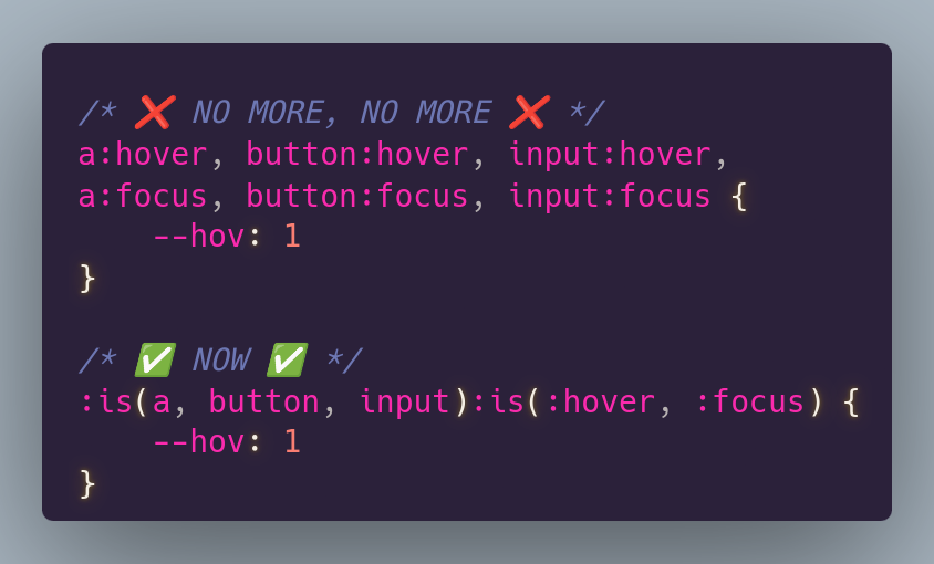
#tinyCSStip
`:is()` is such a great new-ish CSS feature that helps eliminate repetition in selectors ✨
#tinyCSStip If you don't need the start angle and the sector angle to be decoupled, you can simplify things by making the sector angle depend on the start one. 💡
4 base declarations + 1 simple animation = magic! 🪄
All pure CSS.
#tinyCSStip Simplest circle sector in 4 CSS declarations!
1⃣ set width to desired diameter
2⃣ square element with aspect-ratio
3⃣ turn square into disc
4⃣ conic-gradient() magic! 🪄
The start angle and sector angle can also be animated for fun results.
#tinyCSStip Simplest circle sector in 4 CSS declarations!
1⃣ set width to desired diameter
2⃣ square element with aspect-ratio
3⃣ turn square into disc
4⃣ conic-gradient() magic! 🪄
The start angle and sector angle can also be animated for fun results.
Last Seen Hashtags on Sotwe
ağlayan
Seen from Turkey
diyarbakırtrAvesti
Seen from Germany
taksimtraveſti
Seen from Turkey
extremewwo
Seen from Netherlands
โคราชในเมือง
Seen from Thailand
straightguy
Seen from Chile
nolimit()**filter:native_video
Seen from Egypt
michaelaftonnsfw
Seen from United States
Jenki
Seen from United States
cderindo
Seen from United States
Most Popular Users

Elon Musk 
@elonmusk
240.2M followers

Barack Obama
@barackobama
119.3M followers

Donald J. Trump
@realdonaldtrump
111.6M followers

Cristiano Ronaldo
@cristiano
109.4M followers

Narendra Modi
@narendramodi
106.9M followers

Rihanna
@rihanna
97.4M followers

NASA
@nasa
92.1M followers

Justin Bieber
@justinbieber
90.7M followers

KATY PERRY
@katyperry
87.1M followers

Taylor Swift
@taylorswift13
80.9M followers

Lady Gaga
@ladygaga
72.4M followers

Kim Kardashian
@kimkardashian
69.5M followers

Virat Kohli
@imvkohli
69M followers

YouTube
@youtube
68.6M followers

Bill Gates
@billgates
63.5M followers

The Ellen Show
@theellenshow
62.5M followers

CNN
@cnn
61.9M followers

Neymar Jr
@neymarjr
61.6M followers

X
@x
60.9M followers

Selena Gomez
@selenagomez
60.2M followers