By embracing the old and the authentic we bring the focus back to creating sentimental and meaningful spaces, the perfect alternative for those who aren’t interested in the minimalist approach 😌 https://t.co/JFaCJ4Ugfq
Colour blocking doesn’t have to involve clashing primary colours. Experiment with olive greens and muted blushes for a combination that achieves the ultimate sense of calm 😍 https://t.co/vR7RtoCNDs
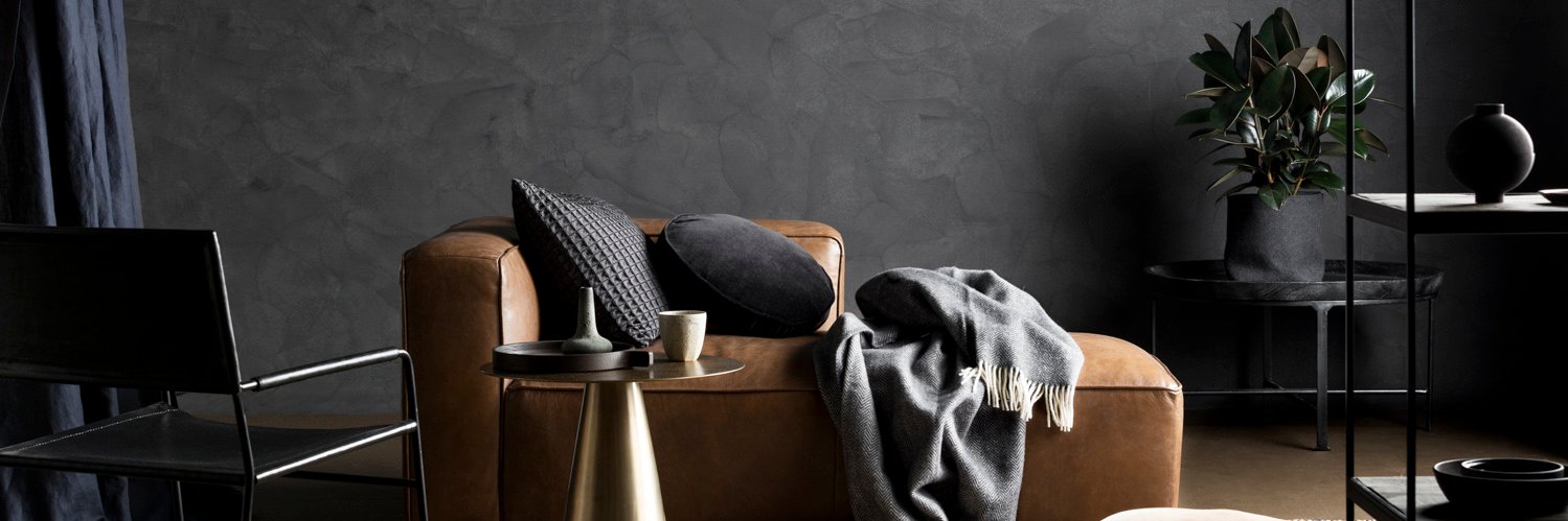
We’ve all heard the saying that ‘less is more’, and with minimalism now more popular than ever this monochrome palette offers an approach to design that embraces only the essentials 🙌 https://t.co/bQBbSGbMW8
For the unfamiliar, Wabi Sabi isn’t a spicy sushi condiment, but a century-old approach to living coined by the Japanese. Now popping up in all aspects of design, the key takeaway for interiors is to embrace the beauty in imperfection! ✨ https://t.co/AQ48SYER8p
Step inside the Armadale abode of Hunting for George Co-Founder Lucy Glade-Wright. A lover of all things art deco, Lucy couldn't miss the opportunity to land a little piece of architectural history when she purchased the 1940s apartment ✨ https://t.co/reAzF1QK8h
Did you know almost every colour in the Haymes Paint colour range has a
colourful family story behind it? Can you guess the story behind Patricia Brown? https://t.co/5OtUk2ZfD9
If an expensive kitchen makeover isn't on the cards, don't underestimate the simple but cost effective updates that can make a world of difference. Case in point, this fresh coat of paint on the walls and... https://t.co/vY1PBv1CTY
This leafy 1960s Armadale apartment has a new lease on life after a contemporary but cost effective reno. Check out the before and after, you'll barely recognise it ➡
Colour used is Haymes Parchment Grey
Photography by Martina Gemmola
Styling by Ruth Welsby
Haymes Minimalist keeps this open plan living space light and bright, the perfect backdrop for eclectic homewares and mixed textures ✨
Colours used are Haymes Minimalist and Haymes Humas
Home by A Pair & A Spare
With Pantone announcing Living Coral as their Colour of the Year for 2019, there has never been a better time to embrace the bold and energetic hue 💥 https://t.co/C0cjTl2sxy
The spirit of The Jericho Cup perfectly captured by the duo from WYATT ART! It was the colourful story we had to tell, and this incredible piece created using Haymes Paint was the perfect way to tell it. #WYATTART https://t.co/crdBawgf05
By incorporating natural elements into our living spaces, it subconsciously empowers us to make better decisions about our environmental impact. Finding that... https://t.co/6dktfPnhgu
We are truly excited to be a part of sharing the largely unknown story of what is a significant part of our country’s heritage, 100 years on. For Haymes, The Jericho Cup is the colourful story we had to tell. https://t.co/4uIVpwD4gp
The Colour Conscience re-edit has arrived, a re-imagination of the hues featured in our latest Colour Library collection. The Cohabitate palette is perfect for... https://t.co/BvE6YZ8FNJ