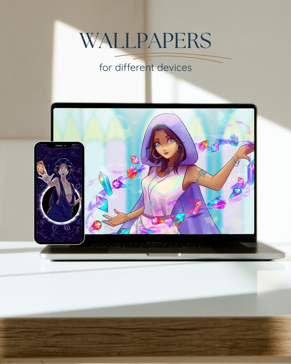
It would be a great help if you could share it, thank you!
For small donations, you can use Kofi.
https://t.co/ubIdzcbN9c
Or you can check out my Patreon; you might find it interesting.
https://t.co/i9hVIUCXyM
🔸COMMISSIONS OPEN🔸
We are experiencing serious financial difficulties at home, and this is now my main source of income.
More information, examples, and terms of service can be found at: https://t.co/slJmXLzpa8
You can contact me at [email protected]
Reminder for all European artists : The EU passed a law that forces Twitter to no longer gather EU member's informations to train AI
This means that if you're part of the EU, YOU CAN JUST OPT OUT OF THIS. YOU DON'T HAVE TO DELET YOUR ACCOUNT.
@suiika___ It's fascinating to see how you can create such a beautiful and well proportioned character starting just with the eyes and drawing everything else around them afterwards. I can't stop looking at it <3
@OpaltheViper It’s really easy! You just need 2 layers above your artwork. Duplicate your artwork, and above the duplicated layer, fill a layer mask with an orange color and set it to Luminosity. Then set the layer below to Hard Light and that’s it!
맑은 느낌의 파스텔톤 보정법!
묘사와 색을 많이 얹은 그림에 효과적이에요
주황 휘도를 하드 라이트로 얹으면 명도 대비가 완화되고 색이 투명해집니다
채도를 그대로 유지하기에 스포이드로 보면 채도 변화는 거의 없지만
시각적으로는 색이 밝고 생생해져 파스텔톤처럼 맑은 인상이 만들어집니다