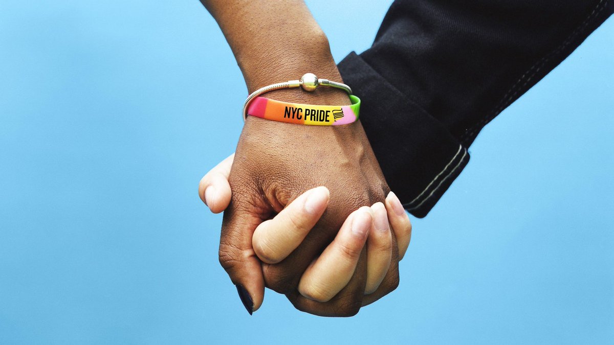
We are so proud to celebrate our partnership with Lippincott on the reimagined brand identity for NYC Pride!
The inclusive new look uses two typefaces from our library, Knockout and Gotham. They lend a bold and direct, yet warm appearance.
Read more here: https://t.co/QhHBLl8YcC
I haven’t decided what the next step of my journey will look like, but I’ll be sharing things on @jonathanhoefler while the folks at Monotype take the reins here. Whatever comes next, I know it will involve letters, and I hope it will once again involve you. —JH
To the designers who have trusted their work to my alphabets, the students who’ve taken the time to get in touch, and the ever-growing community of people around the world who have shared my affection for the craft: I am so deeply thankful. ➔
@gray Now what movie isn’t improved by the addition of “U.S.” to its title? Tell me that these aren’t changes for the better:
• Paris, Texas U.S.
• Once Upon a Time in America U.S.
• C.H.U.D. U.S.
• Tales of Us U.S.
Apparently not one to hold back, Historian Nicolete Gray, in just two pages, describes sans serifs of the period 1832–1838 as “crude”, “earnest”, “serious”, “gaunt”, “heavier”, “clumsier”, “dour”, “too fat”, “lumpish”… 🧵
…“more threatening”, “lugubrious”, and made by an England that’s “awake to the conditions of unmitigated hardship,” “sternly evangelical,” and possessed of “tyrannical dogmatism” and “the will to face the dreariest facts.”
!
@ArrowType@mttymtt On the topic of “smart features,” yeah. You’d have enjoyed the GX conversations at Apple around 1991, when someone accidentally talked management into believing that small caps could be inferred from context! And then the question of what happens when one types “us.” 👨👩👧👦/🇺🇸
@Mantia@ArrowType@mttymtt I suppose the # should get the same treatment, though I generally balance it about the figures, which seems to work ok for the lowercase, too. I suppose it could use an OpenType substitution in some faces?
@Mantia@ArrowType@mttymtt Email definitely changed how I looked at the @ — here are two fonts from Before Email, HTF Didot and Requiem, in which it sits on the baseline; cf the later Mercury, Sentinel, and Decimal, in which it’s balanced about the lowercase.
@Mantia@ArrowType@mttymtt It’s a different semantic element. The raised colon is used for ratios and the time, the baseline colon for everything else. It’s not unlike the distinction between the slash and the fraction bar, cf “½” vs “9/11.”
@ArrowType@mttymtt Another place you don’t want colons between numbers is in biblical citations. “Luke 4:20”, alas, is neither a time nor a lifestyle, but a chapter and verse.